Have you done a multivariate logistic regression using R?
Are your predictor variables dichotomous?
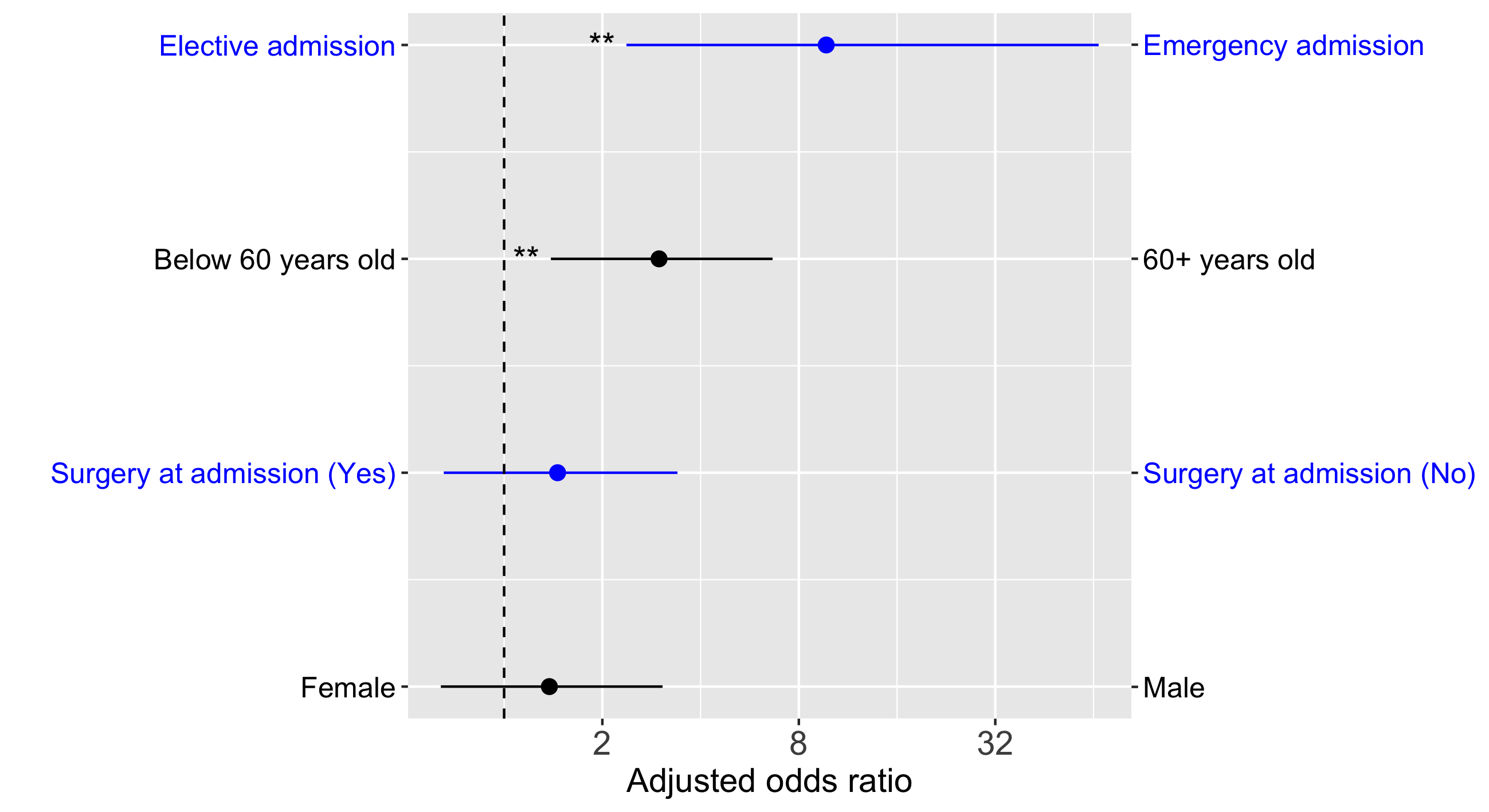
Then you can use forest_odds.R to directly output a figure like this:
This is a forest plot of odds ratios with their confidence intervals.
But using forest_odds.R has a number of benefits:
- This R function does most of the work for you
- Automatically order odds ratios so that the most important factors are shown highest in the plot
- Automatically flip odds ratios, CIs and labels, so that odds ratios are all > 1
- Figure includes a pair of labels for the levels of each factor
- Figure elements alternate in colour across factors for easy visualization
- Automatically displays significance stars for each factor
- Options for font sizes and so on, if you want to change anything
- ggplot2
Look at the script example_script.R. It is a full example that includes doing a multivariate logistic regression in R.
Here I describe the essential parts of the example script, example_script.R.
After you call glm() in R like this for example:
output <- glm(sta ~ sex + ser + age + typ, data=icu3.dat, family=binomial)
output will be one of the inputs to forest_odds.R.
Obviously, you'll need to specify the file name for your new figure.
However, you will also need to make 2 more variables to get going. All other inputs to forest_odds.R are optional, having to do with the appearance of the figure.
For the example figure shown above, you need to write something like this:
lowLab <- c("Male", "Surgery at admission (No)", "Below 60 years old", "Elective admission")
highLab <- c("Female", "Surgery at admission (Yes)", "60+ years old", "Emergency admission")
Please make sure that these labels match how your factors are coded. For example, the reference level for the SEX factor should be Male.
Also, make sure that the order of labels in lowLab and highLab match the order of the predictor variables in your call to glm when you actually asked R to do the regression. For example SEX is the first predictor in output <- glm(sta ~ sex + ser + age + typ, data=icu3.dat, family=binomial) and it is also the first predictor in both lowLab and highLab.
Finally, just write a single line of code to call forest_odds.R like this:
forest_odds(output, lowLab, highLab, "my-figure.png")
After you run your script, you'll get a new file with your figure in it.
UCLA's Institute for Digital Research and Education makes available various textbook datasets. The particular dataset we use is from a commonly used textbook on logistic regression: Applied Logistic Regression (Second Edition) by David Hosmer and Stanley Lemeshow.
If you use this R function to produce a figure that is published, please cite the following paper:
Thomas, J., Barbato, M., Verlinden, M., Gaspar, C., Moussa, M., Ghorayeb, J., Menon, A., Figueiras, M.J, Arora, T., & Bentall, R. P. (2020). Psychosocial Correlates of Depression and Anxiety in the United Arab Emirates During the COVID-19 Pandemic. Frontiers in Psychiatry, 11, 1248. https://doi.org/10.3389/fpsyt.2020.564172
