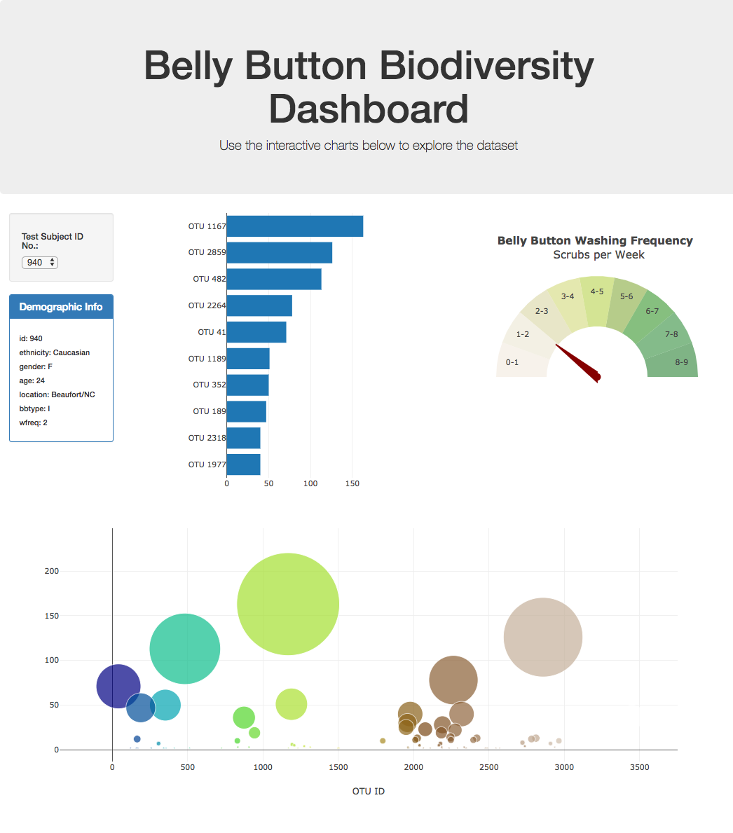
Built an interactive dashboard to explore the Belly Button Biodiversity
View the interactive website here: Belly Button Biodiversity

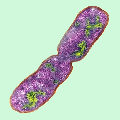
The dashboard was built to explore the Belly Button Biodiversity dataset, which catalogs the microbes that colonize human navels.
The dataset reveals that a small handful of microbial species (also called operational taxonomic units, or OTUs, in the study) were present in more than 70% of people, while the rest were relatively rare.
Used the following directory and file setup:
-root directory
- files in root directory:
- index.html
- README.md
-static (under the root directory)
- folders in static directory:
- css - files in css directory: main.css
- js - files in js directory: app.js , gauge.js
- images - files in images directory: bactieria.jpg , hw02.png
-data (under the root directory)
- files in data directory:
- samples.json
- When running locally on your computer, d3 needs a local server Local Server Setup
- When on github d3 looks for a file from working directory, from your root.
-
Used the D3 library to read in
samples.json. -
Created a horizontal bar chart with a dropdown menu to display the top 10 OTUs found in that individual.
-
Used
sample_valuesas the values for the bar chart. -
Used
otu_idsas the labels for the bar chart. -
Used
otu_labelsas the hovertext for the chart.
- Created a bubble chart that displays each sample.
-
Used
otu_idsfor the x values. -
Used
sample_valuesfor the y values. -
Used
sample_valuesfor the marker size. -
Used
otu_idsfor the marker colors. -
Used
otu_labelsfor the text values.
-
Displayed the sample metadata, i.e., an individual's demographic information.
-
Displayed each key-value pair from the metadata JSON object somewhere on the page.
-
Updated all of the plots any time a new sample is selected.
-
Created a Gauge Chart.
-
Adapted the Gauge Chart from https://plot.ly/javascript/gauge-charts/ to plot the weekly washing frequency of the individual.
-
Modified the example gauge code to account for values ranging from 0 through 9.
-
Updated the chart whenever a new sample is selected.
-
Used
console.loginside of the JavaScript code to see what the data looks like at each step. -
Referred to the Plotly.js documentation when building the plots.
-
Deployed the app to a free static page hosting service, such as GitHub Pages.
-
Ensured the repository has a README.md file
Hulcr, J. et al.(2012) A Jungle in There: Bacteria in Belly Buttons are Highly Diverse, but Predictable. Retrieved from: http://robdunnlab.com/projects/belly-button-biodiversity/results-and-data/
© 2021 Trilogy Education Services, LLC, a 2U, Inc. brand. Confidential and Proprietary. All Rights Reserved.
