#Ionic Content Banner
A Facebook style info/error content banner for the Ionic Framework
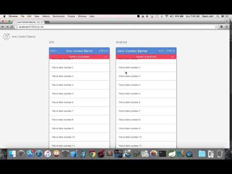
- Watch the Demo video below
- Download the Demo app on Ionic View with appId:
5445a4a4 - Run the demo source code by cloning the ionic-content-banner repo, navigating to /demo and running the following
Run the following ommands:
npm install
bower install
gulp
bower install ionic-content-banner
Include the following JavaScript/CSS file imports in your index.html. Remember to import the ionic libraries first! The example below assumes your 3rd party bower dependencies are located in the default bower_components folder.
<link rel="stylesheet" href="bower_components/ionic-content-banner/dist/ionic.content.banner.css">
<script src="bower_components/ionic-content-banner/dist/ionic.content.banner.js"></script>
Add jett.ionic.content.banner as a module dependency of your app module.
angular.module('Demo', ['ionic', 'jett.ionic.content.banner'])
  .config(function () {..});
Include the scss/ionic.content.banner.scss file at the top of your main.scss file as shown below. Import any
custom Content Banner scss styles below the ionic and ionic.content.banner scss.
@import
  "path_to_bower_components/ionic/scss/ionic",
  "path_to_bower_components/ionic-content-banner/scss/ionic.content.banner";
A service you can inject in your controller to show the Content Banner
Create and show a new Content Banner. A new isolated scope will be created for the Content Banner and the new Content Banner will animate just under the top of the active views ion-content.
@returns {function} close A function which, when called, closes the Content Banner. Make sure you use this to
clean up and remove the content banner!!
@param {object} options The options for the content banner. Properties:
-
{string=}iconThe icon used for the close button. defaults to
ion-ios-close-empty -
{string=}transitionThe transition used to animate in the content banner. Supported options are
verticalandfade; defaults tovertical. The content banner will create a css classcontent-banner-transition-{transitionVal}, so you can add a custom value and then a custom css class to match if you would like to create your own transition. -
{string=}typeThe type of banner to show. Supported types are
infoanderror; defaults toinfo. The content banner will create a css classcontent-banner-{typeVal}, so you can add a custom type value and then a custom css class to match if you would like to create your own type. -
[String]textA string array that contains the text values to display on the banner. If the array contains more than one value, the content banner will cycle through the values of the array at the supplied
interval(see below). -
{number=}intervalNumber of milliseconds between text value changes. Default value is 7000ms (7 seconds).
-
{number=}autoCloseNumber of milliseconds before the content banner automatically closes. This option is disabled by default.
-
{boolean=}cancelOnStateChangeWhether to cancel the content banner when navigating to a new state. Default value is true.


