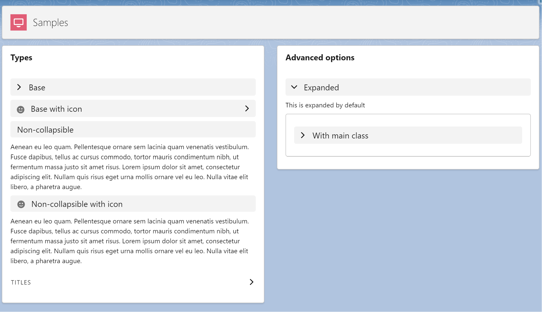
Generic SLDS expandable section LWC component.
- Native SLDS Style
- Support all the SLDS variants
- Icon support
- Integrated on a single component (easy to copy to multiple projects)
Everything was developed in a single LWC, so you just need a new single component on your project.
- Copy the following files to your project:
- force-app/main/default/lwc/lwcExpandableSection/**
- Call the component and pass the options
<c-lwc-expandable-section section-title="Expanded" variant="default" expanded>
This is expanded by default
</c-lwc-expandable-section>- Run the
createorg.shto create a scratch org - Open the
LWC Expandable Sectionlightning app - Explore the code on the
samplescomponent - Edit the page to preview on mobile devices or login with your mobile device (check the
password.envfile)
Do you want to use just a simple accordion section without extra customizations? Use the native SLDS component:
<lightning-accordion active-section-name="A">
    <lightning-accordion-section name="A" label="Accordion Title A">
        This is the content area for section A
    </lightning-accordion-section>
</lightning-accordion>
https://www.lightningdesignsystem.com/components/expandable-section/
Section Titles are interactive titles that open and close sections, typically on a form. An accordion allows a user to toggle the display of a section of content. Expandable sections are used to break up content into logical groups.
| Property | Required | Description | Sample |
|---|---|---|---|
mainClass |
No | CSS classes for the main element. | slds-var-m-bottom_large |
sectionTitle |
No | Title or label of the section. | Filters |
iconName |
No | Name of the icon to be displayed. | utility:info |
sectionTitleBackgroundColor |
No | Background color of the section. Default is the normal background color (grey). | #F3F3F3 |
variant |
No | Variant of the component. Default is base. Options: base, non-collapsible, titles. |
base |
expanded |
No | State of the section (expanded or not). Default is false. |
false |
