This repository contains a set of Stan-based scripts allowing to analyze PIC-seq (Physically Interacting Cell - Sequencing) data. Those scripts have been tested on the data from the Nature Biotech paper "Dissecting cellular crosstalk by sequencing physically interacting cells".
Briefly this PIC-seq processing script take as an input the gene expression profile of PIC/doublets together with the mean expression profiled of each single-cell cluster. The fitting relies on Stan to create an extremely efficient Hamiltonian Monte Carlo (HMC) sampler able to estimate the contribution of each single-cell cluster to the gene expression profile of each PIC/doublet.
Those scripts are relying on several R packages : rstan, Matrix, Ternary, foreach and doParallel.
Analysis of the conventionnal single-cell data can be performed by any package of choice such as Seurat, Pagoda2 or MetaCell.
All the core functions are stored in the Bayesian_PIC_seq.R script.
Here we will use the data provided by the authors of the paper "Dissecting cellular crosstalk by sequencing physically interacting cells" : they are fully available on the GEO website (GEO accession number : GSE135382). We focused on the in-vitro data where mouse monocytes derived Dendritic Cells (moDCs) where put in contact with T-cells. PIC and single-cells were sequenced 3h, 20h and 48h post co-culture.
The analysis of the single-cells is done using the Pagoda2 Pagoda2 pipeline.
Data are first filtered to remove low quality cells/PIC and non expressed genes :
##data_raw object : Sparse Matrix describing the gene expression of PIC and single cells

par(las=1,bty="l")
lib_size = colSums(data_raw)

hist(log10(lib_size),n=50,col="grey")
abline(v=log10(350),lty=2,col="red")
boxplot(log10(lib_size)~Gating,outline=F,col=c("red3","green3","orange3"),xlab="Gating",ylab="Total UMIs (Log10)")

gene_size = rowSums(data_raw)
hist(log10(gene_size),n=30,col="grey",xlim=c(0,5))
abline(v=log10(50),lty=2,col="red")

# data_count : filtered expression data, only cells with more than 500 UMIs and genes with more than 50 UMIs are kepts
data_count = data_raw[gene_size>50,lib_size>500]

#Filtering the Time and Experimental condition vectors
Gating_count = Gating[lib_size>500]
Time_point_count = Time_point[lib_size>500]
We can then analyze the single-cell data and identify the major cell clusters. The most variable genes are first identified (1500 genes with the higest excess of zeros) :
Mean_expression = rowSums(data_count)
Proportion_zero = rowSums(data_count==0)
plot(log10(Mean_expression),Proportion_zero,pch=21,bg="orange")
Regression_zeros = loess(Proportion_zero~log10(Mean_expression),degree = 2)
Excess_zeros = Regression_zeros$residuals
Excess_zeros = Excess_zeros[order(Excess_zeros,decreasing = T)]

Selected_genes = names(Excess_zeros[1:1500])
We can then create the Pagoda2 object and perform the different steps of the analysis :
library(Pagoda2)
r <- Pagoda2$new(data_count[,Gating_count!="Doublet"],log.scale=F)
r$adjustVariance(plot=T,gam.k=10)
r$calculatePcaReduction(nPcs=50,odgenes = Selected_genes)
r$makeKnnGraph(k=30,type='PCA',distance = "cosine")
r$getKnnClusters(method=multilevel.community,type='PCA')
r$getDifferentialGenes(type = "PCA",clusterType = "community",verbose = T,z.threshold = 3)
In addition a low-dimensional embedding of the data can be performed :
umap_plot = umap(r$reductions$PCA,n_neighbors = 30,spread = 3,
                 n_components = 2,metric = "cosine",verbose = T)
par(las=1,bty="l")
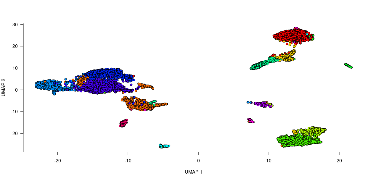
plot(umap_plot,pch=21,bg=string.to.colors(r$clusters$PCA$community),xlab="UMAP 1",ylab="UMAP 2",main="All cells")
In order to better interpret the cluster we can look at the correlation between the mean expression profile of each cluster :
Mean_expression_cluster = aggregate(as.matrix(r$counts[,Selected_genes]),FUN = mean,by=list(r$clusters$PCA$community))
Mean_expression_cluster = t(Mean_expression_cluster[,-1])
Correlation_cluster = cor(Mean_expression_cluster,method = "spearman")
colnames(Correlation_cluster) = 1:ncol(Correlation_cluster)
rownames(Correlation_cluster) = 1:ncol(Correlation_cluster)

Order_cluster = pheatmap(Correlation_cluster,clustering_method = "ward.D")
Order_cluster = Order_cluster$tree_col$order
The dataset of course includes T-cells (Trac, Cd3d) and Dendritic cells (expressing Ccl17, Ccl22, Fscn1 and co-stimulatory molecules such as Cd40 and Cd86) but also a small contamination by NK (Ncr1, Klrb1b) and plasma cells (Igkc, Ighm, Mzb1).
We can now perform the demultiplexing of the PIC/doublets. We first load the functions from the script :
source("Bayesian_PIC_seq.R")We now compute the normalzied mean expression profile of each cluster :
K = length(unique(r$clusters$PCA$community))
Singlet_mean_profile = matrix(0,nrow = length(Selected_genes_Fitting),ncol = K)

Singlet_data = data_count[Selected_genes_Fitting,Gating_count!="Doublet"]

for (k in 1:K) {
  M = Singlet_data[,r$clusters$PCA$community==k]
  M = rowSums(M)
  M = M/sum(M)
  Singlet_mean_profile[,k] = M
}
Now we can perform the demultiplexing through Rstan using the PIC_demultiplexing : be careful as it requires significant amount of computational ressources !
Data_to_fit = data_count[Selected_genes_Fitting,Gating_count=="Doublet"]
Doublet_time = Time_point_count[Gating_count=="Doublet"]
Doublet_time = factor(Doublet_time,levels = c("3h","20h","48h"))
Alpha_table = PIC_demultiplexing(PIC_Expression_matrix = Data_to_fit[],N_cores = 14,Singlet_mean_profile = Q)
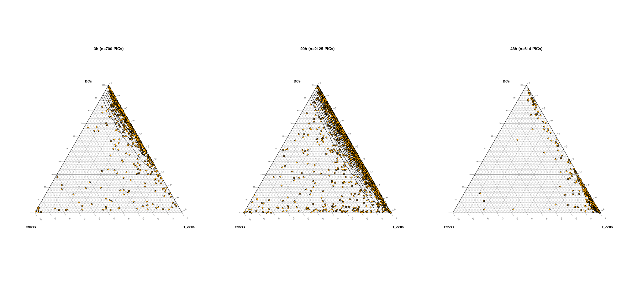
The Alpha_table contains the contribution of each cluster into each PIC with each column corresponding to a cell and each row to a single-cell cluster. Of course each column sums to one.
The result of the fitting can be visualized using the Ternary_QC_plot function. The user only needs to provide the classification of the clusters, that is to say indicating to which major cell type each cluster corresponds to. For instance, here clusters are either classified moDCs, T-cells and 'Others'. Additionally, a vector describing to which experimental condition a PIC belongs can be provided to generate separate plots.
Classification_clusters = list(DCs = c(1,2,3,4),T_cells = c(5,6,7,8),Others=c(9,10) # Classification of the clusters has to be provided as a list of length three
Ternary_QC_plot = function(Alpha_table=Alpha_table,Classification_clusters,Experimental_condition=Doublet_time)
