- Introduction
- Download
- Getting Started
- Managing Your Module Project
- Markdown Guide
- Visual Studio Code Extension
- Other Editors
- License
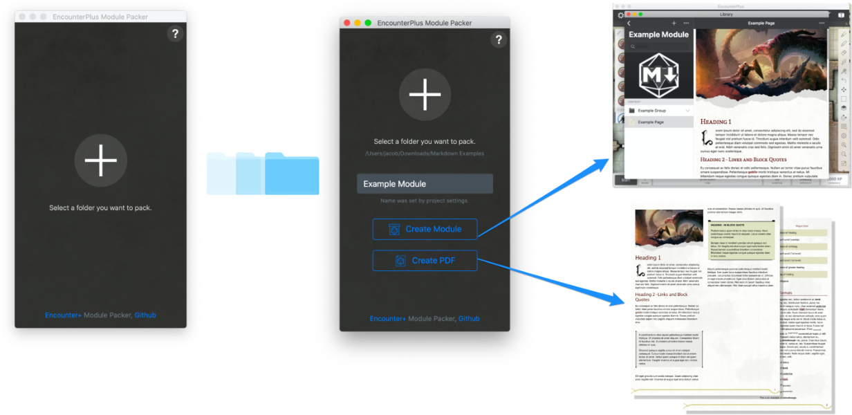
The EncounterPlus Module Packer is a simple standalone application for converting markdown documents into modules for EncounterPlus. It also allows exporting the markdown files into a PDF with a similar style. The Module Packer is also available as a Visual Studio Code Extension.
Click the links below to download the latest versions of the EncounterPlus Module Packer.
It's easy to begin creating a module in markdown. A guide to Markdown syntax can be found further in this document in the Markdown Guide section.
- Download the Module Packer for macOS, Windows, or as a Visual Studio Code Extension!
- Create a folder where you will write your module's text and images.
- Start writing your module content in Markdown.
- Pack your module so it can be imported by EncounterPlus.
- Import your module into EncounterPlus!
The content of the examples.zip file can be used to see examples of multiple module structures or to test the application.
Below is an example of how you might structure your Module content.
.
└── assets               # Optional - allows custom CSS and Javascript styling (note lowercase folderpaths)
  └── css                # Contains custom CSS files to be included in your module
    └── custom.css       # Custom CSS to be applied to all of your pages (for advanced use cases)
  └── js                 # Contains custom Javscript files to be included in your module
    └── custom.js        # Custom Javascript to be applied to all of your pages (for advanced use cases)
└── Encounters           # The folder for maps
  ├── Group.yaml         # Sets 'include-in' to 'files' to only copy files, and not create a module group
  └── Encounter.zip      # The encounter zip file exported from EncounterPlus
└── Group A              # A group for the module.
  ├── Page A.md          # A page in Group A of the module.
  ├── Page A Cover.jpg   # An image used in Page A.
  ├── Page B.md          # A page in Group A of the module.
  └── Group.yaml         # Optional - can define attributes of the group (e.g., Name, Order, etc.)
└── Group B              # A group for the module.
  ├── Page C.md          # A page in Group B of the module.
  └── Page D.md          # A page in Group B of the module.
└── Images               # A folder to store shared images.
  ├── Group.yaml         # Sets 'include-in' to 'files' to only copy files, and not create a module group
  ├── Image1.png         # An image used in multiple pages.
  └── Image2.jpg         # An image used in multiple pages.
└── Maps                 # The folder for maps
  ├── Group.yaml         # Sets 'include-in' to 'files' to only copy files, and not create a module group
  └── Map1.zip           # The map zip file exported from EncounterPlus
├── Module.yaml          # Optional - can define attributes of the module (e.g., Title, Author, Slug, etc.)
└── My Module.md         # A page at the root level of the module.
In the root folder of your module project, you can create a file named Module.yaml to define properties about the module. If Module.yaml does not exist, essential properties like name and slug will be inferred from the module's folder name. A more thorough guide to Module.yaml is available.
id: <Random UUIDV4>
name: Example Module
slug: example-module
description: Example module description.
category: adventure
author: Dungeony MasterFace
code: ABC-123
cover: cover.jpg
print-cover: cover.jpg
version: 4
auto-increment-version: true
delete-empty-groups: true
ignore:
  - README.md
  - CHANGELOG.md
maps:
  - path: Maps/my-first-map.zip
    order: 2
    parent: my-adventure-part-1
    slug: my-first-map
encounters:
  - path: Encounters/my-first-encounter.zip
    order: 1
    parent: my-first-map
    slug: my-first-encounter
Values:
All Module.yaml values are optional - and default values will be used for anything not specified.
author: The author of the module.auto-increment-version: May betrueorfalse. Iftrue, it will cause the version number to automatically increment each time the module is packed. This is useful for keeping trackcategory: The category of the module. May beadventureorother.code: A reference code for the module.cover: The file name of the cover image for the module (placed in the same directory).delete-empty-groups: May betrueorfalse. Iftrue, empty groups will be removed from the module when built.description: The description of the module.encounters: The encounters to include with the module. See more in the Including Maps & Encounters Tutorial.id: If specified, will cause a module to be overwritten rather than duplicated when repeatedly imported. Never copy another module's UUID, or you will cause that module to be overwritten.ignore: A list of files or folders to ignore when adding pages. This list allows glob patterns.maps: The maps to include with the module. See more in the Including Maps & Encounters Tutorial.name: The name of the module.print-cover: The cover to use as the cover image in PDF output (this will be, effectively, a page 0).slug: The slug for the module. Slugs should follow standard URL slug guidelines (best to stick with only lowercase letters and dashes). If a slug is manually specified, care should be taken that the slug is not repeated elsewhere in the module. Repeats will cause prevent the module from being created.version: The version of the module. Must be an integer.
Groups can have some properties defined by creating a Group.yaml file in the group's folder on the file system.
name: Example Group
slug: example-group
parent: parent-slug
order: 5
include-in: all
copy-files: true
All Group.yaml values are optional - and default values will be used for anything not specified.
copy-files: If set to false, image and other files from the group folder will not be copied to the module. This is useful for reducing file size of module files when there is print-only content. Default value istrue.include-in: Defines whether the group will be included in module output or PDF output. Valid values areall(default),print, andmodule, andfiles. Iffilesis specified, only the group's files will be copied, but no pages will be parsed.name: The name of the group.order: An order for the group. Lower numbers will be placed before higher numbers. If two groups share the same order value, their effective order may differ upon each import. Pages and groups placed at the same place in the tree will respect each other's group values.parent: The slug of the parent entity (page or group). If not specified, the parent will be based on the folder structure.slug: The slug for the group. Slugs should follow standard URL slug guidelines (best to stick with only lowercase letters and dashes). If a slug is manually specified, care should be taken that the slug is not repeated elsewhere in the module. Repeats will cause prevent the module from being created.
Subdirectories under the main module folder will automatically be turned into Groups in the module. To have a folder not be made into a Group, create a Group.yaml file in the folder and set the include-in value to files. That folder and all subfolders will no longer be turned into groups. They will, however, be included as a resource folder in the module (e.g. for the images folder).
Each markdown document can contain front matter block for additional configuration.
---
name: Page name
slug: page-name
order: 3
parent: parent-slug
module-pagebreaks: h1, h2, h3
pdf-pagebreaks: h1, h2, h3
pdf-pagebreaks: h1
footer: My Custom Footer Text
hide-footer: false
hide-footer-text: false
include-in: all
cover: pageCover.jpg
print-cover-only: false
---
Values: All front-matter values are optional - and default values will be used for anything not specified.
cover: The name of a cover image for this page/section when printing.. This cover image will appear on the page before and take up the entire page document.footer: If specified, allows custom footer text to be entered. Otherwise the footer text follows the format ofPage Name | Parent Name.hide-footer: If true, will hide the footer entirely.hide-footer-text: If true, will hide the footer text, but keep the footer background image. This is superseded byhide-footerif it is true.include-in: Defines whether the page will be included in module output or PDF output. Valid values areall(default),print, andmodule, andcompendium. Ifcompendiumis chosen, the page will be processed for compendium entries, but will not be shown in either print or the module.module-pagebreak: Element tags that, when specified, will automatically result in the markdown being split into individual pages. The order specified here will cause pages to nest accordingly (e.g., H2 values will be nested under H1 values). This will only apply when the markdown is being output to an EncounterPlus module.name: The name of the page.order: An order for the page. Lower numbers will be placed before higher numbers. If two pages share the same order value, their effective order may differ upon each import. Pages and groups placed at the same place in the tree will respect each other's group values.parent: The slug of the parent entity (page or group). If not specified, the parent will be based on the folder structure.pdf-pagebreak: Element tags that, when specified, will automatically result in the markdown output being split into individual pages. The order specified here will cause pages to nest accordingly (e.g., H2 values will be nested under H1 values). This will only apply when the markdown is being output to a PDF.print-cover-only: If true, and printing to PDF, this will cause the page content not to be output. This is useful for having multiple, consecutive pages that are full-images (like maps). Generally used in combination withinclude-in: print. This value is not used when exporting to a module.slug: The slug for the module. Slugs should follow standard URL slug guidelines (best to stick with only lowercase letters and dashes). If a slug is manually specified, care should be taken that the slug is not repeated elsewhere in the module. Repeats will cause prevent the module from being created.
Below you will find examples of markdown syntax with images as it will appear in Encounter Plus. While EncounterPlus supports nearly all of the traditional markdown tags, it also supports many non-standard tags as well.
A single hash symbol denotes a first-level heading, two hash symbols is a second-level heading, three hash symbols is third-level, etc. Note that text content that occurs immediately after a first level heading will have a fancy first letter.
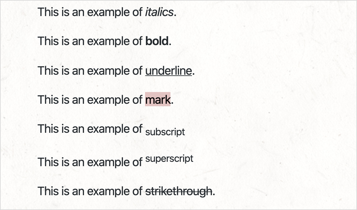
# My Heading 1 ## My Heading 2### My Heading 3#### My Heading 4##### My Heading 5###### My Heading 6Below is an example of standard text format styles in markup:
This is an example of *italics*.

This is an example of **bold**.

This is an example of _underline_.

This is an example of ==mark==.

This is an example of ~subscript~

This is an example of ^superscript^

This is an example of ~~strikethrough~~.
And their corresponding appearance:
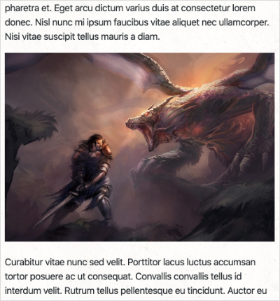
An image is shown by using an exclamation point, followed by a description in brackets, followed by a link to the image file in parantheses.
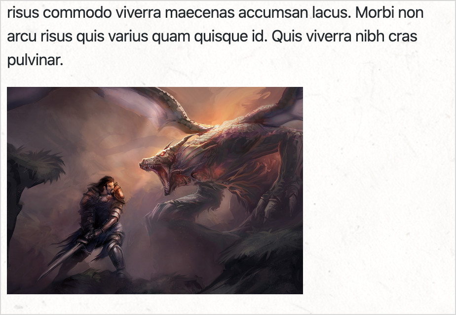
By default, in markdown, an image will take the full width of the page, minus any default margins. An image can be more manually sized by adding a space, and equals sign, and dimensions after the image.
If you are only interested in specifying the width, and allowing the image to size its height by the innate aspect ratio, simply forego specifying the height.
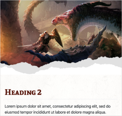
A special cover image style may be placed above the top header. This is specified by adding the text {.size-cover} after the image.
{.size-cover}
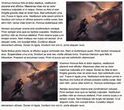
## Heading 2Images can be set to float on the left or right side of the view by using the {.float-left} and {.float-right} styles.
{.float-left}You can add default text block with standard block quote syntax:
> Text blockA Read-aloud text style can be shown by adding custom class read to standard block quote:
> Read aloud text
{.read}
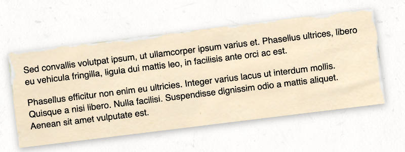
A paper/parchment text block style can be shown by adding custom class paper to standard block quotes:
> Text in paper
{.paper}
A flavor-text text block style can be shown by adding custom class flavortext to standard block quotes:
> Flavor text
{.flavortext}
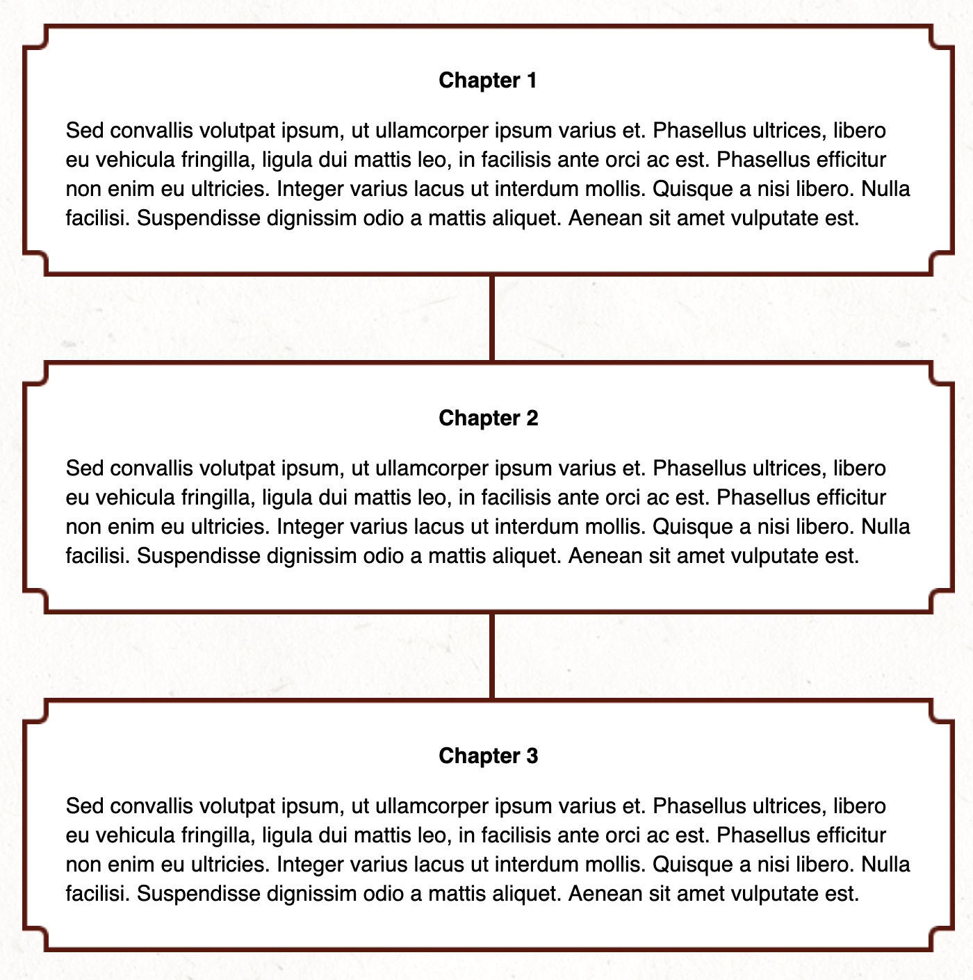
A flowchart text block style can be shown by adding custom class flowchart and flowchart-with-link to standard block quotes:
> **Chapter 1** {.text-center}
>
> Text goes here. {.flowchart}

> **Chapter 2** {.text-center}
>
> Text goes here. {.flowchart-with-link}
A large quote text block style can be shown by adding custom class large-quote to standard block quotes:
> "This is my large quote." {.large-quote}Normally, in markdown, links would be used to link to other webpages. However, in EncounterPlus, you can also add links to:
- Items
- Spells
- Monsters
- Players
- Dice Rolls
- Pages
- Maps
Slugs are absolute and do not need paths or groups specified when linking. Monster links should be prefaced with /monster/. Item links should be prefaced with /item/. Spell links should be prefaced with /spell/.
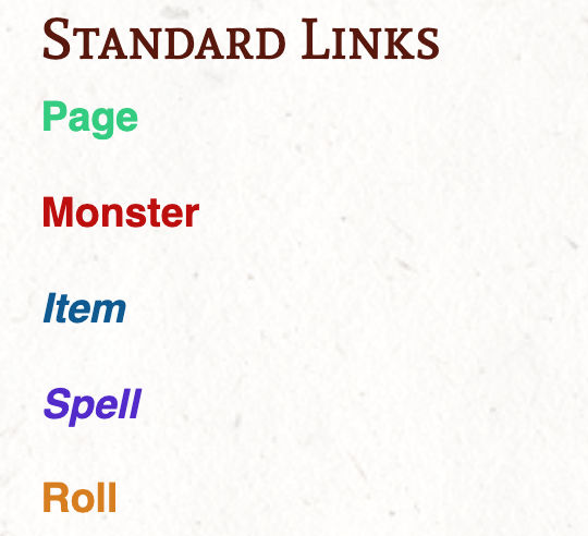
Links will be colored according to the type of item you are linking to.
[Page](/page/myPage)

[Monster](/monster/myMonster)

[Item](/item/myItem)

[Spell](/spell/mySpell)

[Roll](/roll/1d20)
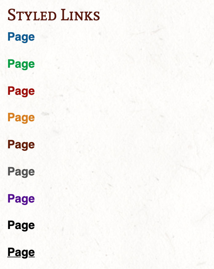
The default link colors and styles can be overridden by applying color attributes to the links:
[Page](/page/myPage){.blue}

[Page](/page/myPage){.green}

[Page](/page/myPage){.red}

[Page](/page/myPage){.yellow}

[Page](/page/myPage){.neutral}

[Page](/page/myPage){.gray}

[Page](/page/myPage){.purple}

[Page](/page/myPage){.black}

[Page](/page/myPage){.black .underline}The Module Packer and Visual Studio Code extension support the standard Markdown table format. In addition, the MultiMarkdown table formatters are also supported for advanced table constructs like cell spans and column spans.
|   d100   | Magic Item                |
|----------|---------------------------|
| 01-50    | Potion of Healing         |
| 51-60    | Spell scroll (cantrip)    |
| 61-70    | Potion of climbing        |
| 71-90    | Spell scroll (1st level)  |
| 91-94    | Spell scroll (1st level)  |
| 95-98    | Potion of greater healing |
| 99       | Bag of holding            |
| 00       | Driftglobe                |
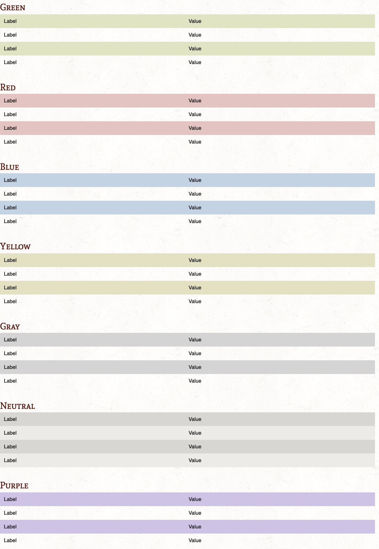
In addition, table colors can be customized with by adding the {.green}, {.red}, {.blue}, {.yellow}, {.purple}, {.gray}, and {.neutral}. Additionally, the {.headerTitle} style can be added to change the header text appearance.
|   d100   | Magic Item                |
|----------|---------------------------|
| 01-50    | Potion of Healing         |
| 51-60    | Spell scroll (cantrip)    |
| 61-70    | Potion of climbing        |
| 71-90    | Spell scroll (1st level)  |
| 91-94    | Spell scroll (1st level)  |
| 95-98    | Potion of greater healing |
| 99       | Bag of holding            |
| 00       | Driftglobe                |
{.blue .headerTitle}
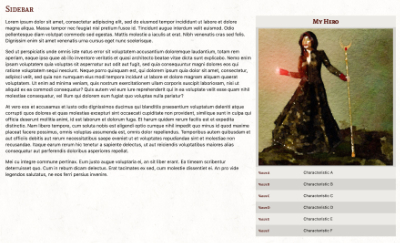
A special, right-floating sidebar style table can be applied by using the {.sidebar} attribute.
| My Hero ||
|----------|------------------------|
| ||
| Value A | Characteristic A |
| Value B | Characteristic B |
| Value C | Characteristic C |
| Value D | Characteristic D |
| Value E | Characteristic E |
| Value F | Characteristic F |
{.sidebar}A shop table style also exists with special header values for showing categories and subcategories of shop items. Mark the table with the {.shop} attrobite and use the {.shopH1} and {.shopH2} row styles for category headers.
|||
|-------|-------|
| Category      |{.shopH1}
| Subcategory   |{.shopH2}
| Item  | ## gp |
| Item  | ## gp |
| Subcategory   |{.shopH2}
| Item  | ## gp |
| Item  | ## gp |
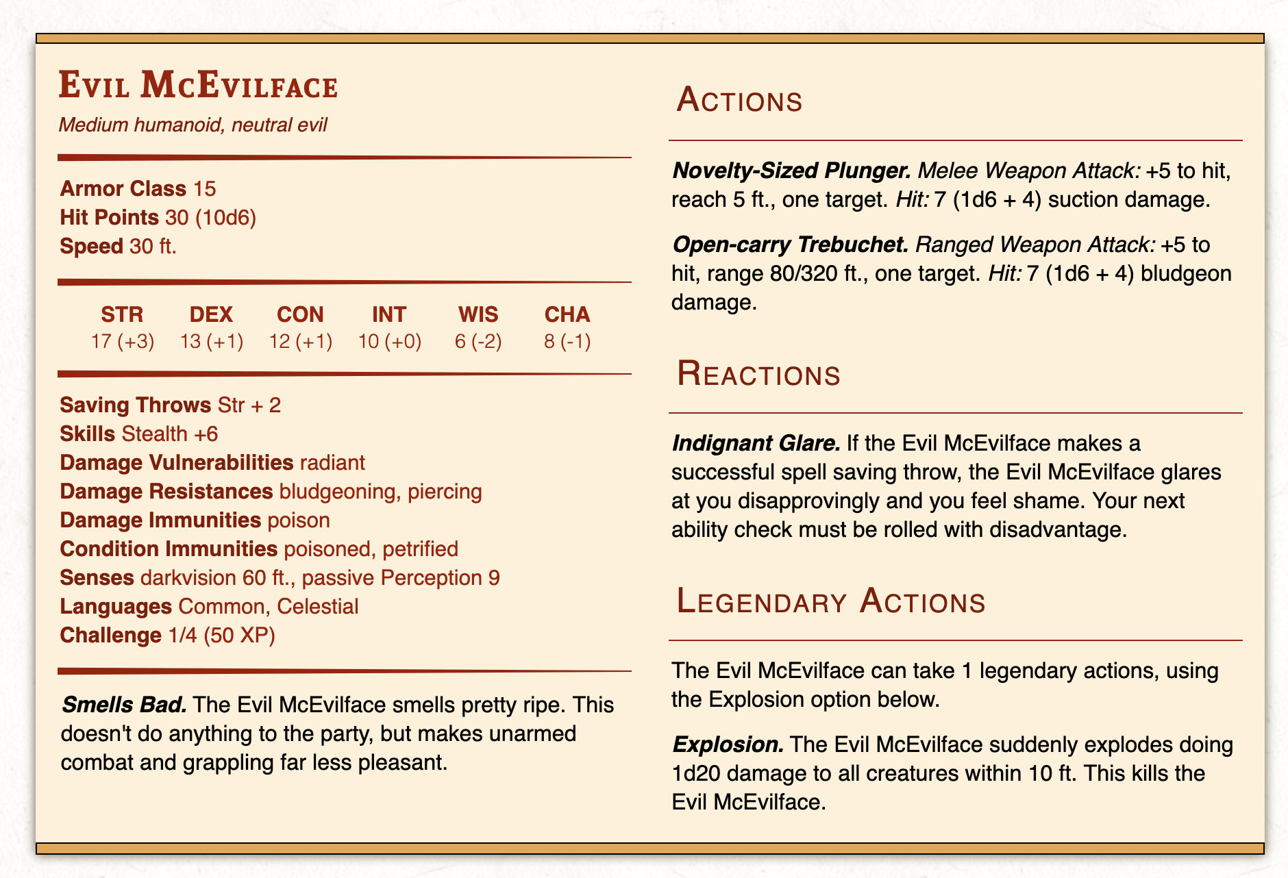
{.shop}Monster stat blocks can be created within a Markdown file. When exported as a module, these monsters will be added to EncounterPlus's compendium. The Monster stat blocks are specified using standard YAML just like the Front-Matter on each page.
```Monster {.two-column}
id: 2c011c22-0f0c-4cc8-95de-9f53a9b89df5
name: Evil McEvilface
slug: evil-mcevilface
size: Medium
type: humanoid
alignment: neutral evil
ac: 15
hp: 30 (10d6)
speed: 30 ft.
str: 17
dex: 13
con: 12
int: 10
wis: 6
cha: 8
saves: Str + 2
skills: Stealth +6
vulnerabilities: radiant
resistances: bludgeoning, piercing
damageImmunities: poison
conditionImmunities: poisoned, petrified
senses: darkvision 60 ft., passive Perception 9
languages: Common, Celestial
challenge: 1/4
environments: forest, grassland, hill, underdark
image: Monster.jpg
token: MonsterToken.png
traits:
  - name: Smells Bad
    description: The Evil McEvilface smells pretty ripe. This doesn't do anything to the party, but makes unarmed combat and grappling far less pleasant.
actions:
  - name: Novelty-Sized Plunger
    description: "Melee Weapon Attack: +5 to hit, reach 5 ft., one target. Hit: 7 (1d6 + 4) suction damage."
  - name: Open-carry Trebuchet
    description: "Ranged Weapon Attack: +5 to hit, range 80/320 ft., one target. Hit: 7 (1d6 + 4) bludgeon damage."
reactions:
  - name: Indignant Glare
    description: If the Evil McEvilface makes a successful spell saving throw, the Evil McEvilface glares at you disapprovingly and you feel shame. Your next ability check must be rolled with disadvantage.
legendaryActions:
  - description: The Evil McEvilface can take 1 legendary actions, using the Explosion option below.
  - name: Explosion
    description: "The Evil McEvilface suddenly explodes doing 1d20 damage to all creatures within 10 ft. This kills the Evil McEvilface."
description: Evil McEvilface lives in the sewer, but not in a cool way like a Ninja Turtle.
```
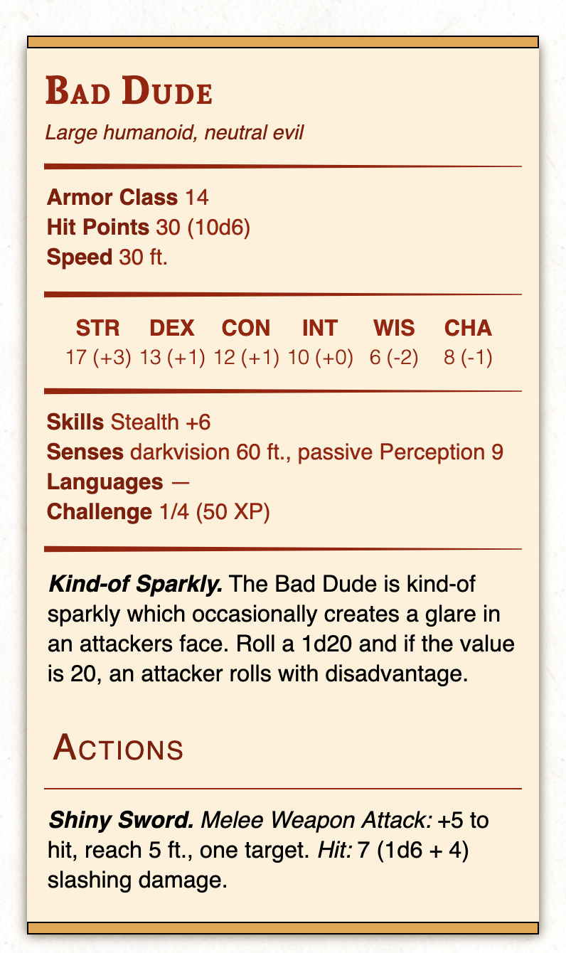
There are two styles of stat blocks available: a standard single-column stat block (default) and a two-column stat block (specified with the .two-column attribute as shown above).
Like images, monster stat blocks may be used with the standard .float-left and .float-right style attributes.
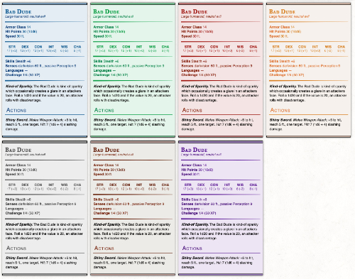
Monster stat blocks can be rendered in a variety of colors with the .blue, .green, .red, .yellow, .purple, .gray, and .neutral tags.
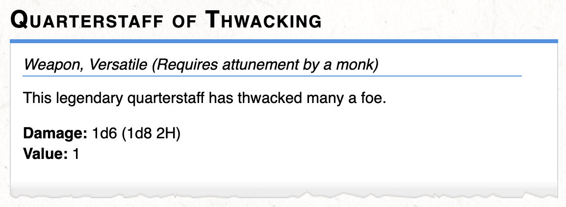
Items can created within a Markdown file. When exported as a module, these items will be added to EncounterPlus's compendium. The Item stat blocks are specified using standard YAML just like the Front-Matter on each page.
```Item
name: Quarterstaff of Thwacking
slug: quarterstaff-of-thwacking
rarity: Uncommon
type: Weapon
attunement: Requires attunement by a monk
primaryDamage: 1d6
secondaryDamage: 1d8
properties:
  - Versatile
  - Finesse
damageType: Bludgeoning
description: This legendary quarterstaff has thwacked many a foe.
value: 1 gp
source: Example Module
```
Available item values are:
type: The item type. Supported values are Wealth, Ammunition, Armor, Adventuring gear, Heavy armor, Light armor, Melee weapon, Medium armor, Potion, Ranged weapon, Rod, Ring, Shield, Scroll, Staff, Wondrous item, Wand, and Weaponrarity: The rarity of the itemvalue: The item's valueweight: The item's weightheading: A custom heading for the item (this will replace the auto-generated heading)attunement: An attunement description for the itemproperties: The properties of the item. Supported values are Ammunition, Finesse, Heavy, Light, Loading, Range, Reach, Special, Thrown, Two-handed, and VersatileprimaryDamage: The item's primary damage value (e.g., 1H if versatile)secondaryDamage: The item's secondary damage value (e.g., 2H if versatile)damageType: The damage type. Supported values are Bludgeoning, Piercing, and Slashingrange: The item's rangeac: The item's ACsource: The item's source (e.g., the name/page of a publication)image: The filename of an image of the itemdescription: The item's description
Item blocks can be rendered in a variety of colors with the .blue, .green, .red, .yellow, .orange, .purple, .gray, and .neutral tags.
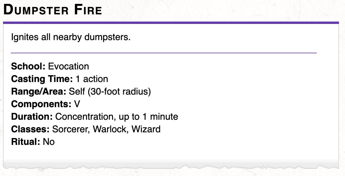
Spells can created within a Markdown file. When exported as a module, these spells will be added to EncounterPlus's compendium. The Spell stat blocks are specified using standard YAML just like the Front-Matter on each page.
```Spell
name: Dumpster Fire
slug: dumpster-fire
level: 0
school: Evocation
ritual: false
time: 1 action
range: Self (30-foot radius)
components: V
duration: Concentration, up to 1 minute
description: Ignites all nearby dumpsters.
classes: Sorcerer, Warlock, Wizard
image: DumpsterFire.jpg
source: Example Module
```
Available spell values are:
level: A number value of the level, a level of zero is a cantripschool: The spell's school. Allowed values are Abjuration, Conjuration, Divination, Enchantment, Evocation, Illusion, Necromancy, and Transmutationritual:trueif the spell is a ritual, otherwisefalsetime: The spell's time to castrange: The spell's range or areacomponents: The spell's componentsduration: The spell's durationclasses: The spell's classessource: The spell's sourceimage: The filename of an image of the spelldescription: The spell's description
Spell blocks can be rendered in a variety of colors with the .blue, .green, .red, .yellow, .orange, .purple, .gray, and .neutral tags.
When designing content for print, content will be clipped at a single page unless you manually specify a page break with the (print-page) tag in your markdown. The (print-page) tag will be hidden in the preview and in EncounterPlus. You can force the next page to be single-column with (print-page-single-column) or multi-column with (print-page-multi-column)
This is some text.

(print-page)

This is some more text.If on the first column and you want to break to the next column, you can use the (print-column) tag.
This is some text.

(print-column)

This is some more text.For elements that you want to show only in the print version, you can use the {.print-only} attribute.
{.print-only}Likewise, for elements that you to show only in EncounterPlus, you can use the {.screen-only} attribute.
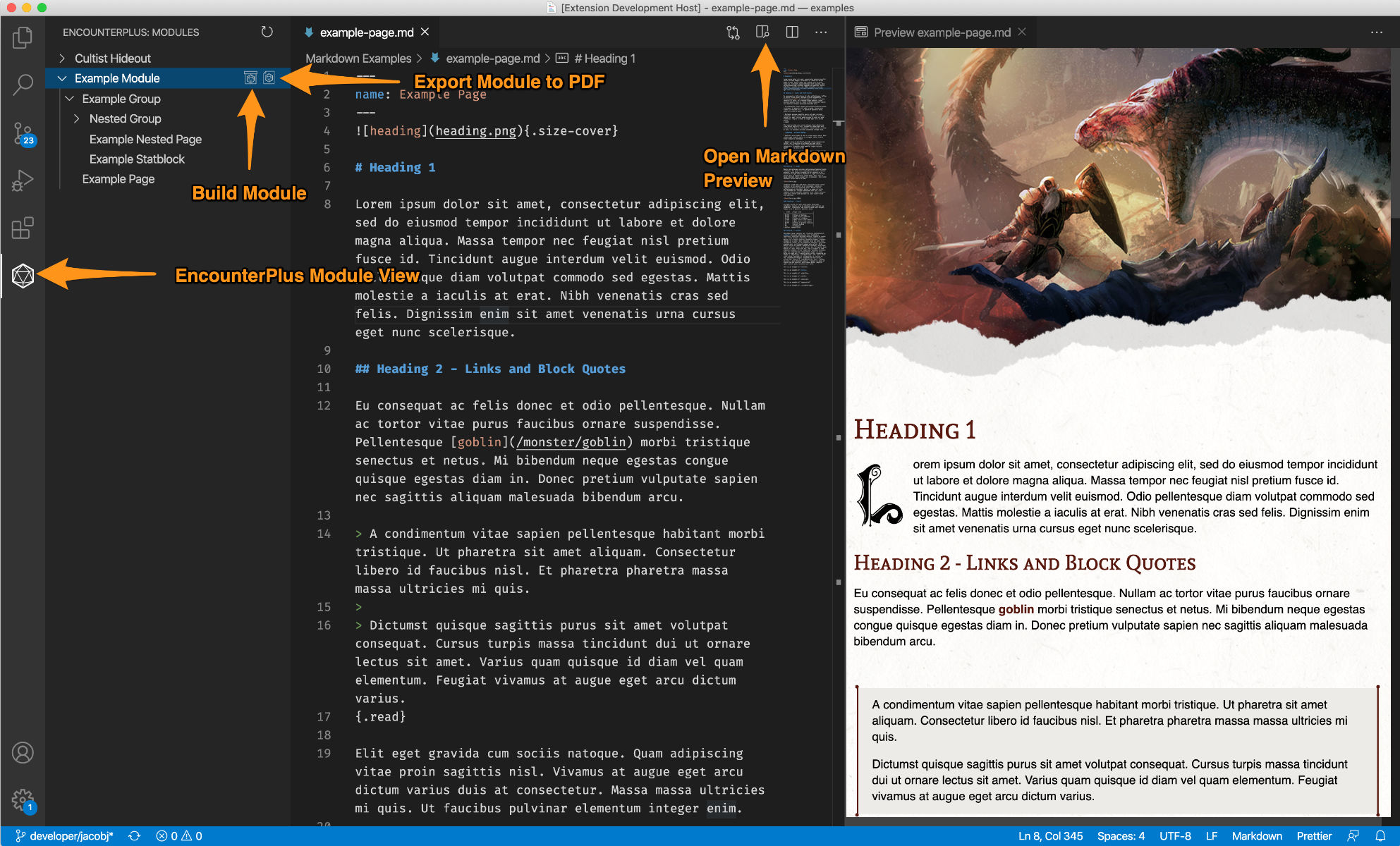
{.screen-only}Visual Studio Code has great support for rendering markdown with custom styles out-of-the-box. However, with the help of the official EncounterPlus Markdown Extension, Visual Studio Code can preview markdown pages as if they were already run through the Module Packer and rendered in EncounterPlus. Simply install the plugin and preview your markdown documents.
The EncounterPlus Markdown Extension also provides access to the same module packing and PDF export capabilities as the standalone Module Packer.
- Open Visual Studio Code.
- Open the Extensions View and search for "EncounterPlus Markdown" in the marketplace.
- Install the EncounterPlus Markdown extension.
- In Visual Studio Code, open the folder that will contain your module.
- Open the EncounterPlus Module View (shown above).
- If necessary, create a
Module.yamlfile for your project. - Use the standard Visual Studio Code file view to create markdown files..
- Use the standard Visual Studio Code preview to preview markdown (they will now be styled as if they were in EncounterPlus).
- Use the EncounterPlus Module View to build and export your module!
| Mac | Windows | Description |
|---|---|---|
Cmd+B |
Ctrl+B |
Toggle Bold |
Cmd+I |
Ctrl+I |
Toggle Italics |
Cmd+U |
Ctrl+U |
Toggle Underline |
Cmd+M |
Ctrl+M |
Toggle Mark |
Cmd+K |
Ctrl+K |
Create Link |
Cmd+Shift+= |
Ctrl+Shift+= |
Toggle Superscript |
Cmd+Shift+- |
Ctrl+Shift+- |
Toggle Subscript |
Cmd+Shift+X |
Ctrl+Shift+X |
Toggle Strikethrough |
Alt+Shift+Q |
Alt+Shift+Q |
Toggle Blockquote |
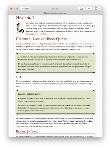
User Team-Hufflepuff has created a wonderful style for Ulysses that allows previewing markdown authored in Ulysses as it would show in EncounterPlus. Ulyssess does not currently support HTML or the extended attributes. Download the EncounterPlus Ulysses plugin here.
Have you supported EncounterPlus's style in another editor? Let us know on Discord!
