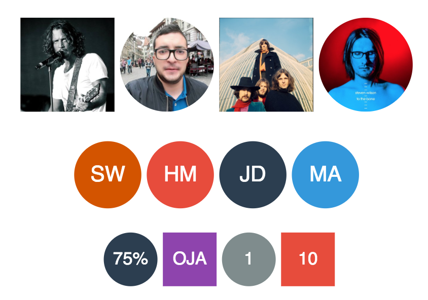
A universal avatar component for Angular applications that fetches / generates avatar based on the information you have about the user. The component has a fallback system that if for example an invalid Facebook ID is used it will try google ID and so on.
You can use this component whether you have a single source or a multiple avatar sources. In this case the fallback system will fetch the first valid avatar.
Moreover, the component can shows name initials or simple value as avatar.
Supported avatar sources:
- Vkontakte (VK)
- Skype
- Gravatar
- GitHub
- Custom image
- name initials
- value
The fallback system uses the same order as the above source list, Facebook has the highest priority, if it fails, google source will be used, and so on.
If you enjoy watching videos, check out this tutorial on medium which explains how to use ngx-avatar in your angular application.
Check out this link to play with ngx-avatar 😀
Install avatar component using Yarn:
$ yarn add ngx-avataror
$ npm install ngx-avatar --save- Import AvatarModule:
Once you have installed ngx-avatar, you can import it in your AppModule:
import { BrowserModule } from '@angular/platform-browser';
import { NgModule } from '@angular/core';
import { HttpClientModule } from '@angular/common/http';

import { AppComponent } from './app.component';

// Import your AvatarModule
import { AvatarModule } from 'ngx-avatar';

@NgModule({
  declarations: [
    AppComponent
  ],
  imports: [
    BrowserModule,
    HttpClientModule,
    // Specify AvatarModule as an import
    AvatarModule
  ],
  providers: [],
  bootstrap: [AppComponent]
})
export class AppModule { }
Starting from version 3.4.0:
HttpClientModuleis mandatory in order to fetch the avatar from external sources (Gravatar, Google, ...).
- Start using it:
Once the AvatarModule is imported, you can start using the component in your Angular application:
<ngx-avatar></ngx-avatar><ngx-avatar facebookId="1508319875"></ngx-avatar>
<ngx-avatar googleId="1508319875"></ngx-avatar>
<ngx-avatar twitterId="1508319875"></ngx-avatar>
<ngx-avatar instagramId="dccomics" size="70"></ngx-avatar>
<ngx-avatar skypeId="1508319875"></ngx-avatar>
<ngx-avatar gravatarId="adde9b2b981a8083cf084c63ad86f753"></ngx-avatar>
<ngx-avatar gravatarId="user@gmail.com"></ngx-avatar>
<ngx-avatar src="assets/avatar.jpg"></ngx-avatar>
<ngx-avatar name="John Doe"></ngx-avatar>
<ngx-avatar value="75%"></ngx-avatar>
<ngx-avatar facebookId="userFacebookID" skypeId="userSkypeID"
googleId="google" name="Haithem Mosbahi" src="assets/avatar.jpg"
value="28%" twitterId="twitter"
gravatarId="adde9b2b981a8083cf084c63ad86f753"
size="100" [round]="true">
</ngx-avatar>Check out this file for more examples on how to use ngx-avatar in your application.
Check out this link for a live demo. Also, you can play with ngx-avatar using an online editor here on stackblitz.
Moreover, the demo folder contains an application generated with angular cli that uses ngx-avatar component.
To run the demo application :
$ yarn install
$ ng serve| Attribute | Type | Default | Description |
|---|---|---|---|
facebookId |
string | null | Facebook ID | |
googleId |
string | null | Google ID | |
twitterId |
string | null | Twitter Handle | |
instagramId |
string | null | Instagram Handle | |
vkontakteId |
string | null | VK ID | |
skypeId |
string | null | Skype ID | |
gravatarId |
string | null | email or md5 email related to gravatar | |
githubId |
string | null | Github ID | |
src |
string | null | Fallback image to use | |
name |
string | null | Will be used to generate avatar based on the initials of the person | |
value |
string | null | Show a value as avatar | |
initialsSize |
number | 0 | Restricts the size of initials - it goes along with the name property and can be used to fix the number of characters that will be displayed as initials. The 0 means no restrictions. |
bgColor |
string | random | Give the background a fixed color with a hex like for example #FF0000 |
fgColor |
string | #FFF | Give the text a fixed color with a hex like for example #FF0000 |
size |
number | 50 | Size of the avatar |
textSizeRatio |
number | 3 | For text based avatars the size of the text as a fragment of size (size / textSizeRatio) |
round |
boolean | true | Round the avatar corners |
cornerRadius |
number | 0 | Square avatars can have rounded corners using this property |
borderColor |
string | undefined | Add border with the given color. boder's default style is '1px solid borderColor' |
style |
object | Style that will be applied on the root element | |
clickOnAvatar |
Output | Fired when the avatar is clicked. The component emits the source object that has been used to fetch the avatar. |
The source object has the following properties:
- sourceType : avatar source ( Facebook, twitter, etc)
- sourceId : identifier of the user
- getAvatar(size) : method to fetch user avatar from the current source
The avatar module provides the possibility of customizing the avatar component by overriding some of its options. For example, the avatar module comes with a set of default colors used to randomly fill the background color of the avatar. Thus, it's possible to change the default list of colors and to pass your own list.
All you need to do is to configure the AvatarModule by calling forRoot method. The forRoot method takes an AvatarConfig Object that contains the overridden options.
AvatarConfig interface has two properties:
- avatarColors: allows the user to override the default avatar colors by providing a new set of colors
- sourcePriorityOrder: allows the user to change the avatar source priority order. If you want the avatar component to look for user initials first, twitter before facebook or any order you want, this is can be done using the sourcePriorityOrder property
The following code shows an example on how to import the AvatarModule with your own source priority order. With the given order, the avatar component will look first for the custom avatar image and then for user initials and after that it will look the rest of sources.
import { BrowserModule } from '@angular/platform-browser';
import { NgModule } from '@angular/core';
import { HttpClientModule } from "@angular/common/http";

import { AppComponent } from './app.component';
import { UserService } from "./user.service";
import { AvatarModule, AvatarSource } from 'ngx-avatar';

const avatarSourcesOrder = [AvatarSource.CUSTOM, AvatarSource.INITIALS];

@NgModule({
  declarations: [
    AppComponent  ],
  imports: [
    BrowserModule,
    HttpClientModule,
    // import AvatarModule in your app with your own configuration
    AvatarModule.forRoot({
      sourcePriorityOrder: avatarSourcesOrder
    })
  ],
  providers: [UserService],
  bootstrap: [AppComponent]
})
export class AppModule { }
Here's an example on how to import the AvatarModule with your own set of colors.
- Starting from version 3.1, overriding the avatar configuration can be done as follows:
import { BrowserModule } from '@angular/platform-browser';
import { NgModule } from '@angular/core';

import { AppComponent } from './app.component';
import { UserService } from "./user.service";
import { AvatarModule } from "ngx-avatar";
import { HttpClientModule } from "@angular/common/http";

const avatarColors = ["#FFB6C1", "#2c3e50", "#95a5a6", "#f39c12", "#1abc9c"];

@NgModule({
  declarations: [
    AppComponent  ],
  imports: [
    BrowserModule,
    HttpClientModule,
    // import AvatarModule in your app with your own configuration
    AvatarModule.forRoot({
      colors: avatarColors
    })
  ],
  providers: [UserService],
  bootstrap: [AppComponent]
})
export class AppModule { }- Users who use a prior version of ngx-avatar ( < 3.1 ) can override the configuration as follows:
import { BrowserModule } from '@angular/platform-browser';
import { NgModule } from '@angular/core';

import { AppComponent } from './app.component';
import { UserService } from "./user.service";
import { AvatarModule,AvatarConfig } from "ngx-avatar";
import { HttpClientModule } from "@angular/common/http";

const avatarConfig = new AvatarConfig(['red','blue','pink']);

@NgModule({
  declarations: [
    AppComponent  ],
  imports: [
    BrowserModule,
    HttpClientModule,
    // import AvatarModule in your app with your own configuration
    AvatarModule.forRoot(avatarConfig)
  ],
  providers: [UserService],
  bootstrap: [AppComponent]
})
export class AppModule { }
Avatar Styling
In addition to the style attribute, ngx-avatar style can be customized using css classes. Thus, the generated code offers two css classes that can be overridden :
- avatar-container : class that represents the avatar container - the host element. Styles in this class will be applied on the avatar whether is an image or text.
- avatar-content : css class that represents the avatar element which is embedded inside the avatar-container.
To overcome Angular's view encapsulation, you may need to use the /deep/ operator to target it. Here's an example that shows how to override ngx-avatar style :
<ngx-avatar class="my-avatar" value="HM"> </ngx-avatar>Your css file might look like this
.my-avatar /deep/ .avatar-content {
    background-color : red !important;
}- 4.2.0: Angular 12/13 support
- 4.1.0: Angular 11 support
- 4.0.0: Angular 9 support and minor improvements
- 3.6.0: Angular 8 support
- 3.5.0: export Avatar component for Angular elements and ng upgrade
- 3.4.0: http module is removed from the library dependencies. Applications' http module will be used instead.
- 3.3.x: Bug fixes
- 3.3.0: Override Source priority order when importing AvatarModule
- 3.2.0: Add support to Angular 7
- 3.1.1: fixes the source priority bug
- 3.1: fixes AOT / Prod build when loading avatar module with config
- This version has a breaking change in the way the module with configuration is imported, for more details see Override Avatar Configuration section.
- 3.0: Add support to Angular 6
- Build the library with Angular CLI
- 2.9: Bug fixes #16 & #16
- 2.8: add initials size option
- 2.7: code refactoring
- 2.6: Customize avatar options
- 2.5: Bug fixes & new css classes
- 2.4: Refactor async sources
- 2.3: Add support for github avatar
- 2.2: Fix prod and aot build
- 2.1: Bug fixes
- 2.0: add support to vkontakte source
- 1.4: background color is now generated based on the sum of ASCII values of avatar's text.
- 1.3: Bug Fixes ( support dynamic avatar data )
- 1.2: Add border related properties.
- 1.1: Listen to click events on avatar and support retina display.
- 1.0: Avatar component that fetches / generates user avatar from different sources.
Contributions and all possible collaboration are welcome.
- Fork it!
- Create your feature branch: git checkout -b my-new-feature
- Commit your changes: git commit -am 'Add some feature'
- Push to the branch: git push origin my-new-feature
- Submit a pull request :D
This project was generated with Angular CLI version 6.1.1.
Run ng serve for a dev server. Navigate to http://localhost:4200/. The app will automatically reload if you change any of the source files.
Run ng generate component component-name to generate a new component. You can also use ng generate directive|pipe|service|class|guard|interface|enum|module.
Run ng build to build the project. The build artifacts will be stored in the dist/ directory. Use the --prod flag for a production build.
Run ng test to execute the unit tests via Karma.
Run ng e2e to execute the end-to-end tests via Protractor.
To get more help on the Angular CLI use ng help or go check out the Angular CLI README.
MIT © Haithem Mosbahi