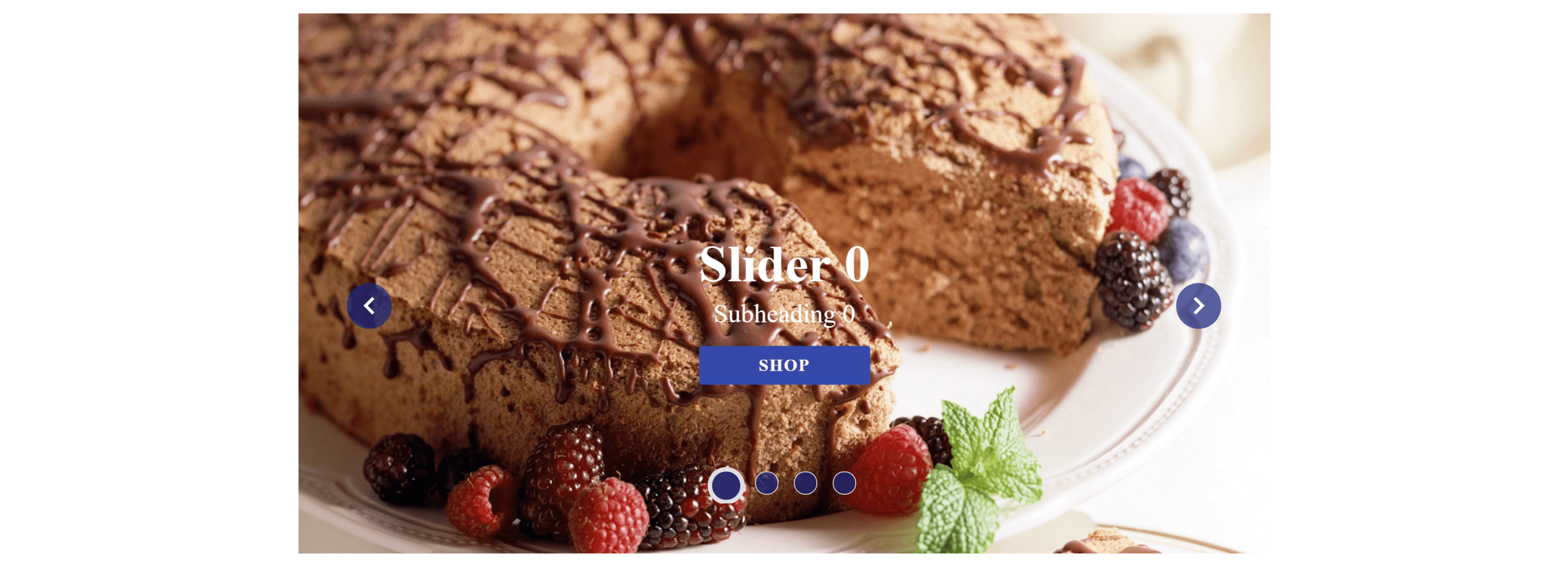
Very lightweight carousel angular component.
Carousel already contains default css. But it's easily customizable;
Live demo: https://pavelpleshko-carousel.now.sh
npm install ngx-banner-carousel-moby --save
import { BannerCarouselModule } from 'ngx-banner-carousel-moby/dist';
...
@NgModule({
  imports: [
    BannerCarouselModule
  ],
})
export class YourModule { }
Inclusion of module will give you access to the carousel component which you can include in your components. Example:
<ngx-carousel-moby [slides]="slides" [config]="config"></ngx-carousel-moby>
Main data that is pictures,captions and links is provided through slides input array. Example:
slides=[
{src:'/assets/slider0.jpg',caption:{
	header:'Slider 0',
	subheader:'Subheading 0',
	callToActionBtn:{
		text:'Shop',
		link:'/shop'
}}},
{src:'/assets/slider1.jpg',caption:{
	header:'Slider 1',
	subheader:'Subheading 1',
	callToActionBtn:{
		text:'Shop',
		link:'/shop'
}
}},
etc
...
];
Secondary data that is config looks like following and is not required for carousel to work:
config:any={
	autoplay:boolean,
	transitionTime:number,
	delay:number,
	firstSlideIndex:number,
	backwards:boolean,
	repeat:boolean,
  animationName:string,
  points:{
    visible:boolean,
    pointClass:string
  },
  controls:{
    visible:boolean,
    controlClass:string
  },
  caption:{
    enabled:boolean
  }
};
| Prop | Type | Default | Description |
|---|---|---|---|
autoplay |
boolean | true |
Whether or not automatically change slides |
transitionTime |
number | 500 |
Animation time between slides in milliseconds |
delay |
number | 3000 |
It is used for time taken to slide the number items |
firstSlideIndex |
number | 0 |
Starts with the provided index of slide |
backwards |
boolean | false |
determines the direction of how carousel changes slides |
repeat |
boolean | true | If false then once carousel reached last slide it stops rotation of the slides |
animationName |
string | slide |
Now supports two animations: slide(default) and fadeIn |
points |
Object | visible:true,pointClass:'custom-point' |
Customizes visibility and adds a custom class to the points of the carousel |
controls |
Object | visible:true,pointClass:'custom-control' |
Customizes visibility and adds a custom class to the controls of the carousel |
caption |
Object | enabled:true |
Whether or not display caption for the slide |
slideChanged - emits index of the current slide
