LIGHT CHASER
1. Introduction
Light Chaser (LC) is a data visualization designer for large screens based on the React ecosystem. With simple drag-and-drop functionality, it allows users to generate beautiful and visually appealing data dashboards and boards.
It has the following features:
- High Performance: By combining the features of React, Mobx, and LC's own design philosophy, efforts have been made to avoid unnecessary rendering of components. This ensures that LC maintains a good overall performance even in scenarios with hundreds of complex components, achieving smooth rendering.
- High Extensibility: LC provides a unified interface, allowing integration with any React ecosystem components in theory. This allows for limitless expansion of the component library in LC.
- High Customization: Similar to the dependency on a unified interface, for components implemented by developers themselves, the configuration options can be fully customized. You can use the default configuration components provided by LC or completely use your own implementation.
- Frontend-Backend Separation: This project is 100% separated between the frontend and backend. Even without a backend service, the LC designer can run perfectly like a local application (currently only supports local execution, with future support for deployment to servers).
- Quick Theme Switching: LC provides a theme switching feature, allowing you to switch themes globally or at the component level. This enables you to quickly switch themes and generate screens with different styles.
- Keyboard Shortcuts: LC provides a rich set of keyboard shortcuts for quick operations, enhancing your work efficiency.
- Drag-and-Drop Grid Layout: LC offers drag-and-drop grid layout functionality, allowing you to quickly complete layouts by dragging components, thereby generating large screens efficiently.
2. Showcase
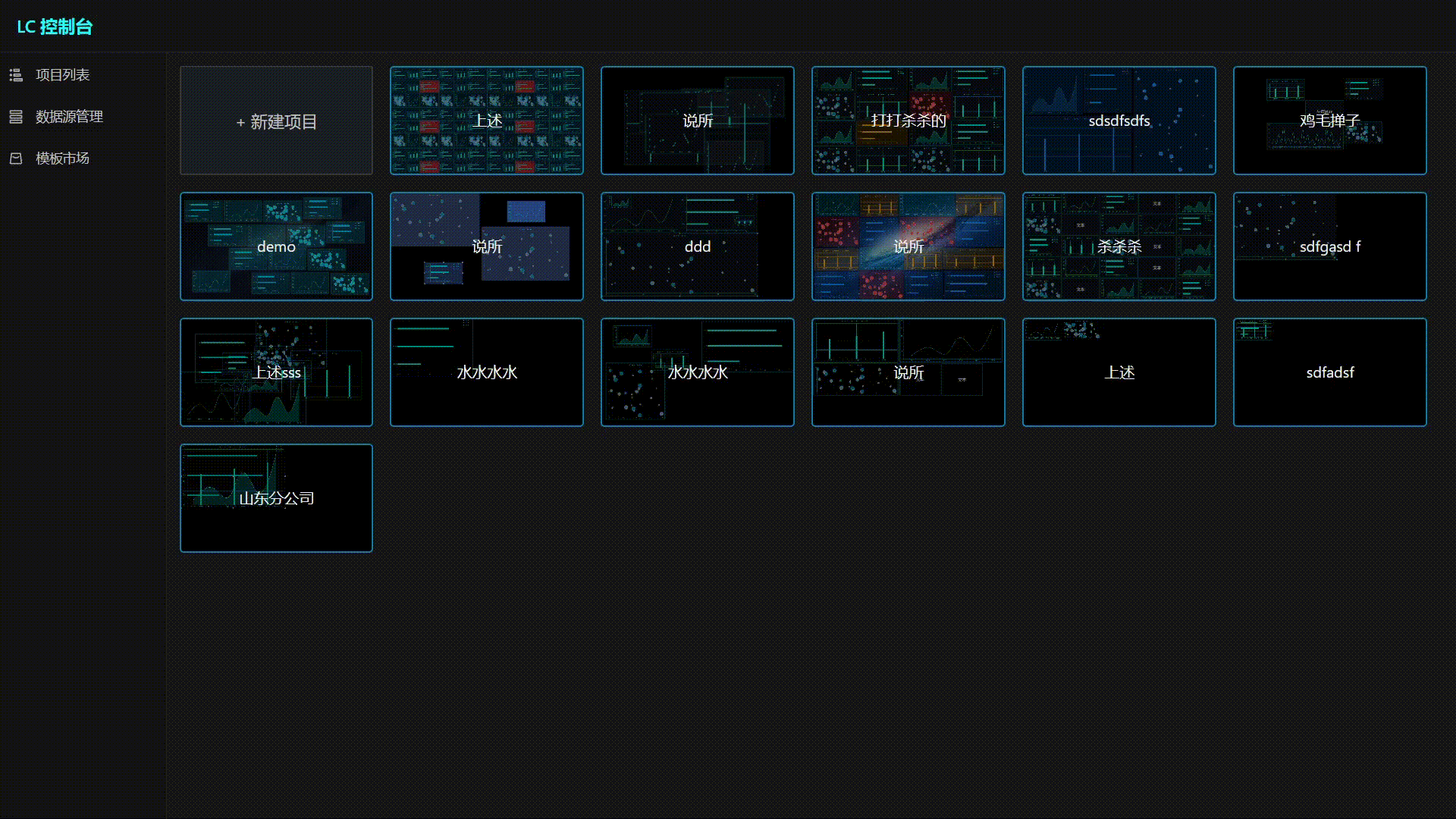
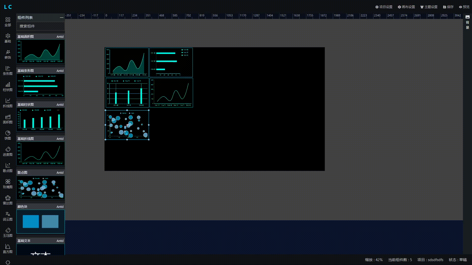
Video Demo: https://v.douyin.com/y8g6VV3/
3. Main Technology Stack
| Technology Stack | Version | Description |
|---|---|---|
| TypeScript | ^4.4.4 | |
| React | ^17.0.2 | |
| Mobx | ^6.7.0 | State management |
| Ant Design | ^4.17.3 | |
| @ant-design/charts | ^1.4.2 | Chart component library |
| @scena/react-ruler | ^0.17.1 | Ruler component |
| react-moveable | ^0.51.0 | Component dragging framework |
| Codemirror | ^5.65.13 | Code editor |
For detailed dependencies, please refer to the package.json file.
4. How to Run
- Clone the project to your local machine
git clone https://gitee.com/xiaopujun/light-chaser.git- Install project dependencies
yarn install- Start the project
yarn start- Access the project
http://localhost:3000- Build the project
yarn build5. How to Use
| Operation/Shortcut | Description |
|---|---|
| Double-click on a component in the left panel | Add the component to the canvas |
| Right-click and hold the mouse button | Drag the canvas |
| Alt + scroll wheel | Zoom in/out of the canvas |
| Ctrl + V | Copy the component |
| Ctrl + L | Lock the component |
| Ctrl + Up Arrow | Bring the component to the front |
| Ctrl + Down Arrow | Send the component to the back |
| Delete | Delete the component |
6. Directory Structure
src
├─comps Component List (All draggable components are implemented in this directory)
│  ├─antd Ant Design components implementation
│  ├─common-fragment Common code snippets
│  └─lc Light Chaser built-in components implementation
├─designer Designer
│  ├─canvas Canvas
│  ├─common Common code
│  ├─footer Designer footer
│  ├─header Designer header
│  ├─left Designer left panel
│  ├─operate-provider Designer event operations
│  ├─right Designer right panel
│  ├─store Designer state management
│  ├─structure Designer page framework structure
│  └─view
├─framework Framework design
│  └─core Automatic component definition scanning
├─icon
├─lib Custom component library
├─list List page (Home page)
└─utils Utility classes
7. How to Quickly Integrate Your Own Components
Integrating your own components into LC is very simple. You only need to do one thing!!!
- Find the
src/compsdirectory and create a folder for your custom component. - Suppose my custom component name is:
MyComp. - Create a new TypeScript file named
MyCompCore.tsin the folder. In this file, create a class that extendsAbstractCustomComponentDefinitionand implement its methods.
That's it!!! The rest will be handled by the automatic scanner, which will automatically scan your component and register it in LC.
The definition of
AbstractCustomComponentDefinitionis as follows:
export abstract class AbstractCustomComponentDefinition {
    /**
     * Returns the basic information of the component, used for display in the component list.
     */
    abstract getBaseInfo(): BaseInfoType | null;

    /**
     * Returns the class template of the React component, which will be used when dragging and creating component instances in the designer.
     */
    abstract getComponent(): React.Component | React.FC | any;

    /**
     * Returns the default configuration of the corresponding component, which is used to display the default effect after dragging and generating component instances.
     */
    abstract getInitConfig(): ElemConfig | Object | null;

    /**
     * Returns the thumbnail image of the component, used in the component list. The image should not exceed 300kb, otherwise it will affect the loading speed of the designer.
     */
    abstract getChartImg(): any;

    /**
     * Returns the menu list for the right-click menu. It is displayed when the component is double-clicked.
     */
    abstract getMenuList(): Array<MenuInfo>;

    /**
     * Returns the specific configuration content corresponding to the right-click menu. This return result is a mapping relationship, returned in the form of an object.
     */
    abstract getMenuToConfigContentMap(): { [key: string]: React.Component | React.FC | any };

    /**
     * Method to update the theme style of this component, used when switching themes globally.
     * @param newTheme The new theme.
     * @param sourceStyle The original style of the component.
     */
    abstract updateTheme(newTheme: ThemeItemType, sourceStyle: any): void;
}
7.1 Code Example
For example, if I want to integrate an Ant Design bar chart component, I only need to provide the following implementation:
import React from "react";
import {AbstractCustomComponentDefinition} from "../../../framework/core/AbstractCustomComponentDefinition";
import {BaseInfoType, ElemConfig} from "../../../designer/DesignerType";
import {MenuInfo} from "../../../designer/right/MenuType";
import barImg from "./bar.png";
import {getDefaultMenuList} from "../../../designer/right/util";
import {updateTheme} from "../../common-fragment/ThemeFragment";

const AntdBaseBarStyleConfig = React.lazy(() => import('./AntdBaseBarConfig').then(module => ({default: module.AntdBaseBarStyleConfig})));
const AnimationConfig = React.lazy(() => import("../../../lib/common-fragment/animation-config/AnimationConfig"));
const ThemeConfig = React.lazy(() => import("../../../lib/common-fragment/theme-config/ThemeConfig"));
const BaseInfo = React.lazy(() => import("../../../lib/common-fragment/base-info/BaseInfo"));
const AntdBaseBar = React.lazy(() => import("./AntdBaseBar"));
const DataConfig = React.lazy(() => import("../../../lib/common-fragment/data-config/DataConfig"));

class AntdBaseBarCore extends AbstractCustomComponentDefinition {
    getBaseInfo(): BaseInfoType {
        return {
            name: "BasicBar Chart",
            key: 'AntdBaseBar',
            typeName: "Bar Chart",
            typeKey: "bar",
            sourceName: "Antd",
            sourceKey: "antd",
        };
    }

    getChartImg(): any {
        return barImg;
    }

    getComponent(): React.Component | React.FC | any {
        return AntdBaseBar;
    }

    getInitConfig(): ElemConfig | Object {
        return {
            info: {
                id: '',
                name: 'Basic Bar Chart',
                type: 'AntdBaseBar',
                des: 'Basic bar chart based on Ant Design',
            },
            style: {
                baseStyle: {
                    padding: "10px",
                    backgroundColor: "rgba(14,16,20,0.11)",
                    border: "2px solid #00deffff",
                    borderRadius: "3px"
                },
                chartStyle: {
                    data: [
                        {
                            name: "1951 Year",
                            value: 48
                        },
                        {
                            name: "1952 Year",
                            value: 52
                        },
                        {
                            name: "1956 Year",
                            value: 22
                        }
                    ],
                    xField: "value",
                    yField: "name",
                    seriesField: "name",
                    xAxis: {
                        grid: null,
                        label: {
                            style: {
                                fill: "#00FFEAFF"
                            }
                        },
                        line: {
                            style: {
                                stroke: "#00ffbbff",
                                lineWidth: 1
                            }
                        },
                        tickLine: {
                            style: {
                                stroke: "#00baffff",
                                lineWidth: 2
                            },
                            alignTick: true,
                            length: 3
                        },
                        subTickLine: {
                            style: {
                                stroke: "#1a98b5ff",
                                lineWidth: 3
                            },
                            count: 5,
                            length: 3
                        },
                        position: "right",
                        title: null
                    },
                    yAxis: {
                        grid: null,
                        label: {
                            style: {
                                fill: "#00FFEAFF"
                            }
                        },
                        line: {
                            style: {
                                stroke: "#00dbffff",
                                lineWidth: 1
                            }
                        },
                        tickLine: {
                            style: {
                                stroke: "#21f2f5ff",
                                lineWidth: 2
                            },
                            alignTick: true,
                            length: 3
                        },
                        subTickLine: {
                            style: {
                                stroke: "#03b7a3ff",
                                lineWidth: 3
                            },
                            count: 5,
                            length: 2
                        },
                        position: "bottom",
                        title: null
                    },
                    color: "#00ffea",
                    legend: {
                        position: "right-top",
                        layout: "vertical",
                        itemName: {
                            style: {
                                fill: "#00f0ffff",
                                fontSize: 12
                            }
                        }
                    },
                    maxBarWidth: 14,
                }
            },
            data: {
                dataSource: 'static',
                staticData: {
                    data: [
                        {
                            name: "1951 Year",
                            value: 38
                        },
                        {
                            name: "1952 Year",
                            value: 52
                        },
                        {
                            name: "1956 Year",
                            value: 61
                        }
                    ]
                },
            },
            animation: {},
            theme: {
                themeId: '',
            },
        };
    }

    getMenuList(): Array<MenuInfo> {
        return getDefaultMenuList();
    }

    getMenuToConfigContentMap(): {
        [

            key: string]: React.Component | React.FC | any
    } {
        return {
            'info': BaseInfo,
            'style': AntdBaseBarStyleConfig,
            'data': DataConfig,
            'animation': AnimationConfig,
            'theme': ThemeConfig
        };
    }

    updateTheme = updateTheme;
}

export default AntdBaseBarCore;
8. Conclusion
If you find this project helpful, please consider giving it a star.