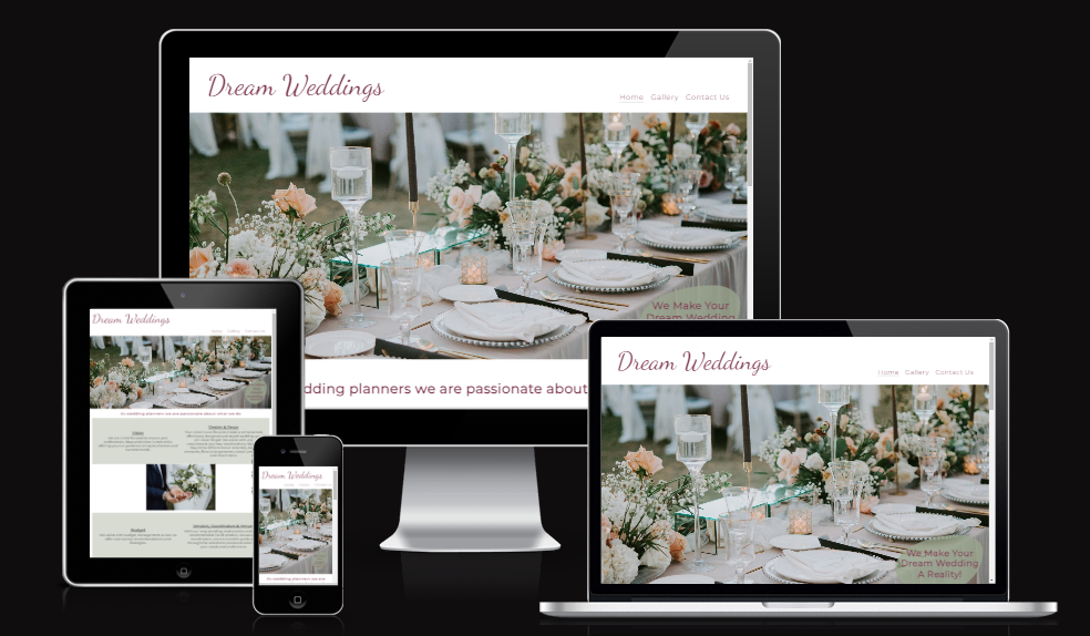
As a service provider, Dream weddings was created to showcase what we as wedding planners can do for couples who plan to get married in the near future.
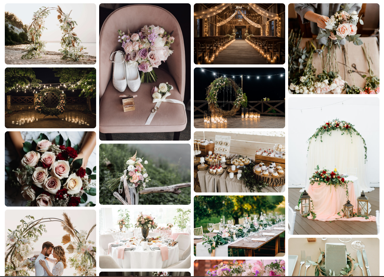
The site is directly targets engaged couples who require assistance with their overall wedding planning needs. A gallery was added to provide a visual guide for the types of possible wedding themes and previous weddings created by us.
The target market of this webpage would be all couples who are looking for guidance / assistance with planning their wedding. Couples looking for full-service / partial wedding planning service.
Users will be looking for clear, easy to read information about what we as a company can offer to their stress free wedding planning process. A photo gallery is provided as users will see this as a reference for the type of service we offer to our clients and previous work we have done. Pictures speak a million words on a website like this.
The webpage consists of three pages to separate the different aspects of the website, with an easy to navigate nav bar at the top of each page, and has a soft color palette with no overwhelming amounts of content to read through. At first glance the webpage offers animation on the logo as well as a beautiful image of a table setting at a wedding we planned.
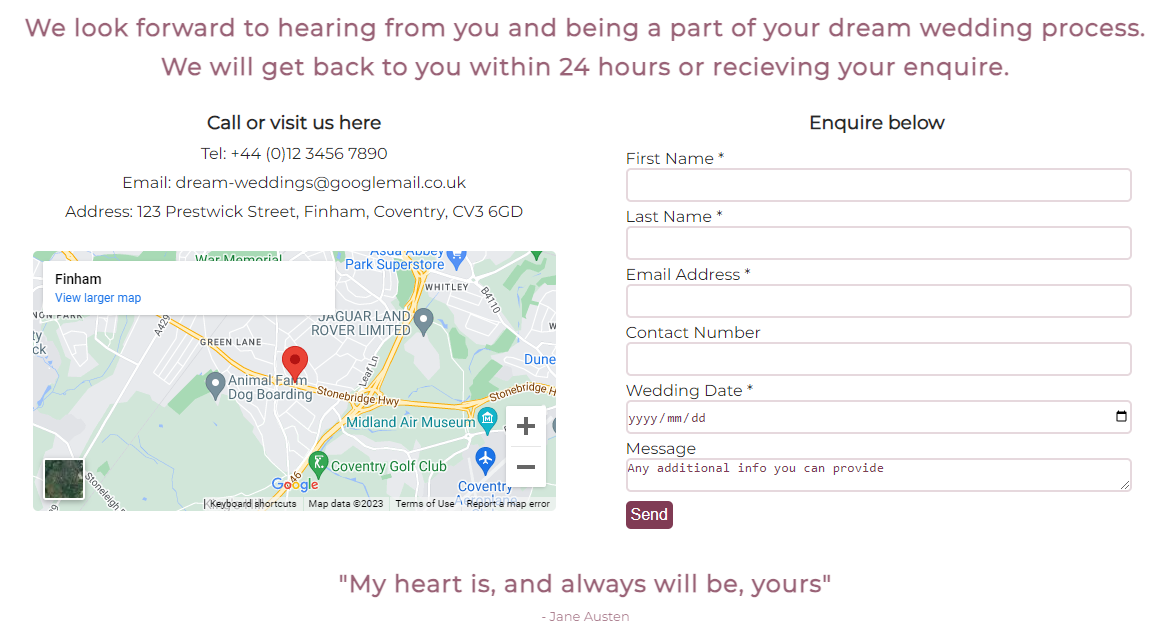
A simple enquiry form was added for users to add their details if they wished to be contacted. The business contact details are also included as well as the location if users decided to visit the store.
- The wireframe created for the webpage was designed to be user friendly. The original layout has changed slightly with some additions.
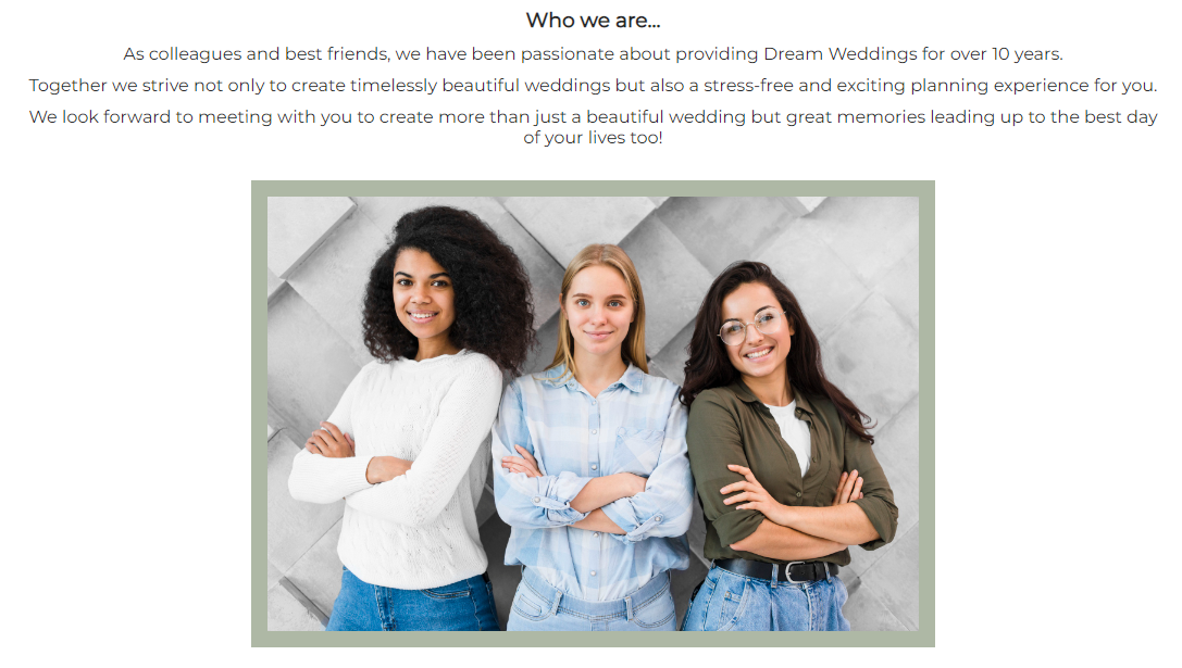
- While building the website, I realised it would be a good idea to add a section introducing the user to the wedding planner team. The 'Who we are' section was then added with an image and introduction.
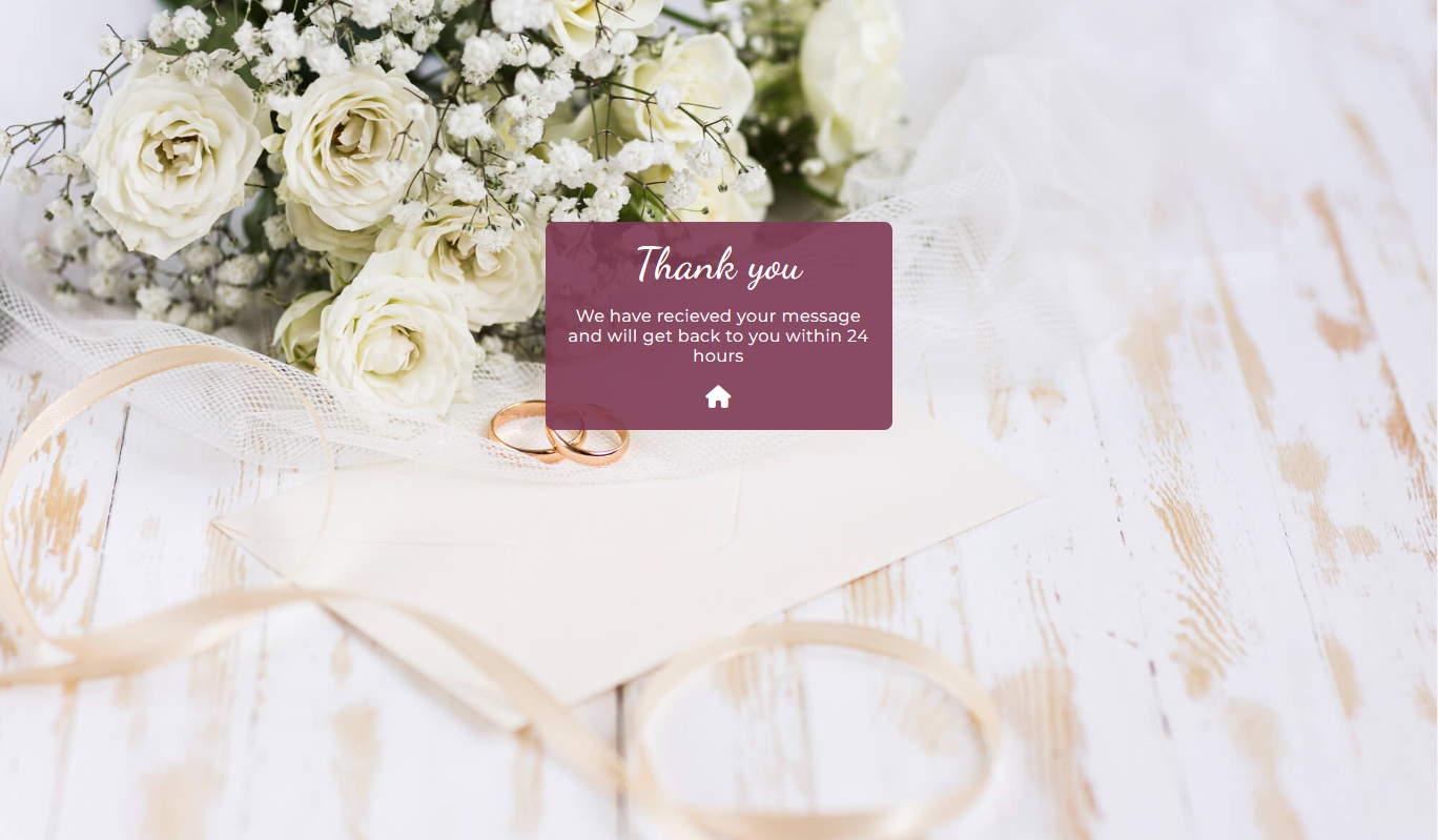
- Another page was added that redirects the user to a 'thank you' page after submiting the enquiry form.
The color palette used for the web page was considered, the look and feel I wanted for the website was soft but elegant. I achieved this buy making use of both Hex and RGBA colors throughout the webpage with a simple white background.
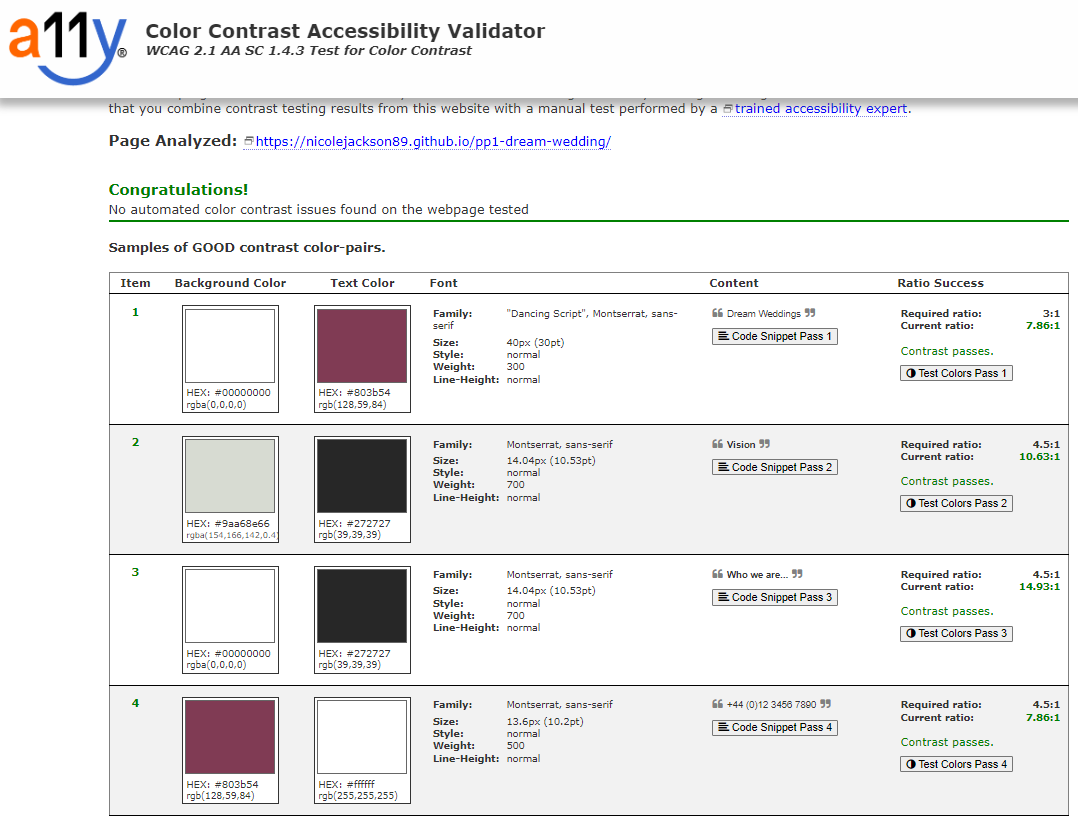
After running the website through a color contrast validator I was pleased to see the chosen colors work well together.
I made use of two fonts which I felt came together very well, 'Montserrat' and 'Dancing Script'. 'Montserrat' was used throughout most of the webpage as I felt it had a professional but readable look to it. 'Dancing Script' was used as the logo for the page as well as in the thank you section for an elegant touch.
This website was designed on desktop view first as I thought this would be the most likely way users will search for the services of a wedding planner.
-
Logo and Navigation Bar
- Both the Logo and Nav Bar were styled inline for an easy flow to the page.
-
Logo
- The logo is fully responsive. No matter which page you are on in the website, by clicking on the logo you will be redirected back to the Home page.
- Animation was added to the logo with a zoom effect as an eye catching experience for users.
-
Navigation Bar
- The nav bar is featured on all three pages of the website with links to the Home, Gallery and Contact Us pages.
- Users will easily navigate to these pages using any device without having to make use of the back button on the browser.
- The links on the nav bar have been styled with underline and higher opacity on hover, the underline will allow users to know which page they are currently in.
-
Landing page image
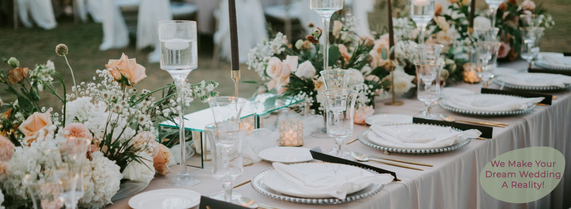
- The landing page image is of a wedding reception table decorated by Wedding Planners, showcasing to the user some of the beautiful work we do.
- An introduction of how we can create a user's dream wedding if they make use of our services is also included in the bottom corner of this image.
-
What we offer Section
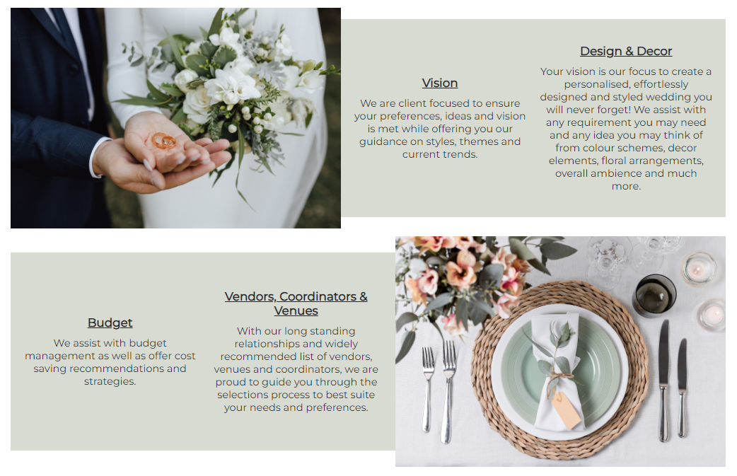
- In this section the user can read about what we offer as a service provider. The user will see that our goal is to understand their vision, preferences and budget for their wedding and that we work around them.
- Two images have been used on either side of the content for a softer, more appealing look.
- On smaller screen sizes the images will display below each content box for ease of reading.
- This short but descriptive section should leave the user feeling encouraged to contact us
-
Who we are section
- In this section we introduce ourselves by making use of an image of our team.
- The user will see we have over 10 years of experience in the field, this will leave the user feeling content with leaving the hard work of planning their wedding in our hands.
- A casual, well thought photograph was used for a playful, hands-on work space feel.
-
Footer
- The footer has links to our social media pages, these will open up in a new tab for ease of navigation for users.
- Company contact details have been added to the footer as I have taken into consideration that some users may want to get straight into contacting us rather than search for the details in another page.
- The social media links have added animation that will increase in size when the user hovers over either of them.
-
Gallery
- The gallery has been added to provide users with supporting images of our work.
- The border radius was intentional to create a softer, welcoming look to the images.
- Images in the gallery would be of value to users as they would be a deciding factor of whether or not to contact us to provide a service to them.
- I have taken smaller screens into consideration, the gallery becomes smaller with a lower number of columns when screen size decreases.
-
Contact Us page
- The contact us page includes a heading letting users know turn around time once the form has been submitted. A short quote has been added to the bottom of the section.
- Our contact details and address using a Google maps link has been added as a feature for users to easily locate us.
- The enquiry form is for users who wish to be contacted back, they will be required to enter their names, email address and wedding date with the option to enter other details.
- Other features added to the form will be on the 'send' button where this has been highlighted in a different color when hovered over.
-
Thank you page
- The user will be redirected to a 'Thank you' page after submitting the form.
- For the ease of navigation an interactive link to the home page has been added with a font awesome icon and animation to match the social media links in the footer.
- Taking into consideration that clients from different locations in the country / world may want to make use of our services, we may add virtual assistance with a bookings and payment page. These will also have links to a skype, Google meets or Teams meetings with clients.
- A review section where past clients can add their experience with us for possible future clients to see.
- A video gallery can be added for users to enjoy a 3D view of our work.
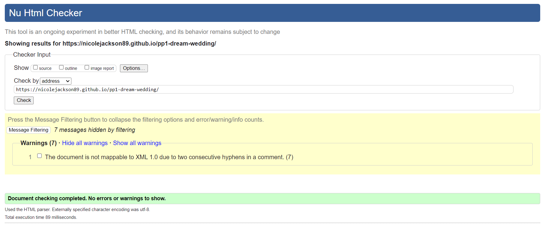
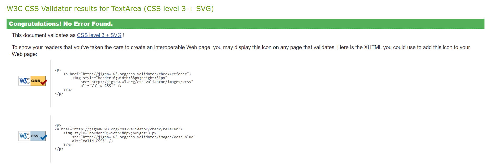
- HTML and CSS code was tested through the building process of this web page using the W3C validator to fix any errors or warnings. This was to ensure a smoother final testing period at the end of the building process.
- All of the HTML pages were passed through the official W3C HTML validator no errors were found.
- A warning has come up for the Gallery HTML page, a section was used without a heading. This was fixed by replacing the section element with a div element.
- Other warnings have come up due to the usage of two or more consecutive hyphens used in comments, I made a conscious decision to leave these as they help with code location on the pages.
- No errors were found when validating my CSS code through the official W3C CSS validator.
- A warning has come back for my Google fonts import, I made a concise decision to leave this as it does not affect the overall website. The warning is a notification that the validator will not validate my imported Google font.
- Other warnings have come up due to the usage of two or more consecutive hyphens used in comments, I made a conscious decision to leave these as they help with code location on the pages.
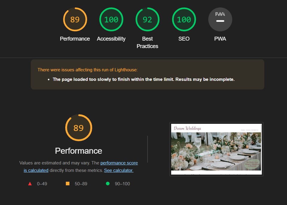
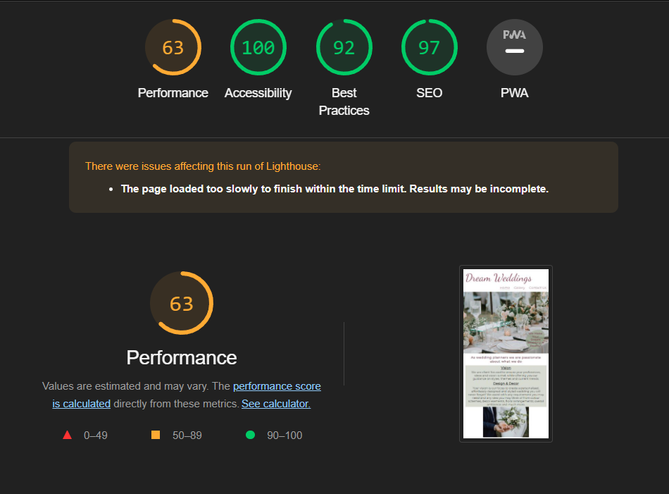
I used the Lighthouse Google Chrome dev tools feature to test the website in mobile and desktop view.
-
Desktop
- The performance score was affected here due to the Home page images being a larger property size.
-
Mobile
- A lower performance score was received on the mobile testing, this was due to my home page images being a larger property size.
| What was tested | Result |
|---|---|
| Social media links in the footer - Open in a new tab in the browser | Passed |
| Three navigation links in the header - Redirect to the correct pages | Passed |
| Enquire form - Required fields message shown | Passed |
| Enquire form submission - Redirected to the 'Thank you' page | Passed |
| What was tested / Expected results | Actual Results | What was done to fix the bug |
|---|---|---|
| Page Logo - To stay within the parent div while animation is active | Overflow when the animation zoom is active | Changed the animation fill mode from both to forward only |
| Margins in media queries for smaller screen sizes - Page content should be readable | Content overflow from the container div | Margins were reduced and display flex used where needed |
| Run Gallery HTML code through the W3C validator | Section element lacking a heading element | Section element changed to a div element |
| HTML Code for 'contact us' page through the HTML Validator | Error - p elements may not be a child of an h2 elements | p elements removed from h2 elements and listed below the h2 element |
GitHub deployment
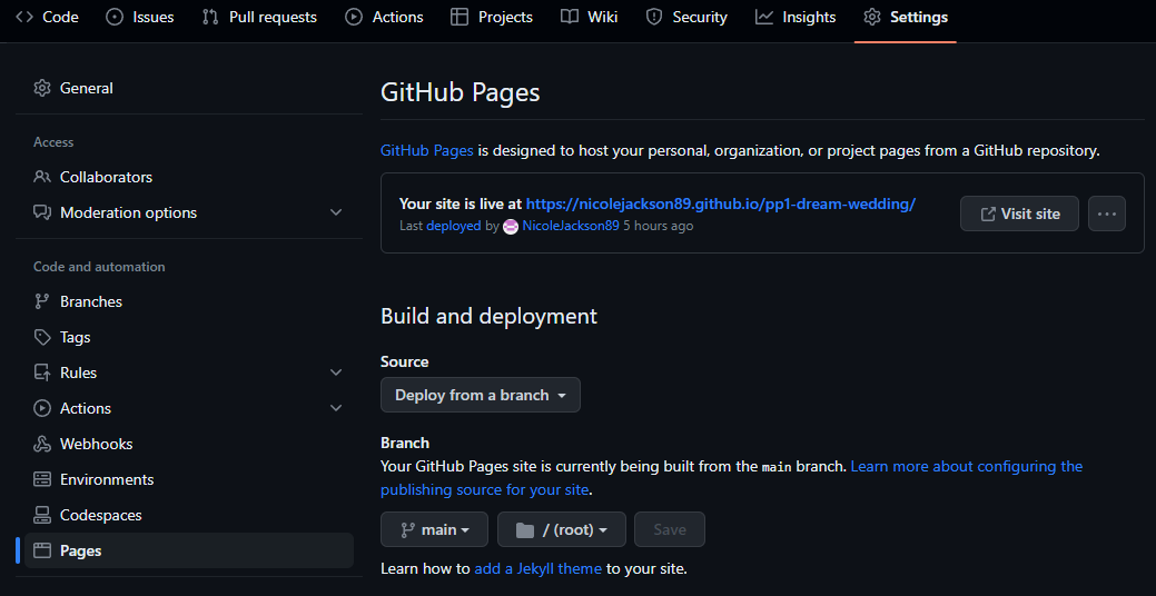
As this code is stored in GitHub, I deployed this webpage as follows:
- Login to GitHub
- Click the repository you wish to deploy (Top left corner)
- In the navigation bar at the top, click 'Settings'
- In the menu on the left-hand side, click 'Pages'
- Under 'Source' select the drop down menu and click 'Deploy from a branch'
- Under 'Branch' select the first drop down menu and click 'main' and save
- The page will be given a URL as shown in the image below next to 'Your site is live at', this may take a few minutes to process before becoming visible.
Cloning a repository will download a full copy of the data to your computer. This is useful when larger commits need to be pushed, adding or removing files and fixing merge conflicts.
- Login to GitHub
- Click the repository you wish to clone (Top left corner)
- Click 'Code' which is shown above the list of files in the repository
- Click the 'Local' tab, copy the HTTPS URL
- Open Codeanywhere, click 'New Workspace'
- Paste the copied URL into the space given under 'Repository URL'
- Click 'Create' and the local clone will be created.
Forking a GitHub repository will allow you to make a copy of the repository, changes can be then be made that will not affect the original repository. This is useful for proposed changes, ideas or fixes to an original repository.
- Login to GitHub
- Click the repository you wish to fork (Top left corner)
- Click the 'Fork' drop down in the top right-hand corner
- Then click 'Create a new fork' you will now have a copy to work on.
- HTML
- HTML was used to structure the content of the web page
- CSS
- CSS was used to style the content of the web page
- Google Fonts
- Google Fonts was used to style the font throughout the web page
- Chrome DevTools
- DevTools was used throughout the process of creating the web page to find bugs and test responsiveness on elements etc.
- Font Awesome
- Font awesome was used for social media icons in the footer and thank you page
- TinyPNG
- TinyPNG was used to resize the images in the Gallery for faster loading time
- Codeanywhere
- Codeanywhere was used as the development environment for this web page
- GitHub
- GitHud is being used to store the code for this web page
- Color Contrast Accessibility Validator
- Color Contrast Validator was used to test the web pages color contrast
- W3C Markup Validation
- W3C validator was used to validate all the HTML code in the web page
- W3C CSS Validation
- W3C validator was used to validate all the CSS code in the web page
- Free Formatter
- Free formatter was used to format the CSS and HTML code throughout the web page
- Am I Responsive?
- Used to for the image in the README file
- Coolors
- Coolors was used to generate the colors for the webpage as well as create RGB codes
- Images throughout the webpage where downloaded from:
- Social media icons grow effect inspiration and code sourced but edited:
- Zoom animation on the Logo and social media links, code was sourced but edited to my preference:
- Code was used for guidance on the NavBar and Logo:
- These links were guidance to using Display Flex in my webpage:
- I used the below code to create the border radius for the text on the hero image:
- This code was used for the gallery layout and media queries with some changes to suite my preference:
- The content of the webpage with regards to what wedding planners do was found on:
- The inspiration of my color palette was found on:
A special thank you to my mentor Mitko Bachvarov for all of his guidance, advice and support as well as my husband and fellow student Iain Jackson for his advice, motivation and troubleshooting assistance throughout the process of this project.
