Writing the History of the Future is an art exhibition from the ZKM | Center for Art and Media in Karlsruhe.
The idea with this project is to come up with an alternative logo for this exhibition. While creating a new visual identity from scratch, it is important that the new logo still embodies the ideas and represent this unique cultural institution that is the ZKM. Considering that the ZKM is the "MECCA OF MEDIA ARTS" we took inspirations from a very broad range of past and present concepts from the media culture.
- Fanny JOSEPH - master's degree student from IMAC
- Erwann LEFEVRE - master's degree student from IMAC
- Nils LANDRODIE - master's degree student from IMAC
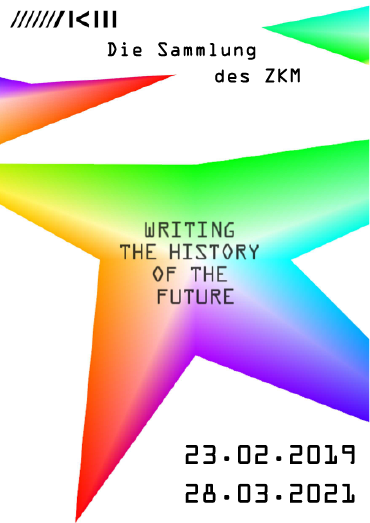
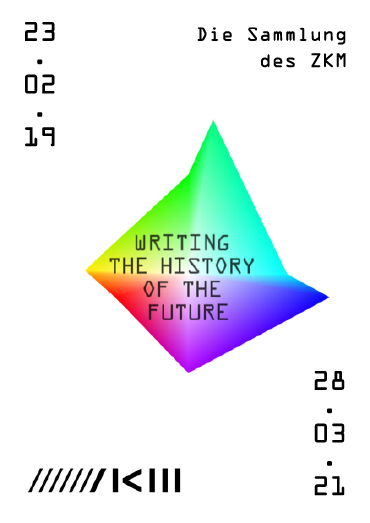
The general concept of this logo is based on colors. We wanted to used every single color possible. As a result, the chromatic circle of Johanes Itten is our major inspiration.
For writing the title in the logo, we decided to use the font OCR-A (Optical Character Recognition). This font was made by Adrian Futiger and the National Institute of norms and the technology in 1966. It was created to be recognized by electronics devices (it is respecting some amount of specifics norms) in order to ease the treatment of documents. Each character is create on a 4x7 grid.
The artist Jean-Paul Fourmentraux said interresting things about computer programming in the artistic creation. In fact, it is changing several things such as interactivity and autonomy. Interactivity is the fact of being manipulated because of the presence of an audience in the exhibition. Autonomy is the fact that artificial creatures can create art alone. Moreover, algorithms give art a generative form. That is why we thought that it was necessary to study and take into account the concepts of interactivty and autonomy of Fourmentraux.
We created a generative and random shape made with four branches/triangles. The concept of randomness is important when we use the generative performance of an algorithm. That is why, we made the shape evolve all the time within a perpetual movement. Not only it as a generative logo, but it is also interactive for the spectator who has an impact on the shape. By moving the mouse on the shape, the end of the branch attaches itself to the mouse and the spectator can control this part of the shape. By doing that, the spectator is blocking the flow of randomness generate where is mouve is standing. The idea was inspired by Bruno Christophe because we wanted to stop the structural fluidity, to have an impact on what computers are genereting and show it to the spectator. By this control is only partial, because only one branch is trapped and controled by the mouse. The other three are still generated randomly. In this way, we wanted to say that our logo shows the real impact that we have on technologies today. Indeed, we can have an impact on something at a specific time and depending on what our actions are, but in reality, it is only one part which is control, the rest still works regardless of our actions. That is why our logo summarizes the action of man on computers and its structural fluidity.
 |
 |
Our major inspiration for this logo is Hansjörg Mayer.
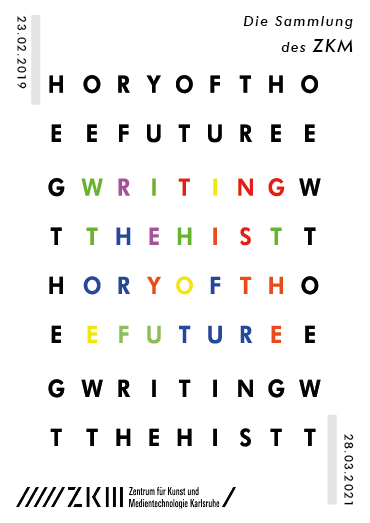
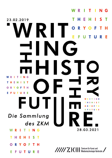
Hansjörg Mayer is an artist who worked a lot with the font Futura. Indeed, he created the magazine Futura, in which he invited several other artists to created a grid. The grid is decomposed in other grids in which letters are placed in differents ways. Those grids made by letters create really nice shapes, playing with the space and the font. He also made different artworks linked with the fact of working with typography. For example, Alphabet (1962) is one of his work and it is exposed in the ZKM exhibition, so it was even more important for us to quote him in our inspirations. Alphabet is a serie of 26 prints in which he played with the repetition of letters to create new forms, showing a new approach of typography. Mayer is also an artist of the computer art. He created artwork which were at the intersection between the poetic and the technological. By his work, he really marked his time and the history, and he managed to show how, in the 60’s, computers were able to create art by drawing randomly. It was important for us to talk about this artist, because his work about typography inspired us to create a logo by using only letters and play with typography in a grid.
The idea of creating a grid link with some letters has also came to us thanks to Etienne Robial. He is a graphist, mostly famous because he created the graphic identity of the french TV channel Canal+. In particular, he created a font for Canal+ by creating a really specific grid. He is famous for his very accurate grids which allow him to have a really precise work. In fact, the police he created is really close to Futura, so it was even more important for our logo to study his work.
For the font which is the center of our logo, we thought that using Futura was a great nod to Hansjörg Mayer. Then, we decided to create a grid made with the letters itself. A grid appeared to be an important element. First, as we said in the inspirations part, because a grid is necessary when it comes to working with typography. Second, because we also wanted to talk about the pixel grid. Indeed, the ZKM exhibition is about computer art, and pixels are omnipresent in the technological world, so talking about pixel grid seemed necessary. We added the computer side in the logo with the grid which is a wink for pixels and computer art. As a result, our logo combines both type of grids : the letters are placed very precisly as if it was on a pixel grid, except that it is not pixel but letters in Futura.
The generative side of this logo is linked with an eye tracker. Indeed, when the spectator is watching a specific place of the logo, the letter which is concerned by the eye is pushed to another place. The letters are pushed randomly by an acceleration, and there are stopped by a friction force. In this way, the title can be destroy by the eye. But the letters are still framed and can’t go out of the square which forms the logo. Why ? Because we wanted to represent the fact that history can be framed, but inside history we can’t predict events (representing by the letters pushed randomly). Also, we wanted to show that we have an impact on the history ; we can change every little things (here letters) and have a real action on the writing of history (fully changing the logo). But there are also norms which are aligned with our society (such as the frame or the friction force), and they are reducing our impact or even erasing it. This is represented in the logo by the fact that we can click on the logo to give him back its original form and erase our « eye creation ».
Why working with the eye ? Because the human body is another important aspect of the ZKM exhibition, and we wanted to create a real interaction with the humain body and the computer.
 |
 |
If you want to visualize the projects and play with the interactivity :
- Download and install Processing here
- Open the
.pdewith processing and press play - Use your mouse to interact with the design
Note for Rewriting with colors :
Note for Rewriting with typography :
If you have a Tobii EyeTracker you can use the eyetracker version of the project. For that you will need to have the GazeTrack library and the TobiiStream application. You can find the files and installation informations here.

