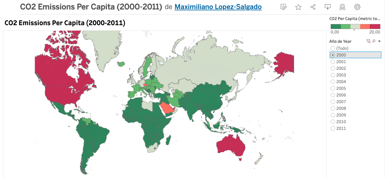
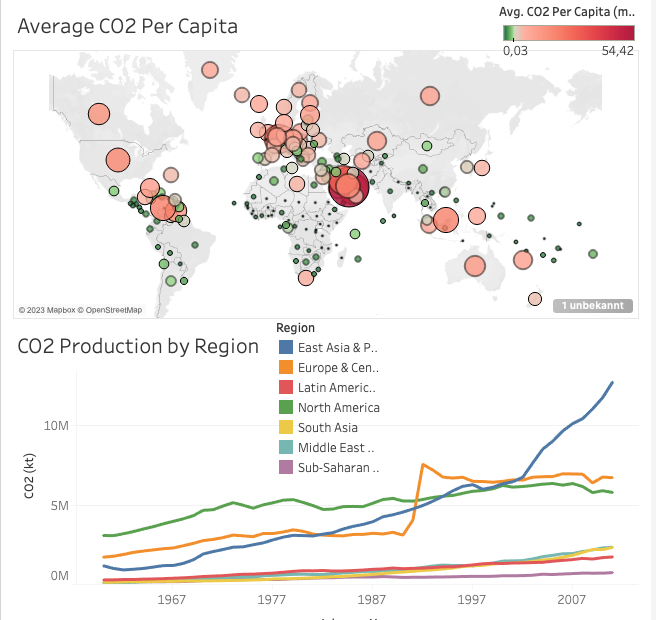
This project demonstrates how to use Tableau to analyze and visualize CO2 emissions data from multiple sources. The goal is to create an interactive visualization that allows users to explore CO2 emissions per capita for different countries from 2000 to 2011, alongside additional data on population, GDP, and energy use.
As a data analyst working for a policy research institute, you are tasked with creating a visualization that helps policymakers and researchers understand the trends in CO2 emissions and their relationship with various socio-economic factors. Here's a step-by-step explanation of the project:
-
Download Datasets: We begin by downloading the necessary datasets:
-
Data Linking in Tableau: We use Tableau to link these datasets and create a unified dataset for analysis.
- We establish connections with the CO2, Energy, GDP Total, and Total Population datasets in Tableau.
-
Creating Joins: To link the data effectively, we create joins between the datasets.
-
We join the CO2 dataset with the Energy dataset, ensuring the correct columns are matched based on common attributes.
-
We repeat the same process for the GDP Total and Total Population datasets, ensuring consistency in data types.
-
-
Data Cleanup: We make necessary data type conversions to ensure data consistency.
-
For instance, we change the data type of "Energy Use" from string to decimal number.
-
Similarly, we convert "Current GDP" from string to a whole number.
-
-
Creating the Visualization: With the linked and cleaned data, we proceed to create a compelling visualization.
-
We use Tableau's features to build an interactive chart that displays CO2 emissions per capita over time.
-
Users can explore the data by selecting specific years, countries, and variables.
-
-
Saving Your Work: It's essential to save your progress in Tableau to preserve your visualization. We also provide guidance on creating extracts if necessary.
This project showcases your ability to:
- Collect and integrate data from multiple sources.
- Clean and prepare data for analysis.
- Use Tableau to create meaningful visualizations.
- Communicate complex data insights in a user-friendly and interactive way.
By sharing this project on your GitHub, you demonstrate your skills as a data analyst and your ability to tackle real-world problems related to environmental analysis and policy research.
To get started with this project, follow the step-by-step instructions provided in the README. You can also watch a video tutorial for a more visual guide.
Contact Information:
- Connect with me on LinkedIn for inquiries and collaborations.
- Check out my other projects on GitHub.
View the Interactive Visualization: Explore the interactive CO2 emissions visualization on Tableau Public.
For any questions or feedback, feel free to reach out through LinkedIn or GitHub.

