The goal of ggdirectlabel is to make it easier to directly label ggplot2 charts rather than using legends.
You can install the development version of ggdirectlabel from GitHub with:
# install.packages("devtools")
devtools::install_github("MattCowgill/ggdirectlabel")library(ggdirectlabel)
library(ggplot2)
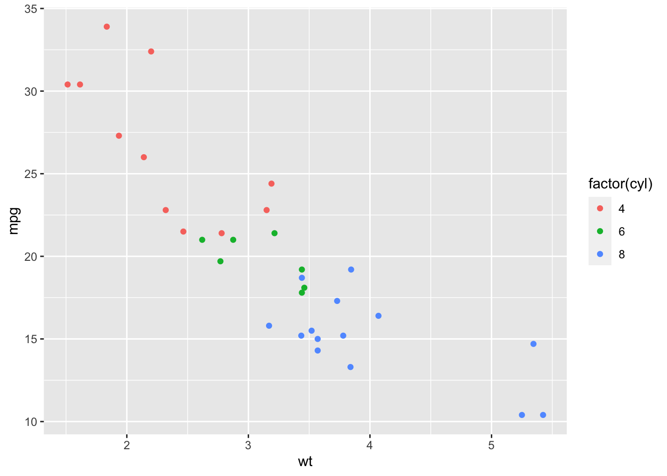
library(magrittr)Here’s a standard ggplot2 scatterplot:
base_scatter <- mtcars |>
  ggplot(aes(x = wt, y = mpg, col = factor(cyl))) +
  geom_point()

base_scatter
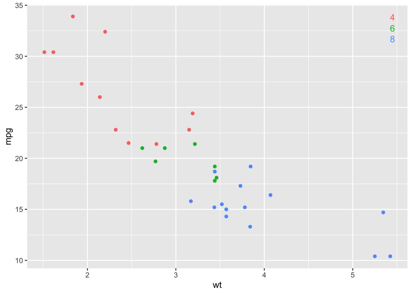
This is fine! But sometimes you might like the legend levels (4, 6, and
8 in this example) to be coloured according to the levels in the data.
That’s where geom_richlegend() comes in:
base_scatter +
  geom_richlegend(aes(label = cyl)) +
  theme(legend.position = "none")
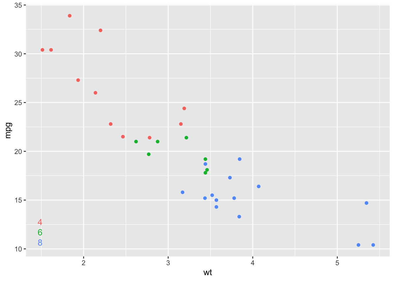
You can move the ‘rich legend’ around:
base_scatter +
  geom_richlegend(aes(label = cyl),
                  legend.position = "bottomleft",
                  vjust = 0,
                  hjust = 0) +
  theme(legend.position = "none")
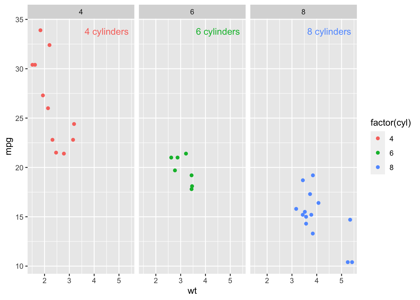
geom_richlegend() respects facets - it’ll place a little legend
annotation for each level of the data that appears in that panel:
base_scatter +
  geom_richlegend(aes(label = paste0(cyl, " cylinders"))) +
facet_wrap(~cyl)Without ggirectlabel, we might do something like:
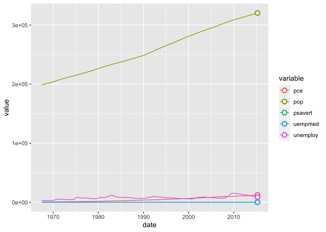
ggplot2::economics_long %>%
  ggplot(aes(x = date, y = value, col = variable)) +
  geom_line() +
  geom_point(data = ~dplyr::filter(., date == max(date)),
             fill = "white",
             shape = 21,
             size = 2.5,
             stroke = 1.25)
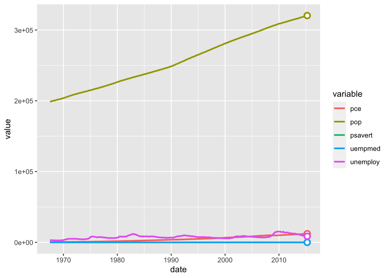
This is fine! But this is a more straightforward way to achieve the same thing:
ggplot2::economics_long %>%
  ggplot(aes(x = date, y = value, col = variable)) +
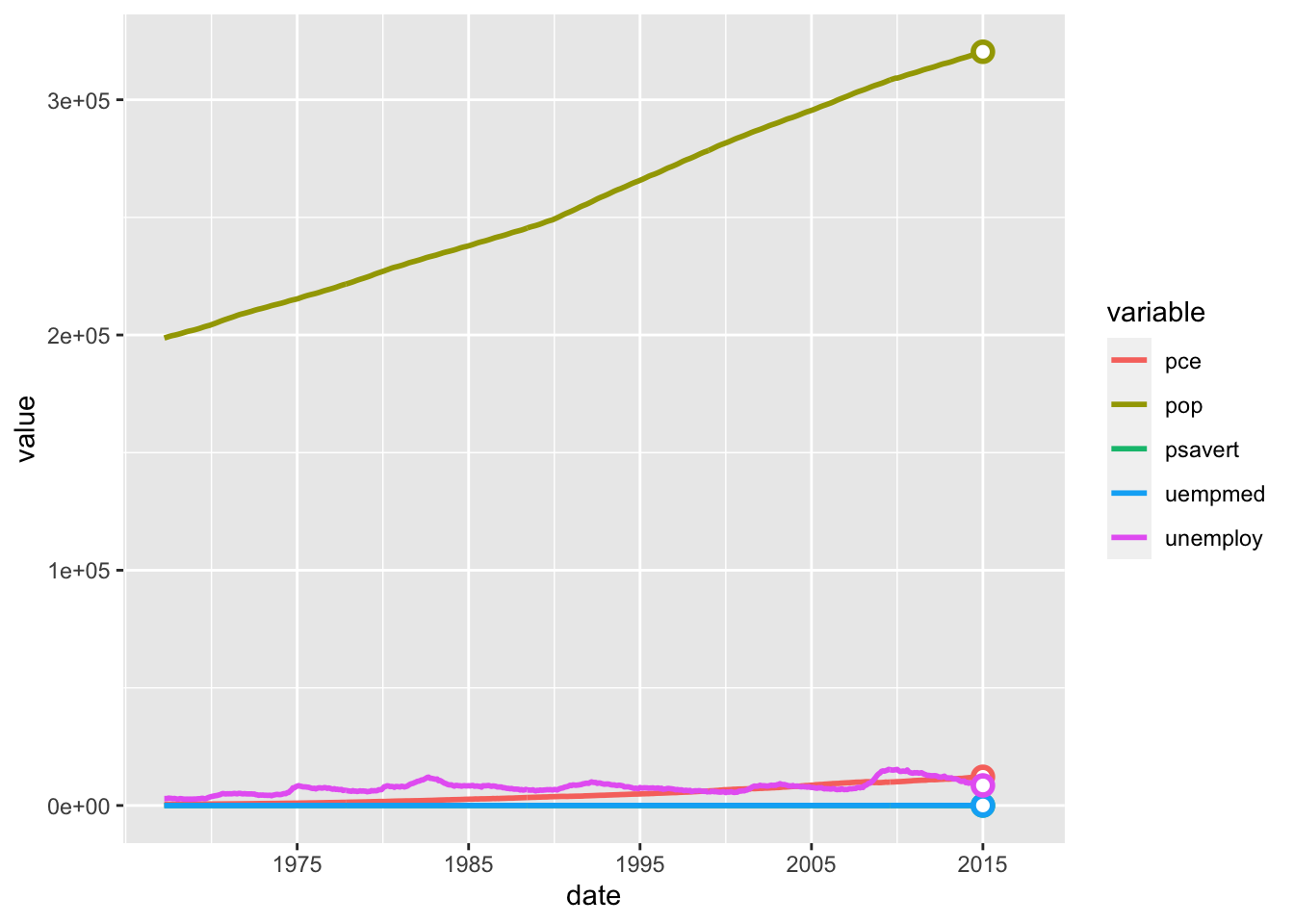
geom_linepoint()In time series line charts, it’s often important to make clear the date
of your most recent observation. The scale_x_date_rightalign()
function aligns the breaks of your x-axis so that the most recent
observation is included in the breaks.
ggplot2::economics_long %>%
  ggplot(aes(x = date, y = value, col = variable)) +
  geom_linepoint() +
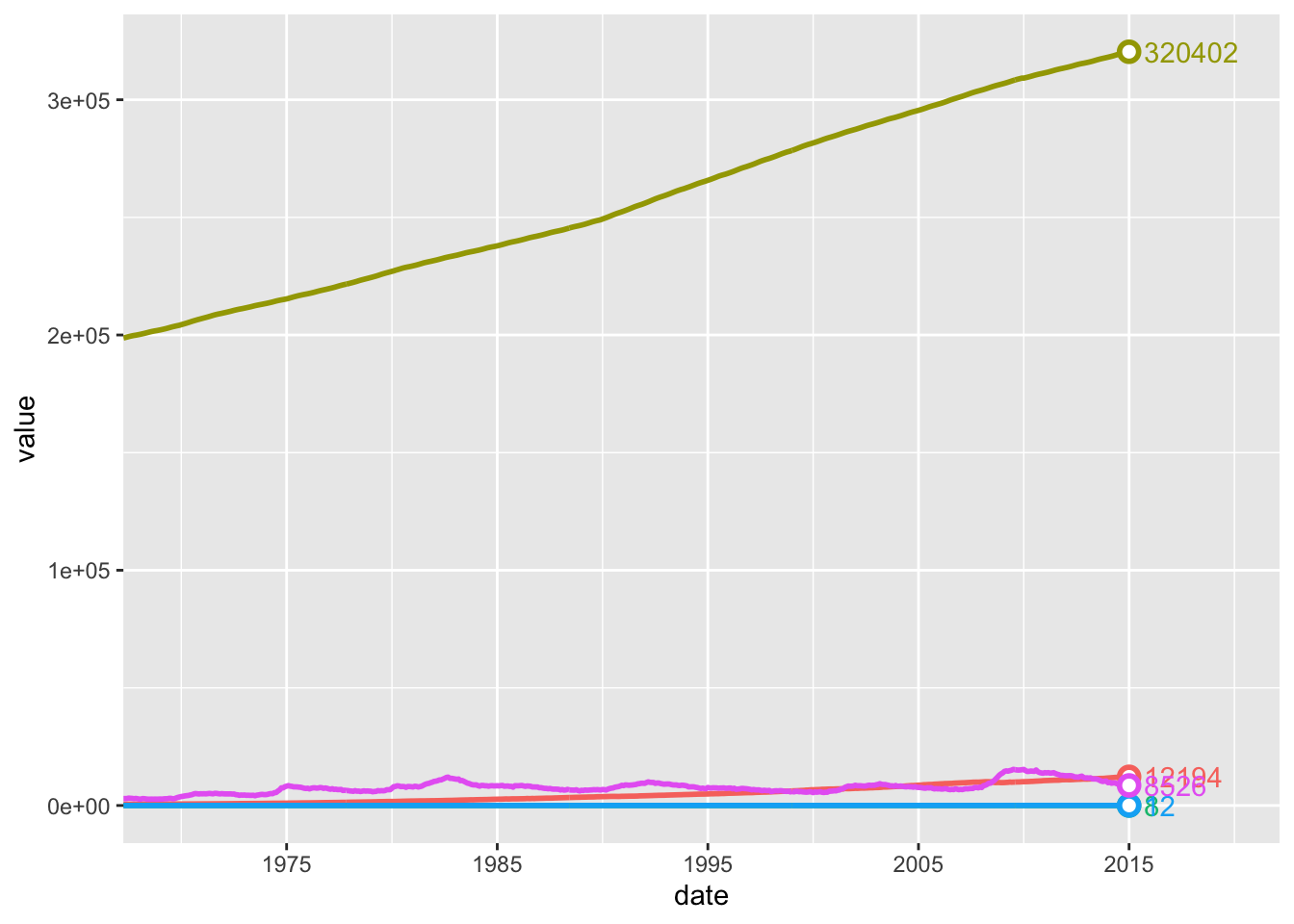
scale_x_date_rightalign()In time series line charts, you may wish to label the final point in the
series. The geom_finallabel() function makes that easy.
ggplot2::economics_long %>%
  ggplot(aes(x = date, y = value, col = variable)) +
  geom_linepoint() +
  geom_finallabel(aes(label = round(value, 0))) +
  scale_x_date_rightalign(expand = expansion(c(0, 0.15))) +
  theme(legend.position = "none")
