Demo version: https://russmaxdesign.github.io/switch-checkbox/
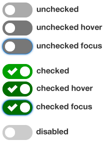
The simple example demonstrates how to style checkbox and radio button elements to look like on/off switches.
<div class="switch">
  <!-- input -->
  <input
    class="switch__control"
    type="checkbox"
    name="example01"
    id="example01">
  <!-- label -->
  <label class="switch__label" for="example01">
    <span class="switch__content">Label content</span>
  </label>
</div>
Class names follow BEM class naming conventions.
/* parent module */
.switch { }
/* descendants of parent module */
.switch__control { }
.switch__label { }
.switch__content { }
The input and label elements are explicitly associated using matching "for" and "id" values.
The label content is used to describe the purpose of each switch for screen readers. This content is hidden off-screen.
The switch is keyboard-friendly, so there is a visible focus state available for checked and unchecked switches.
The colors used for the switch meet WCAG 2.0 color contrast guidelines and work well for all major types of color blindness.
A tick symbol is used for the checked state to make this state clearly distinguishable from the unchecked state. This is important for low vision users as well as conginitive impaired users.
The tick is an SVG image, defined using background-size. This means it can be scaled up or down as needed without dithering issues.
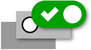
There are three key elements of the switch: the parent (switch), the input (switch__control) and the label (switch__label).
The parent element (switch) is set with a width and a height and given position: relative.
The input element (switch__control) is positioned on top of the switch and sized to the same width and height. This means that the entire area of the switch is then clickable. It is also set with opacity: 0, which means it is not visible.
The label element (switch__label) is then positioned
on top of the input element, and also sized to the same width and height as
the switch element. It is also given a border-radius
to create the round corners. Finally, this label can then be given different
background-color and background-image values
depending on its state (ie. whether it is checked, unchecked, disabled, in
focus, in hover state etc).
Checkbox and radio button elements can given various states such as checked, unchecked or disabled.
However, most of the styling is applied to the label element, rather than the input. Unfortunately, the label element has no checked, unchecked or disabled state of its own.
We can get around this by styling the label after an input that is checked, unchecked or disabled.
This can be achieved using adjacent sibling selectors, which target any label element that is adjacent to the input.
/* unchecked input */
.switch__control:hover + label { }
.switch__control:focus + label { }

/* checked input */
.switch__control:checked + label { }
.switch__control:checked:hover + label { }
.switch__control:checked:focus + label { }

/* diabled input */
.switch__control[disabled] + label { }
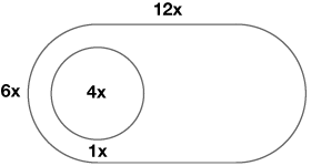
The switch uses the ratio below for dimensions:
A single "master" variable is used to control all dimensions, which means the component can easily be scaled to different sizes as needed.
$switch-width: 3em;
$switch-height: ($switch-width / 2);
$toggle-width: ($switch-width / 3);
$toggle-gutter: ($switch-width / 12);
Different sized switches can be created by changing the font-size of each option.
$switch-xl:  1.6em;
$switch-lg:  1.4em;
$switch-md: 1.2em;
$switch-sm: 1em;
$switch-xs: .8em;
See Licence information for use.


