This project’s objective is to analyse large dataset of csv files and to create a summary DataFrame of the ride-sharing data by city type including a multiple-line graph showing the total weekly fares for each city.
The data source was divided in two CSV’s files, city data and ride data. The ride data file provided information regarding to dates, fare cost, ride id and city name. The city data file was organized by city name, driver count and type of city (rural, suburban or urban). A left join was used to join the table by the city name.
Python 3.7.6, Pandas, Jupyter Notebook and Matplotlib.
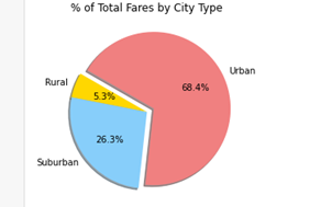
The city type summary shows that more than half of the total rides are centralized in the urban type. The urban type represents more than half of the total rides, followed by suburban type and rural type.
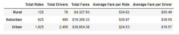
Despite the great number of rides been centralized in the urban type, when analysing the average fare per driver, rural type has the highest value, being 3.3 times higher than the urban type.
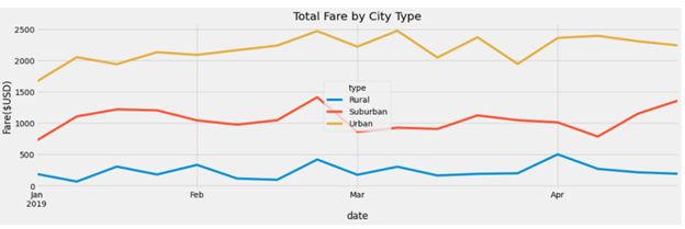
The weekly fare summary shows that for all city types the second half of the months of January and February the number of fares were higher when compared to the first half. This trend continued to happen for the suburban city type for the months of March and April but it was not observed in the urban and rural city types.
-
The biggest amount of Pyber rides is happening in the urban type city.
-
Urban type city generates more fares income than suburban and rural together.
-
Rural type city has the highest average fare per ride and average fare per driver.
-
Distance may be the factor driving the average fare per driver. However, more data is necessary to confirm this assumption.
-
The low average fare per driver in the urban type city is an important indicator of more research and data collection related to time and distance to find the optimum number of drivers reducing unnecessary cost.