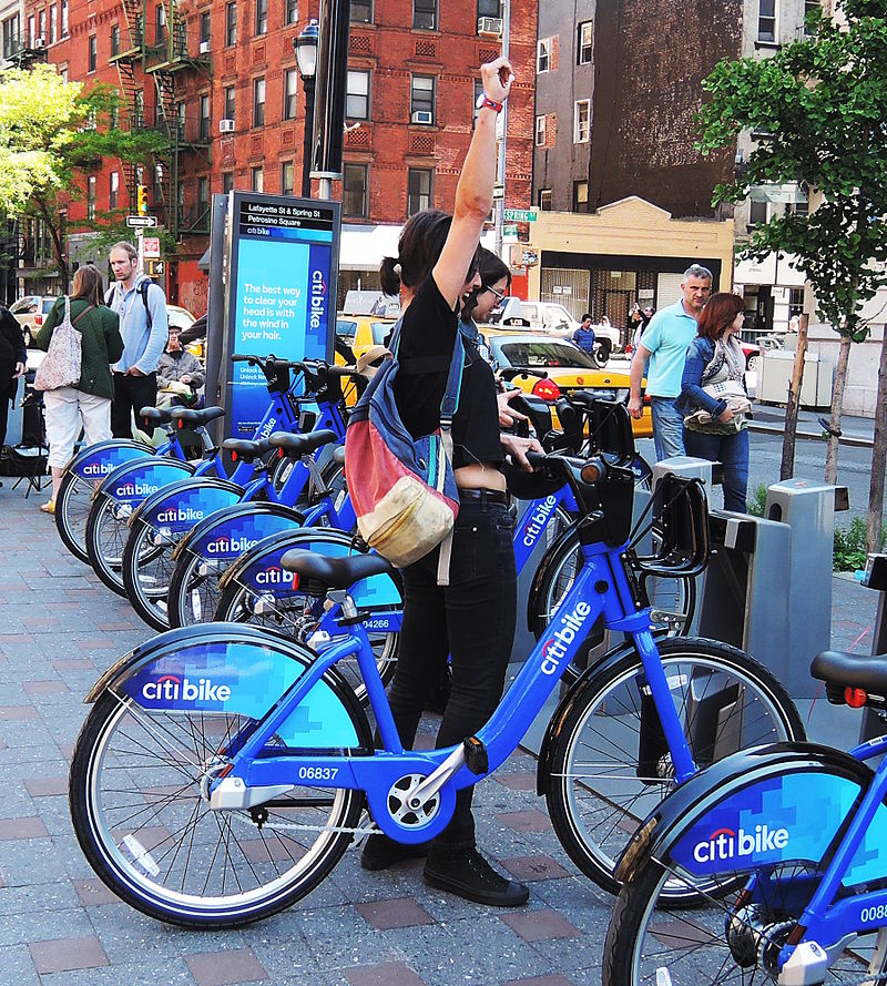
Since 2013, the Citi Bike Program implemented a robust infrastructure for collecting data on the program's utilization. The Citi Bike team collects data each month, organizes it, and made public on the Citi Bike Data webpage.
In this project, I combined the monthly data from the period of June 2019 - February 2020. This period was selected because it was suffciently recent to capture trends but was outside of the Covid-19 pandemic period. It is therfore assumed that this period covers more normalized usage.
Additionally, the period covers a sufficiently large period to capture seasonal trends from hot weather, to mild, to cold.
My objective for this project was to aggregate the data found in the Citi Bike Trip History Logs and find two unexpected phenomena.
Next I designed Tableau visualizations for each discovered phenomena (9 total).
The first phenomena that I discovered was what I called the 1969 Anomaly.
The data reflected that the ages of individuals using Citi Bikes is largely normally distributed with the exception of those individuals born in the year 1969 where there is a significant spike in usage.
The 1969er use type for Citi Bikes utilize the “Customer” rather than “Subscriber” payment method. This customer payment method is designed for 24 Hour or 3 Day use. Additionally, the 1969ers use a larger number of bikes, take longer rides, and are more numerous during mild months. This is aligned with leisure activity.
When looking at this evidence together, it is fair to conclude that the New York and New Jersey area see a high proportion of tourist born in the year 1969 making them around 50 years old at the time of the sample. This high proportion of individuals may be visiting the area due to the momentous birthday or are simply of the age where tourists can enjoy more attractions not specifically geared towards younger families.
The second phenomena I researched was impact of marketing towards women to increase Citi Bike usage. From the data, this does not appear to be effective.
Women are less inclined to use Citi Bikes based on the data gathered for the time period of June 2019 – February 2020. A reason for this may be that women are more inclined to use multiple forms of transportation particularly to avoid inclement weather. The data hints at this in the seasonal ride time where women are more inclined have rides with greater durations during more mild months.
Women are also more inclined to ride Citi Bikes in New Jersey. This in part may be due to fewer transportation options and greater distances to walk between start and end points. New Jersey may also be safer to cycle or have more designated cycling areas which may appeal to women who are generally more risk adverse.
Interestingly, there is a wider age range of women who are open to Citi Bikes when compared to the male steeper slope.
The visualizations for both the 1969 Anomaly and Gender Outreach were combined into Tableau Dashboards and analysis was provided in a powerpoint.
I then performed analysis on station popularity in terms of number of journeys started at a station and number of journeys ended at a station.
The first map I created utilized the Tableau dual axis function to reflect different symbols for journey starts and ends. The data was futher distinguished by size (number of journeys started/ended) and color. I then overlayed zip codes and zip code boundries to the map.
I then created a seperate map which outlined the seasonal differences in end journeys over the period. This was achieved by constructing a map with only the end journey information and adding a drop down filter for the months. Users can now drill down to understand how usage changed throughout the period.
Interestingly, Station Popularity reflects that Citi Bikes are significantly more popular in New Jersey than the New York Boroughs during analysis period.
Stations located in New Jersey sustained higher popularity in both starting and ending locations. It can therefore be inferred that the individuals using Citi Bikes stay within New Jersey. This trend does reduce seasonally where end locations occur with greater frequency in Manhattan during warmer months.
A possible root cause for this trend is that there are fewer transportation options in New Jersey than in the Boroughs. Additionally, the distances between starting and ending points may be of slightly greater distance which disposes an individual to use Citi Bikes rather than walking.
The data from the phenomena visuzlizations, the dashboards, and the maps was then combined into a Tableau Story. The data was also analyzed in text format via powerpoint. The visualizations can be found on my Tableau Public webpage.
