Kong UI plugins for Tempad Dev.
This plugin allows you to view component code and style code in both SCSS and JS formats, specifically tailored for Kong’s design system.
-
Install TemPad Dev from Chrome Web Store.
-
Install
@kongor@kong/advancedin TemPad Dev's plugins section.
Note
The @kong/advanced plugin generates property values using the var() function and provides the corresponding SCSS variable as a fallback. This is useful for developing libraries like kongponents itself.
-
CSS Codegen: Rewrite CSS variables using design tokens from
@kong/design-tokens.e.g. SCSS output:
display: flex;
width: 960px;
padding: $kui-space-90;
flex-direction: column;
justify-content: center;
align-items: center;
gap: $kui-space-70;
border-radius: $kui-border-radius-30;
border: $kui-border-width-10 solid $kui-color-border;
background: $kui-color-background;
e.g. JS output:
{
  display: 'flex',
  width: '960px',
  padding: KUI_SPACE_90,
  flexDirection: 'column',
  justifyContent: 'center',
  alignItems: 'center',
  gap: KUI_SPACE_70,
  borderRadius: KUI_BORDER_RADIUS_30,
  border: `${KUI_BORDER_WIDTH_10} solid ${KUI_COLOR_BORDER}`,
  background: KUI_COLOR_BACKGROUND
}
-
Component Codegen: Convert design components to Kongponents code.
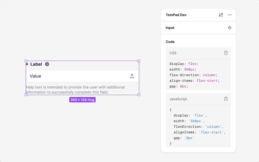
e.g.
Inputto<KInput>:<KInput v-model="value" label="Label" :label-attributes="{ info: '...', }" required help="Help text is intended to provide the user with additional information to successfully complete this field." > <template #before> <SearchIcon /> </template> <template #after> <UploadIcon role="button" tabindex="0" @click="() => {}" /> </template> </KInput>