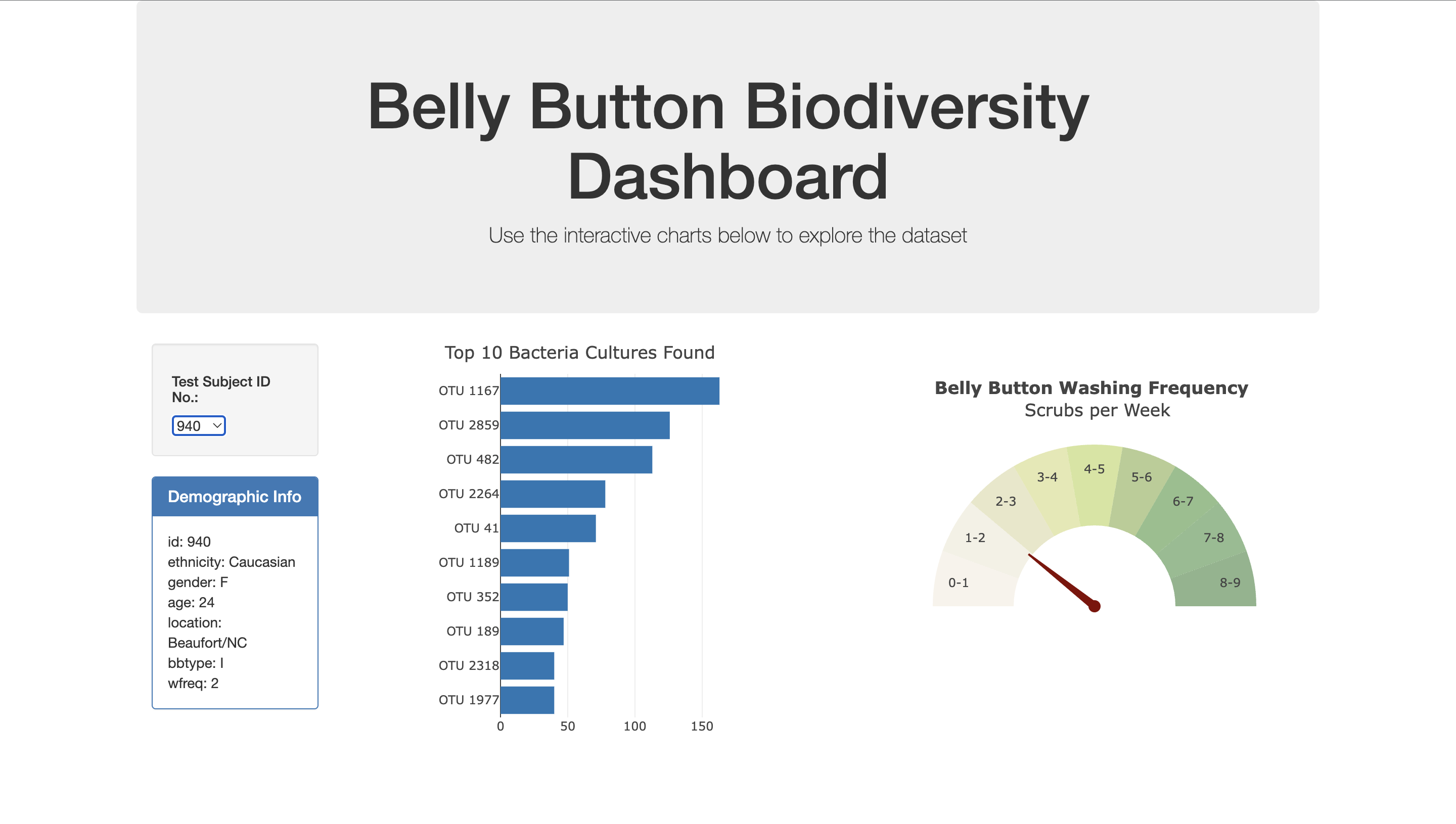
Aim of this challenge was to use the JavaScript visualizations knowledge, to create an interactive dashboard, to explore the Belly Button Biodiversity dataset, which catalogs the microbes that colonize the human naval.
Intriguingly, a handful of microbial species called operational taxonomical units (OTUs) were present in more than 70% of the people and the rest were relatively rare. We aim to give users the autonomy to explore this for themselves with the interactive dashboard.
- Using D3, the data was read from the samples.json file.
- Used the data read to generate a horizontal bar chart of the top 10 OTUs found in an individual.
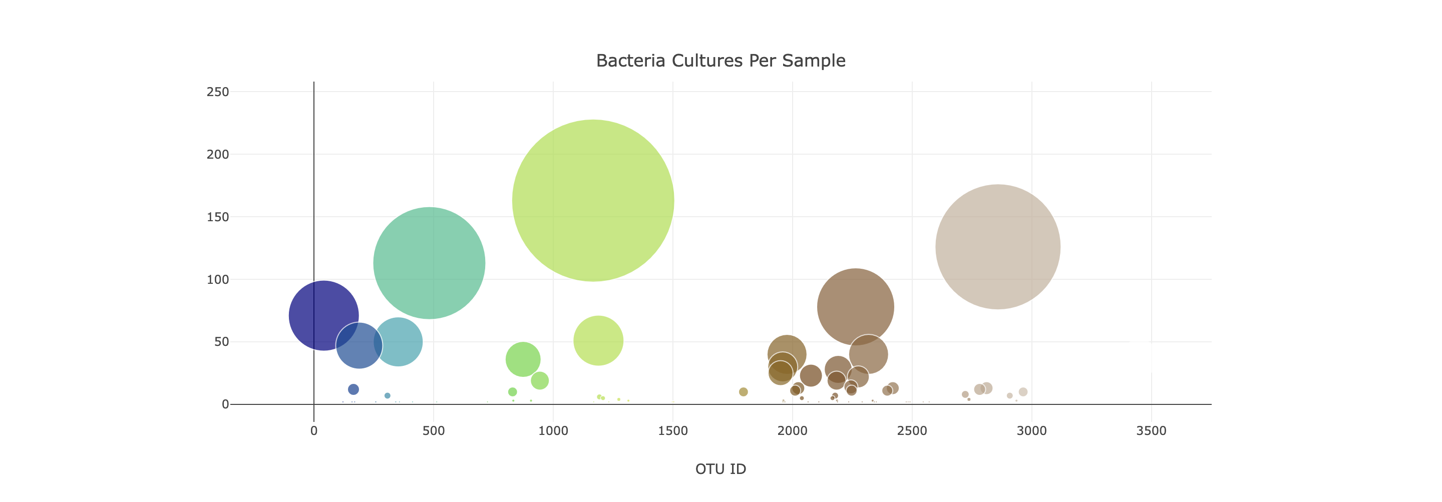
- Used several elements of the data to generate a bubble chart.
- Used the data to display the demographic info of the first patient id in a tabular format.
- Lastly, created a Gauge chart to display the wash frequency of the individual.
Note: Except the demographic info, all the three charts change with every user selection.
To run this script:
- Copy the git link to your local git repository
- Ensure static and Images directories are present along with index.html file and samples.json dataset.
- The main JS files used to code are in the static folder, app.js file has the code for the bar, bubble charts and the demographic info, while the bonus.js file has the code for the gauge chart displayed on the dashboard.
- Run the index.html file on VScode either using the extension Liver Server or double clicking it from the local folder.
- This ensures the webpage is opened on a new browser tab
- Once the dashboard is loaded, the user has the ability to select different patient ids from the dropdown and see the charts change accordingly.
- In additon, user could change the sample dataset containing different patient ids with similar info and run the code to see the results. User could also explore more plotly charts and visualizations to represent the data.
- The images of the dashboard are in the Images folder for reference.
To write this script, I used the starter code provided and discussed some of the coding hurdles with my TAs and tutor.
They helped me understand the logic to present the demographic info and my tutor helped me clean up the code, while also providing me with the sample gauge chart code. I adapted the gauge chart code to work with the challenge requirements.
Majority of the work went into understanding the DOM element in JS, accessing and manipulating it. Seeing the dashboard come alive was the most enjoyable part of this challenge.
https://observablehq.com/@arronhunt/building-a-gauge-meter-with-plotly
https://plotly.com/javascript/indicator/#overview
https://plotly.com/javascript/horizontal-bar-charts/
https://plotly.com/javascript/bubble-charts/
https://observablehq.com/@d3/gallery?utm_source=d3js-org&utm_medium=nav&utm_campaign=try-observable

