Crowdfunding platforms like Kickstarter and Indiegogo have been growing in success and popularity since the late 2000s. From independent content creators to famous celebrities, more and more people are using crowdfunding to launch new products and generate buzz, but not every project has found success.
To receive funding, the project must meet or exceed an initial goal, so many organisations dedicate considerable resources looking through old projects in an attempt to discover “the trick” to finding success. I organised and analysed a database of 1,000 sample projects to uncover any hidden trends.
-
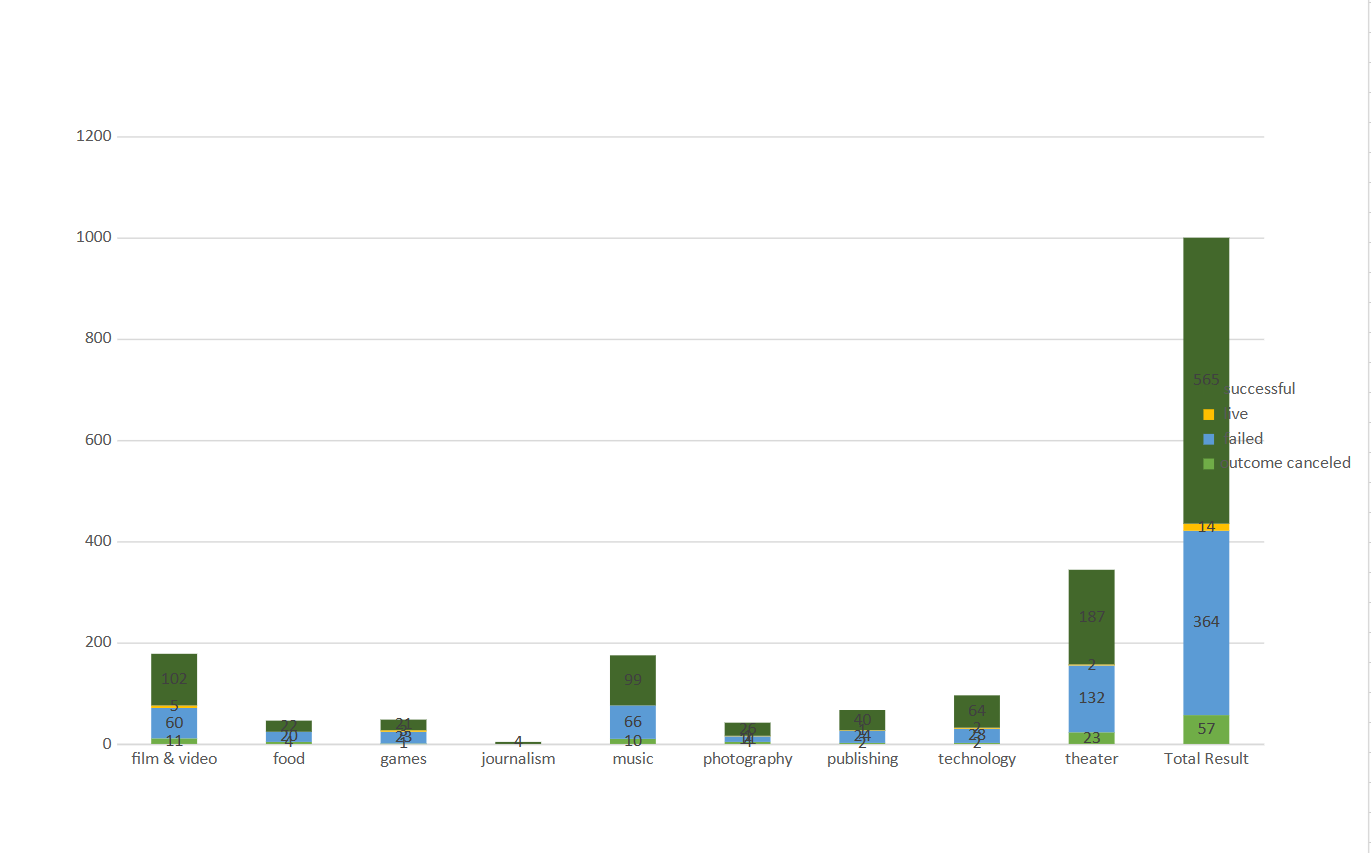
It seems like that most of the campaigns successful are related to arts.
-
So, the bars depict the high volume of success in theater with 199, film & video 102, and third music with 99.
-
The data shows that journalism have all the least volume of projects with successful status.
-
Rest of the fours categories including technology have average ratio with slight positive numbers for successful projects as compare to the failed ones.
-
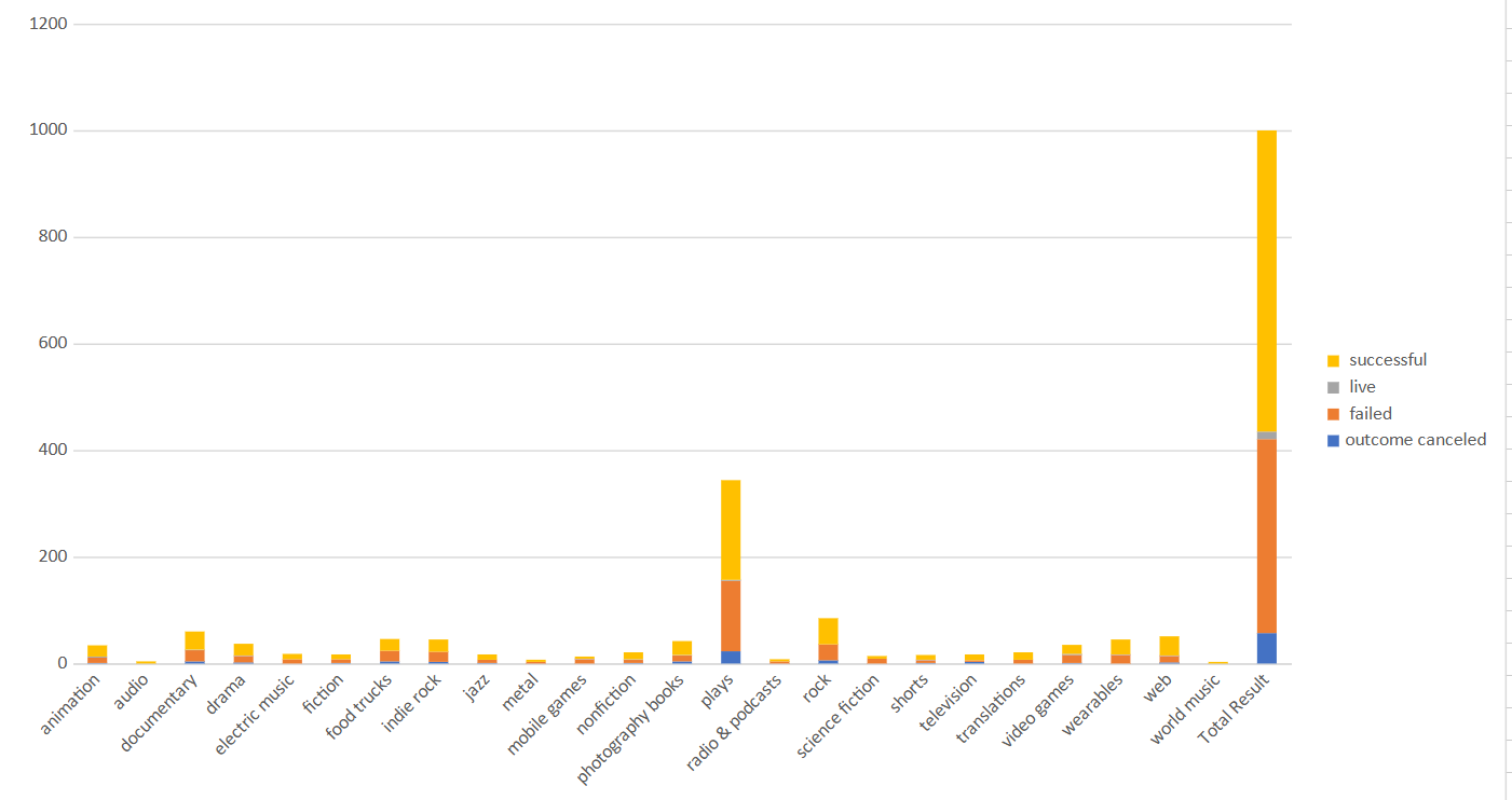
“Plays” has the prominent most high values from all the other categories for number of projects and the successful rate. Crowdfunding is 7 to 8 times larger than all others projects.
-
The “rock” and “documentary” cross above 50 numbers for crowdfund with good successful projects.
-
As rest of the categories are under 50 and doesn’t explicit any significant differences between them.
-
It seems that there are a lot of people who are putting out campaign in the summer months that’s why there are number of successful attempts goes up in the summer months.
-
It also seems like failed and cancelled campaign do not get effected by the month of the year.
-
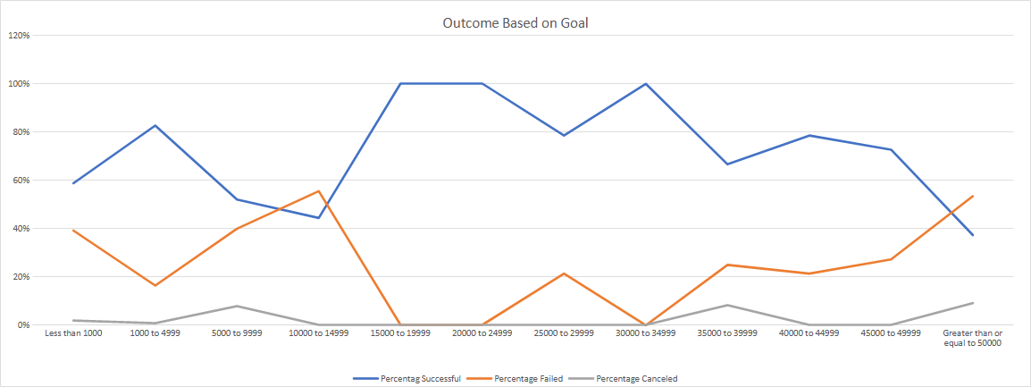
We do have an increase for successful attempts ranges from 15k to 35k.
-
Most people do not bother funding for expensive projects more than 50k.
-
Cancel attempts are consistent across the goal buckets.
-
I have no breakdown for backers counts for goals and pledges. So. There are no individual details to know more individuals people contribution to the projects.
-
We have funds but with different currencies. A standardize format is required for making more accurate comparisons regarding the currency with respect to projects.
What are some other possible tables and/or graphs that we could create, and what additional value would they provide?
-
Pie chart can create to analyze the number of projects and fundings with respect to countries.
-
Another pie chart can be created to determine that how many pledge amounts are available for projects.
-
Helps which country have the highest amount of funds.
-
We can plot scattered chart for X axis as goals and y-axis as pledge to know trends for funds for goals and pledges.
-
Another scattered chart can be possible to know for country with currency wise.
-
If as the pledge amount is higher than the goal for projects.
-
Above scattered charts could use for visualizing the successful and failed projects.
-
According to summarized information, we can estimate that mean is higher than the median.
-
We can see there are a lot of outliers in the box plots and there is right-skew distribution, then median would be the best measure to explain the data.
-
Mean is pulled by the outliers, i.e., biased for distribution the data.
Use your data to determine if there is more variability with successful or unsuccessful campaigns. Does this make sense? Why or why not?
-
The deviations are right-skewed.
-
More variability is having more backers count in the successful campaigns rather than unsuccessful campaigns.
-
The distribution for successful campaigns according to standard deviation.
• Our distribution is right-skewed, because we have more outliers.


