The purpose of this visualization is to inform the city planners and the fire department about details of fire incidents in the City of Toronto. More specifically, this visualization is designed to help city planners and the fire department to decide where additional fire stations should be built within the city, to reduce the number of fire incidents or minimize loss from such. The data that are used in the visualization is from The City of Toronto’s Open Data Portal. The datasets that we used included fire incidents data, fire station locations, and neighborhood profiles (Toronto Census 2016). There are two parts in the visualization: 1) a map on the left side and 3) a scatterplot on the right side. When the website is first opened, an info (information) box will pop up and hover over the scatterplot, in which highlights in the visualization will be stated, and readers can close it whenever so the scatterplot would be visible again. If the readers are interested in reading it again, the reader can click on a small button on the top right corner of the website to open the info box again.
Our main audiences are the city planners and the fire department in the city of Toronto, the map with a general overview and the map with specific details regarding neighborhoods would provide insights to the audience, so that they can see which neighborhood or which area within a specific neighborhood would require more fire stations. Also, with the scatterplot, our audience would be able to see if there is a trend between the number of incidents and time in each neighborhood, so that they can make a plan on the order of building fire stations. This means that they can first build more stations in more urgent neighborhoods, which are the neighborhoods with a strong positive trend on the scatterplot. Then they can follow the order (trend) and build in other neighborhoods.
Our primary data source includes:
Technology/Libraries to Be Used: In our development, we will be building a shiny app in R. The project will be deployed on Github as R projects for easy collaborations. The final product will be a shiny web app if time permits. The main libraries we will be using include “shiny” for creating interactive web applications; “tidyr”, “dylpr”, “lubridate” for data manipulations; “sf”, “leaflet” and “opendatatoronto” for handling geographical data. Lastly, we will use “ggplot2” for plotting everything.
The interactive web app can be visit via shiny.io
Alternatively, you could run the fire incidents shiny app in R from the github repo
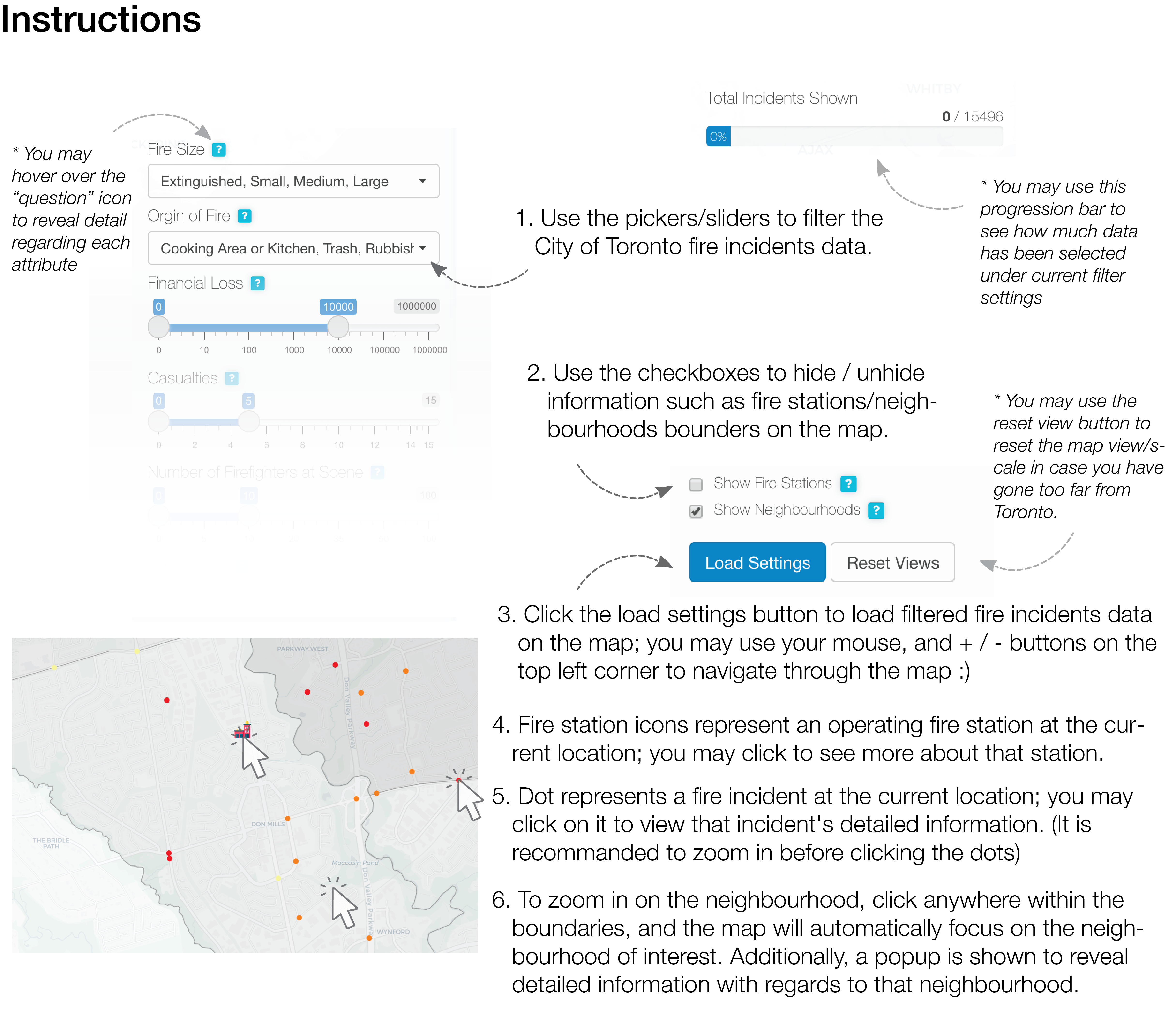
Please follow the instructions below to use the fire browser:
 The arrow
illustration
& pointer
illustration
are used above. Also acknowledge that the fire station icon is made by
Freepik from
www.flaticon.com
Hi there, it’s the “Fancy Thoughts Squad”, students from the University of Toronto teaming up for the STA313 final assignment. Hope anyone who read this will have a “fancy” day (?)… I guess?
- Eric Bailey (2015). shinyBS: Twitter Bootstrap Components for Shiny. R package version 0.61. https://CRAN.R-project.org/package=shinyBS
- Hadley Wickham, Romain François, Lionel Henry and Kirill Müller (2020). dplyr: A Grammar of Data Manipulation. R package version 1.0.2. https://CRAN.R-project.org/package=dplyr
- H. Wickham. ggplot2: Elegant Graphics for Data Analysis. Springer-Verlag New York, 2016.
- Joe Cheng, Bhaskar Karambelkar and Yihui Xie (2021). leaflet: Create Interactive Web Maps with the JavaScript ‘Leaflet’ Library. R package version 2.0.4.1. https://CRAN.R-project.org/package=leaflet
- Victor Perrier, Fanny Meyer and David Granjon (2021). shinyWidgets: Custom Inputs Widgets for Shiny. R package version 0.6.0. https://CRAN.R-project.org/package=shinyWidgets
- Winston Chang, Joe Cheng, JJ Allaire, Carson Sievert, Barret Schloerke, Yihui Xie, Jeff Allen, Jonathan McPherson, Alan Dipert and Barbara Borges (2021). shiny: Web Application Framework for R. R package version 1.6.0. https://CRAN.R-project.org/package=shiny
- Statistics Canada. 2017. Toronto [Census metropolitan area], Ontario and Ontario [Province] (table). Census Profile. 2016 Census. Statistics Canada Catalogue no. 98-316-X2016001. Ottawa. Released November 29, 2017. https://www12.statcan.gc.ca/census-recensement/2016/dp-pd/prof/index.cfm?Lang=E.
- Sharla Gelfand (2020). opendatatoronto: Access the City of Toronto Open Data Portal. R package version 0.1.4. https://CRAN.R-project.org/package=opendatatoronto
- Yihui Xie, Joe Cheng and Xianying Tan (2021). DT: A Wrapper of the JavaScript Library ‘DataTables’. R package version 0.18. https://CRAN.R-project.org/package=DT
Toronto Fire Incidents (2011-2019) (c) by Sijie Xu Toronto Fire Incidents (2011-2019) is licensed under a Creative Commons Attribution 4.0 International License. You should have received a copy of the license along with this work. If not, see http://creativecommons.org/licenses/by/4.0/.