The goal of this repo is to demonstrate different visualisation techniques for communicating information about transport networks.
We’ll use a route network dataset from the Propensity to Cycle Tool (PCT) to demonstrate the package. The PCT is a web application that allows users to explore cycling potential across England and Wales. The PCT is available at www.pct.bike.
We also provide an example dataset from Limerick, Ireland, from the CRUSE project. This is imported and plotted with code shown below.
rnet_limerick = sf::read_sf("test-data/rnet_limerick.geojson")
plot(rnet_limerick)A simple visualisation of the data in a multi-panel static map is shown below.
Read in data for Leeds with the following:
rnet_central = sf::read_sf("test-data/rnet_central.geojson")
plot(rnet_central)usethis::use_data(rnet_central, overwrite = TRUE)In Python this would look something like this:
import geopandas as gpd
rnet_central = gpd.read_file("test-data/rnet_central.geojson")
rnet_central.plot()
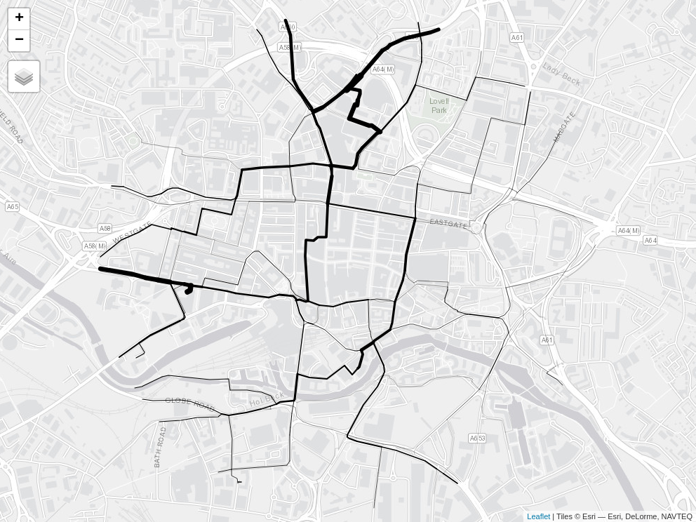
Interactive maps are more engaging and policy-relevant, allowing people
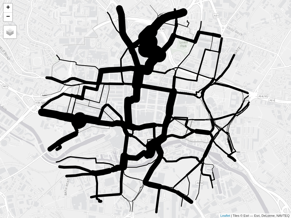
to zoom in and explore results. The images below illustrate interactive
maps of the route network data focussed on the bicycle and dutch_slc
variables.
The maximum level of flow in the Go Dutch scenario is 6 times the maximum level of flow in the baseline scenario. We can use this to scale the line widths as illustrated below.
m2 = tm_shape(rnet_central) +
  tm_lines(
    lwd = "dutch_slc",
    scale = 9 * width_multiplier
  )
tmap_save(m2, "maps/m2.html")
# browseURL("maps/m2.html")
if(!file.exists("maps/m1.png")) {
  webshot2::webshot("maps/m1.html", "maps/m1.png")
  webshot2::webshot("maps/m2.html", "maps/m2.png")
}
There are two problems with line widths in the maps shown above:
- The thinnes lines are too thin
- The thickest lines are too thick
Given that the maximum width is determined by the scale argument, we
can solve the first problem by increasing the value of scale. The
second problem can be solved with a multiplier that prevents lines being
x times thicker than the thinnest lines, 5 times in this case.
A function that does this would look something like this:
scale_line_widths = function(x, max_width, min_width) {
  # ...
}
In the plot below, for example, we increase the thickness of the
thinnest lines by setting min_width to 3, making the lines with less
flow more visible.
m5 = scale_line_widths(x, max_width = 15, min_width = 3)
# m5[[1]]
# m5[[2]]
Instead of showing different layers side-by-side, it’s useful to be able
to select them as different layers interactively. The netvis()
function defined in this packages does that, as illustrated below.


