This project aims to analyze and visualize the monthly COVID-19, influenza, and pneumonia deaths data using Python. It generates interactive heatmaps to help understand the trends and patterns in these mortality rates.
The data used in this analysis is sourced from CDC. It includes the number of deaths for each month and year, as well as the corresponding data as of date.
Before running the Python code, ensure you have the following packages installed:
- pandas
- seaborn
- matplotlib
You can install them using pip:
pip install pandas seaborn matplotlib- Clone this repository:
git clone https://github.com/IAmJuniorB/COVID-Analysis.git
cd COVID-Analysis-
Place the data file filtered_deaths.csv in the project folder.
-
Run the Python script:
python CovidDeaths.py
python PnaDeaths.py
python InfluenzaDeaths.py
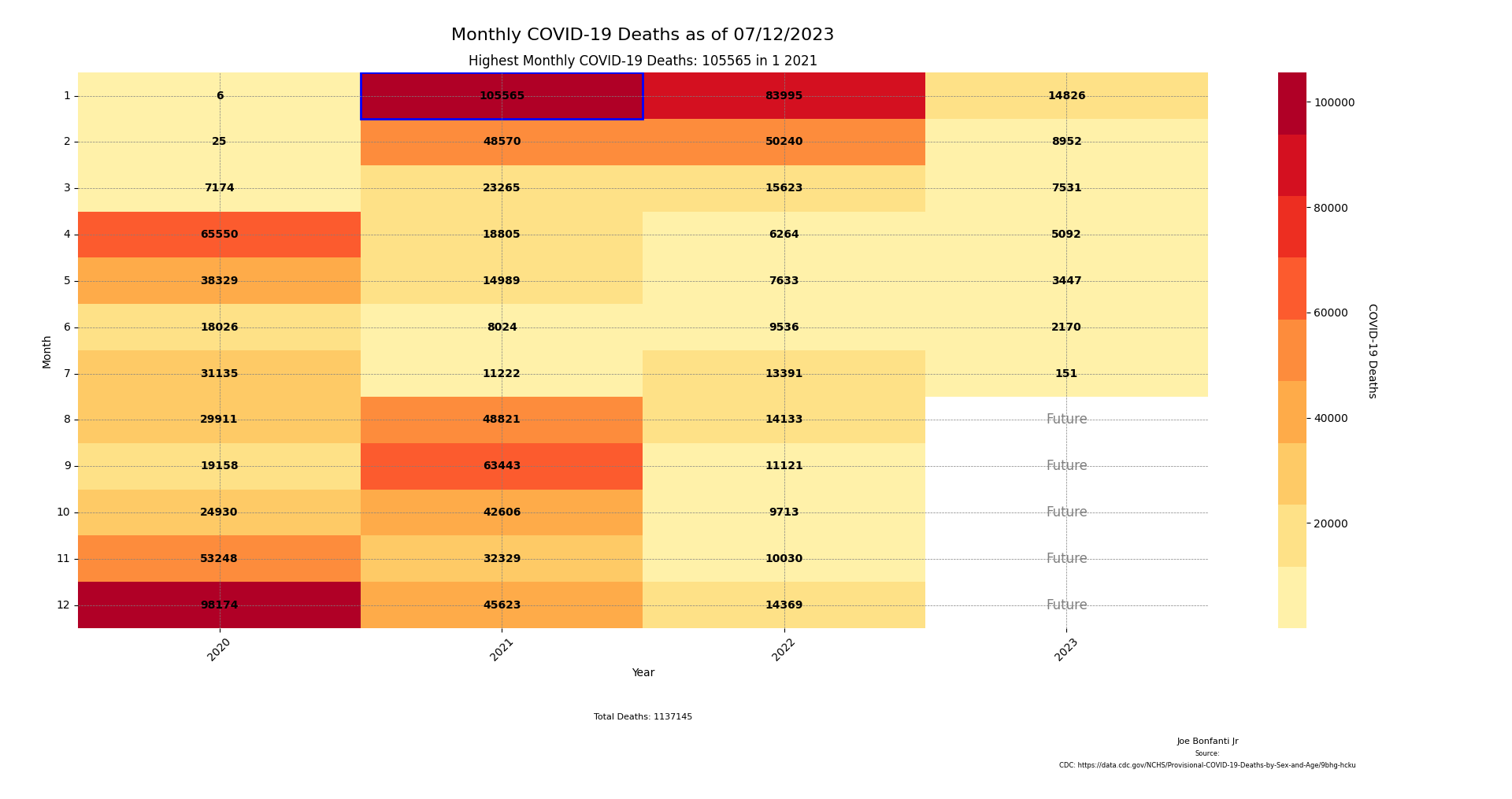
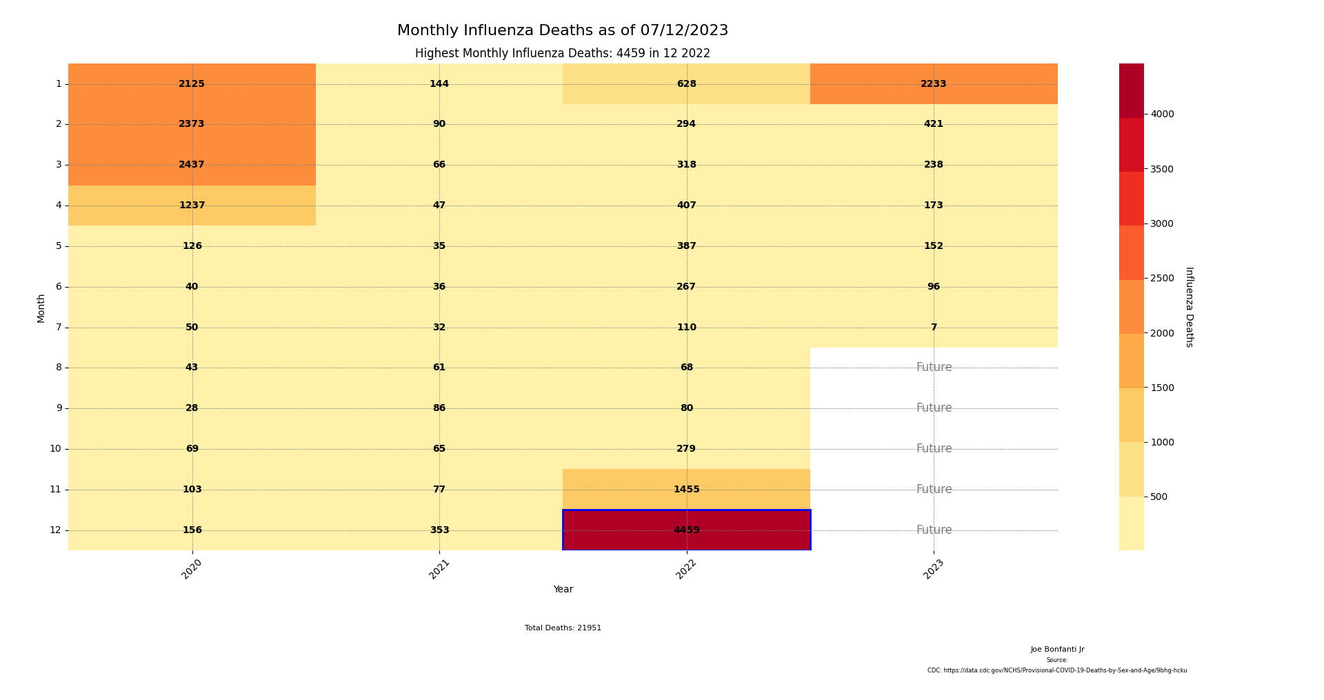
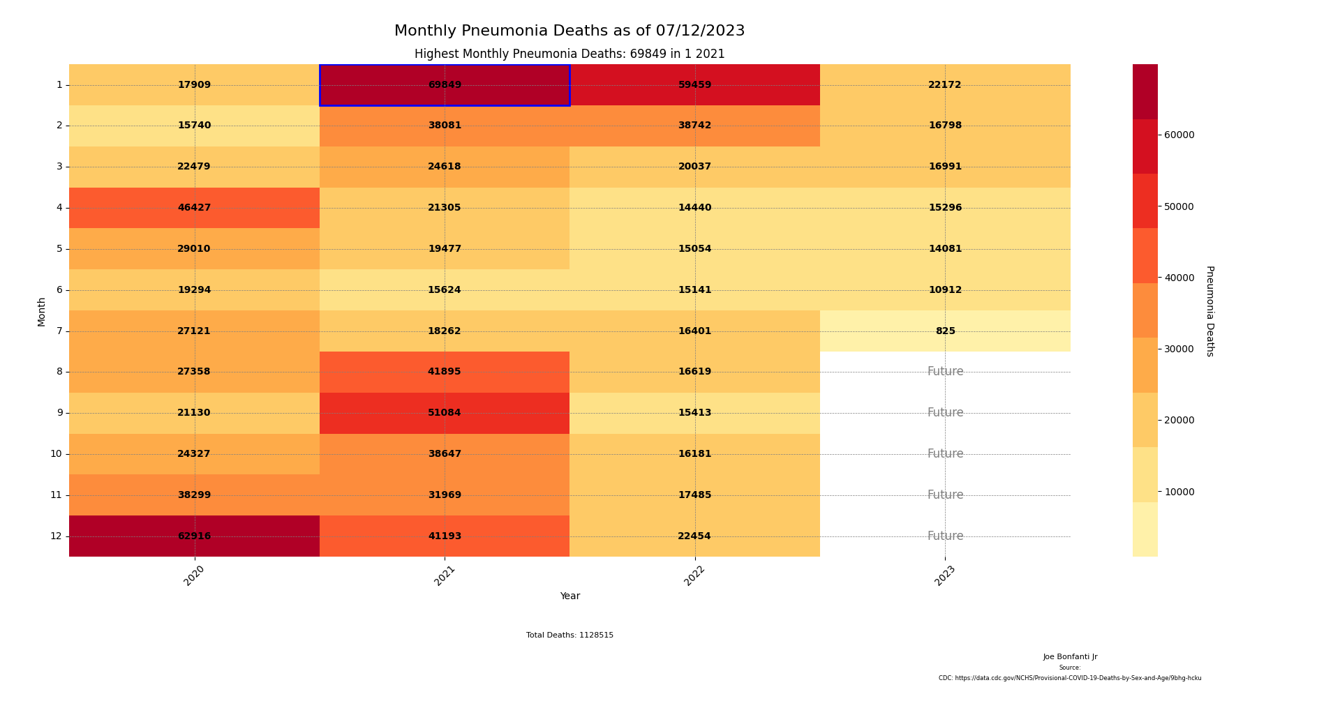
The scripts will generate three heatmaps for COVID-19, influenza, and pneumonia deaths as of the latest data (7/12/23).
The COVID-19 heatmap illustrates the monthly deaths for each year, with a custom color scale. The highest monthly death count is highlighted.
The influenza heatmap illustrates the monthly deaths for each year, with a custom color scale. The highest monthly death count is highlighted.
The pneumonia heatmap illustrates the monthly deaths for each year, with a custom color scale. The highest monthly death count is highlighted.


