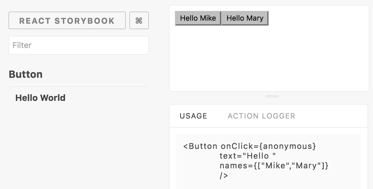
Storybook Usage
This addon let you display the story's declaration inside a panel. This project extends initial Storybook usage addon project created by mthuret. But since it wasn't maintained and PR were ignored I created a new project for it.
Should I use it?
There is another great addon Info addon. It has a lot more functionality, but it doesn't use sidebar location. That makes it difficult to use with react-native-storybook. If you manage to set it up, try to use it instead of this one, since this project is not going to get any new functionality.
Getting Started
First, install the addon
npm install storybook-usageAdd this line to your addons.js file (create this file inside your storybook config directory if needed).
import 'storybook-usage/register';Add those lines to your storybook config file
import {Usage} from 'storybook-usage'
storybook.addDecorator(Usage);