Project to create an interactive visualization of gender fluctuations over time using d3.js.
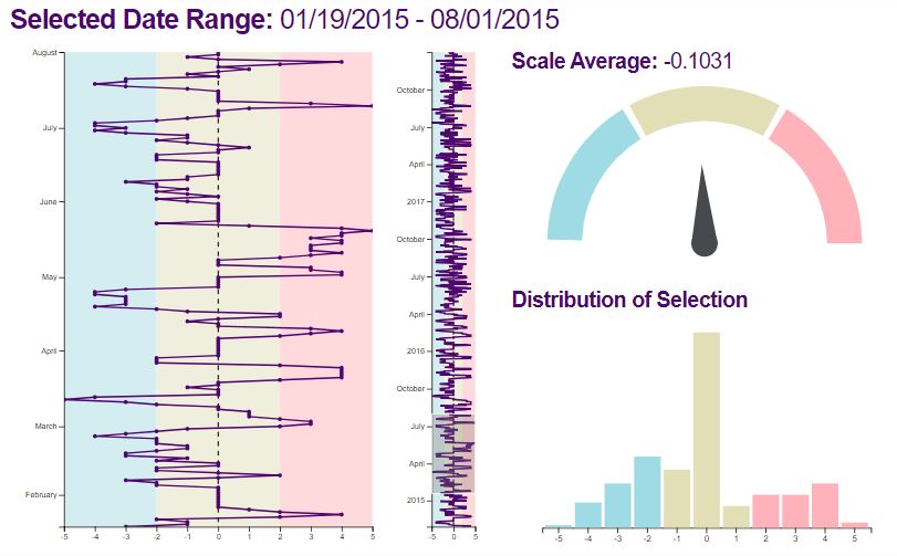
I have tracked gender fluctuations daily from Nov 2014 to Dec 2017 using an excel spreadsheet similar to what is included in the respository. The fields are "date" formatted as "mm/dd/yyyy" and "scale" which is a number from -5 to 5 indicating the gender rank I assigned that day. A value of -5 indicates a highly masculine day, whereas a value of 5 specifies an extremely feminine day. A value of 0 represents a purely neutral day, either in the agender or genderneutral sense. For purposes of the visualization, -5 to -3 are usually catagorized as a "masculine" day, -2 to 2 as a "neutral" day, and 3-5 as a "feminine" day.
Data is read into the program as a .csv file. The repository includes 2 .csv files; a small test data file and the actual data.
If you download the repository, you can use a python simple HTTP server to run the app locally in your browser.
- Clone or Download the repo
- In the command prompt navigate to your local folder
- Start a python simple HTTP server (8080 can be any number you like). In python 3 use:
python -m http.server 8080
- In a browser go to http://localhost:8080/ to see your visualization
The program creates 3 visualizations; a line chart, a gauge, and a histogram showing and summarizing the data input. The selection brush in the middle of the page will update the visualizations accordingly. Rollover tooltip capabilites in the line and bar charts give the user additional information.
Screenshot below:
Analysis folder contains R scripts used to calculate descriptive stats and text analysis (for textual data not in repo). Results can be found at https://www.gaytascience.com/plot-me-genderfluid/