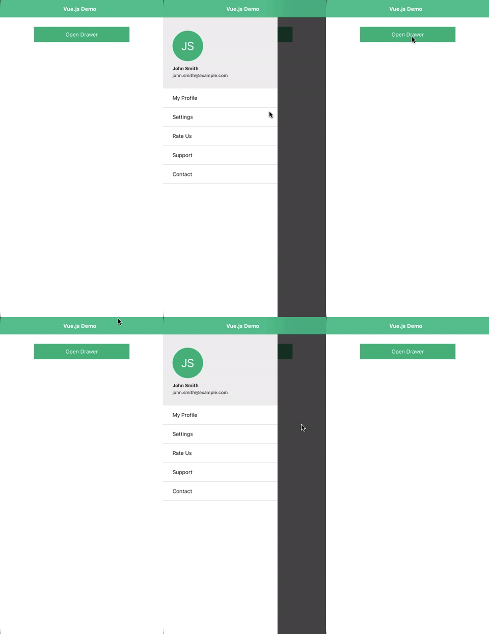
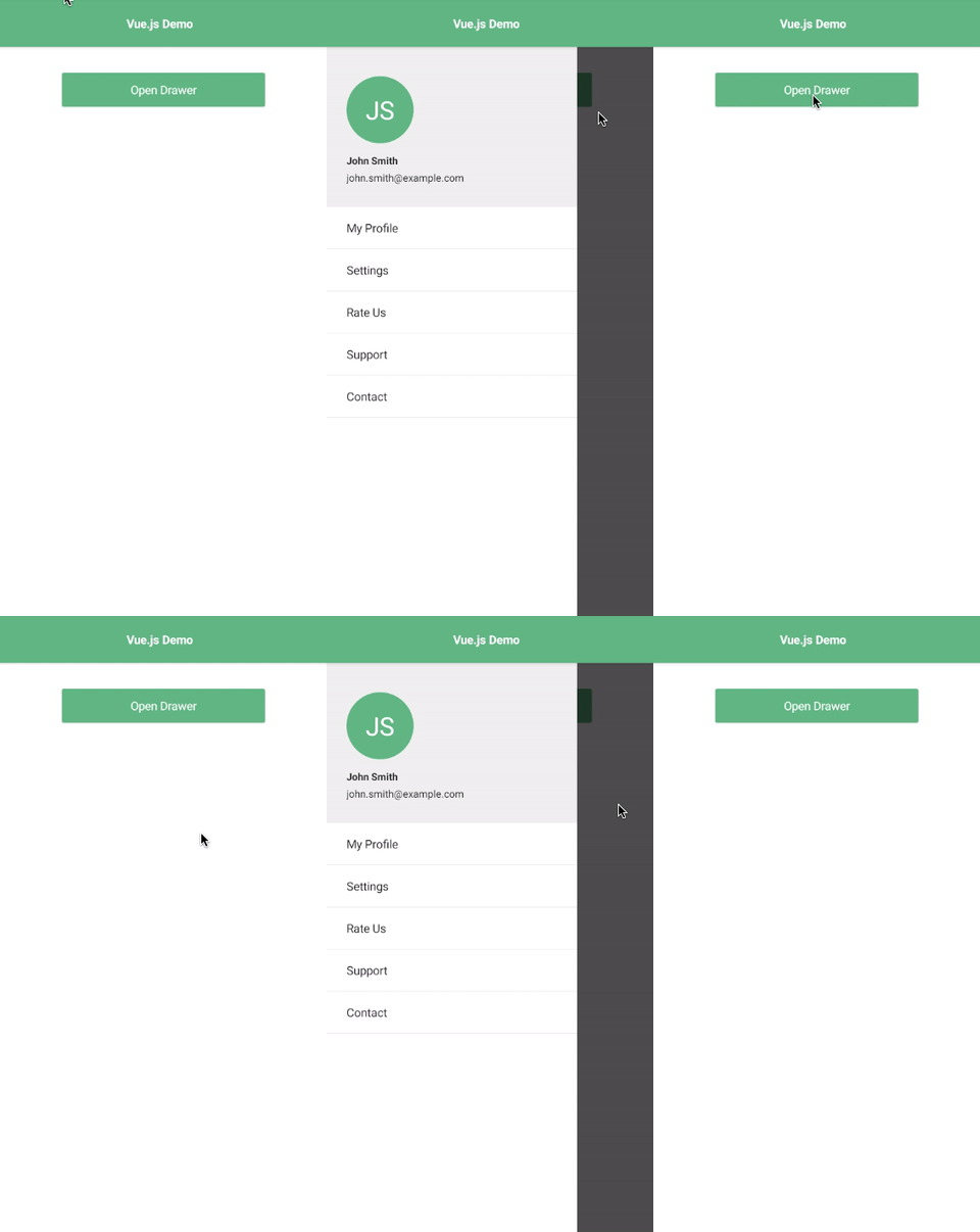
NativeScript plugin that allows you to easily add a side drawer (side menu) to your projects. This can be used as an Open Source alternative to RadSideDrawer.
 |
 |
|---|---|
| iOS Demo | Android Demo |
ns plugin add @nativescript-community/ui-drawer
For gestures to work, make sure to add the following code block inside the main application file (e.g. app.ts):
import { install } from '@nativescript-community/ui-drawer';
install();| Property | Default | Type | Description |
|---|---|---|---|
| leftDrawer | undefined |
View |
View containing the content for the left side drawer |
| rightDrawer | undefined |
View |
View containing the content for the right side drawer |
| topDrawer | undefined |
View |
View containing the content for the top side drawer |
| bottomDrawer | undefined |
View |
View containing the content for the bottom side drawer |
| mainContent | undefined |
View |
View containing the main content of the app |
| gestureEnabled | true |
boolean |
Boolean setting if swipe gestures are enabled |
| backdropColor | new Color('rgba(0, 0, 0, 0.7)') |
Color |
The color of the backdrop behind the drawer |
| leftDrawerMode | slide |
Mode ('under' or 'slide') |
The color of the backdrop behind the drawer |
| rightDrawerMode | slide |
Mode ('under' or 'slide') |
The color of the backdrop behind the drawer |
| gestureMinDist | 10 |
number | The min "swipe" distance to trigger the menu gesture |
| leftSwipeDistance | 40 |
number | The "left" zone size from where the gesture is recognized |
| rightSwipeDistance | 40 |
number | The "right" zone size from where the gesture is recognized |
| topSwipeDistance | 40 |
number | The "top" zone size from where the gesture is recognized |
| bottomSwipeDistance | 40 |
number | The "bottom" zone size from where the gesture is recognized |
| leftOpenedDrawerAllowDraging | true |
boolean | Allow dragging the opened menu |
| rightOpenedDrawerAllowDraging | true |
boolean | Allow dragging the opened menu |
| topOpenedDrawerAllowDraging | true |
boolean | Allow dragging the opened menu |
| bottomOpenedDrawerAllowDraging | true |
boolean | Allow dragging the opened menu |
| Name | Return | Description |
|---|---|---|
| open() | void |
Programatically open the drawer |
| close() | void |
Programatically close the drawer |
| toggle() | void |
Programatically toggle the state of the drawer |
| install() | void |
Install gestures |
| Name | Event Data | Description |
|---|---|---|
| open | side, duration |
Drawer opens |
| close | side, duration |
Drawer closes |
Import the module into your project.
import { DrawerModule } from "@nativescript-community/ui-drawer/angular";

@NgModule({
    imports: [
        DrawerModule
    ]
    schemas: [
        NO_ERRORS_SCHEMA
    ]
})

export class AppModule { }
Then in your component add the following:
<Drawer>
    <GridLayout leftDrawer backgroundColor="white">
      <Label text="This is the side drawer content"></Label>
    </GridLayout>

    <StackLayout mainContent backgroundColor="white">
      <Label text="This is the main content"></Label>
    </StackLayout>
</Drawer>
For a more complete example, look in the demo-ng directory.
Register the plugin in your app.js.
import DrawerPlugin from '@nativescript-community/ui-drawer/vue'
Vue.use(DrawerPlugin);
Then in your component add the following:
<Drawer>
    <GridLayout ~leftDrawer backgroundColor="white">
      <Label text="This is the side drawer content" />
    </GridLayout>

    <StackLayout ~mainContent backgroundColor="white">
      <Label text="This is the main content" />
    </StackLayout>
</Drawer>
For a more complete example, look in the demo-vue directory.
Register the plugin in your app.ts.
import DrawerElement from '@nativescript-community/ui-drawer/svelte';
DrawerElement.register();
Then in your component, add the following:
<drawer>
    <gridlayout prop:leftDrawer backgroundColor="white">
      <Label text="This is the side drawer content" />
    </gridlayout>

    <stacklayout prop:mainContent backgroundColor="white">
      <Label text="This is the main content" />
    </stacklayout>
</drawer>
For a more complete example, look in the demo-svelte directory.
Register the plugin in your app.ts.
import DrawerElement from '@nativescript-community/ui-drawer/react';
DrawerElement.register();
Then in your component, add the following:
import { Drawer } from "@nativescript-community/ui-drawer/react"<Drawer>
<gridLayout nodeRole="leftDrawer" backgroundColor="white" width="300">
<label text="This is the side drawer content" />
</gridLayout>
<stackLayout nodeRole="mainContent" backgroundColor="white">
<label text="This is the main content" />
</stackLayout>
</Drawer>For a more complete example, look in the demo-react directory.
This repository includes Angular, Vue.js, and Svelte demos. In order to run these execute the following in your shell:
$ git clone https://github.com/@nativescript-community/ui-drawer
$ cd ui-drawer
$ npm run i
$ npm run setup
$ npm run build && npm run build.angular
$ cd demo-ng # or demo-vue or demo-svelte or demo-react
$ ns run ios|android

