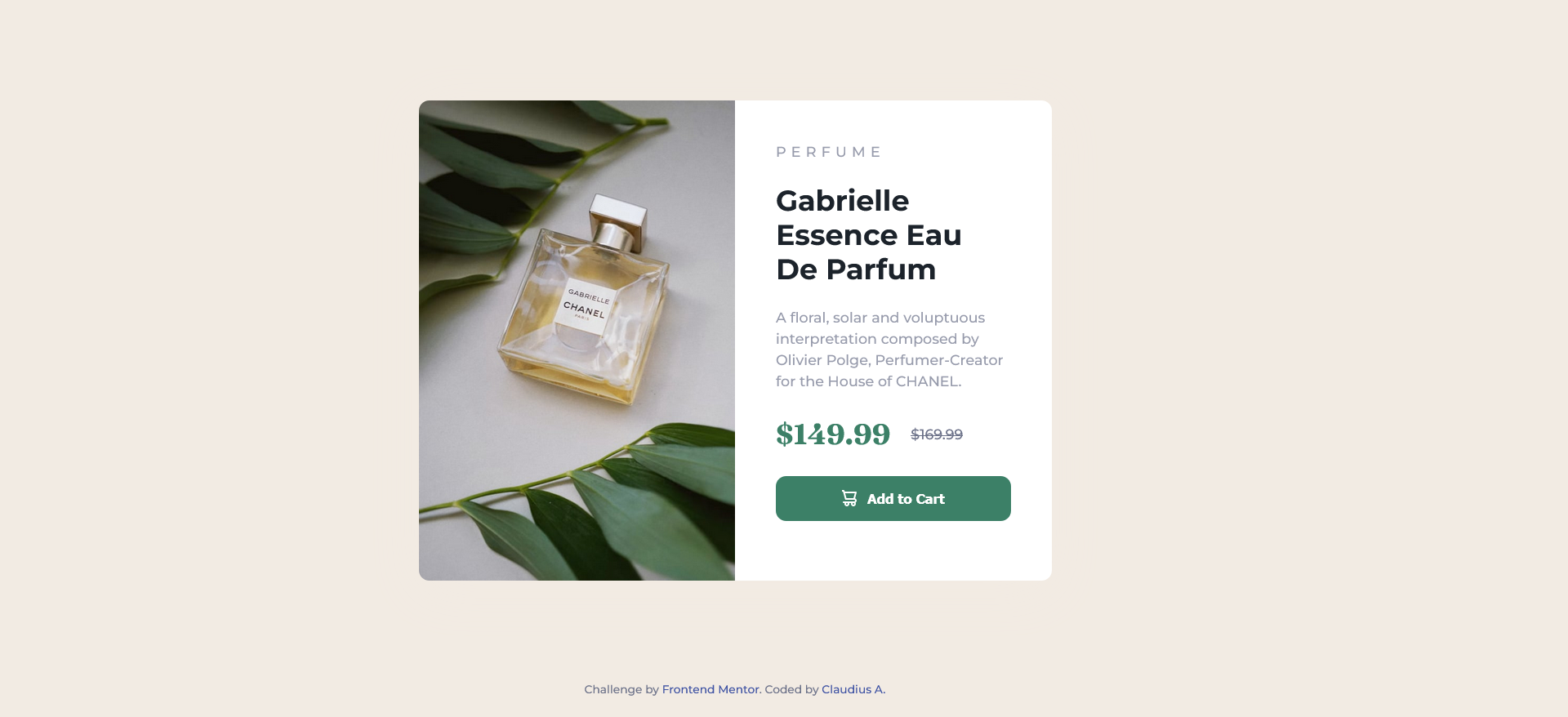
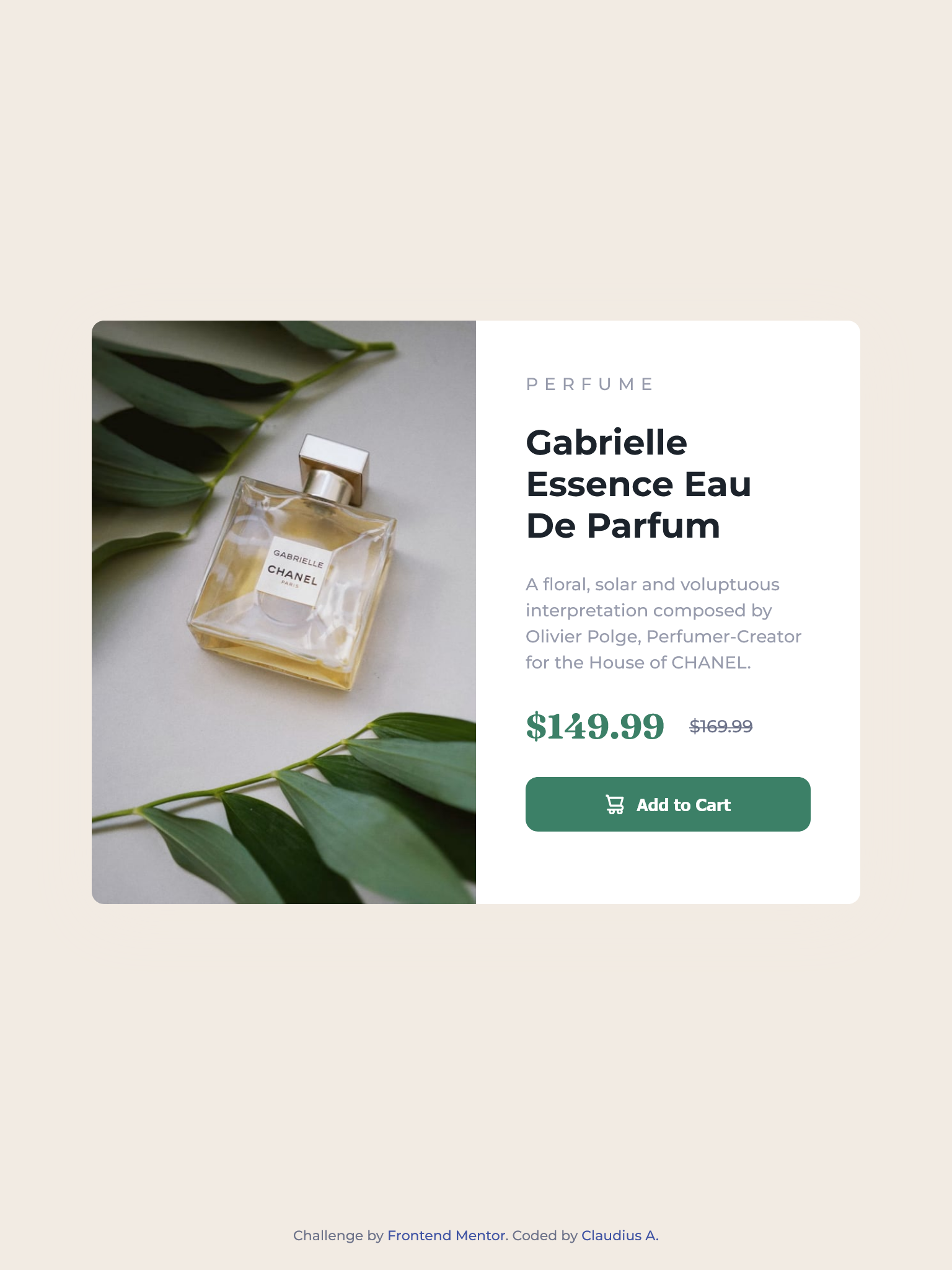
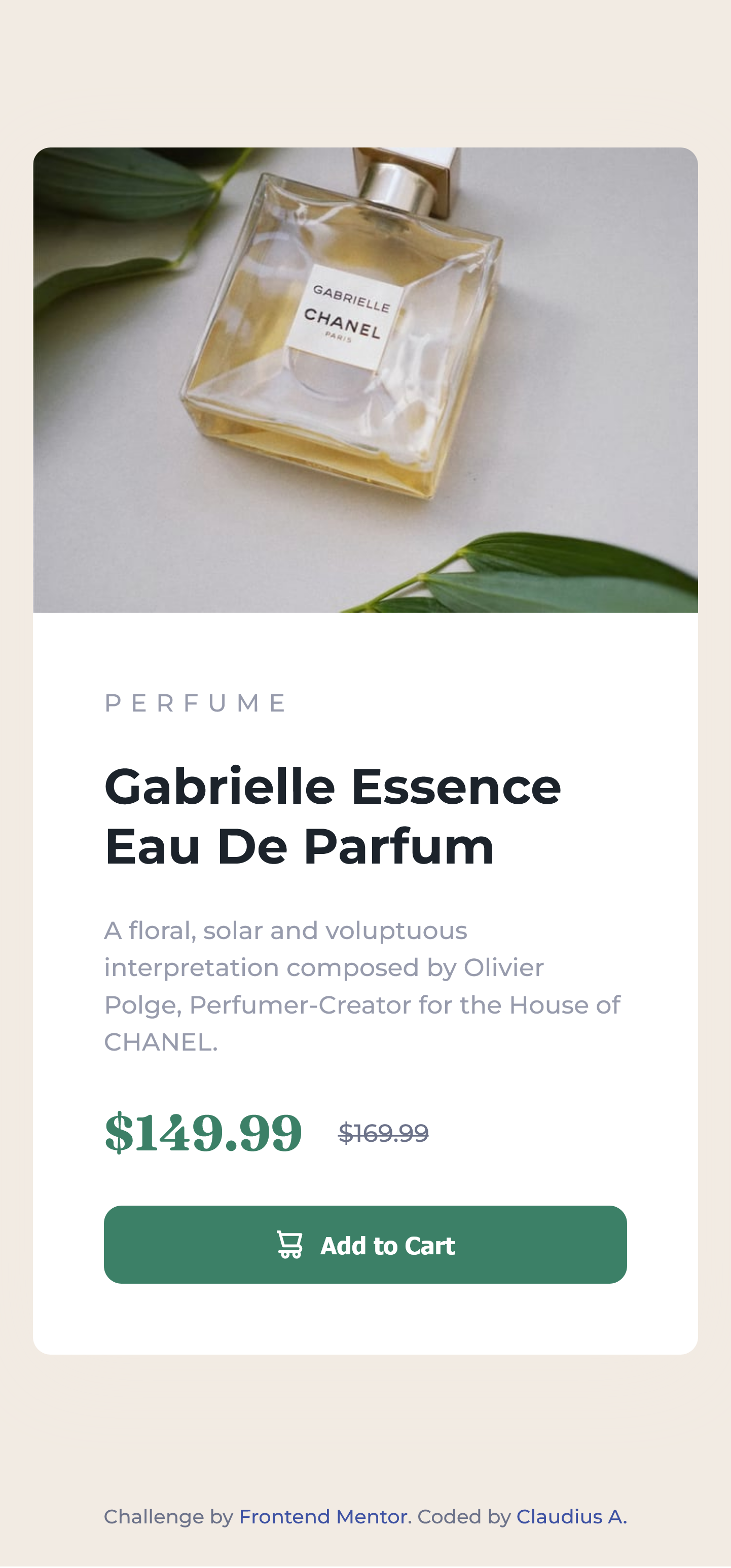
This is a solution to the Product preview card component challenge on Frontend Mentor. Frontend Mentor challenges help you improve your coding skills by building realistic projects.
Users should be able to:
- View the optimal layout depending on their device's screen size
- See hover and focus states for interactive elements
- GitHub: https://github.com/ClaudiusAyadi/2-Product-Card.git
- Live Site URL: https://product-card-dovely.netlify.app/
- I read the challenge brief on the Frontend Mentor website.
- I downloaded the material provided and unzipped it into my working folder.
- I set up a new repo for the challenge and push all the files to GitHub.
- To start, I read through the style guide, then structured the HTML using the preview image provided, and set up the CSS root variables and font styles using the style guide.
- Finally, I focused on the CSS to get a near-perfect design and added 100% responsiveness.
- Pushed the final design to GitHub, deployed it to Netlify, submit the challenge, and updated the README.md.
- Semantic HTML5 markup
- CSS custom properties
- Flexbox
- CSS Grid
- Mobile-first workflow
I finally learned to place the footer at the bottom of the screen. This has been my major issue when working with fullscreen design (100vh). Using place-items: center for grid or justify-content: center for flex (column direction) would get the content centered on the screen. Issues arise when I try to place the footer at the bottom of the screen.
<footer>Content</footer>Using margin - auto solved the issue eventually.
.card {
  margin: auto;
}
I would like to know if there's a better way to solve this.
I hope to develop more card components for different uses. This particular design will be used as the foundation for my product card when I'm building my e-commerce capstone project. The card would also be functional using Javascript and API to dynamically fill it, and clicking on the Add to Cart button would add the item or product to the cart.
I would love to connect with you. I am currently looking for coding buddies to build amazing projects together. My current stack: HTML, CSS, TailwindCSS, and Javascript (beginner).
- Website - Claudius A.
- Frontend Mentor - @ClaudiusAyadi
- Twitter - @ClaudiusAyadi


