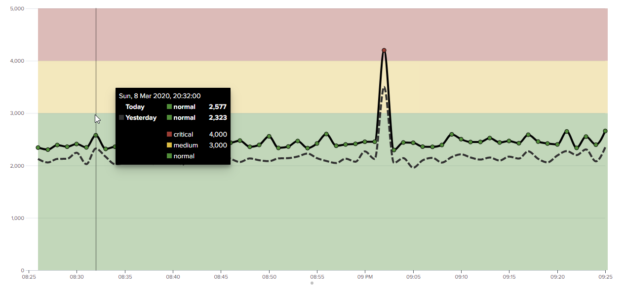
Region Chart Viz
A line chart visualization that supports data-driven, colored regions.
Can be used to show:
- configured thresholds
- the spread of data (for example using standard deviation/interquartile range)
- where data might be incomplete (because it is still arriving)
- maintenance periods
- business hours
Provide valuable context to your line charts. Built with D3.
See also Get ITSI Thresholds - a custom command to retrieve ITSI time-based thresholds.
Copyright (C) 2020 Chris Younger | Splunkbase | Source code | Questions, Bugs or Suggestions | My Splunk apps