

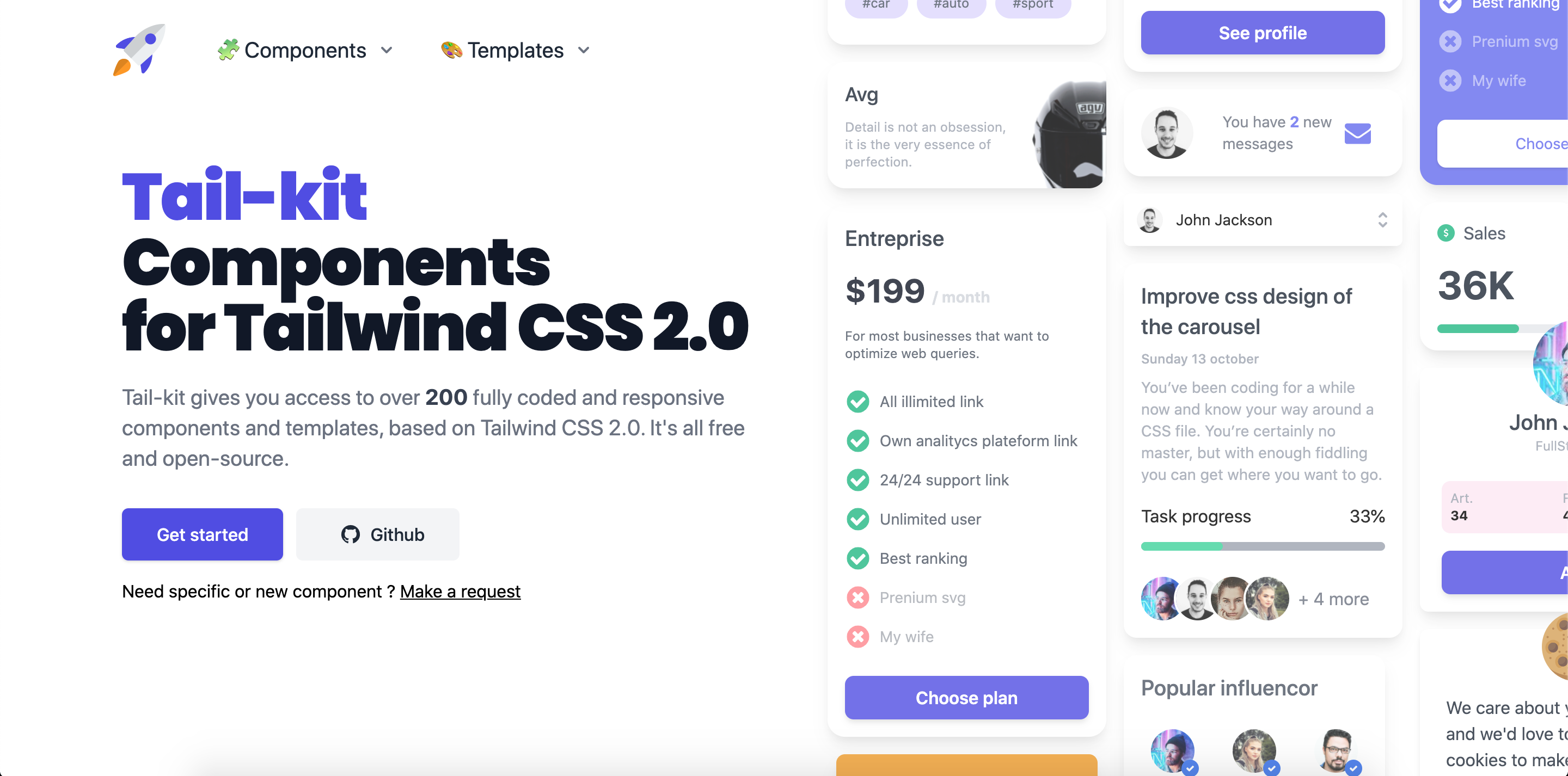
Tail-Kit is Free and Open Source. It does not change or add any CSS to the already one from TailwindCSS 3.0. It features multiple HTML elements that can be used in all web projects who's use tailwind CSS.
Tailwind Starter Kit comes with 230+ Fully Coded CSS elements.
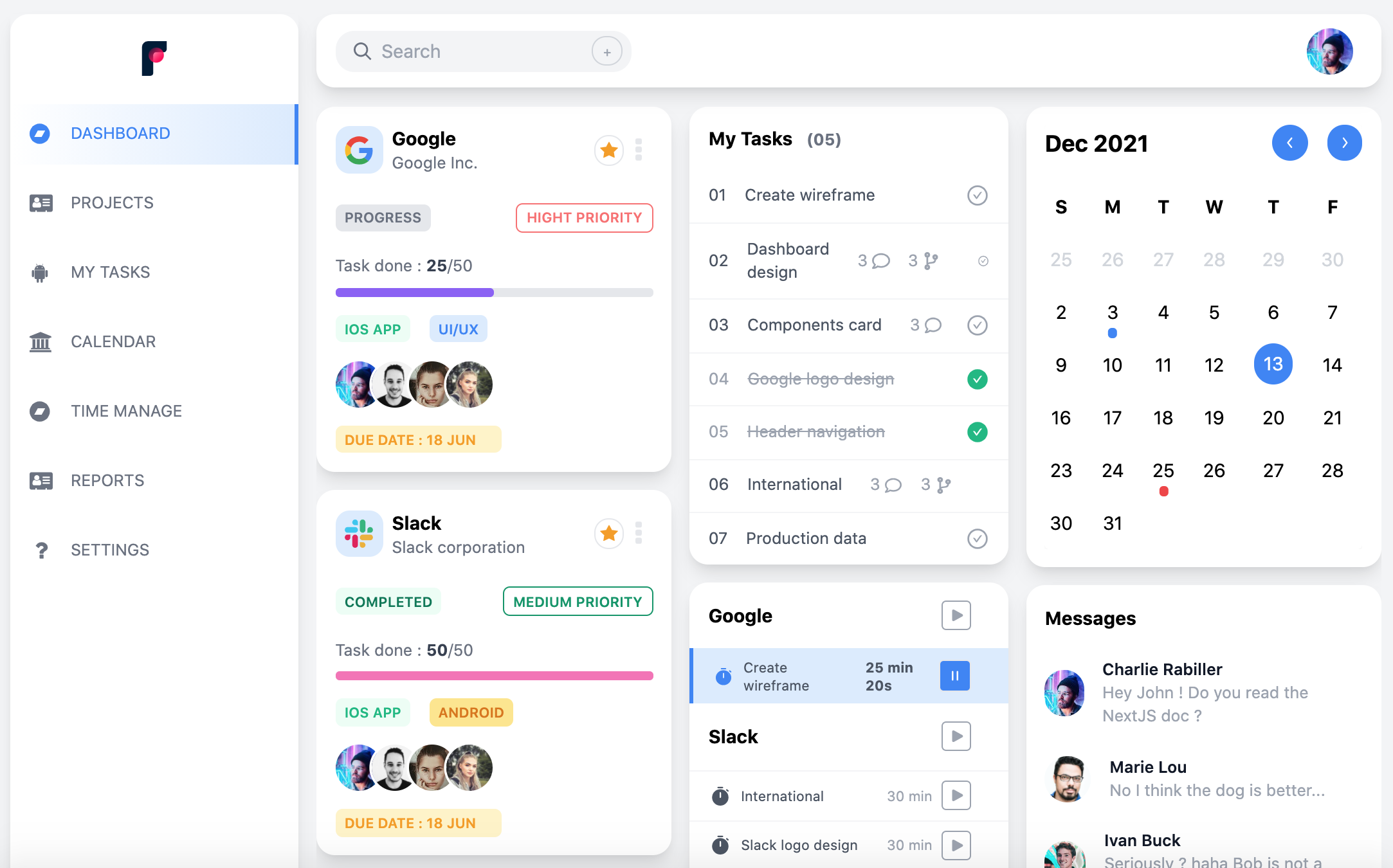
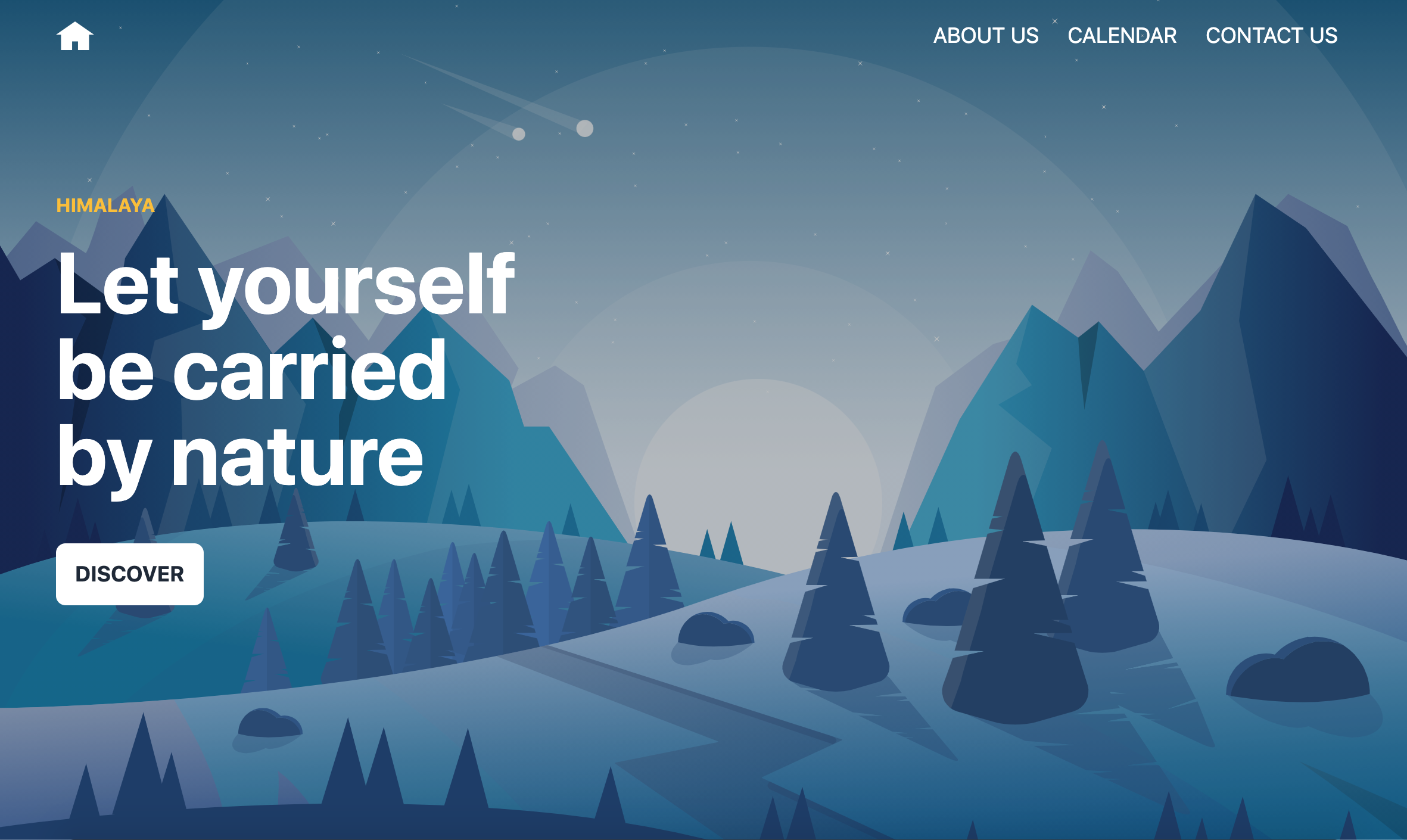
Tailwind Starter Kit contains many templates like dashboards, landing pages, login pages etc. All are fully Coded and ready to copy paste.
and much more !!

Tailwind-kit include a live code editor to change the components code and see in live the modification.
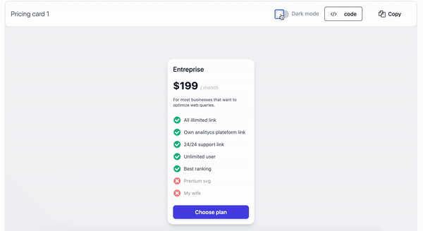
Most components and templates are implemented with a light and dark version, with the new dark mode 3.0 feature of tailwind CSS.
The documentation for the Tailwind-kit is hosted at our website.
At present, we officially aim to support the last two versions of the following browsers:
| Chrome | Firefox | Edge | Safari | Opera |
|---|---|---|---|---|
 |
 |
 |
 |
 |
Every Issues, and PR are welcome ! the site is not perfect, there must be typos, bugs, improvements. Do not hesitate to contribe and add your own components/layout.
Tail-Kit is a static site build with Next.js and typescript.
Node.js 10.13 or later
Recommanded : Node v12.18.3
Install dependencies:
npm install
# or
yarn install
Run the development server:
npm run dev
# or
yarn dev
Open http://localhost:3000 with your browser to see the result.
You can start editing the page by modifying pages/_index.tsx. The page auto-updates as you edit the file (static folder : /out).
Build the static site:
npm run build
# or
yarn buildA quick look at the important repo files and directories you'll see in a the project.
.
├── node_modules
├── public
├── pages
├── components
	 ├── kit
        ├── components
        ├── templates
     ├── layout
     ├── site
├── utils
├── editorTheme.tsx
├── global.css
├── LICENSE
├── next.config.js
├── tailwind.config.js
├── package.json
├── README
├── tsconfig.json
├── .gitignore
└── yarn.lock.json
-
/node_modules: This directory contains all of the modules of code that your project depends on (npm packages) are automatically installed. -
/public: This directory contain all the public assets that need the project (images, icons). -
/pages: This directory contain all pages of the app. See NextJs pages documentation for more details -
/components: This directory contain all components and templates of the app.- kit : contains all components and templates used for demonstration/preview. Component/templates are sorted by section (Commerce, Elements, Forms ...). Each section have his directory.
- layout : contains all layout used in the application. See NextJs layout documentation for more details
- site : contains all component used for the structure of the application (header, footer, home, ...)
-
/utils: This directory contain all utils classes, like html parser, html beautifier (use to indent the components code on preview) -
editorTheme.tsx: This file is the configuration theme (colors) for the components code preview. See react-prism for more details -
global.css: This css file contain all the 'custom' css use for the app (home page animation) -
LICENSE: Bulma-css is licensed under EULA. -
next.config.js: This file contain all the nextJS configuration. Here we use the default one. -
tailwind.config.js: This file contain all the Tailwind configuration. -
package.json: A manifest file for Node.js projects, which includes things like metadata (the project’s name, author, etc). This manifest is how npm knows which packages to install for your project. -
README.md: A text file containing useful reference information about your project. -
tsconfig.json: The presence of a tsconfig.json file in a directory indicates that the directory is the root of a TypeScript project. The tsconfig.json file specifies the root files and the compiler options required to compile the project. -
.gitignore: This file tells git which files it should not track / not maintain a version history for. -
yarn-lock.json(Seepackage.jsonbelow, first). This is an automatically generated file based on the exact versions of your npm dependencies that were installed for your project. (You won’t change this file directly).
Components and templates are sorted by category.
Categories are sorted by section.
A section can have one or more category.
Category can have one or more component/templates.
To add a new main section like Commerce, Element, Form .. you must :
- Create your new directory in components/kit/components/{yourSectionName} or components/kit/templates/{yourSectionName}. It's inside this directory that you will put all your components/templates files.
- Create a index.tsx file on this new directory. It will contain the description (categories names, components/tempaltes numbers, title, ....) of the section. See other section files for an example.
- Each time you want create a new category on a section you will need create a directory in the directory of this one. Then you will put the component/templates file in the category directory.
See an example :
├── components
	 ├── kit
     	├── components
        	├── MyNewSection // section directory
            	index.tsx // section description file
            	├── MyCategory // category directory
                		MyComponent.tsx // My component source file
                        MyComponent2.tsx // My component source file
                        ....
        ├── templates
     ├── layout
     ├── site
├── ...
└── ...
As seen just above, to create a new category you need to create a directory on a section that will contains your components. We also need to create the category page.
- Create your new directory in pages/components/{yourCategoryName} or pages/templates/{yourCategoryName}. It's inside this directory that we will put the category page code.
- Create a index.tsx file on this new directory. It will contain all the components/templates that we want import and see in this category. See other category files for an example.
- When index.tsx is created NextJs create a route for this category that we can see on : http://localhost:3000/components/{yourCategoryName} or http://localhost:3000/templates/{yourCategoryName}
Components and templates are classics React functional component.
If you want that your component have a dark version, use Tailwind classes for dark mode (documentation).
The last thing to do is to import your component/template on the wanted category file : (/pages/components/{category}/index.tsx) or (/pages/templates/{category}/index.tsx)
To enabled all feature preview like live edition, dark mode, ... you need to pass our component to ComponentLayout.
ComponentLayout is the layout who will add all buttons (Code, Copy, Dark mode) and the live edition feature on our component.
ComponentLayout take few props :
element: The JSX.Element of our componentcomponent: The componenttitle: The title of the component display on the paneljsLink: The link of the component codeon github (if need JS to work)needConfiguration: Boolean if the component/template need a custom tailwind configuration to workvertical: Boolean if the code preview is display on side of the component or belowshowSwitchMode: Boolean if the component have dark/light implementation (Display or hide the dark mode checkbox)containerClasses: Classes to add on the container of the component (ex : add margin, padding ...)
| propName | propType | defaultValue | isRequired |
|---|---|---|---|
| element | JSX.Element | x | |
| component | x | ||
| title | string | x | |
| jsLink | string | ||
| needConfiguration | boolean | false | |
| vertical | boolean | false | |
| showSwitchMode | boolean | false | |
| containerClasses | string |
Example of the index.tsx file of the toggle category :
import React, { FC } from "react";
import AppLayout from "../../../components/layout/AppLayout";
import ComponentLayout from "../../../components/layout/ComponentLayout";
import SectionHeader from "../../../components/site/header/SectionHeader";
import FormSubscribe from "../../../components/kit/components/form/layout/FormSubscribe";

const TogglePage: FC = () => {
  return (
     <AppLayout
      title="Toggle, Checkbox and Radio buttons components for tailwind css"
      desc="Free and open source toggle, checkbox and radio buttons components for tailwind css"
    >
      <SectionHeader title="Form layout" />
      <ComponentLayout
        title="Subscribe"
        element={<FormSubscribe label="Subscribe" placeholder="Email" />}
        component={FormSubscribe}
      />
    </AppLayout>
  );
};

export default TogglePage;To learn more about Next.js, take a look at the following resources:
- Next.js Documentation - learn about Next.js features and API.
- Learn Next.js - an interactive Next.js tutorial.
You can check out the Next.js GitHub repository - your feedback and contributions are welcome!
-
Copyright 2020 Charlie Rabiller
-
Licensed under MIT