This is a modular Multi Select component made with React, TypeScript and Styled Components.
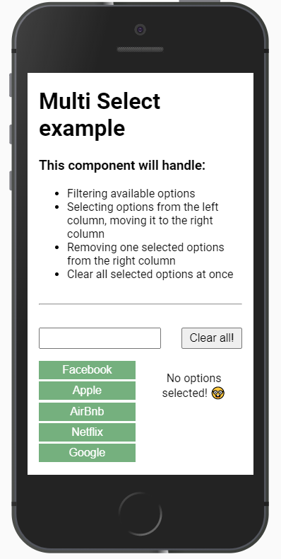
It's responsive for any device size, fitting by default the whole width of it's container, so it's easily adaptable for any container you want to wrap this Multi Select with.
This component is a concept what will evolve with time, and after adding more customization options to it and some tests, I'll make a npm package so it's easily installable in any project.
import { MultiSelect } from 'path/to/MultiSelect.tsx';

<MultiSelect options={[]} selection={[]} onChange={() => {}} clearAllEnabled />
As you can see in the interfaces and the way App.tsx is rendering the component, the props we can use are:
options=> An array of elements { id: string | number; value: string }.selection=> An array of elements { id: string | number; value: string }. As the Multi Select component is controlled, this should be an external state.onChange=> A function that changes the external state to control de input.clearAllEnabled=> A boolean so you can choose to have theClear All!button available. Defaults totrue.
A way to control the component would be something similar to what is being rendered in App, like this useState:
const [selection, setSelection] = useState([]);
Mobile view:
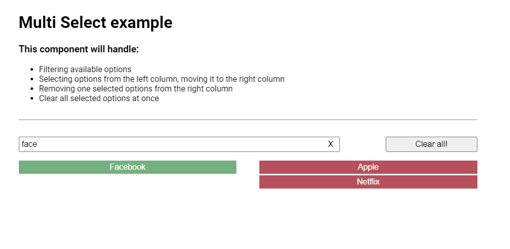
Desktop view:
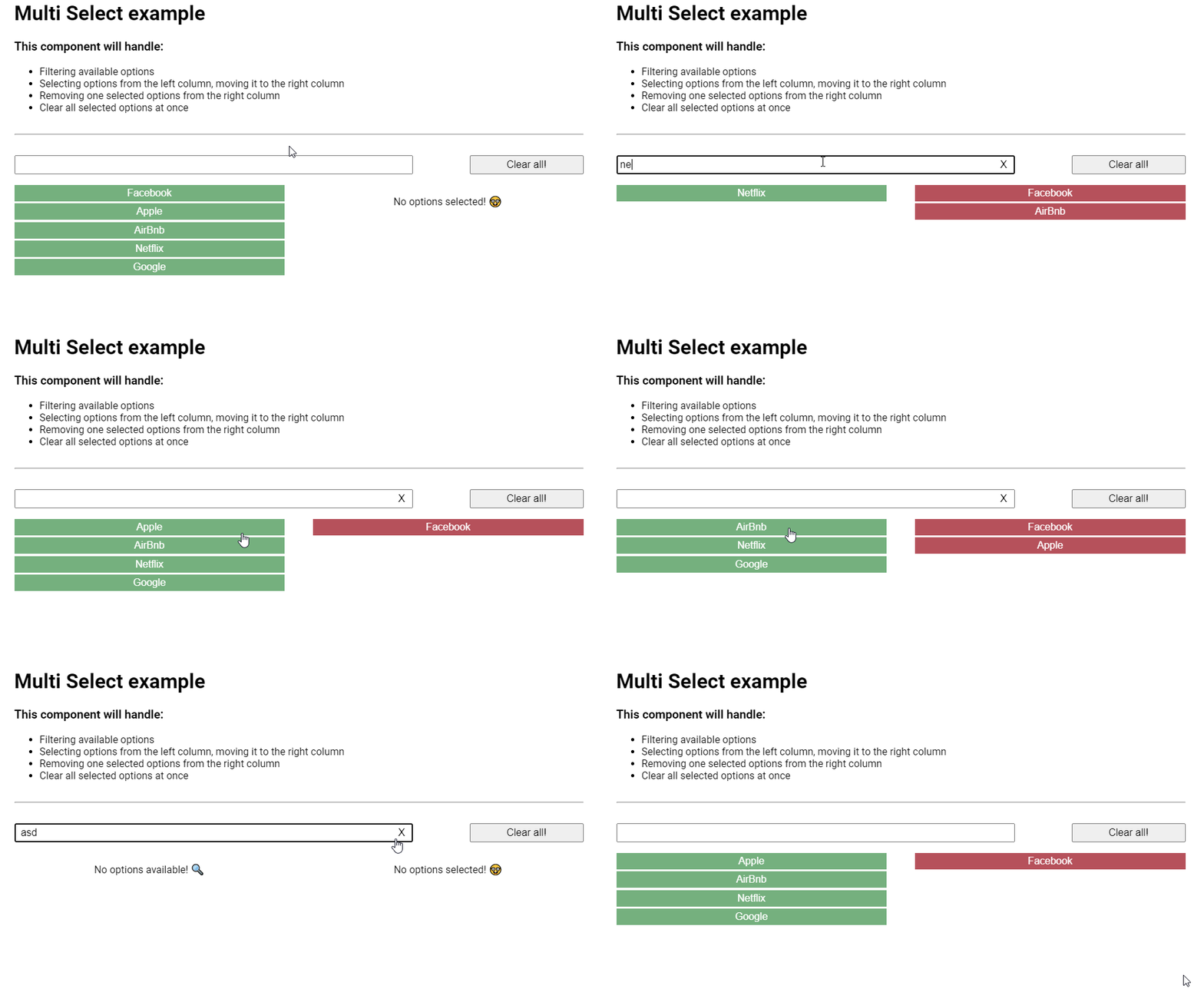
GIF:


