Parking tickets. The dread of city dwellers everywhere. The Washington DC government has published a wealth of data about the tickets it hands out through its excellent opendata.dc.gov portal. This provides an interesting opportunity for data-minded people. I initially planned to merge shapefiles covering the past year, but there are so many rows in each dataset that I realized combining would have made it difficult for others to reproduce my analysis. Therefore this analysis uses the most recent shapefile, which contains data for April, 2016.
library(magrittr)
library(ggplot2)
library(scales)
library(ggthemes)
library(plyr)
library(dplyr)
library(rgdal)
library(choroplethr)
library(ape)
library(hexbin)

# Unzip the file
unzip("./data/Parking_Violations_in_April_2016.zip", exdir = "./data", overwrite = TRUE)

# Read the shapefile
april16 <- readOGR(dsn = "./data" , layer = "Parking_Violations_in_April_2016")
## OGR data source with driver: ESRI Shapefile
## Source: "./data", layer: "Parking_Violations_in_April_2016"
## with 260405 features
## It has 17 fields
Let's dive into the data! Let's see what happens when we visualize the data using base r's plot command.
plot(april16) Not very useful. All you see are markings in the shape of Washington DC. We can safely conclude that parking tickets are issued all over the District. But the tickets evenly distributed or are there hotspots where more tickets are given out than other places? Let's answer that question using base R's smoothScatter function.
april16@coords %>%
  smoothScatter(axes = FALSE, xlab = "", ylab = "")
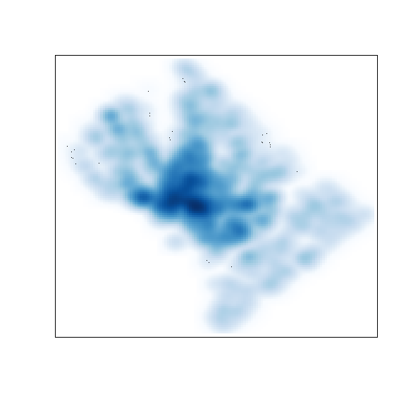
It looks like there's some clustering around downtown, but the chart is blurry and doesn't tell us how many tickets were issued in each area. The hexbin package can help us here.
# For the plot command I modified the color selection from this gist:
# https://gist.github.com/cameronbracken/317960
april16@coords %>%
hexbin %>%
plot(.,colramp=colorRampPalette(c('green','red')),border=gray(.75), xlab = "", ylab = "")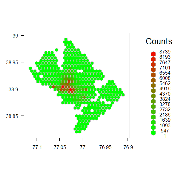 Much better! We can see that the downtown effect is larger than smoothScatter suggested. We can also clearly see holes in the data where there are parks and rivers.
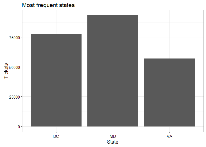
Each parking ticket records the state of the offending car. As you'd expect, most ticketed cars come from the DC area, but nearby Maryland eclipses DC for first place.
summary_state <- april16$RP_PLATE_S %>%
  as.character() %>%
  table() %>%
  tbl_df

summary_state <- setNames(summary_state, c("State", "Tickets")) %>%
  dplyr::arrange(desc(Tickets)) %>%
  top_n(3)

names(summary_state) <- c("State", "Tickets")

ggplot(summary_state, aes(x = State, y = Tickets)) +
  geom_bar(stat="identity") +
  ggtitle("Most frequent states") +
  theme_bw()
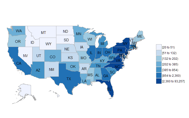
What about other states? Let's look at a map of the entire country to see whose drivers are ticketed the most. You see high numbers of tickets throughout the Northeast Corridor. Unsurprisingly, very few tickets are given to cars from Alaska or Hawaii.
state.name[match(as.character(april16$RP_PLATE_S), state.abb)] %>%
  tolower %>%
  table %>%
  data.frame %>%
  setNames(c("region", "value")) %>%
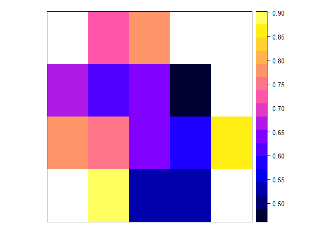
state_choroplethLet's combine our two analyses. Is there a difference in the percentage of parking tickets that are given to locals versus people from other states based on where in the city the ticket is issued? In order to be as methodical as possible, I'll put a grid over the entire city and aggregate the percentages of locals vs. non-locals in each cell of the grid.
# Special thanks to this thread for helping me create the grid:
# http://gis.stackexchange.com/questions/88830/overlay-a-spatial-polygon-with-a-grid-and-check-in-which-grid-element-specific-c
bb <- bbox(april16)
cs <- c(.05, .05)
cc <- bb[, 1] + (cs/2)
cd <- ceiling(diff(t(bb))/cs)  # number of cells per direction
grd <- GridTopology(cellcentre.offset=cc, cellsize=cs, cells.dim=cd)

sp_grd <- SpatialGridDataFrame(grd,
                               data=data.frame(id=1:prod(cd)),
                               proj4string=CRS(proj4string(april16)))

xy <- april16@coords %>%
  tbl_df %>%
  cbind(sp::over(april16, sp_grd))

# Assign a grid number ("id") to each row of the dataset
xy <- april16@data %>%
  cbind(sp::over(april16, sp_grd)) %>%
  mutate(tourist = ifelse(RP_PLATE_S %in% c("DC"), 0, 1)) %>%
  dplyr::select(id, tourist) %>%
  group_by(id) %>%
  dplyr::summarize(tourist = mean(tourist))

sp_grd@data <- left_join(sp_grd@data, xy)

spplot(sp_grd, "tourist")
The analysis shows substantial variation based on the part of the city. White cells are outside of the District's borders and can be ignored. The north and west parts of the city clearly have more tickets being given to non-DC residents.
