Detailed guide about CSS (all basics for CSS).
Part 3 contains : Responsive layouts with CSS (Grid-Layouts).
The code examples in the guide can be found in the listed folders.
- Introduction to CSS
- 1.1. History of CSS
- 1.2. Principle of CSS application
- 1.3. Embedding CSS into HTML
- 1.4. Analyze CSS in the web browser
- The CSS selectors
- 2.1. The simple selectors of CSS
- 2.2. Combinators
- Inheritance and the cascade
- 3.1 The principle of inheritance in CSS
- 3.2. Understanding the control system of the cascade
- 3.3. Pass values to CSS properties
- The box model of CSS
- 4.1. The classic box model
- 4.2. The newer alternative box model of CSS
- 4.3. Design boxes
- 4.4. CSS Vendor Prefixes
- CSS positioning
- 5.1. Positioning with the CSS property
position - 5.2. Stacking with
z-index - 5.3. Floating boxes with
float - 5.4. Flexible boxes (flexbox model)
- 5.1. Positioning with the CSS property
- Responsive layouts with CSS
- 6.1. Theoretical basic knowledge about responsive web design
- 6.2. Create a responsive layout
- 6.3. Responsive layouts with images
- 6.4. The CSS Grid Layout
- 6.5. Change the behavior of HTML elements with
display - 6.6. Calculation with CSS and the
calc()function
- Styling with CSS
- 7.1. Text design with CSS
- 7.2. Design lists with CSS
- 7.3. Tables with CSS
- 7.4. Images and graphics with
widthandheight - 7.5. Transfom elements
- 7.6. Style HTML forms with CSS
- Testing and organizing
- 8.1 Validate HTML and CSS
- 8.2. View websites in different sizes
- 8.3. Set up central stylesheet
- Useful websites about CSS
Today, responsive layouts are used to display a suitable web page for the user for any device width.
The way the Internet is accessed today has become very versatile. Where a few years ago a website was only viewed with a desktop PC or laptop, today many other devices such as tablets, smartphones, e-book readers, game consoles or TVs have joined the mix. The challenge here is to respond to the screen size and screen resolution of each device with a suitable layout.
Statistics confirm the trend that mobile devices are now the most used devices when visitors are on the web.
The most common standard sizes:
- Smartphone: 320 to 480 pixels
- Tablets: 768 to 1024 pixels
- Desktop PCs: 1024 pixels and above
Instead of creating and maintaining countless layout versions for the same website, responsive web design is used. In this technique, the characteristics of the device are taken into account to adapt the website to achieve an optimal and custom display for the device. The main criterion for such a layout is the screen size of the device and the available input method, e.g. mouse or touch screen.
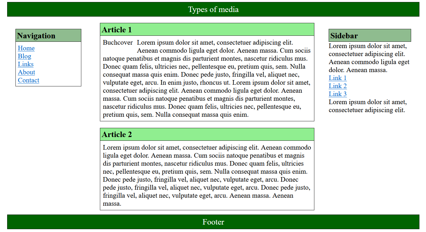
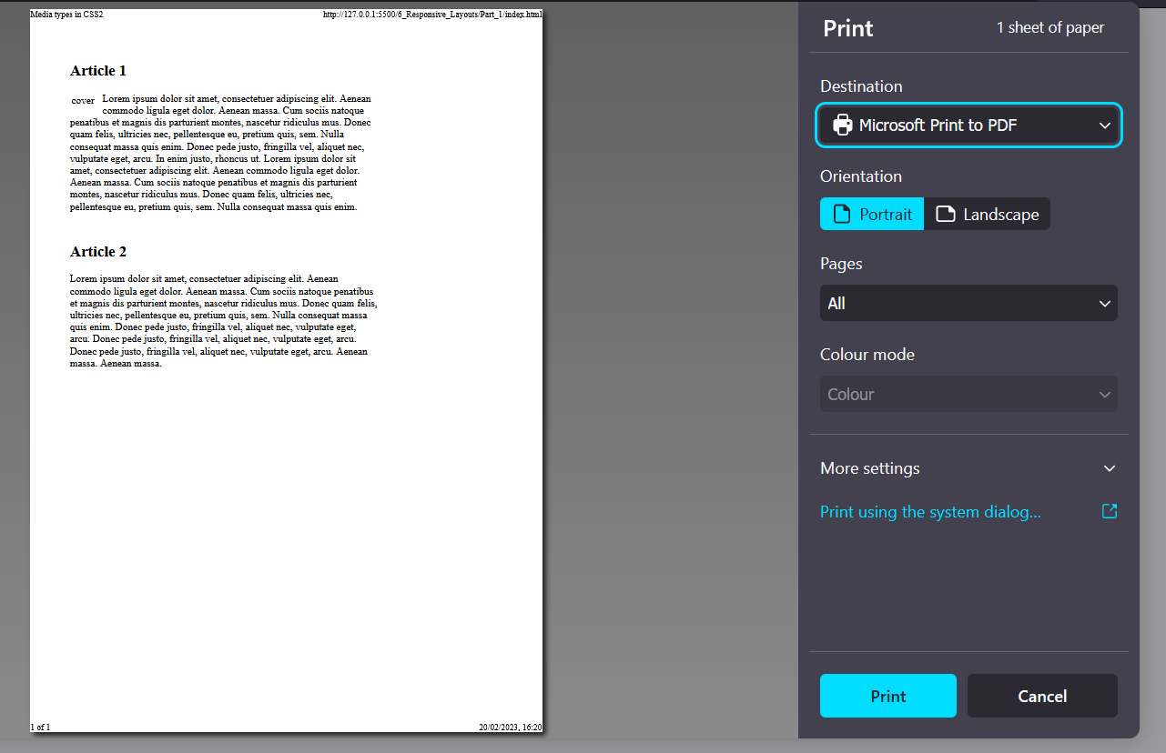
Using the link element, CSS instructions are provided for the screen (media="screen") and a special version for the printer (media="print"). If the media type is not defined, then the CSS instructions automatically apply to all output types (media="all").
Complete Code --> 6_Responsive_Layouts/Part_1
media="screen"
media="print"
-
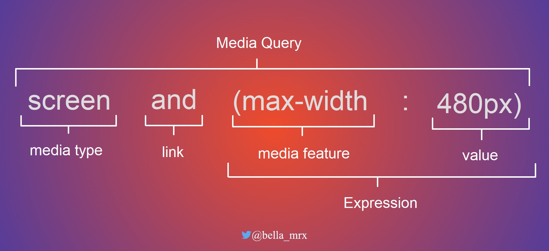
The media features can be included and used in various ways. The use of such a media query in HTML can be noted as follows:
 ...
 <head>
     <link href="styles/style.css" rel="stylesheet" />
     <link href="styles/mobile.css" rel="stylesheet" media="screen and (max-width: 480px)" />
 </head>
 ...
mobile.css is used only if the maximum screen width of 480 pixels is not exceeded. For devices with a higher resolution, only style.css is used.
-
Including queries in the
<style>tag is possible as follows:... <style type="text/css" media="screen and (max-width: 480px)"> /* CSS statement for screen up to max. 480 pixel */ </style> ... -
Embedding directly into the stylesheet with
@media:... .main { background-color: blue; } @media screen and (max-width: 480px) { .main { background-color: yellow; } } ...
If the maximum screen size of 480 pixels is not exceeded, the background is displayed in yellow.
-
Use media features with the
@importrule as follows:@import url('styles/mobile_480.css') screen and (max-width: 480px);
Thus, querying media features can be used in HTML with the link element or in the style element and in CSS with the @media or @import rule.
The media features is linked with the keyword and. Several and characteristics can be linked and processed. The link can be made with or without a media type.
For example:
 @media screen and (min-width: 960px) {
     /* CSS statement for desktop */
 }
 @media screen and (min-width: 768px) and (max-width: 960px) {
     /* CSS statement for tablets and netbooks */
 }
 @media screen and (max-width: 480px) {
     /* CSS statement for smartphones */
 }
If only one media type is to be used, a specification can be made in front of the media type with only.
 @media only screen and (max-width: 480px) {
     /* CSS statement for smartphones */
 }
A media query can also be negated with not.
The various output devices have many different features. The most common feature that is queried is the minimum and maximum width of the display area.
| Media features | Meaning | Values |
|---|---|---|
width,min-width,max-width |
Width of the display area (viewport) of the web browser. Possible values are positive length values e.g. min-width: 480px. |
px, %, em |
height,min-height,max-height |
Height of the display width of the web browser. Possible values are positive length values e.g. max-height: 720px. |
px, %, em |
orientation |
This sets the orientation of the device from. The orientation can be portrait or landscape e.g. orientation: landscape. |
portrait, landscape |
aspect-ration, min-aspect-ration, max-aspect-ration |
Specifies the aspect ratio of width and height to each other. A value of 1280 x 720 corresponds to an aspect ratio of 16:9. |
width/height e.g. 16/9, 1280/720 |
color, min-color/max-color |
Query the color depth of the device. For black and white devices the value for color is 0 | Integer value |
color-index, min-color-index, max-color-index |
Checks the use of indexed colors of the output device | Integer value |
monochrome, min-monochrome, max-monochrome |
Checks if the output device is monochrome. | Integer value |
resolution, min-resolution, max-resolution |
Query the pixel density of the device, e.g. resolution: 720dpi. |
dpi, dcm |
pointer, any-pointer |
Tests if the output device provides a mouse as an input device. | none, coarse, fine |
hover, any-hover |
Checks if the output device provides hover effects at the primary input device. | none, hover |
An overview of all media features can be found at WC3 - Media Queries.
The viewport plays an essential role in terms of querying media features on mobile devices. The viewport on desktop computers and the viewport on mobile devices often causes a bit of confusion. High-resolution displays make it even more complicated, as a pixel is suddenly no longer a pixel. A collection of the many different sizes of displays on different devices can be found at Screensiz.es.
In terms of desktop computers, the viewport is the inner area of the browser window without the borders. When the browser window is reduced or enlarged, the viewport is also reduced or enlarged. This visual viewport can be addressed with the media features width and height. On mobile devices like a smartphone, the screens are much smaller than on a desktop computer, but the viewport there is still often larger than on desktop screens. Without special adjustments to the viewport for mobile devices, therefore, the web page on these devices would often be called a layout viewport.
The problem with mobile devices can be easily solved with the meta-tag viewport or CSS rule @viewport.
-
The metatag
viewportis added in theheadarea of the HTML document<meta name="viewport" content="width=device-width, initial-scale=1.0">
The width=device-width sets the width of the layout viewport to the width of the visual viewport. With this line all different layout viewports from different devices are normalized and adjusted to the current display size. Besides width there is the counterpart with height=device-height for the height, but this is rarely needed in practice.
With initial-scale=1.0 the initial zoom value is set to 100% or 1:1. In addition to initial-scale there are further viewport features with minimum-scale or maximum-scale, with which the minimum and maximum zoom level can be set. With user-scaleable=no zooming can be blocked completely.
-
The
@viewportrule@viewport { width: device-width; zoom: 1; }
In the future the CSS rule @viewport will probably replace the metatag. But not all browsers support this method yet. The advantage of the CSS rule is, that theoretically more is possible, because different media queries can be declared with different information.
Once the viewport has been adjusted, the web page must also be optimized using media queries. The setting of the viewport alone only ensures that the automatic scaling of the web browser has been switched off.
Performing the media query with the unit em is quite helpful, since the screen is measured in pixels. The advantage is that the media query then works correctly even if the font size is changed. This ensures that when the fonts are displayed larger, the next layout level is really triggered and the layout does not collapse.
 @media screen and (min-width: 640px) {
     /* CSS statement for for screens from 640px width */
 }
A breakpoint has been set up here for screens 640 pixels and larger. All CSS statements between the curly brackets are thus only executed from a screen width of 640 pixels. Referring to the recommendation to use the unit em for such breakpoints, the screen size only has to be divided by 16. 16 pixels is usually the browser base font size. 640 pixels divided by 16px is 40em.
This means then:
 /* 640px / 16px = 40em */
 @media screen and (min-width: 40em) {
     /* CSS statement for for screens from 640px width */
 }
The layout is changed during these wraps. In practice, different layouts for different resolutions are provided here, which can be controlled with media queries.
 /* CSS statement for for screens from 640px width */

 /* 640px / 16px = 40em */
 @media screen and (min-width: 40em) {
     /* CSS statement for for screens from 640px width */
 }

 /* 1024px / 16px = 64em */
 @media screen and (min-width: 64em) {
     /* CSS statement for for screens from 1024px width */
 }

 /* 1280px / 16px = 80em */
 @media screen and (min-width: 80em) {
     /* CSS statement for for screens from 1280px width */
 }
Here three common breakpoints have been defined with media queries. The statements are definitely executed before the first breakpoint. Here, in addition to the basic CSS properties, the mobile layout for smartphones can also be defined right away. Subsequently is still for the screen widths 640 pixels (tablets), 1024 pixels (desktop) and 1280 pixels (extra large desktop).
By using the box model with border-box, you do not need to calculate with width, padding and border. This CSS statement should be set right at the beginning.
 html {
     box-sizing: border-box;
 }

 *, *::before, *::after {
     box-sizing: inherit;
 }
Media queries are now understood by all major web browsers. Browsers that cannot handle media queries, the browser uses the base version of the website that was defined before the first breakpoint with a media query. Therefore, it is always recommended to create a base version before the media queries.
Whether a website is first created as a desktop version or as a mobile version, everyone should decide for themselves and also depends on how the page is used. But today it is recommended to start with the mobile version first, because most users consider the mobile version first.
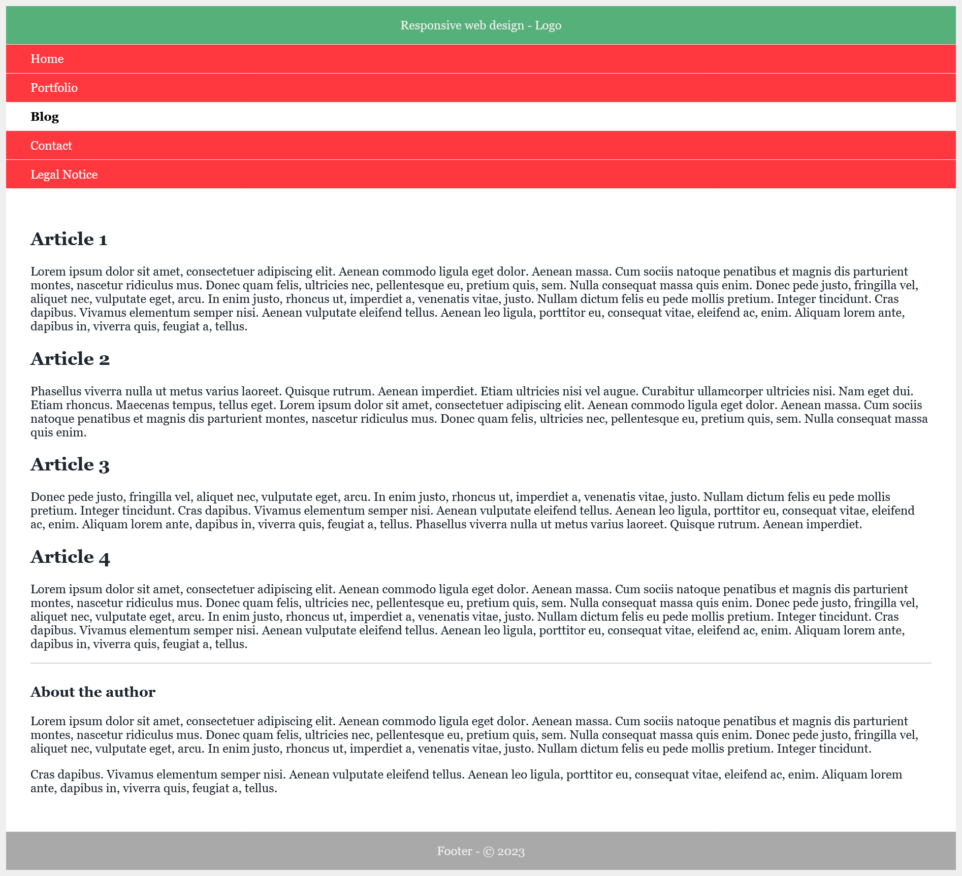
Here is the mobile version first:
Complete Code --> 6_Responsive_Layouts/Part_2/index.html
<!DOCTYPE html>
<html lang="en">
<head>
<meta charset="utf-8">
<title>mobile version</title>
<meta name="viewport" content="width=device-width, initial-scale=1">
<link rel="stylesheet" href="styles/layout.css">
</head>
<body>
<div class="wrapper">
<header class="header">
Responsive web design - Logo
</header>
<nav>
<ul class="nav-ul">
<li class="nav-li"><a href="#" title="dummy" class="nav-li-a">Home</a></li>
<li class="nav-li"><a href="#" title="dummy" class="nav-li-a">Portfolio</a></li>
<li class="nav-li nav-active"><strong class="nav-li-a">Blog</strong></li>
<li class="nav-li"><a href="#" title="dummy" class="nav-li-a">Contact</a></li>
<li class="nav-li"><a href="#" title="dummy" class="nav-li-a">Legal Notice</a></li>
</ul>
</nav>
<div class="container">
<main class="content">
<article class="article">
<h2>Article 1</h2>
<p>Lorem ipsum ... </p>
</article>
<article class="article">
<h2>Article 2</h2>
<p>Phasellus viverra ...</p>
</article>
<article class="article clear">
<h2>Article 3</h2>
<p>Donec pede ...</p>
</article>
<article class="article">
<h2>Article 4</h2>
<p>Lorem ipsum ...</p>
</article>
</main>
<aside class="aside">
<h3>About the author</h3>
<p>Lorem ipsum ... </p>
<p>Cras dapibus... </p>
</aside>
</div>
<footer class="footer">
Footer - © 2023
</footer>
</div>
</body>
</html>
Complete Code --> 6_Responsive_Layouts/Part_2/styles/layout.css
 @charset "UTF-8";
 /* --------------------------------------------------
         General basic settings
  ----------------------------------------------------*/
 html {
     box-sizing: border-box;
 }

 *, *::before, *::after {
     box-sizing: inherit;
 }

 body {
     color: #1d2731;
     background-color: #efefef;
     font-family: Georgia;
 }

 ul {
     padding: 0;
 }

 .wrapper {
     background-color: #ff383f;
 }

 /* ------------------------------------------------------------------
     CSS properties for mobile devices (smaller than 640 px)
     + Arrange everything in one column below each other
 -------------------------------------------------------------------- */
 .header {
     text-align: center;
     padding: 1em ;
     background-color: #55b079;
     color: #efefef;
     border-bottom: 1px solid #efefef;
 }

 .aside {
     border-top: 1px solid #a9a9a9;
     padding-top: 0.5em;
 }

 .footer {
     background-color: #a9a9a9;
     color: #efefef;
     padding: 1em;
     text-align: center;
     border-top: 1px solid #efefef;
 }

 .nav-ul {
     background-color: #ff383f;
     margin:0;
 }

 .nav-li {
     list-style: none;
     margin-left: 0;
     border-bottom: 1px solid #efefef;
 }

 .nav-li-a  {
     padding: 0.6em 2rem;
     display: block;
 }

 .nav-ul a:link {
     text-decoration: none;
 }

 .nav-ul a:link, .nav-ul a:visited {
     color: #fff;
 }

 .nav-ul a:hover, .nav-ul a:focus, .nav-ul a:active {
     background-color: #000;
     color: #efefef;
 }

 .nav-active {
     color: #000;
     background-color: #fff;
 }

 .container {
     background-color: #fff;
     padding: 2em 2rem;
 }
Here is the mobile version + desktop version:
Complete Code --> 6_Responsive_Layouts/Part_3/styles/layout.css
 @charset "UTF-8";
 /* --------------------------------------------------
         General basic settings
 ----------------------------------------------------*/

 ...

 /* ------------------------------------------------------------------
       CSS properties for mobile devices (smaller than 640 px)
         + Arrange everything in one column below each other
 -------------------------------------------------------------------- */

 ...

 /*-----------------------------------------------------
     Tablet version from 640 pixel
     640px / 16px/em = 40em
         + 2 columns
         - Header and navigation on top below each other
 	    - Main content and sidebar next to each other
 	    - Footer bar below
 ------------------------------------------------------*/
 @media screen and (min-width: 40em) {
     .header {
         padding: 1.5em;
         text-align: left;
     }

     .container {
         padding: 3rem 0;
         display: block;
         overflow: auto;
     }

     .content {
         display: block;
         float: left;
         width: 65%;
         padding: 0 1rem 0 2rem;
     }

     .aside {
         display: block;
         margin: 0 0 0 65%;
         width: 35%;
         padding: 0 2rem 0 2rem;
         border-top: none;
     }

     .nav-ul {
         padding: 0 2rem;
         overflow: hidden;
     }

     .nav-li {
         float: left;
         display: inline-block;
         border: none;
         width: auto;
     }

     .nav-li-a{
         padding: 0.7em 1.2rem;
         display: inline-block;
     }
 }
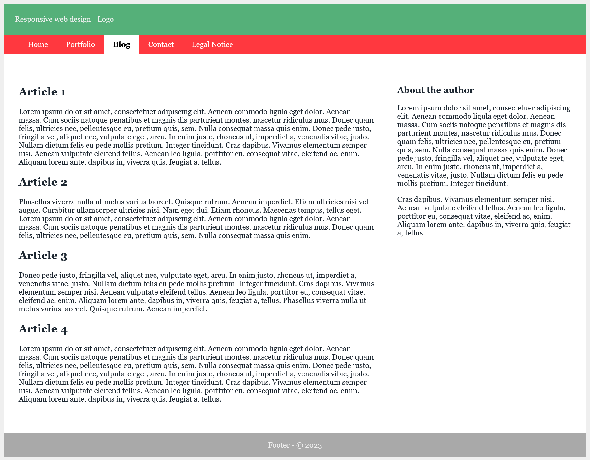
Desktop version:
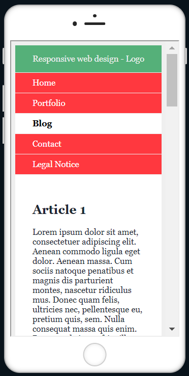
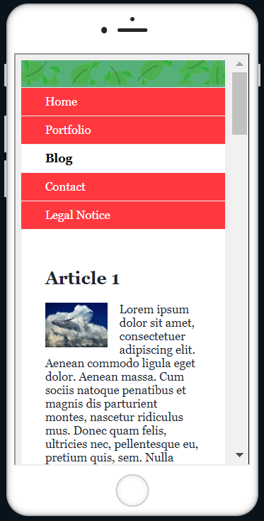
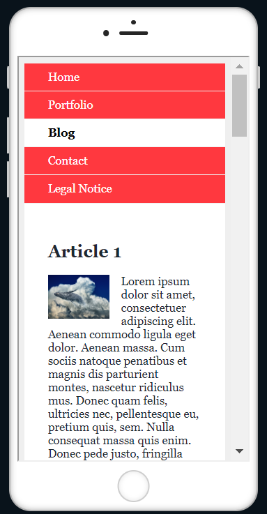
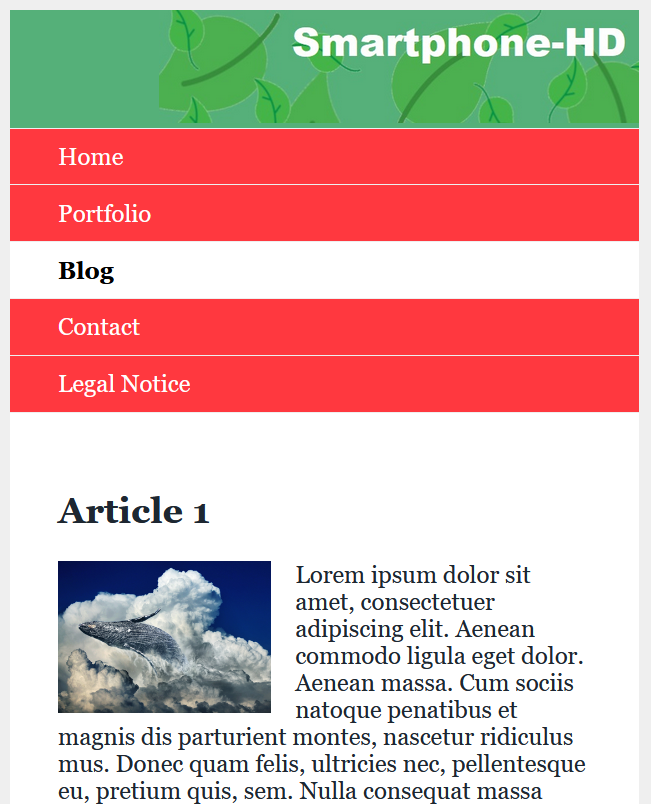
Smartphone version:
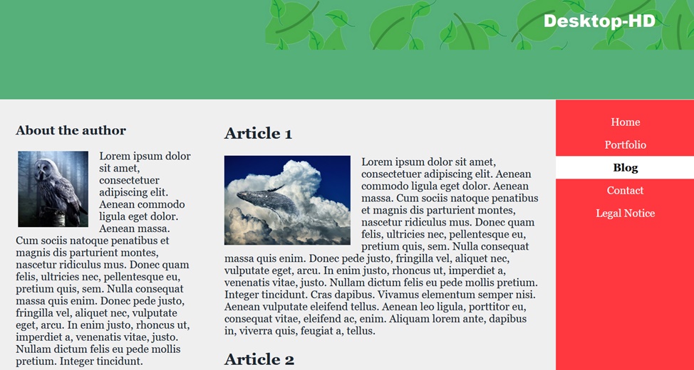
Here you can see that the view automatically adapts to the screen, i.e. smartphone or desktop.
More examples:
Complete Code --> 6_Responsive_Layouts/Part_4/...
Desktop version:
Smartphone version:
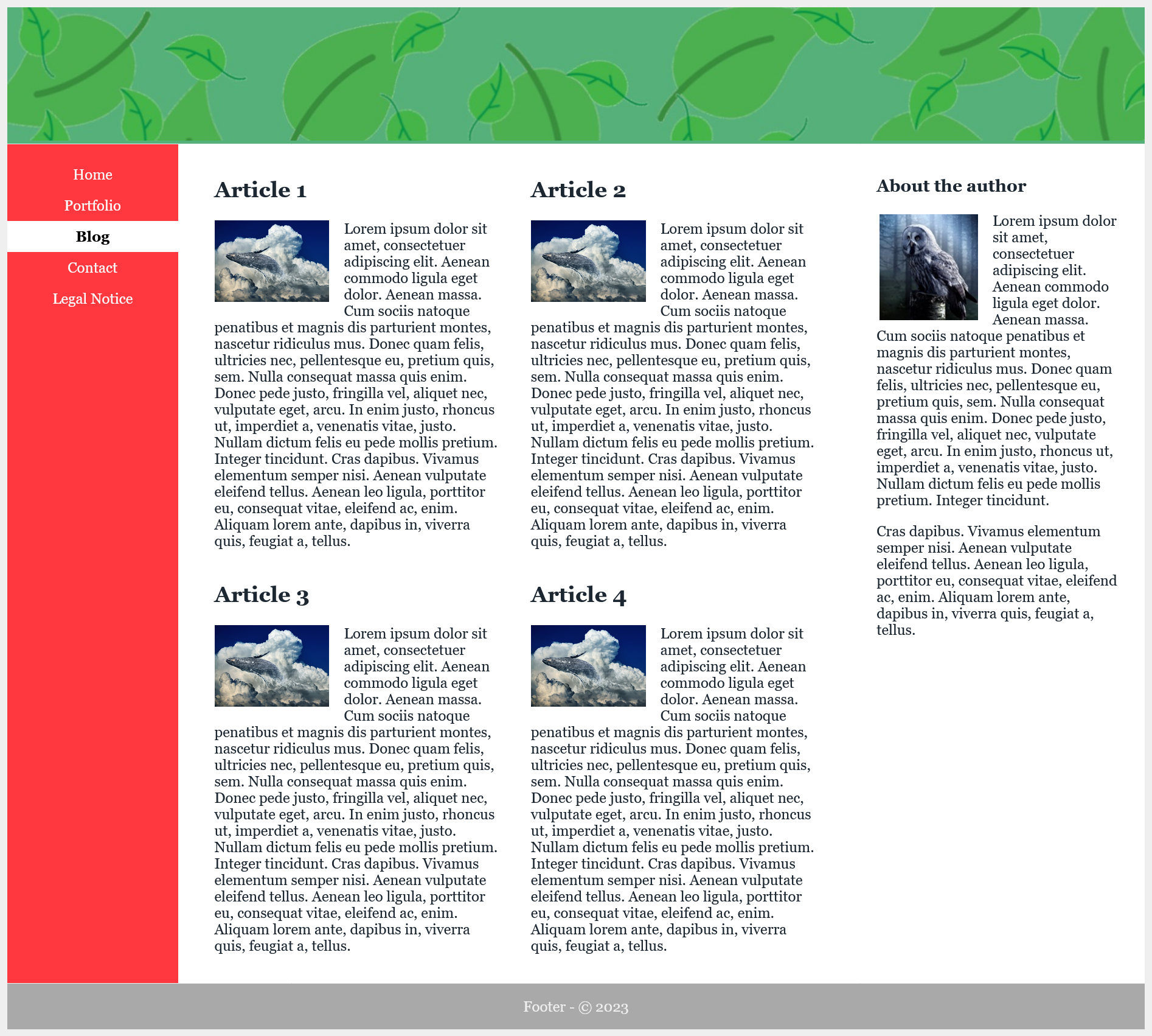
Extra Large Desktop Version:
Complete Code --> 6_Responsive_Layouts/Part_5/...
The examples created in this way now flexibly adapt to the layout breaks with the media queries to the user's devices.
Relative specifications should always be used instead of pixels for font sizes. On screens with a higher pixel density, fonts that are specified with pixels are displayed relatively small. It is possible to zoom in on them later, but a website should be rendered legibly immediately after loading. Therefore, pixels should be avoided and relative specifications such as em, rem or percent should be used.
With a fixed image size, the text can slip away towards the bottom, and individual words can be left at the top if there is not enough space. This text wrapping can be avoided by setting the maximum width of the image with the CSS property max-width accordingly in percent. With max-width the maximum width of an element can be determined.
Complete Code --> 6_Responsive_Layouts/Part_6/styles/layout.css
 ...
 .img-art {
     float: left;
     margin: 0 1em 0.2em 0;
     max-width: 40%;
     height: auto;
 }

 .img-side {
     float: left;
     margin: 0.1em 1em 0.2em 0.2em;
     max-width: 40%;
     height: auto;
 }
 ...
If images should always be expanded over the full width regardless of the device and still remain responsive, max-width can be set to 100%. This also depends on where the image is placed. Setting an image to 100% means that an image will not be responsive until the column it is defined in is smaller than the image. It also depends on the context in which the image is used.
Complete Code --> 6_Responsive_Layouts/Part_6/index.html
 ...
 <header class="header">
     <img src="images/logo.jpg" alt="Logo" class="img-logo">
 </header>
 ...
Complete Code --> 6_Responsive_Layouts/Part_6/styles/layout.css
 ...
 .img-logo {
     max-width: 100%;
     height: auto;
 }
 ...
With <video> it works the same way as with images.
To hide images in a certain version, here for example for smartphones you can set display to none. On the desktop screen, the logo remains visible.
For the other layout wraps you have to make the header visible again with display: block.
Complete Code --> 6_Responsive_Layouts/Part_7/styles/layout.css
 ...
 .img-logo {
     display: none;
 }

 ...

 /*-----------------------------------------------------
     Tablet version from 640 pixel
 ------------------------------------------------------*/

 .img-logo {
     display: block;
     max-width: 100%;
     height: auto;
 }
 ...
The disadvantage of max-width is that with small displays often large files must be loaded, this is bad for the Performence and the pictures must be scaled down, which affects the picture quality negatively.
The <picture> element, serves as a container element for multiple image sources. The individual image sources are specified with source.
Complete Code --> 6_Responsive_Layouts/Part_8/index.html
 ...

 <header class="header">
     <picture class="img-logo">
         <source media="(min-width: 1023px)" srcset="images/logo-desktop.jpg 1x,images/logo-desktop-HD.jpg 2x">
         <source media="(min-width: 639px)" srcset="images/logo-tablet.jpg 1x,images/logo-tablet-HD.jpg 2x">
         <source srcset="images/logo-smartphone.jpg 1x,images/logo-smartphone-HD.jpg 2x">
         <!-- Fallback for browsers that can't do <picture> -->
         <img src="images/logo.jpg" alt="Logo" class="img-logo">
     </picture>
 </header>

 ...
When a background image is inserted with background-image, the height and width can be adjusted with the CSS property background-size.
Complete Code --> 6_Responsive_Layouts/Part_9/styles/layout.css
 ...

 .img-background {
     background-size: cover;
     background-image: url("../images/background.jpg");
     background-repeat: no-repeat;
 }

 ...
In the previous examples, it is quite time-consuming to realize a more complex layout or to redesign it. For such purposes the grid layout is a good choice. CSS offers real design grids with CSS grid layouts.
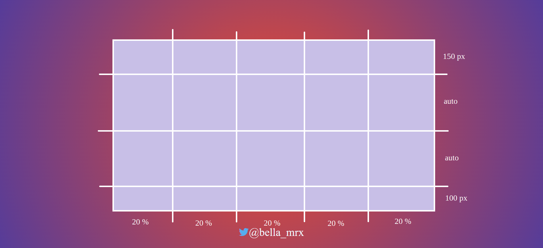
The principle of a CSS grid is based on creating a grid in a parent element and positioning the child elements within it. To do this, assign the value grid to the CSS property display in the parent element and then use the properties grid-template-columns and grid-template-rows to define the individual grid lines.
 grid {
     display: grid;
     grid-template-rows: 150px auto auto 100px;
     grid-template-columns: 20% 20% 20% 20% 20%;
 }
This creates a CSS grid with four rows and five columns. The first row is 150 pixels high and the last 100 pixels high. The middle two rows are still adjusted with auto according to the content. All five columns are 20% wide. Besides the units percent or pixel, you can also use em or fr(e.g. 1fr or 2fr). The unit fr means flexible fragment (fractional part).
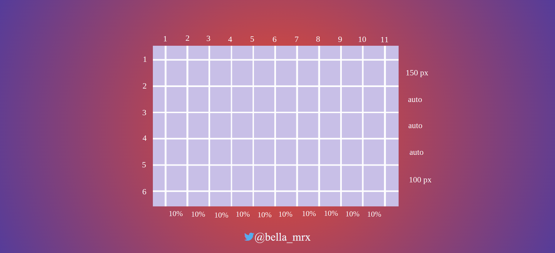
The grid can be adjusted as desired.
 grid {
     display: grid;
     grid-template-rows: 150px auto auto auto 100px;
     grid-template-columns: repeat (10, 10%);
 }
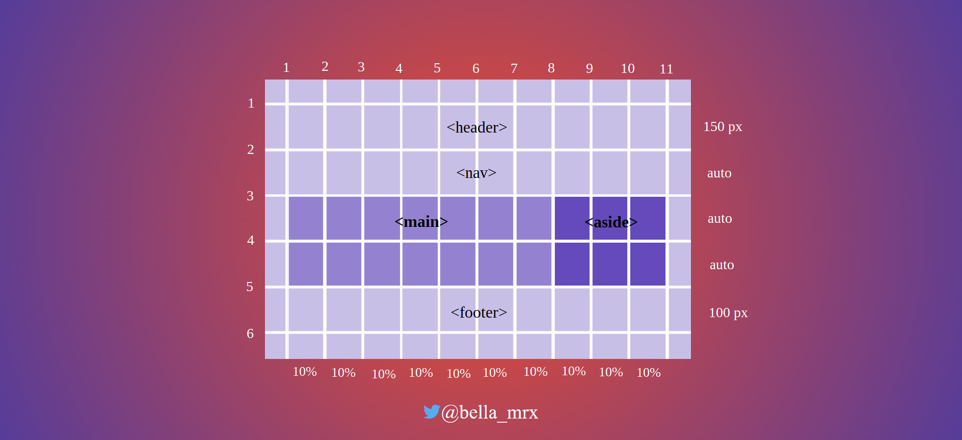
This defines a grid layout with five rows and ten columns. The header area is specified with a height of 150 pixels and the footer area with 100 pixels. The three rows in between automatically adjust to the content. repeat (10, 10%) means 10% 10% 10% 10% 10% 10% 10% 10% 10% 10%.
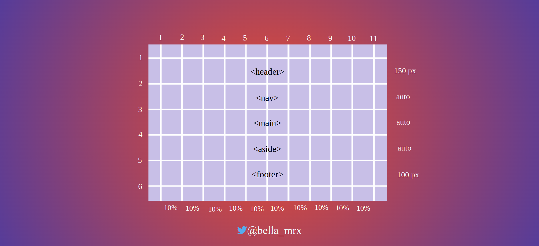
To use the grid layout, the class selector .grid must be used in the parent element, whose child elements are positioned in this grid. Inside the div parent element the child elements are placed (<header>, <nav>, <main>, <aside>, <footer>).
Complete Code --> 6_Responsive_Layouts/Part_10/index.html
 <body>
     <div class="grid">
         <header class="header">
             ...
         </header>
         <nav class="nav">
             ...
         </nav>
         <main class="content">
             ...
         </main>
         <aside class="aside">
             ...
         </aside>
         <footer class="footer">
             ...
         </footer>
     </div>
 </body>
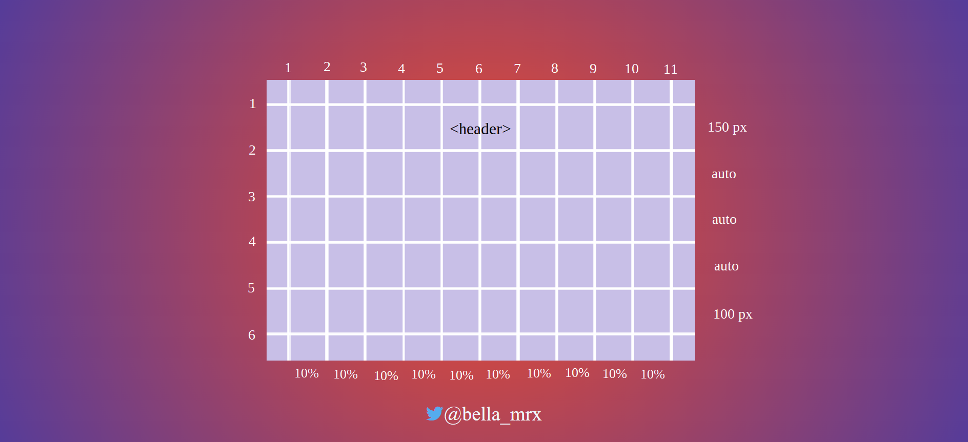
With grid-row-start and grid-row-end or grid-column-start and grid-column-end you can specify where the HTML elements should be placed in the grid.
Complete Code --> 6_Responsive_Layouts/Part_10/styles/layout.css
 .header {
     grid-column-start: 1;
     grid-column-end: 11;
     grid-row-start: 1;
     grid-row-end: 2;
     text-align: right;
     background-color: #55b079;
     color: #efefef;
     border-bottom: 1px solid #efefef;
 }
 .nav {
     grid-column-start: 1;
     grid-column-end: 11;
     grid-row-start: 2;
     grid-row-end: 3;
 }

 .content {
     grid-column-start: 1;
     grid-column-end: 11;
     grid-row-start: 3;
     grid-row-end: 4;
 }

 .aside {
     grid-column-start: 1;
     grid-column-end: 11;
     grid-row-start: 4;
     grid-row-end: 5;
 }

 .footer {
     grid-column-start: 1;
     grid-column-end: 11;
     grid-row-start: 5;
     grid-row-end: 6;
 }
 .aside {
     grid-column: 1 / 11;
     grid-row: 4 / 5;
 }
means
 .aside {
     grid-column-start: 1;
     grid-column-end: 11;
     grid-row-start: 4;
     grid-row-end: 5;
 }
There is another shorter variant, with the grid-area property, the order is as follows:
grid-area: row-start / column-start / row-end / column-end;
 .aside {
     grid-area: 4 / 1 / 5 / 11;
 }
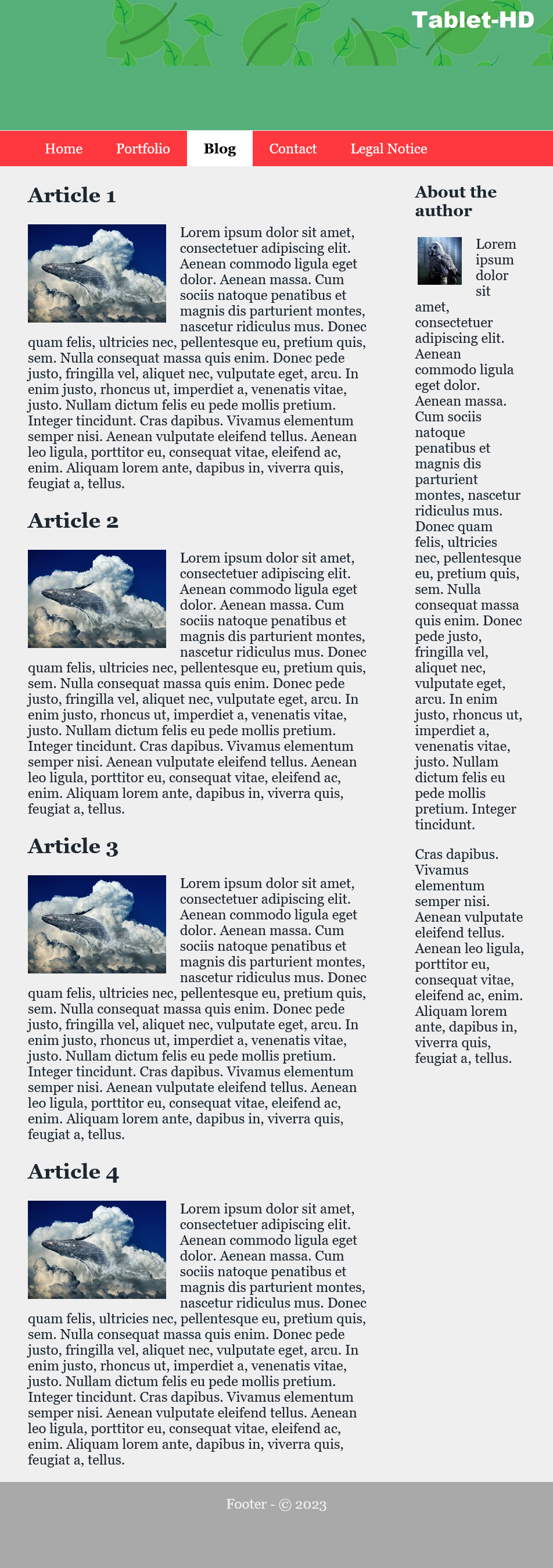
Starting from the basic mobile layout version, little work is now needed to respond to the next layout change for the tablet version.
Complete Code --> 6_Responsive_Layouts/Part_10/styles/layout.css
 @media screen and (min-width: 40em) {
     .content {
         grid-column: 1 / 8;
         grid-row: 3 / 4;
         padding: 0 1rem 0 2rem;
     }
     .aside {
         grid-column: 8 / 11;
         grid-row: 3 / 4;
         padding: 0 2rem 0 2rem;
         border-top: none;
     }
     ...
 }
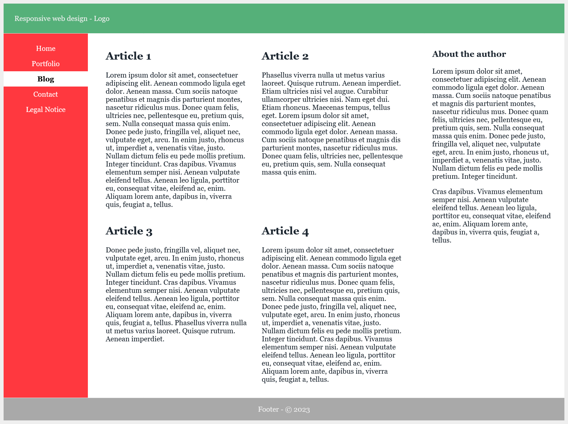
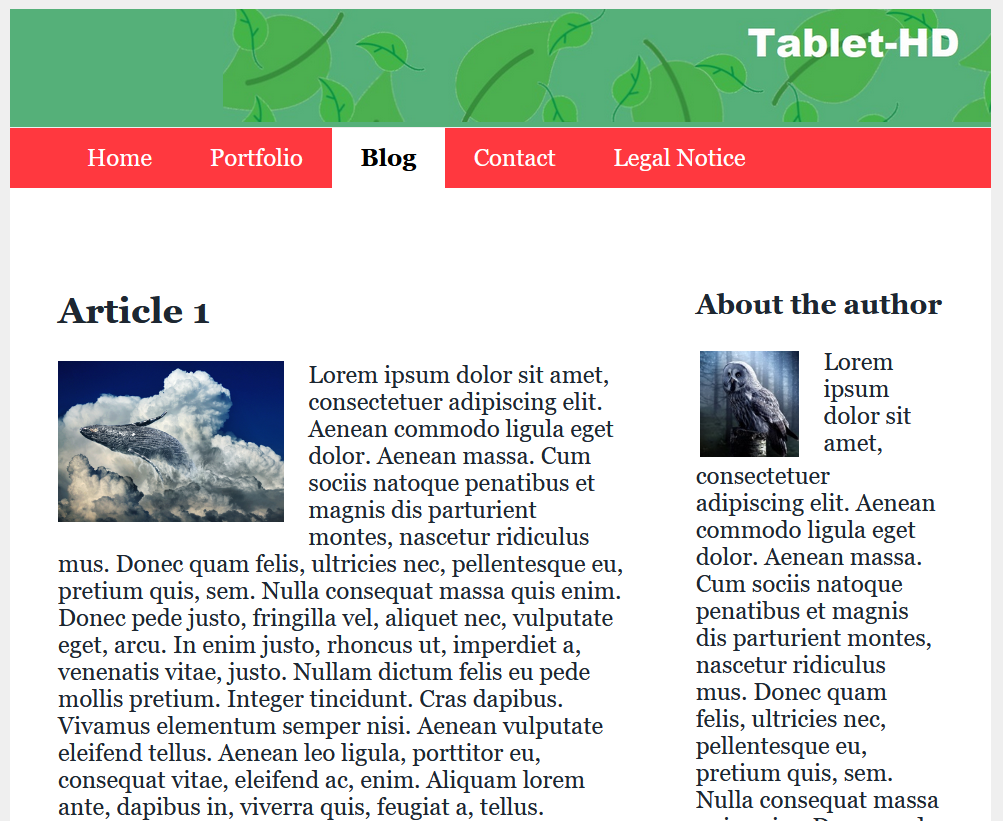
Tablet-Version
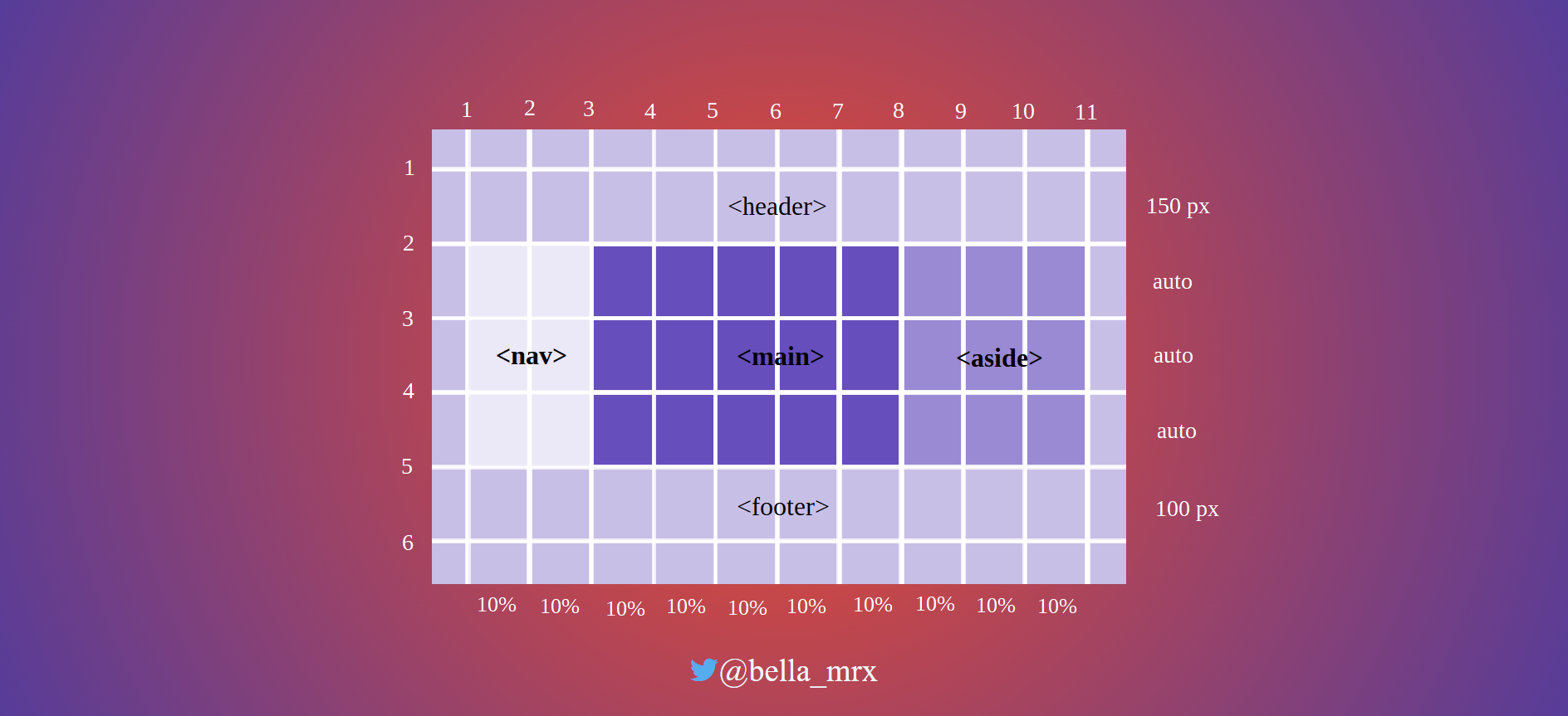
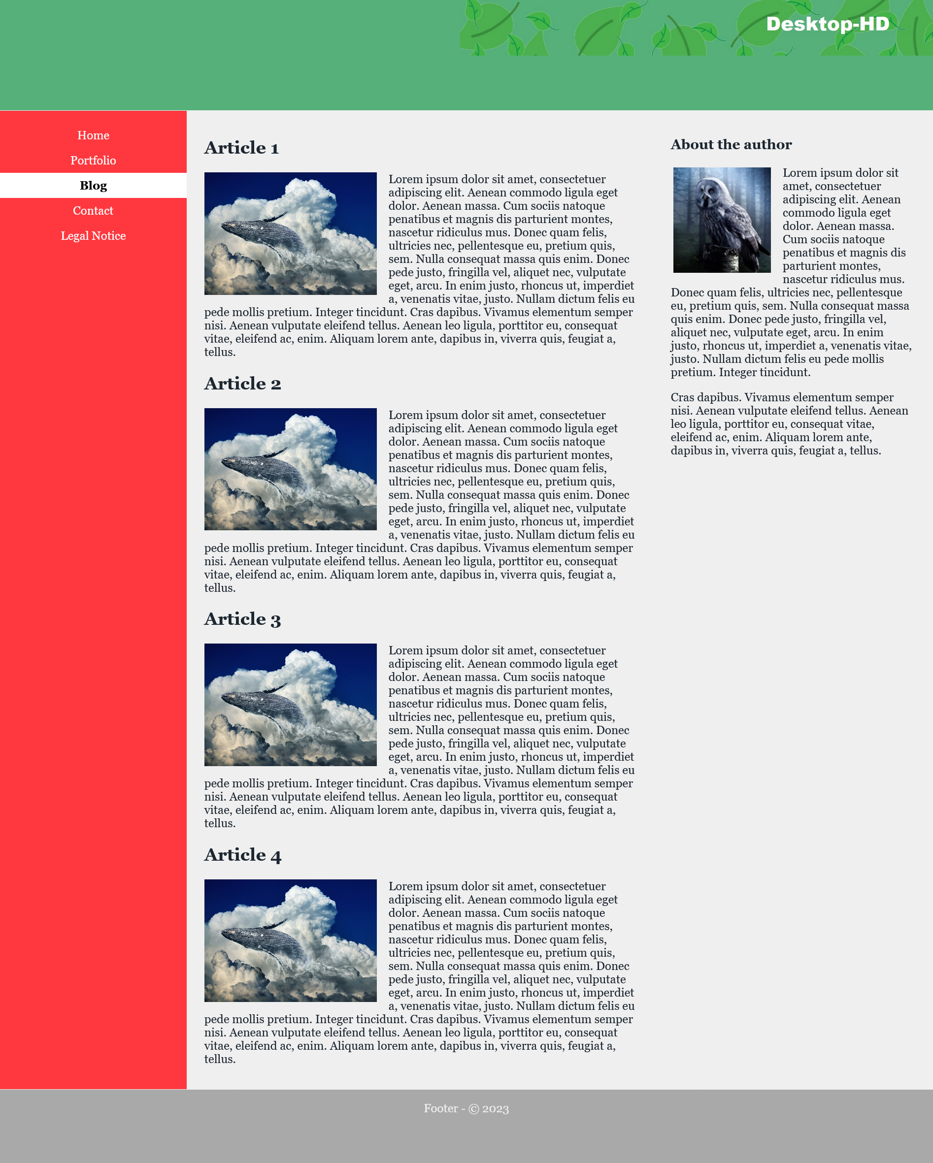
And yet another version for the desktop:
Complete Code --> 6_Responsive_Layouts/Part_10/styles/layout.css
 @media screen and (min-width: 64em) {
     .content {
         grid-column: 3 / 8;
         grid-row: 2 / 4;
         padding: 1em 1.5em;
     }
     .aside {
         grid-column: 8 / 11;
         grid-row: 2 / 4;
         padding: 1em 1.5em;
     }
     .nav {
         grid-column: 1 / 3;
         grid-row: 2 / 4;
         background-color: #ff383f;
     }
     ...
 }
Desktop-Version
Because the elements in the grid are freely positionable, it is easy to redesign the layout now. For this, only the positions of the cells and columns in the grid have to be adjusted.
To change the desktop version from the previous example, you can simply change the values for grid-column as follows:
Complete Code --> 6_Responsive_Layouts/Part_11/styles/layout.css
 @media screen and (min-width: 64em) {
     .content {
         grid-column: 4 / 9;
         grid-row: 2 / 4;
         padding: 1em 1.5em;
     }
     .aside {
         grid-column: 1 / 4;
         grid-row: 2 / 4;
         padding: 1em 1.5em;
     }
     .nav {
         grid-column: 9 / 11;
         grid-row: 2 / 4;
         background-color: #ff383f;
     }
     ...
 }
Desktop-Version
So the navigation is now on the right side.
If spacing between columns or rows should be added, this can be done with grid-column-gap or grid-row-gap. The spaces are only created between the columns. No spacing is added at the beginning and end of the column.
for example:
 grid {
     display: grid;
     grid-template-rows: 150px auto auto auto 100px;
     grid-template-columns: repeat (10, 10%);
     grid-row-gap: 15px;
     grid-column-gap: 10px;
 }
the shorthand is:
grid-gap: 15px 10px;
Also the horizontal and vertical alignment of the parent elements can be set with the CSS property align-items for vertical and with justify-items for horizontal behavior. The values start, end, stretch and center are available.
For an individual alignment of a single raster cell, align-self and justify-self are available. Here, too, the values start, end, stretch and center are available.
The CSS property display can be used to change the behavior of an HTML element when it is displayed in the web browser. The HTML element has a fixed box that describes the behavior of the element.
Thus, the behavior of an HTML element such as <p> can be changed with display: inline; and thus no more line breaks are executed.
On the other hand, the behavior of an element like <a> can be changed with display: block so that it performs a line break. With display: none; an element can be hidden so that it no longer takes up space in the HTML document.
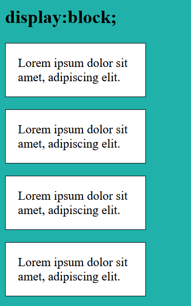
display: block;
Complete Code --> 6_Responsive_Layouts/Part_12/indexA.html
 p {
   display: block;
   width: 150px;
   border: 1px solid black;
   background-color: white;
   padding: 1em;
 }
In this example, display: block; can also be omitted, since the <p> element is a block element anyway, so a line break is automatically created.
display: inline;
But if now display: inline; is used, the single <p> -elements are displayed in a row, so no automatic line break.
Complete Code --> 6_Responsive_Layouts/Part_12/indexB.html
 p {
     display: inline;
     width: 150px;
     border: 1px solid black;
     background-color: white;
     padding: 1em;
 }
The specification of width is ignored and thus has no effect. Although the inner and outer margins and borders can be specified as usual, these specifications also have no effect on the line height. Thus, an inline box only occupies the width that the content requires. And may not look very nice, as in this example.
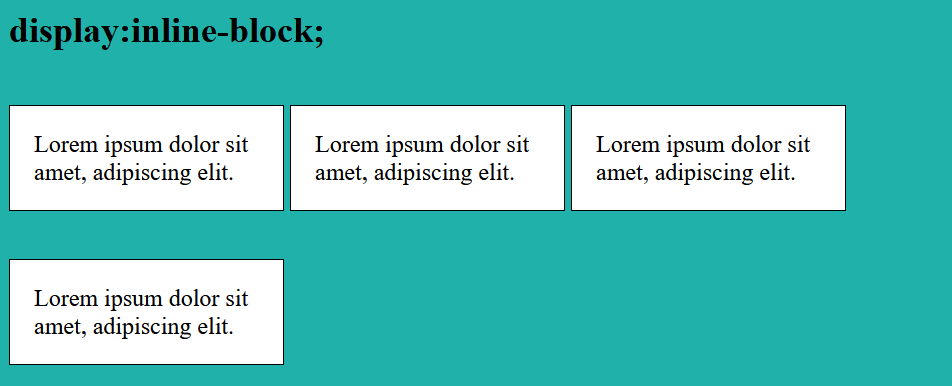
display: inline-block;
Complete Code --> 6_Responsive_Layouts/Part_12/indexC.html
  p {
   display: inline-block;
   width: 150px;
   border: 1px solid black;
   background-color: white;
   padding: 1em;
 }
An inline-block -box initially behaves like an inline -box and runs over one line. But an inline-block -box is moved to the next cell when the box no longer fits in the screen width.
display: none;
Complete Code --> 6_Responsive_Layouts/Part_12/indexD.html
  p {
   display: none;
   width: 150px;
   border: 1px solid black;
   background-color: white;
   padding: 1em;
 }
With display: none; elements can be hidden, the web browser does not create a box for this. It is also possible to hide elements with visibility: hidden;, but the box remains, and the element becomes only transparent. Hidden or transparent elements are used, for example, to show buttons only in the smartphone version but not in the desktop version.
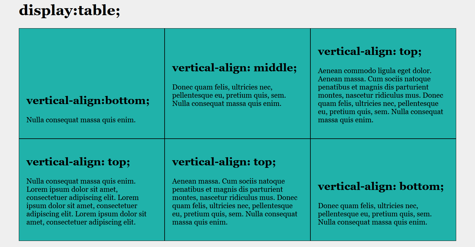
Besides display: grid and display: flex (which I have already discussed here), another form is display: table;. With this, elements can be arranged like in a table and in practice, theoretically, a layout for a web page can be created. But for that display: grid is the better alternative.
Then there is also display: list-item;, which displays the element as a list. This creates two boxes for an element. One box is used for the list item and the other box for the list element.
There are other values for display, but they are rarely used. An overview of the existing values can be found at MDN - display.
Complete Code --> 6_Responsive_Layouts/Part_12/indexE.html
 .table {
     display: table;
 }

 .row {
     display: table-row;
 }

 .article {
     border: 1px solid black;
     padding: 1em;
     width: 33.3333%;
     background-color: LightSeaGreen;
     display: table-cell;
 }

 .bottom {
     vertical-align: bottom;
 }

 .middle {
     vertical-align: middle;
 }
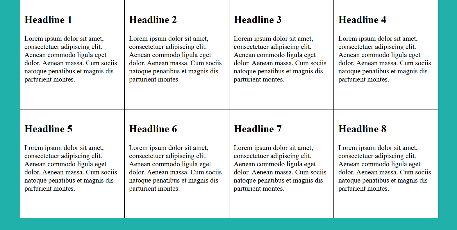
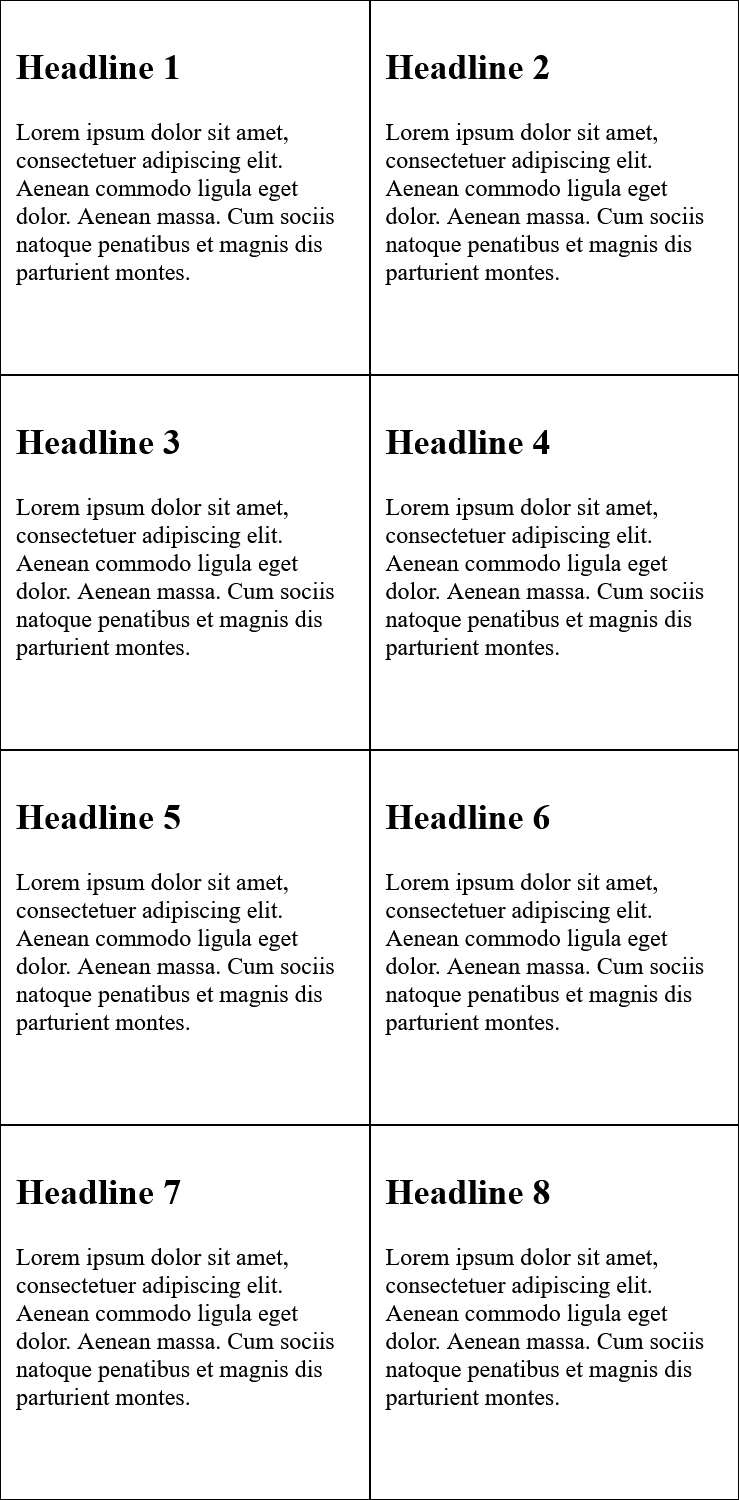
Sometimes it is helpful to calculate and display individual values. This is possible with the calc() function, with which the basic arithmetic operations addition(+), subtraction(-), multiplication(*) and division(/) can be carried out. It is important that with the addition and subtraction, before and after a blank character must stand. This is not necessary for multiplication and division.
Complete Code --> 6_Responsive_Layouts/Part_13/styles/layout.css
 .column {
     float: left;
     padding: 10px;
     width: 90%;
     width: calc(100% / 4);
 }

 @media screen and (max-width: 40em) {
     .column {
         width: calc(100% / 2);
     }
 }

 @media screen and (max-width: 30em) {
     .column {
         width: 100%;
     }
 }
Desktop-Version
Tablet-Version
This is the end of CSS Guide Part 3. You can find the next part here CSS Guide Part IV.
On my Twitter account @bella_mrx you can find more useful stuff about HTML and web development.
Or check out my GitHub profile.
Thanks for reading. I hope you enjoyed it or at least learned something.
