This project was built on a mock scenario were a data analyst at PyBer, a ride-sharing app company valued at $2.3 billion, has been assigned to analyze all the rideshare data from January to early May of 2019 and create a compelling visualization to present to the company’s CEO. The analysis and visualization produced is to help PyBer improve access to their ride-sharing services and determine affordability for underserved neighborhoods.
To perform this exploratory analysis Python scripts was written using Pandas’s library, Jupyter notebook and Matplotlib. The data is coming from CSV files that contain two datasets of four months of rideshare data. Matplotlib was used to create several types of visualization that tell a compelling story about the data. Such as, charts that showcase the relationship between the type of city and the number of drivers and riders, as well as the percentage of total fares, rides, and drivers by type of city.
The following list of steps and deliverables:
-
Import your data into a Pandas DataFrames and merge them.
-
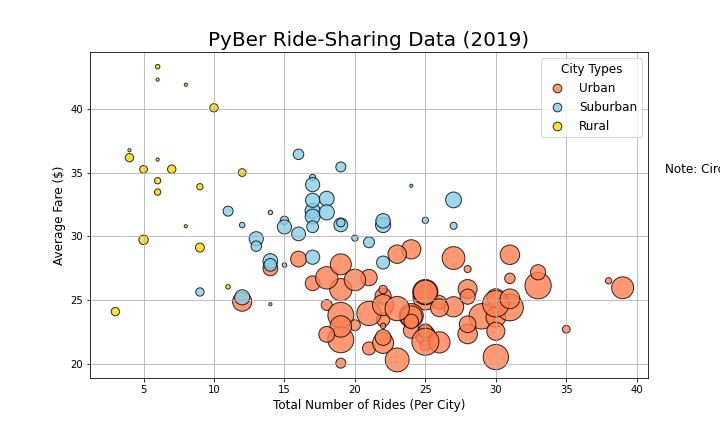
Create a bubble chart that showcases the average fare versus the total number of rides with bubble size based on the total number of drivers for each city type, including urban, suburban, and rural.
-
Determine the mean, median, and mode for the following:
-
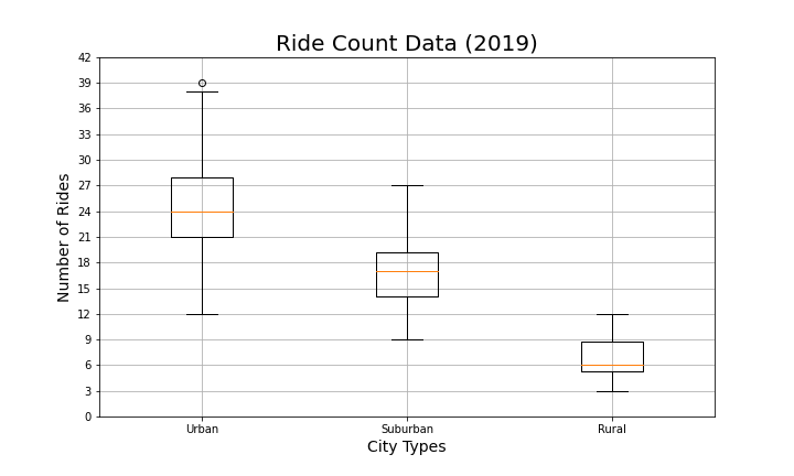
The total number of rides for each city type.
-
The average fares for each city type.
-
The total number of drivers for each city type.
-
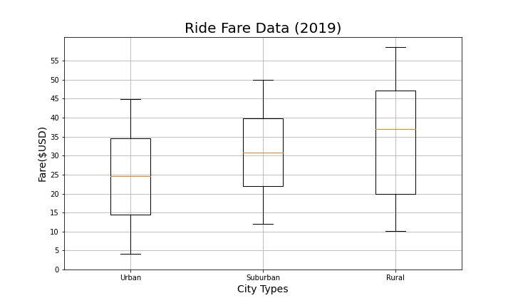
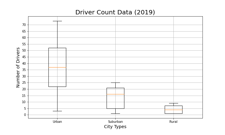
Create box-and-whisker plots that visualize each of the following to determine if there are any outliers:
-
The number of rides for each city type.
-
The fares for each city type.
-
The number of drivers for each city type.
-
-
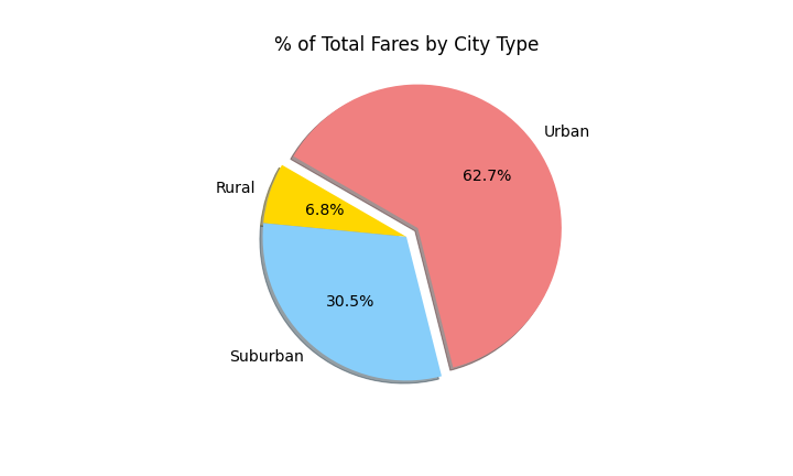
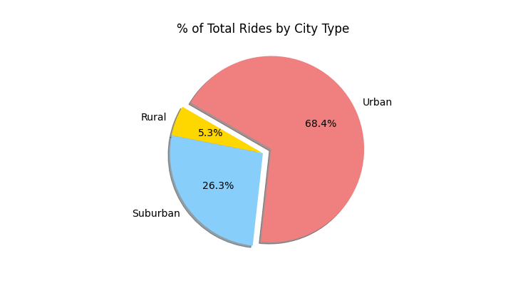
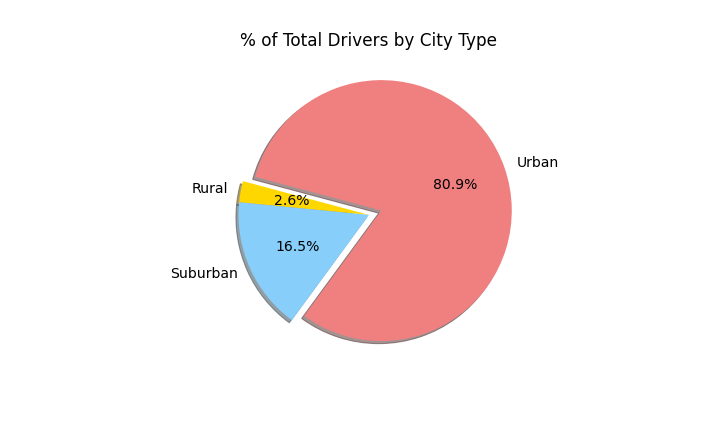
Create a pie chart that visualizes each of the following data for each city type:
-
The percent of total fares.
-
The percent of total rides.
-
The percent of total drivers.
-


Create a summary DataFrame and multi-line chart of the ride-sharing data by city type.
- Deliverable 01: A ride-sharing summary DataFrame by city type

- Deliverable 02: A multiple-line chart of total fares for each city type

Looking at the summary DataFrame and the multiple-line chart above, we can
see there is a difference in ride-sharing data among the different city types.
Urban places seems to have more rides, followed by suburban areas. The rural
areas seem to have least number or rides. Regarding fares, Urban areas rides
seems to cost more than rides in suburban or rural areas. However, the trend for
all types seems to be consistent during the analyzed time frame. Also, number of
rides correlate with car ownership in all the three types. Also, Urban lifestyle
and more need for short rides.
Based on the results from last two deliverables, here are few recommendations to
the
CEO of PyBer:
-
Increasing marketing budgets especially in rural and suburban areas. And maybe increase the intensive for drivers going to these areas. This way might help overcoming the problem of more than needed drivers in Urban areas compared to few drivers for suburban and ruler ones.
-
To redo the analysis having time element included. Knowing how long a ride in each type of cities would give an important and more complete picture about the business and riders behavior and needs.