Python script for quick and attractive Changes of Anisotropy RaDial (ChARd)
plots, as introduced by Michał Kaźmierczak*, Ewa Patyk-Kaźmierczak,
and Andrzej Katrusiak in https://doi.org/10.1021/acs.cgd.0c01636.
The file can be used as a stand-alone command-line script or a python library.
In either case it requires Python version 3.8+ with libraries
numpy, pandas, matplotlib installed. See also LICENSE file.
In order to plot a chard plot, you need an input file, which needs to be either a "raw" file with three unnamed columns standing for a, b, c in this exact order (see examples/raw.csv) or a "named" file with column names in first row including columns named "a", "b", "c" and any other such as "p" or "T" (see examples/named.csv). The file can be either a csv or any spreadsheet supported by your version of pandas (xls, ods, xlrd, pyxlsb for pandas 1.2+, + openpyxl for 1.3+). It is suggested to use a "named" format (with named columns), as it allows more flexibility.
The simplest ChARd can be generated using command:
python chard.py -i examples/raw.csv
where -i points to the input file.
Flag -i can be specified multiple times to plot multiple files together.
In general, the following flags may be specified multiple times,
once for each ChARd series:
-i,--input- Path to input file with a single series to plot;-s,--sheet- If importing from spreadsheet, name of the sheet with data;-c,--color- Color, colon-separated series of colors, or colormap to be used for plotting series, can be sliced (see docstring for full desc.);-n,--normalizer- Index or values to normalize abc to, if needed;0will normalize to 1st entry, while12.4,6.5,30.4will normalize to these values.-e,--emphasis- Name of the column with information about emphasis, plot as darkening of color or progress on colormap. Prefix the name with "@" to reverse the order.
The following flags may be specified once and affect the final figure:
-o,--output- If given, save the figure under this name instead of plotting it in an interactive mode.-w,--linewidth- Width of the lines used to plot series (default 1).-l,--labelsize- Size of the axis and grid line labels (default 15).
The plots present in directory images have been generated using the commands listed below. If you want to try yourself, you are advised to change the output path not to overwrite the original figures:
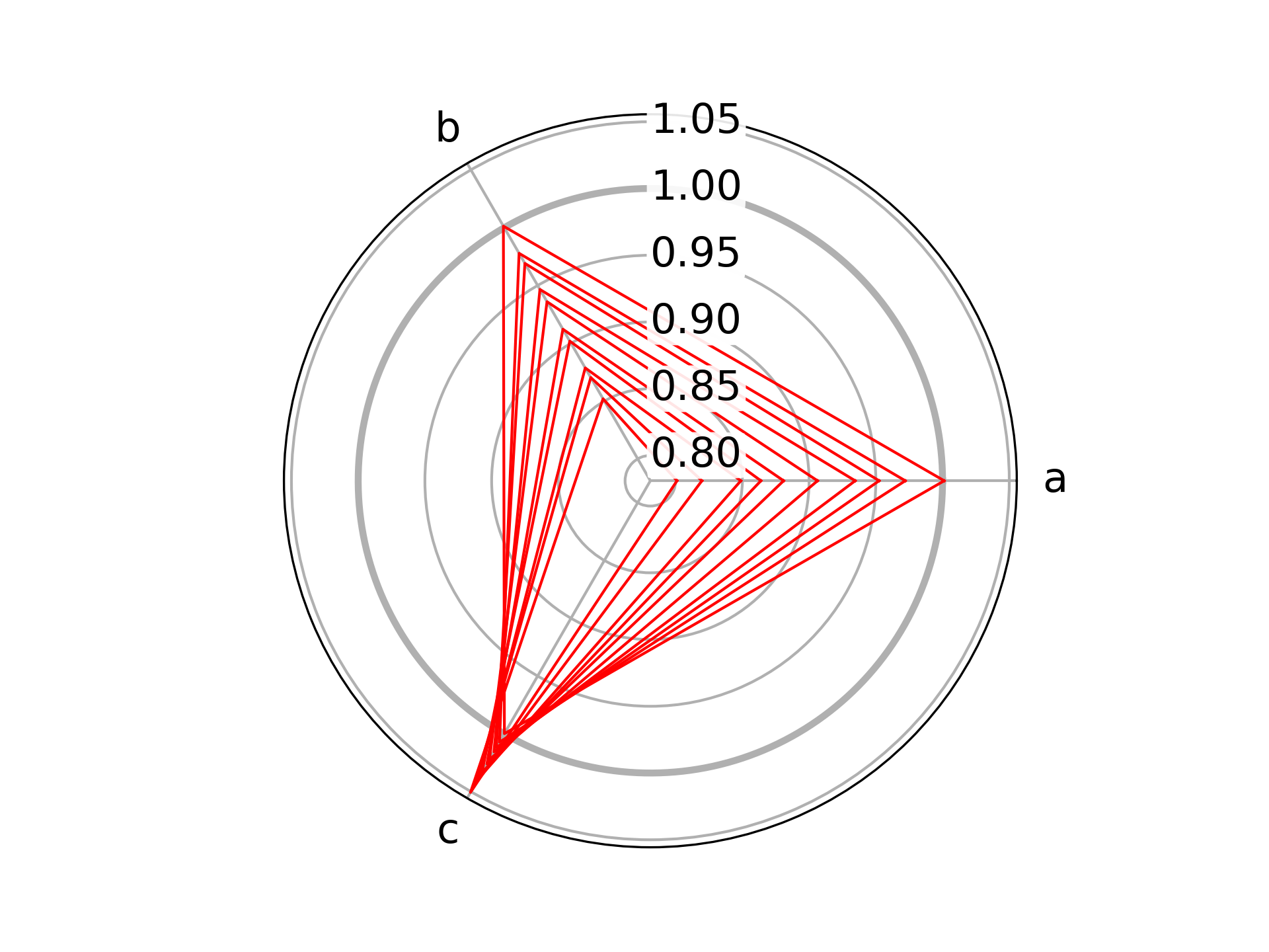
python chard.py -i examples/raw.csv -c red -n "10,10,10" -o images/raw.png
This plot is based on data in examples/raw.csv,
colored red, and normalized to absolute values of a=10, b=10, c=10.
The figure was then saved in images as raw.png.
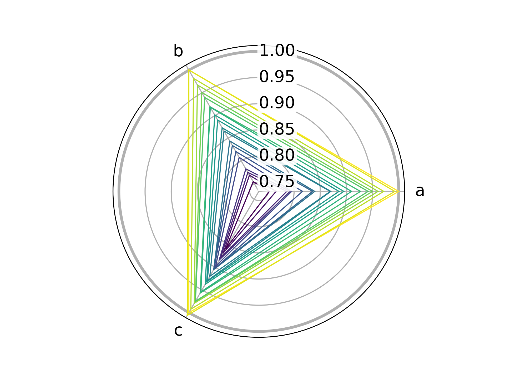
python chard.py -i examples/named.csv -c viridis -e @p -n 0 -o images/named.png
This plot is based on data in examples/named.csv, which
apart from information about unit cell axes contains also pressure values.
Instead of using a single color, various colors are probed from the matplotlib
viridis colormap (-c viridis) based on the values stored in column p
in reversed order (-e @p). All values are normalized to those from the first
row (-n 0), and the width of plotted lines is slightly increased (-w 1.5).
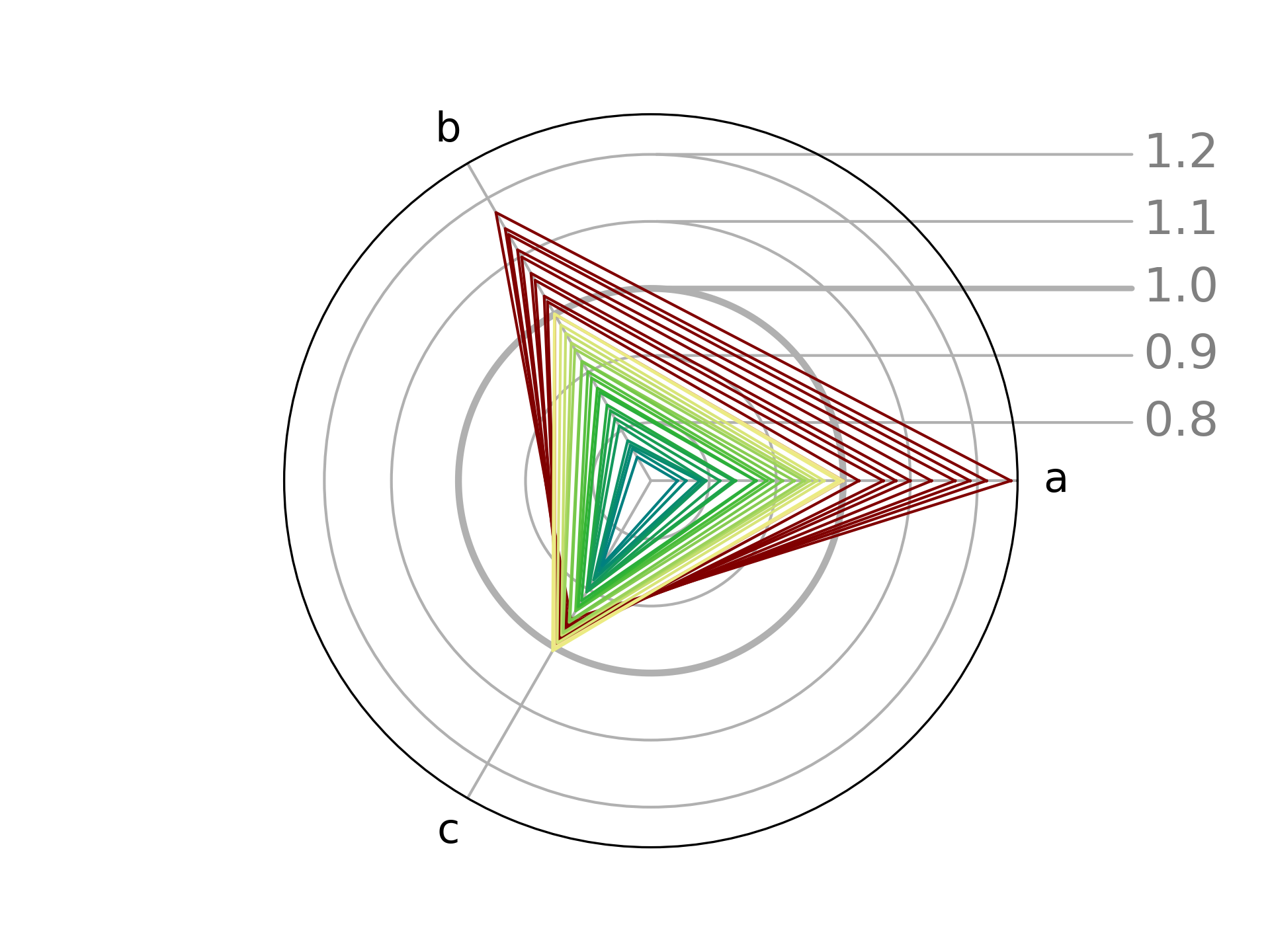
python chard.py -i examples/raw.csv -c "#800000" -e p -n "-1" \
                -i examples/named.csv -c khaki:teal -e p -n 0 \
                -o images/combined.png -a right
While the previous plots were prepared using a single series each,
multiple series can be provided by specifying -i (and other necessary flags)
multiple times. As a result, this plot is based on data from both
examples/raw.csv and
examples/named.csv.
The first dataset is drawn in dark red given with a hex code (-c "#800000"),
while the second one is drawn in colors spanning from "khaki" to "teal"
(-c khaki:teal). The emphasis on both plots comes from column "p" (-e p),
though this information is naturally absent in the first "raw" dataset
which features no "p"-named column.
The axis tick labels are moved to the right (-a right).
Finally, the unit cell parameters are normalized to the last value in raw.csv
(-n "-1") and to the first value in named.csv (-n 0).
In order to use the chard-style matplotlib axis as a library,
the chard.py file needs only to be imported.
The ChardAxes class will be auto-registered as a custom projection
named chard in matplotlib. The axes can be then for example using
fig, ax = plt.subplots(subplot_kw=dict(projection='chard')).
In this chard projection, individual lines can be plotted as normal using
ax.plot(), where x must be skipped and only a 3-long list y
(and any desired keywords) need to be provided.
However, it is much more convenient to also from chard import ChardSeries
and use a custom method ax.plot_series() to plot entire series with
a single command.
For further details, please refer to doc strings in the file itself.
For a rudimentary example, see example() function.


