Custom-Button-Sample
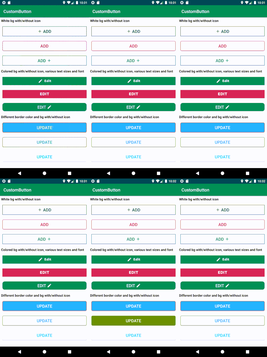
CustomButton(custom button) is an easy android library to customize button color for different button states(pressed,disabled..etc) without selector creation and also you can add left/right icon easily to it.
Features
- Customizable button text color, size and font style.
- Customizable button size, background color and border color.
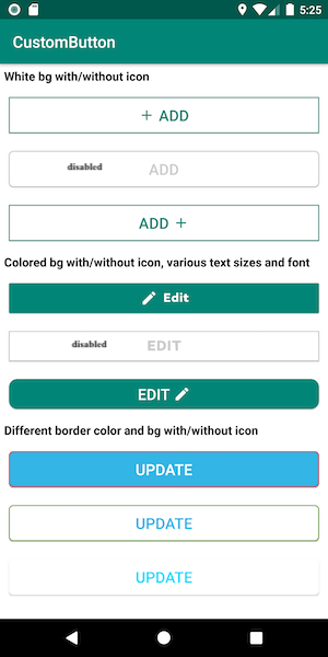
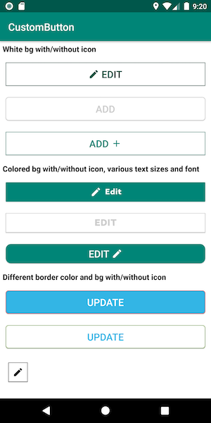
- Automatically sets button color for pressed, enable and disable states.
- Easy to add icons either left or right to the button text and can set icon size also.
- Easy to change to as image button or button
- minSdkVersion 21
- targetSdkVersion 33
Screenshots
Installation
Latest version of the customButton(Custom Button) android library can be found on Maven Central.
For Gradle users
Open your build.gradle Then, include the library as dependency:
implementation 'com.barelogics:sahana.customButton:1.7'
For Maven users
Add this dependency to your pom.xml:
<dependency>
  <groupId>com.barelogics</groupId>
  <artifactId>sahana.customButton</artifactId>
  <version>1.7</version>
  <type>aar</type>
</dependency>
Usage
Please see the Custom-Button-Sample/app for a more detailed code example of how to use the Custom-Button android library.
1.Add the CustomButton view to the layout you want to show.
<com.barelogics.sahana.CustomButton
        android:id="@+id/customButton"
        android:layout_width="match_parent"
        android:layout_height="wrap_content"
        android:layout_margin="10dp"
        app:buttonType="normal_button"
        app:setColor="@color/colorPrimary"
        app:setImage="@drawable/ic_baseline_add_24"
        app:setText="Add"
        app:setTextFont="@string/bold"
        app:setTextSize="19sp"
        app:showImage="right" />
-
Add Fonts: Add your custom fonts to
assets/. All font definitions are relative to this path.Assuming that you are using Gradle you should create the assets directory under
src/main/in your project directory if it does not already exist. As it's popular to use multi-project build with Gradle the path is usuallyapp/src/main/assets/, where app is the project name.You might consider creating a
fonts/subdirectory in the assets directory (as in examples). -
Configure attributes:
-
setColor- is used to set color for the button(such as text,border and background color of the button according to thebuttonTypewe set). -
setImage- is used to set icon drawables. Only use thesetImageattribute when you have to set icon. -
showImage- is used to show/set an icon either left or right, has two valuesleftandright. By default set toleft. -
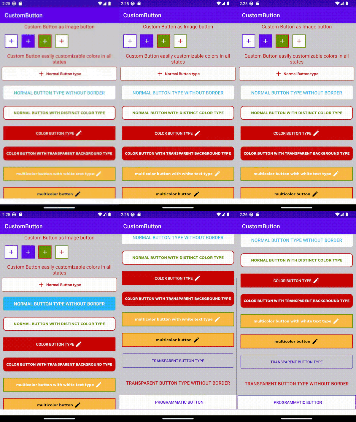
buttonType- is used to set different types of button. By default set tonormal_button. It has 7 types.1. normal_button: It is a general button.
setColorvalue will set to the border and text of the button with white background. On pressed state, the samesetColorvalue will apply to the button background with white color text2. transparent_button:
setColorvalue will set to the border and text of the button with transparent background. On pressed state, the samesetColorvalue will apply to the button background with white color text3. normal_button_with_distinct_color: If we want to set different colors for text and border of the button then we should use this.
setBorderColorattribute value should set along with thesetColor.setBorderColorvalue will set to the border of the button,setColorvalue will set to the text of the button with white background. So this button type is used to set different colors for text and border with white background. On pressed state, thesetBorderColorvalue will apply to the button background with white color text.4. color_button:
setColorattribute color value will set to the background and border of the button with white text. On pressed state, the samesetColorvalue will apply to the text of the button with white background.5. multicolor_button_with_white_text: If we want to set different colors for background and border of the button then we should use this.
setBorderColorattribute value should set along with thesetColor.setBorderColorvalue will set to the border of the button,setColorvalue will set to the background of the button with white text. So this button type is used to set different colors for background and border with white text. On pressed state, thesetBorderColorvalue will apply to the button background with white color text.6. color_button_with_transparent_background:
setColorattribute color value will set to the background and border of the button with white text. On pressed state, the samesetColorvalue will apply to the text of the button with transparent background.7. multicolor_button: If we want to set different colors for background, text and/or icon and border of the button then we should use this.
setBorderColorsetBackgroundColorattribute value should set along with thesetColor.setBorderColorvalue will set to the border of the button,setBackgroundColorvalue will set to the background of the buttonsetColorvalue will set to the text of the button,. So this button type is used to set different colors for background, text and/or icon and border. On pressed state, thesetColorvalue will apply to the button background andsetBackgroundColorvalue will apply to the text. -
setBorderColor- is used to set border color for the button. If we want to set different color for button border then we should use this. Otherwise no need to set. -
setBackgroundColor- is used to set background color for the button. If we want to set different color for button background ,text and/or icon and border then only use this attribute to set background color. Otherwise no need to set. -
setText- is used to set text for button. -
setStrokeWidth- is used to set border/stroke size in dp (default: 1dp ). -
setTextFont- is used to set text font(typeface).Usage <com.barelogics.sahana.CustomButton app:setTextFont="fonts/Light.otf"/>. -
setDisableColor- is used to set color for when disabled the button. By default button disabled color is gray(#cccccc). So If you would like to set your desired color for disable then you can use this. -
setTextSize- to set text size in SP. -
setAllCaps- is used to set on/off capital letters for text.Truemeans capital letters on for text. -
android:enabled- is used to set enable or disable the button.Falsefor disable the button. -
setCornerRadius- is used to set corner radius of the button to make rounds. By default no(zero)corner radius for button. -
setImageWidth- is used to set icon width in dp. By default width value 25dp. -
setImageHeight- is used to set icon height in dp. By default height value 25dp. -
android:scaleType- is used to scale icon in given space. -
iconMarginLeft- is used to set left margin to icon. -
iconMarginRight- is used to set right margin to icon. -
iconMarginTop- is used to set top margin to icon. -
iconMarginBottom- is used to set bottom margin to icon. -
textMarginLeft- is used to set left margin to text. -
textMarginRight- is used to set right margin to text. -
textMarginTop- is used to set top margin to text. -
textMarginBottom- is used to set bottom margin to text.
- If you would like to enable/disable the button dynamically then call the below method:
setViewEnable(boolean isViewEnable)
Ex: mCustomButtom.setViewEnable(false);
- If you would like to set text dynamically for the button then call the below method:
setText(String text)
Ex: mCustomButtom.setText("Your button text");
- If you would like to set icon dynamically for the button then call the below method:
setImage(int imageViewResourceId)
Ex: mCustomButtom.setImage(R.drawable.ic_edit);
- If you would like to set/show icon direction/position either left or right dynamically for the button then call the below method:
showImage(@Direction int direction)
Ex: mCustomButtom.showImage(CustomButton.Direction.RIGHT);
- If you would like to set color dynamically for the button then call the below method:
setColor(int colorResourceID)
Ex: mCustomButtom.setColor(R.color.green);
- If you would like to set border color dynamically for the button then call the below method:
setBorderColor(int colorResourceID)
Ex: mCustomButtom.setBorderColor(R.color.red);
- If you would like to set button type dynamically then call the below method:
setButtonType(@Type int type)
Ex: mCustomButtom.setButtonType(CustomButton.Type.COLOR_BUTTON);
- If you would like to set stroke width dynamically then call the below one of methods:
   setStrokeWidthInDp(int width)
            or
   setStrokeWidthInPixels(int width)
            or
   setStrokeWidth(@DimenRes int resID):-resID must be dimension resource id. it can accept any size units like DIP, PX, SP

Ex: mCustomButtom.setStrokeWidthInDp(3);  or  mCustomButtom.setStrokeWidthInPixels(3);  or  mCustomButtom.setStrokeWidth(R.dimen.stroke_width);
-
Call the below method to get the button text and it returns string:
String text = mCustomButtom.getText(); -
If you would like to set text margins in pixels dynamically then call the below method:
   setTextMargins(@Nullable Integer textMarginLeft, @Nullable Integer textMarginRight, @Nullable Integer textMarginTop, @Nullable Integer textMarginBottom)

Ex: mCustomButtom.setTextMargins(50,50,null,null);
- If you would like to set icon margins in pixels dynamically then call the below method:
     setIconMargins(@Nullable Integer iconMarginLeft, @Nullable Integer iconMarginRight, @Nullable Integer iconMarginTop, @Nullable Integer iconMarginBottom)
Ex: mCustomButtom.setIconMargins(null,null,50,null);
- If you would like to set background color dynamically for the button then call the below method:
setBackgroundColour(int colorResourceID)
Ex: mCustomButtom.setBackgroundColour(R.color.red);
License
Copyright 2022 Sahana B

Licensed under the Apache License, Version 2.0 (the "License");
you may not use this file except in compliance with the License.
You may obtain a copy of the License at

   http://www.apache.org/licenses/LICENSE-2.0

Unless required by applicable law or agreed to in writing, software
distributed under the License is distributed on an "AS IS" BASIS,
WITHOUT WARRANTIES OR CONDITIONS OF ANY KIND, either express or implied.
See the License for the specific language governing permissions and
limitations under the License.


