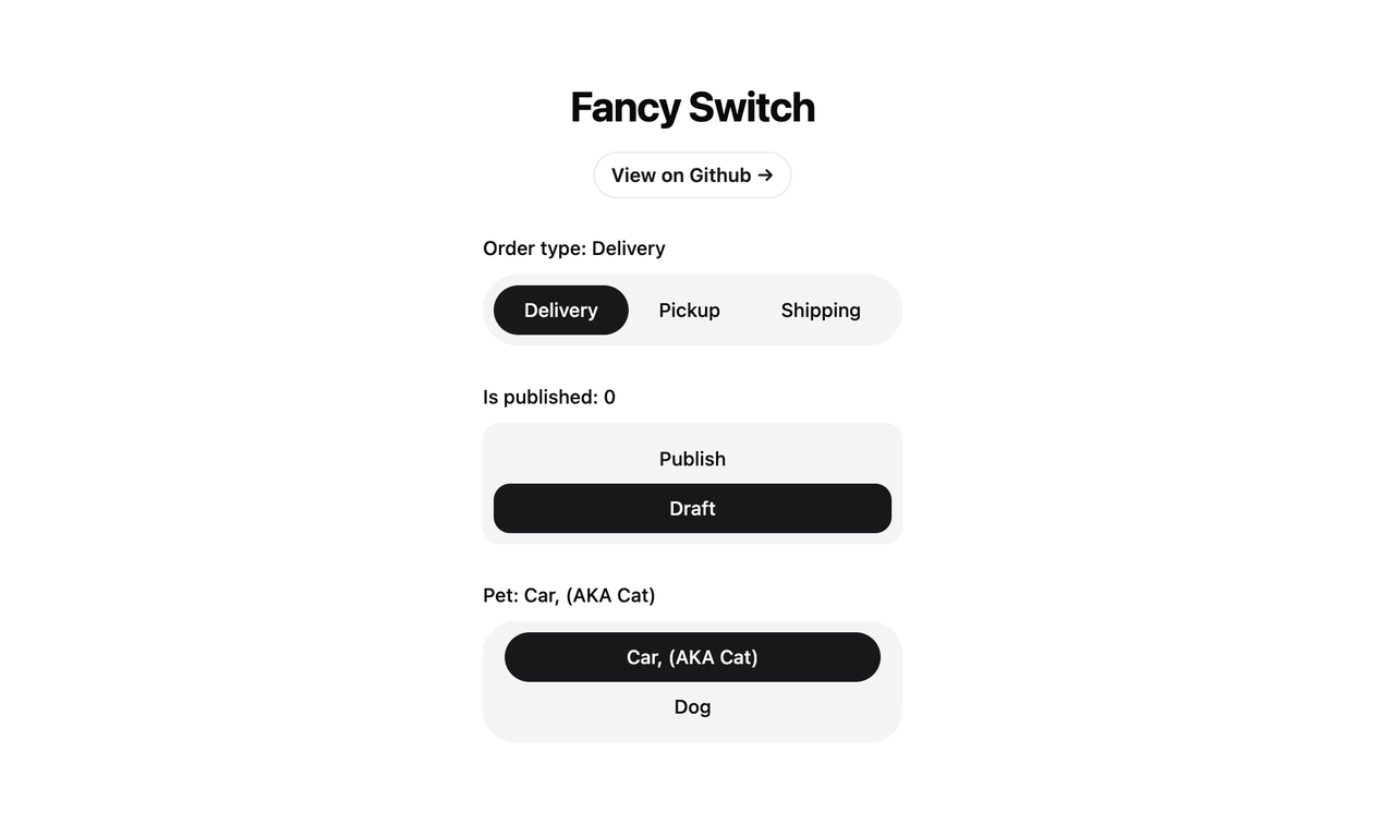


Simple React Fancy Switch Component without framer-motion. its customizable component that provides an elegant and interactive way to switch between multiple options. It's designed to be flexible, accessible, and easy to integrate into your React applications.
- Supports both string and object-based options
- Customizable styling for radio buttons and highlighter
- Keyboard navigation support
- Accessible design with proper ARIA attributes
- Smooth transition effects
To use FancySwitch in your project, you can install it via npm:
npm install @omit/react-fancy-switchHere are examples of how to use the FancySwitch component with different types of option arrays:
import React, { useState } from 'react'
import FancySwitch from '@omit/react-fancy-switch'

const StringExample = () => {
  const [selectedOption, setSelectedOption] = useState('apple')

  const options = ['apple', 'banana', 'cherry']

  return (
    <FancySwitch
      options={options}
      value={selectedOption}
      onChange={setSelectedOption}
      className="some-class"
      radioClassName="radio-button"
      highlighterClassName="highlighter"
    />
  )
}import React, { useState } from 'react'
import FancySwitch from '@omit/react-fancy-switch'
const DefaultObjectExample = () => {
const [selectedOption, setSelectedOption] = useState('option1')
const options = [
{ value: 'option1', label: 'Option 1' },
{ value: 'option2', label: 'Option 2' },
{ value: 'option3', label: 'Option 3' }
]
return (
<FancySwitch
options={options}
value={selectedOption}
onChange={setSelectedOption}
radioClassName="radio-button"
highlighterClassName="highlighter"
/>
)
}import React, { useState } from 'react'
import FancySwitch from '@omit/react-fancy-switch'
const CustomObjectExample = () => {
const [selectedOption, setSelectedOption] = useState(1)
const options = [
{ id: 1, name: 'First Choice' },
{ id: 2, name: 'Second Choice' },
{ id: 3, name: 'Third Choice' }
]
return (
<FancySwitch
options={options}
value={selectedOption}
onChange={setSelectedOption}
valueKey="id"
labelKey="name"
radioClassName="radio-button"
highlighterClassName="highlighter"
/>
)
}| Prop | Type | Default | Description |
|---|---|---|---|
options |
OptionType[] |
Required | An array of options to display. Can be strings or objects. |
value |
OptionValue |
- | The currently selected value. |
onChange |
(value: OptionValue) => void |
- | Callback function called when the selection changes. |
valueKey |
string |
'value' |
The key to use for the option's value when using object options. |
labelKey |
string |
'label' |
The key to use for the option's label when using object options. |
radioClassName |
string |
- | CSS class name for the radio button elements. |
highlighterClassName |
string |
- | CSS class name for the highlighter element. |
highlighterIncludeMargin |
boolean |
false |
Whether to include margins in highlighter size calculations. |
Additional HTML attributes for the container div can be passed as props and will be spread onto the root element.
type OptionValue = string | number
interface OptionObject {
  [key: string]: OptionValue
}
type OptionType = OptionValue | OptionObjectThe FancySwitch component provides CSS class hooks for styling:
- Use the
classNameprop to style the container div. - Use the
radioClassNameprop to style individual radio button elements. - Use the
highlighterClassNameprop to style the moving highlighter element.
Example:
<FancySwitch
  className="flex rounded-full bg-muted p-2"
  highlighterClassName="bg-primary rounded-full"
  radioClassName={cn(
    'relative mx-2 flex h-9 cursor-pointer items-center justify-center rounded-full px-3.5 text-sm font-medium transition-colors focus:outline-none data-[checked]:text-primary-foreground'
  )}
  highlighterIncludeMargin={true}
/>FancySwitch is built with accessibility in mind:
- Proper
roleandaria-attributes are used. - Keyboard navigation is supported (arrow keys to move between options).
- Focus management is handled automatically.
This project is open source and available under the MIT License.