


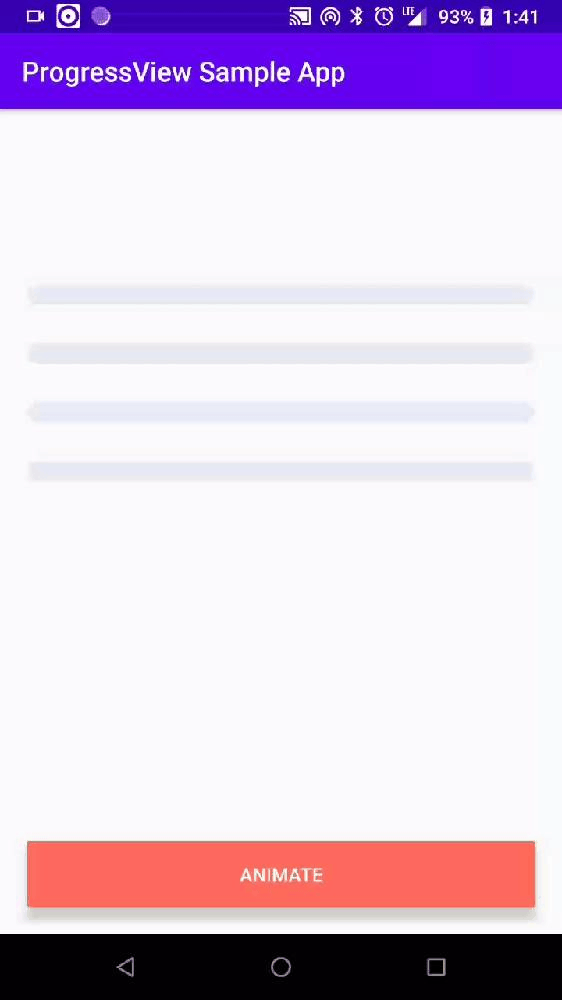
A Minimalistic ProgressView, fully customizable with animations.
Add below codes to your root build.gradle file (not your module build.gradle file).
allprojects {
    repositories {
        jcenter()
    }
}
And add a dependency code to your module's build.gradle file.
dependencies {
    implementation 'com.github.4bh1nav:ProgressView:v1.0'
}Add following XML namespace inside your XML layout file.
xmlns:app="http://schemas.android.com/apk/res-auto"Here is a basic example of implementing ProgressView.
<com.abhinav.progress_view.ProgressView
  android:id="@+id/progressView1"
  android:layout_width="match_parent"
  android:layout_height="35dp"
  app:progressView_animation="normal" //Interpolator to be used in state change animations
  app:progressView_autoAnimate="true"  //Animation enabled flag, if true, the view will animate it's state changes (enabled by default)
  app:progressView_radius="12dp"
  app:progressView_colorBackground="@color/white"  //Color of background
 />
Submit data to the view
val progressViewData = ProgressData("view1",30f,120f,R.color.rally_orange)
progressView.setData(progressViewData)The view accepts ProgressData object that define data to be displayed.
Each ProgressData object holds section's unique name (string), it's color (color int) and progress's value (float)and Total value (float).
val data = ProgressData(
    name = "view_name",
    value = 30f,
    total = 120f,
    color = R.color.rally_orange
)Interpolator to be used in state change animations.
ProgressViewAnimation.NORMAL
ProgressViewAnimation.BOUNCE
ProgressViewAnimation.DECELERATE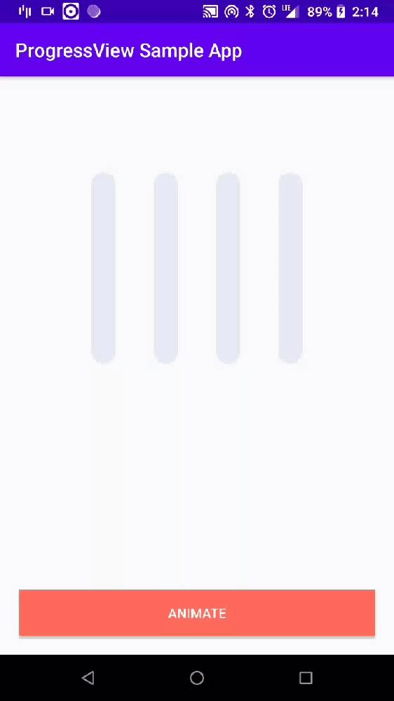
ProgressViewAnimation.ACCELERATEDECELERATEWe can implement the ProgressView vertically using the below option.
We should set the width and height value like vertical shape.
<com.abhinav.progress_view.ProgressView
  android:layout_width="35dp"
  android:layout_height="300dp"
  app:progressView_orientation="vertical"

...The view allows you to configure various properties to let you create a unique style that fits your needs.
| Name | Default value | Description |
|---|---|---|
progressView_orientation |
horizontal |
ProgressView's orientation (default horizontal ) |
colorBackground |
#e7e8e9 |
Background color of the ProgressView |
progressView_radius |
20dp |
The corner radius of the progressView |
progressView_autoAnimate |
true |
Animation enabled flag, if true, the view will animate it's state changes (enabled by default) |
progressView_animation |
DecelerateInterpolator |
Interpolator to be used in state change animations |
progressView_duration |
1000 ms |
Duration of state change animations in ms |
Copyright 2019 Abhinav Singh

Licensed under the Apache License, Version 2.0 (the "License");
you may not use this file except in compliance with the License.
You may obtain a copy of the License at

   http://www.apache.org/licenses/LICENSE-2.0

Unless required by applicable law or agreed to in writing, software
distributed under the License is distributed on an "AS IS" BASIS,
WITHOUT WARRANTIES OR CONDITIONS OF ANY KIND, either express or implied.
See the License for the specific language governing permissions and
limitations under the License.