mobile-layout
一、viewport和像素
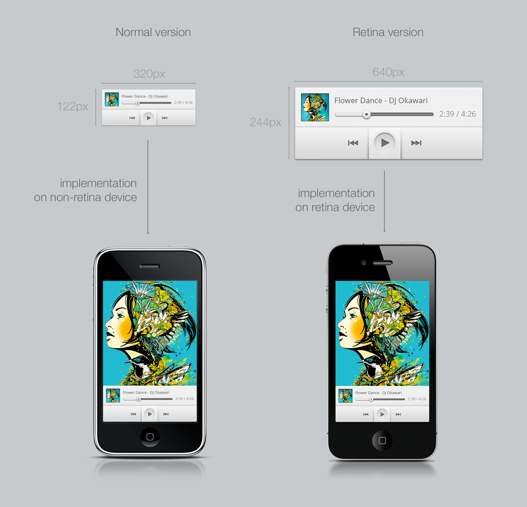
物理像素、CSS像素、独立像素和devicePixelRatio
- 物理像素 device pixel: 物理像素指显示设备上的物理像素点
- CSS像素 css pixel: 指我们写页面时理解的那个像素单位px
- 独立像素dp: (dips device independent pixels): DP用在Android上,PT用在Apple上
- 衡量设备的物理像素密度 DPI 和 PPI
- DPI 指 Dots Per Inch(dpi ldpi mdpi hdpi for android)
- PPI指 Pixels Per Inch。
- http://dpi.lv/
- window.devicePixelRatio = 物理像素/dips(dp) 等效于ddpx
- dppx : device pixel / css pixel;
- 分辨率(Resolution):屏幕区域的宽高所占像素数
- 设计师DPI指南
viewport和devicePixelRatio
-
meta viewport
- width:sets the width of the layout view port to the indicated value. device-width
- initial-scale: sets the initial zoom factor of the page and the width of the layout viewport.
- minimum-scale: sets the minimum zoom level (how much the user can zoom out).
- maximum-scale: sets the maximum zoom level (how much the user can zoom in).
- user-scalable: prevents user zooming when set to no. This is evil and we will demonstratively ignore it.
-
使用viewport和devicePixelRatio实现兼容retina屏幕的像素


-
devicePixelRatio测试:http://www.quirksmode.org/m/tests/widthtest_vpdevice.html
-
css中使用devicePixelRatio
 .css{
     background-image: url(img_1x.png);
 }

 /* 高清显示屏(设备像素比例大于等于2)使用2倍图  */
 @media only screen and (-webkit-min-device-pixel-ratio:2){
     .css{
         background-image: url(img_2x.png);
     }
 }

 /* 高清显示屏(设备像素比例大于等于3)使用3倍图  */
 @media only screen and (-webkit-min-device-pixel-ratio:3){
     .css{
         background-image: url(img_3x.png);
     }
 }
- vh单位:相对于视口的高度。视口被均分为100单位的vh
二、REM布局
rem原理
- 使用相对尺寸的一种,随着页面宽度的改变,html的font改变,控制页面用rem标记元素的尺寸
- 相对于百分比布局,控制局部尺寸更加方便
- 参考 淘宝无线首页
代码
- 需要设置基准元素还有最大的字体元素(防止全屏)
- 核心计算公式
- 页面宽度:getBoundingClientRect还是width
- htmlFont = min[pageWidth/(psdWidth/basicFont, maxFont)
- text-size-adjust调整100%
- html font size的设置 拼css完成 而不是document.documentElement.style.fontSize
- 绑定处理 DOMContentLoaded load resize 从未设置viewport的网页进入重新设置一下 pageshow/load persisted(是否后退进入)
实战
无线团队的lib.flexible
-
1 代码
-
2 不同点
- 为了快速兼容vh单位 将布局分为了100份
- 根据dpr控制meta的值,这样可以保证分别处理不同dpr的样式,但是增加了开发复杂度
三、Flexbox盒模型
原理

版本
-
display: -webkit-box;
-
display: -moz-box; //2009
-
display: -ms-flexbox;//2011
-
display: -webkit-flex;
-
display: flex; //now
‘APIS’
-
flex type
- display: inline-flex (make element inline-block)
- display: flex (make element block)
-
direction
- flex-direction:row row-reverse column column
- box-orient:horizontal vertical
-
wrap
- flex-wrap: nowrap | wrap(if not enough place will put content to the next row/column ) | wrap-reverse (should not use in mobile safari)
-
flex-flow(direction wrap)
- flex-flow: row nowrap;
-
justify-content(horizontal distribution)
-
justify-content: flex-start | flex-end | center | space-between | space-around;(should not use in mobile safari)
-
horizontal center:
-webkit-box-pack:center;
-webkit-justify-content:center;
-ms-flex-pack:center;
justify-content:center;
-
-
align-items (vertical distribution)
-
align-items: flex-start | flex-end | center | baseline | stretch
-
https://developer.mozilla.org/en-US/docs/Web/CSS/align-items
-webkit-box-align:center;
-webkit-align-items:center;
-ms-flex-align:center;
align-items:center;
-
-
align-self
- used for flex items to change its align-items
- align-items used for flex container
-
flex-grow flex-shrink


