onBlur validation produces undesired ui effect
audiolion opened this issue · comments

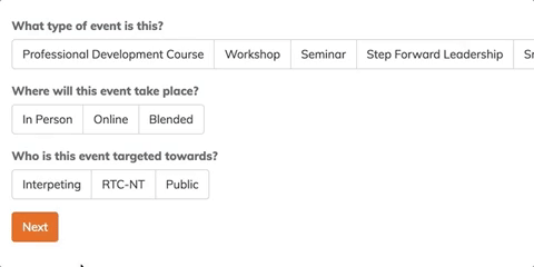
easiest to demonstrate with a gif, the onBlur validation affects the click processing of the next element, so you have to click it twice to get it to trigger

I think the issue is that when the validation passes and the error message gets removed it shifts the element spot so the click doesn't register on the element, see this gif where I click at the top of the elements for the first two and it works the as expected and the next button doesnt because I didn't click it all the way at the top

We had a similar problem in our app and we realized that making error messages not push around elements solves it and makes your UI better. If you position the error text absolutely, or render an empty error container (first option is better) it won’t push anything around so there won’t be a jump.
Check out the latest version, 0.1.1 I made it so if an error is set, it will be removed onChange. This means it should go away the moment they click a selection and pass validation!
great point, spacing out to allow room for the error message if present would be a much better design 💯 should be good with the onchange for faster response too