Stacked-bar-chart-visualizer
UW-Madison 2021 Fall CS765 Data Visualization
Course Final Project - Design Challenge 2
Yuchen Zeng, Lihe Liu
Try our tool: https://tiny-visualizer.herokuapp.com/.
1. Motivation and Goal
Stacked bar graphs (SBG) can be used to visualize the quantitative relationship that exists between a main category and its subcategories. Each bar represents a primary category and will be divided into different section that represents the subcategories for a second categorical variable.
However, there are many challenges in automatically resizing SBG. The change of the size and/or the aspect ratio of plotting frame will make the content too compact/skewed, and/or obscure the underlying relationship. Such limitation will create perceptional challenge and affect the visualization effectiveness.
The goal of this project is to develop a web app that visualizes the input dataset as a stacked bar chart in the required figure size.
Our main expectations are:
-
developing an efficient algorithm which automatically adapts a stacked bar chart to a smaller size;
-
building a small program which takes an external dataset, required figure size, two categorical variables and one numerical positive variable as input, and output a stacked bar chart with the expected figure size;
-
embedding the resizing algorithm into the program and building a user-friendly web app that can automatically generate customized stacked bar charts.
2. About this Tool
2.1 Description
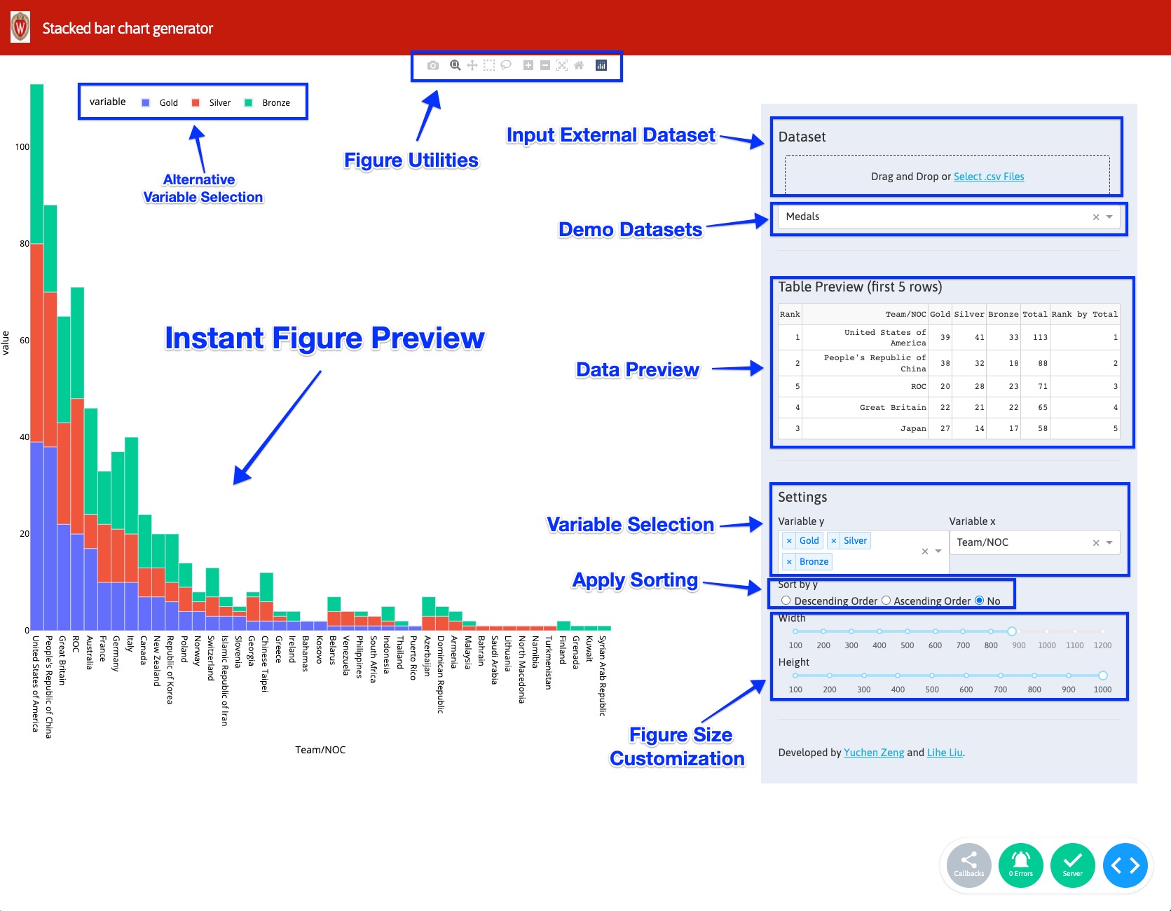
Our application has a user-friendly interface with two panels.(As shown)
The right panel has:
-
Data input and selection: We provide data input feature where user could provide their dataset as a .csv file. Note the provided dataset should be well-organized since data cleaning is beyond the scope of this tool. For a well-formatted dataset, user would be able to select whatever available variables to encode (see variable selection feature below). We also have two simple datasets provided for demonstration purpose. They are 2021 Tokyo Olympics medals counts by country and US Export of Plastic Scrap.
-
Data Preview: The first 5 rows will be briefly shown in this section.
-
Variable Selection: All available variables will be collected and shown in dropdown boxes for selection. A variable can be encoded to either the X or Y axis.
-
Sorting: Sorting can be applied to the variable(s) encoded to the Y-axis using the radio buttons provided.
-
Size Customization: Figure width and height can be specified using the slider provided. Values outside the provided range may be able to be applied temporarily.
The left panel has:
-
Figure Utilities: On the top, a set of functions, including downloading the current figure, can be accessed directly by clicking.
-
Instant Figure Preview: A preview of the dataset with the current parameters.
-
Alternative Variable Selection: The figure legend is displayed and can be used as an alterant for variable selection by simply clicking on the corresponding variable.
2.2 Implementation
Stacked bar chart visualizer is currently available online.
Alternatively:
user could download this repository and run python app.py.
Then access http://127.0.0.1:1234/ using your web browser.
3. Application Framework
This tool is developed using Dash apps.
This tool is deployed with Heroku.
