Tiny (596B) utility for composing class variants using clsx
pnpm add onno
- 🚀 Framework agnostic
- 🔬 Single tiny dependency on
clsx(330B) - 😋 Written in TypeScript with delicious type helpers
- 💯 Rigorously tested with 100% code coverage
- 🎊 Perfect companion to Tailwind CSS
import { onno } from "onno"

const button = onno({
  variants: {
    size: {
      sm: "h-8 px-1",
      md: "h-10 px-2",
      lg: "h-12 px-3",
    },
    intent: {
      primary: "bg-blue-600 text-white",
      secondary: "bg-gray-200 text-black",
    },
    disabled: "opacity-50",
  },
})

// "h-10 px-2 bg-blue-600 text-white opacity-50"
const classes = button({ size: "md", intent: "primary", disabled: true })Define variant names and the classes to be applied to them using the variants config option:
const button = onno({
  variants: {
    // This `boolean` variant is applied when `disabled === true`
    disabled: "access denied", // Classes can be defined as a `string`

    // This `boolean` variant is applied when `hidden === true`
    hidden: ["barely", "visible"], // Classes can also be a `string[]`

    // This `enum` variant is applied when `size === "sm" || "lg"`
    size: {
      sm: ["pretty", "small"], // Here we are using a `string[]` class list
      lg: "really large", // ...and here we are using a `string` class list
    },
  },
})

button() // ""
button({}) // ""
button({ size: "sm" }) // "pretty small"
button({ disabled: true }) // "access denied"
button({ hidden: true, size: "lg" }) // "barely visible really large"
Note that you cannot use className as a variant key since it is reserved for applying additional classes:
const button = onno({
  variants: {
    className: "not allowed", // Error: "className" cannot be used as a variant name
  },
})Default variants can be set using the defaults config option:
const button = onno({
  defaults: {
    hidden: true,
    intent: "secondary",
  },
  variants: {
    hidden: "barely visible",
    intent: {
      primary: "super punchy",
      secondary: "quite bland",
    },
    size: {
      sm: "pretty small",
      lg: "really large",
    },
  },
})

button() // "barely visible quite bland"
button({}) // "barely visible quite bland"
button({ hidden: false }) // "quite bland"
button({ intent: "primary" }) // "barely visible super punchy"
button({ size: "sm" }) // "barely visible quite bland pretty small"
Base classes can be applied using the base config option:
const button = onno({
  base: "solid base", // Can also use a `string[]` class list
  variants: {
    size: {
      sm: "pretty small",
      lg: "really large",
    },
  },
})

button() // "solid base"
button({}) // "solid base"
button({ size: "lg" }) // "solid base really large"Apply classes when certain variants are combined using the compounds config option:
const button = onno({
  variants: {
    hidden: "barely visible",
    size: {
      sm: "pretty small",
      md: "kinda normal",
      lg: "really large",
    },
  },
  compounds: [
    {
      size: ["sm", "lg"],
      className: ["compound", "one"], // Applied when `size === "sm" || "lg"`
    },
    {
      size: "md",
      hidden: true,
      className: "compound two", // Applied when `size === "md" && hidden === true`
    },
  ],
})

button() // ""
button({}) // ""
button({ size: "md" }) // "kinda normal"
button({ hidden: true }) // "barely visible"
button({ size: "lg" }) // "really large compound one"
button({ size: "md", hidden: true }) // "barely visible kinda normal compound two"
Additional classes can be applied using the className option:
const button = onno({
  base: "solid base",
  variants: {
    size: {
      sm: "pretty small",
      lg: "really large",
    },
  },
})

button() // "solid base"
button({ className: "with more" }) // "solid base with more"
button({ className: "with more", size: "sm" }) // "solid base pretty small with more"Classes are applied in the following order:
basevariantscompoundsclassName
Under the hood onno uses clsx to build the class list (see clsx docs)
For convenience clsx is exported from onno so you can use it to compose classes:
import { onno, clsx } from "onno"

const button = onno({
  variants: {
    size: {
      sm: "pretty small",
      lg: "really large",
    },
  },
})

clsx("foo", ["bar", { baz: true }], button({ size: "sm" })) // "foo bar baz pretty small"
Note that onno's className option also accepts any clsx.ClassValue so you can do:
import { onno, clsx } from "onno"

const button = onno({
  variants: {
    size: {
      sm: "pretty small",
      lg: "really large",
    },
  },
})

button({ size: "lg", className: ["foo", ["bar"], { baz: true }] }) // "really large foo bar baz"Use the OnnoProps type to infer variant props from an OnnoFunction
import { onno, type OnnoProps } from "onno"

export const button = onno({
  variants: {
    disabled: "not allowed",
    size: {
      sm: "pretty small",
      lg: "really large",
    },
  },
})

export type ButtonProps = OnnoProps<typeof button>
export type ButtonSizeType = ButtonProps["size"] // "sm" | "lg" | undefined
export type ButtonDisabledType = ButtonProps["disabled"] // boolean | undefined
Note that inferred OnnoProps also include the className option alongside the variants:
export type ButtonClassNameType = ButtonProps["className"] // clsx.ClassValueBy default all variants inferred by OnnoProps are optional. To require one or more variants, pass a union of required variant keys as the second argument to the OnnoProps generic type:
import { onno, type OnnoProps } from "onno"

export const button = onno({
  variants: {
    disabled: "not allowed",
    intent: {
      primary: "super punchy",
      secondary: "quite bland",
    },
    size: {
      sm: "pretty small",
      lg: "really large",
    },
  },
})

// Require both the `intent` and `size` variants
export type ButtonProps = OnnoProps<typeof button, "intent" | "size">

// Error: Property 'intent' is missing in type '{ size: "md" }'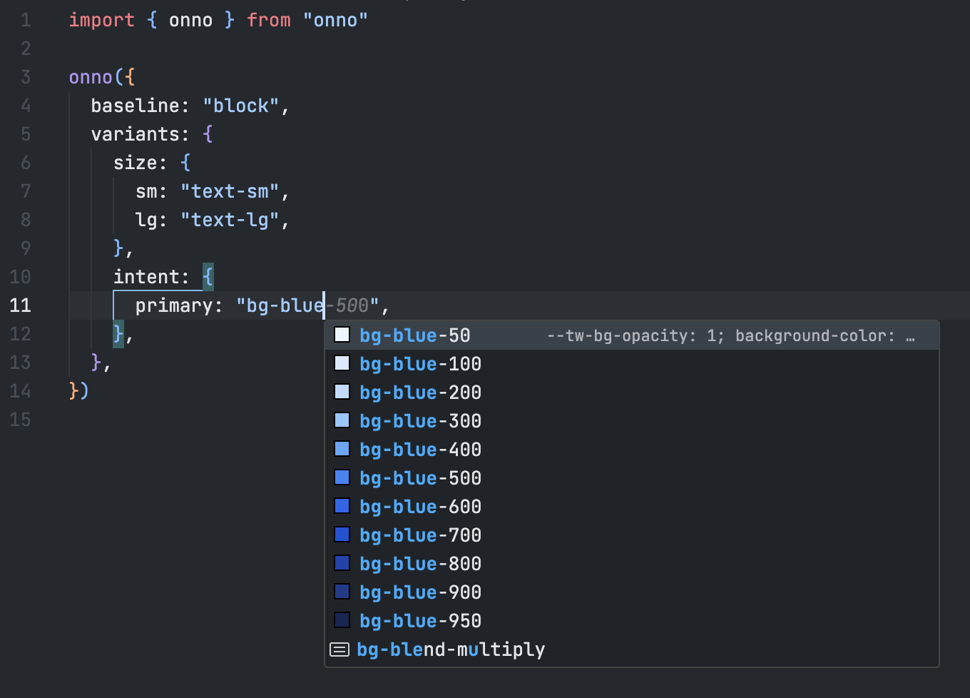
const buttonProps: ButtonProps = { size: "md" }If you are using the Tailwind CSS VSCode extension, add the following configuration to your workspace .vscode/settings.json file:
{
  "tailwindCSS.experimental.classRegex": [
    ["onno|clsx\\(([^)]*)\\)", "[\"'`]([^\"'`]*)[\"'`]"]
  ]
}
This will enable Tailwind's IntelliSense for both onno and clsx within your project! 🎉