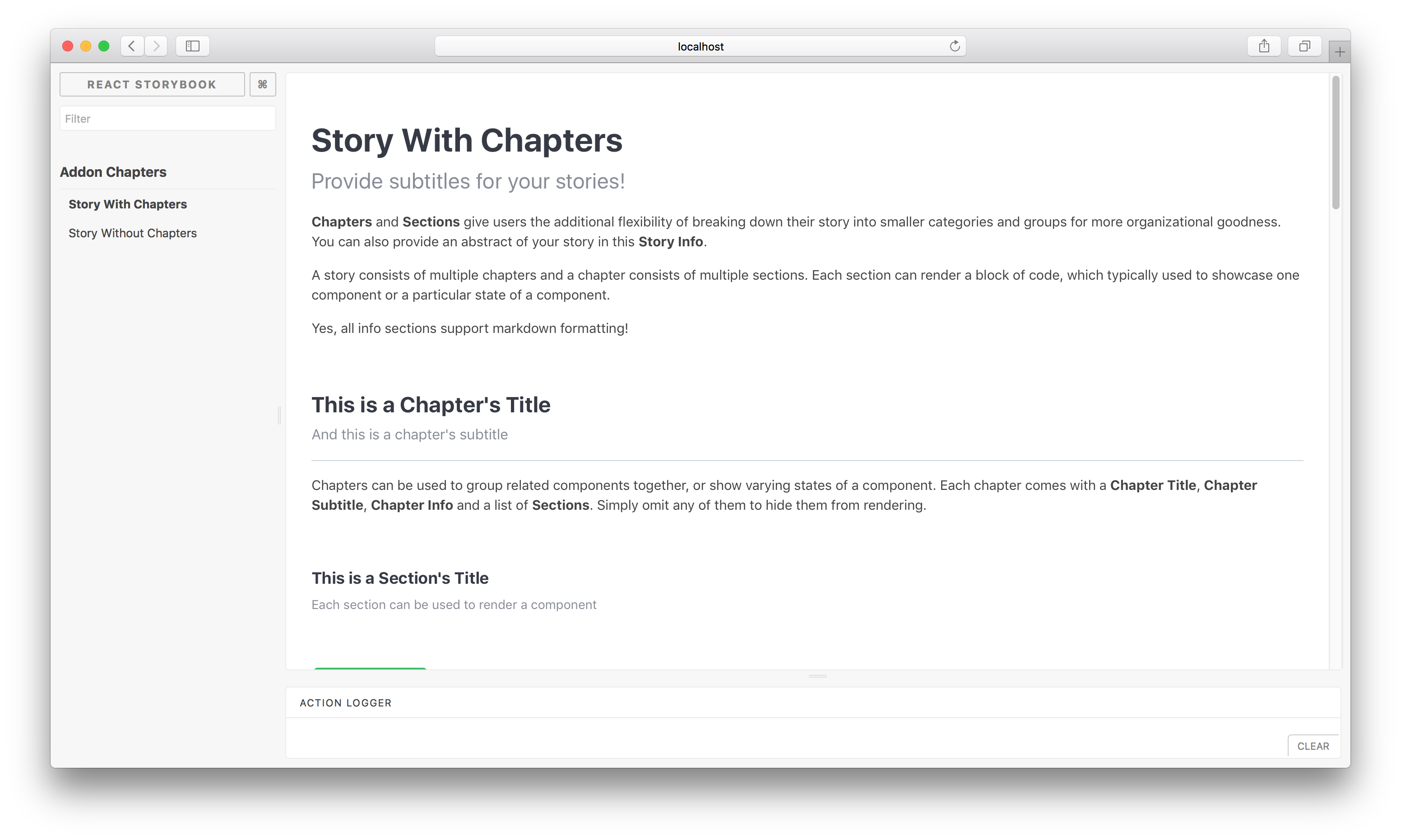
React Storybook Chapters addon allows showcasing of multiple components within a story by breaking it down into smaller categories (chapters) and subcategories (sections) for more organizational goodness.
Using the addon, a story can consist of multiple chapters and a chapter consists of multiple sections. Each section can render a block of code, which typically used to showcase one component or a particular state of a component.
Chapters can be used to group related components together, or show varying states of a component. Each chapter comes with a Chapter Title, Chapter Subtitle, Chapter Info and a list of Sections. Simply omit any of them to hide them from rendering.
Each section comes with a Section Title, Section Subtitle, Section Info.
This addon was modified from react-storybook-addon-info and uses some of the component code from there.
Install the following npm module:
npm install --save-dev react-storybook-addon-chaptersThen set the addon in the place you configure storybook like this:
import React from 'react';
import { configure, setAddon } from '@storybook/react';
import chaptersAddon from 'react-storybook-addon-chapters';

setAddon(chaptersAddon);

configure(function () {
  ...
}, module);
To turn off the default styles add:
setDefaults({sectionOptions: {useTheme: false}});All rendered components have a specified class. With the 'useTheme' set to false you should have no problem styling your chapters.
Then create your stories with the .addWithChapters API.
import React from 'react';
import Button from './Button';
import { storiesOf } from '@storybook/react';

storiesOf('Addon Chapters')
  .addWithChapters(
    'Story With Chapters',
    {
      subtitle: <Optional story subtitle>,
      info: <Optional story info>,
      chapters: [
        // List of chapters. Refer to Configuration Format section.
        {
          title: <Optional chapter title>,
          subtitle: <Optional chapter subtitle>,
          info: <Optional chapter info>,
          sections: [
            // List of sections.
            {
              title: <Optional section title>,
              subtitle: <Optional section subtitle>,
              info: <Optional section info>,
              sectionFn: () => (<Button label="My Button" onClick={() => { alert('Hello World!'); }}/>),
              options: {
                showSource: true,
                allowSourceToggling: true,
                showPropTables: true,
                allowPropTablesToggling: true,
              },
            },
            ...
          ],
        },
        ...
      ]
    }
  );
Have a look at this example stories to learn more about the
addWithChaptersAPI.
To configure default options for all chapter sections (section.options), use setDefaults in .storybook/config.js .
import React from 'react';
import { configure, setAddon } from '@storybook/react';
import chaptersAddon, { setDefaults } from 'react-storybook-addon-chapters';

// optionally override defaults
setDefaults({
  sectionOptions: {
    showSource: true,
    allowSourceToggling: true,
    showPropTables: false,
    allowPropTablesToggling: true,
    decorator: story => (<div>{story()}</div>),
  }
});
setAddon(chaptersAddon);

configure(function () {
  ...
}, module);| Key | Description | Type | Default |
|---|---|---|---|
| subtitle | Story subtitle | String | - |
| info | Additional information for the story | String (markdown) | - |
| chapters | An array of Chapter objects | Array | - |
| Key | Description | Type | Default |
|---|---|---|---|
| title | Chapter title | String | - |
| subtitle | Chapter subtitle | String | - |
| info | Additional information for the chapter | String (markdown) | - |
| sections | An array of Section objects | Array | - |
| Key | Description | Type | Default |
|---|---|---|---|
| title | Section title | String | - |
| subtitle | Section subtitle | String | - |
| info | Additional information for the section | String (markdown) | - |
| sectionFn | A function that returns a React component to be displayed | Function | - |
| options | A configuration object for this section. Refer to the next few rows for the keys | Object | - |
| options.showSource | Display the component's source | Boolean | True |
| options.allowSourceToggling | Allow showing/hiding of the component's source | Boolean | True |
| options.showPropTables | Display the component's propTypes | Boolean | False |
| options.allowPropTablesToggling | Allow showing/hiding of the component's propTypes | Boolean | True |
| options.decorator | An optional decorator function that will be used for rendering the component in section | Function | - |
Components lose their names on static build
Component names also get minified with other javascript code when building for production. When creating components, set the displayName static property to show the correct component name on static builds.
