Web terminals have more font saturation
FormalSnake opened this issue · comments

Hi, i love Hyper terminal and when i run neofetch, the colors look different than in iTerm2 (more saturated). It is the case in any other non-web terminal as well.
When i am on my iPad, i want to get the same saturation, but without a web terminal. Is there some special software i can install?
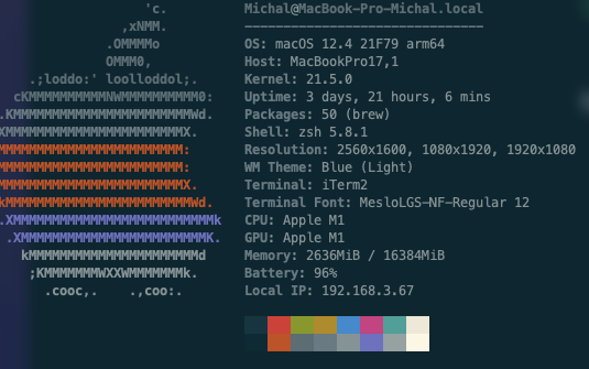
Hyper is on the right, and iTerm2 is on the left:

there is clearly a big difference in saturation

At the first glance it looks like you have a theme applied to hyper.app that changed the colors a bit, but Your iterm2 runs with default color preset, hence why you see difference. It has nothing to do with web-terminal :)
For example this is iterm2 with Color Preset "Solarized Dark"
So as you can see its all about (Color Preset) in iterm2 and themes in hyper.app. Different themes in hyper.app will sometimes use different color palette and produce different visual experience.
This fixed my problem, I saw your answer before but forgot to reply, thanks a lot!