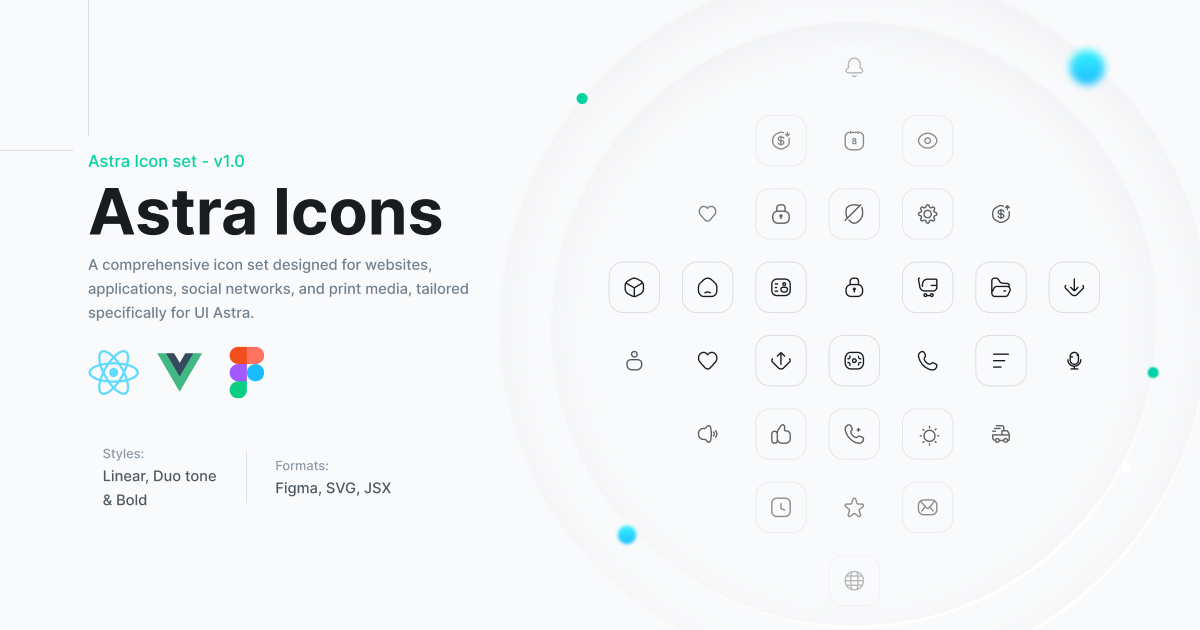
The easiest way to utilize these icons is to copy the SVG source from uiastra.com and directly embed it into your HTML:
<svg
  class="size-6 text-gray-500"
  fill="none"
  viewBox="0 0 24 24"
  stroke="currentColor"
  stroke-width="1.5"
>
  <rect x="2" y="2" width="20" height="20" rx="10" />
  <path
    d="M9 3C7.66667 8.84 7.66667 15.16 9 21"
    stroke-linecap="round"
    stroke-linejoin="round"
  />
  <path
    d="M15 3C16.3333 8.84 16.3333 15.16 15 21"
    stroke-linecap="round"
    stroke-linejoin="round"
  />
  <path d="M2 12L22 12" />
  <path d="M3 7L21 7" />
  <path d="M3 17L21 17" />
</svg>
These icons are designed to be easily styled by modifying the color CSS property, either directly or through utility classes such as text-gray-500 in frameworks like Tailwind CSS.
Begin by installing @astraicons/react from npm:
npm install @astraicons/reactThen import each icon individually as a React component:
import { GlobalIcon } from "@astraicons/react/linear";

function MyComponent() {
  return (
    <div>
      <GlobalIcon className="size-6 text-blue-500" />
      <p>...</p>
    </div>
  );
}
The 24x24 linear icons can be imported from @astraicons/react/linear, the 24x24 bold icons from @astraicons/react/bold, and the 24x24 brand icons from @astraicons/react/brand.
Icons are named using upper camel case and always end with Icon.
View the full list of icon names on UNPKG →
First, install @astraicons/vue from npm:
npm install @astraicons/vueNext, import each icon individually as a Vue component:
<template>
  <div>
    <GlobalIcon class="size-6 text-blue-500" />
    <p>...</p>
  </div>
</template>

<script setup>
import { GlobalIcon } from "@astraicons/vue/linear";
</script>
The 24x24 linear icons can be imported from @astraicons/vue/linear, the 24x24 bold icons from @astraicons/vue/bold, and the 24x24 brand icons from @astraicons/vue/brand.
Icons follow an upper camel case naming convention and always end with Icon.
View the full list of icon names on UNPKG →
While we welcome contributions to enhance the project, our current focus is on resolving issues like incorrect TypeScript types or improperly exported icons.
Please note that we are not accepting contributions for new icons.
This project uses parts from the HeroIcons library from TailwindLabs.
This library is released under the MIT license.