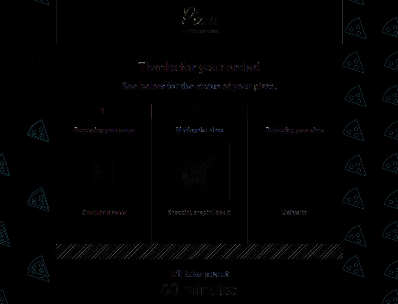
| Difference map (brighter pixels represent bigger difference) |
|---|
 |
-
The Font
- The smaller text is indeed Avenir Next. At a closer look, using a demi version of the font can match the mock up better then the regular in bold.
-
The Header
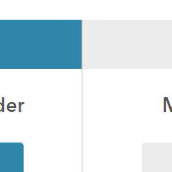
- In the mock up, the yellow header is shifted 1 pixel to the right. This creates a vertical white line to it's left and pokes out the right by 1 yellow pixel. In a real world case, this would be a mistake and I have not included it the finished product. (See image below)
| Header (Mock zoomed in) |
|---|
 |
- The Panel Seperator
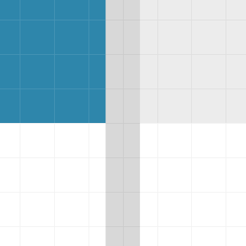
- Zoomed in to the mockup (left), the line seperating the 3 panels appears to have be 1 pixel thick, sitting between 2 pixels. When zoomed out (right), this looks like a 2 pixels thick with half the darkness. I decided to go with 1 pixel darker version following the zoomed in version of the mockup. (See image below)
| Panel seperator (Mock zoomed in) | Panel seperator (Mock zoomed out) | Panel seperator (Mine) |
|---|---|---|
 |
 |
 |
-
The Background
- The background is covered by a pseudo element, to show that I can bring a background opacity down to 30% without changing the opacity in the image directly in say photoshop.
- The right side of the background is purposely mismatched as a continuation of the left, because using two divs for one background is inefficient and too far from a real world case.
- For the tiling pattern of the pizza slices, I have two options:
- Option 1: Re-tile the pizza slice in photoshop to match the mock up. The first 3 slices of pizza in the top left match exactly, but the rest of the tiling in the mock up is inconsistent, so the rest of the slices can't be matched.
- Option 2: Don't touch the asset, instead use a background linear gradient trick in css: This will get you a 2x2 version of the image with only the top-left slice visible, then that 2x2 is tiled. This would only get the implementation somewhat close without changing the asset at all.
- (See difference map)
-
The Animated Loader GIF
- The animated loader is 50px tall in the mock up. The gif provided is 41px tall. I picked one of two options:
- Option 1: Stretch it up uniformly with the drawback of thicker lines and deviating from the mock up
- Option 2: Crop the gif to 25px tall, this height lets it tile, lets you match the thickness to mock up exactly
- Some CSS opacity blending with it's parent color is done to make the asset colors match the mockup colors exactly.
- The animated loader is 50px tall in the mock up. The gif provided is 41px tall. I picked one of two options:
-
Responsive Design with Mobile Layout
- It goes into a vertical, mobile targeted layout, when under 960px width, which should be lowered for real world cases.
- In this layout I moved the
It’ll take about 60 minutesportion to the top. - All panels are then stacked vertically, with completed panels removed from view.
-
Animated Transitions
- I added these for fun with a completed state that hides all panels when the delivery timer reaches 0.
-
CSS Selectors
- They are the most efficient when they are one level.
Example:
#myid {}and#myclass {}are more efficient than#myid .myclass {}In this simple app, I've avoided multilevel selectors for the most part and have left a few multilevels to reflect real world scenarios.
- They are the most efficient when they are one level.
Example:
-
Avoid re-renders in ReactJS
- Memo was used to avoid re-renders in the panels when only the timer has updated.