Cursor (I-Beam) has the wrong color in some input fields
nunq opened this issue · comments

Please use GitHub reactions 👍 to show that you are affected by the same issue. Please don't comment if you have no relevant information to add!
Describe the bug
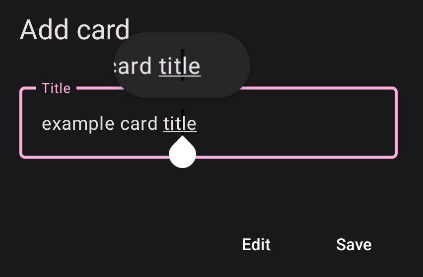
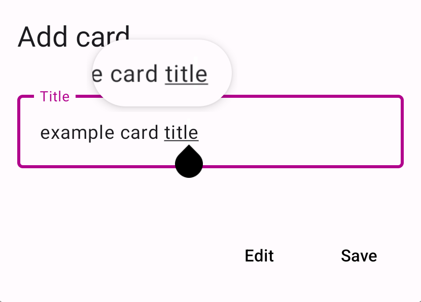
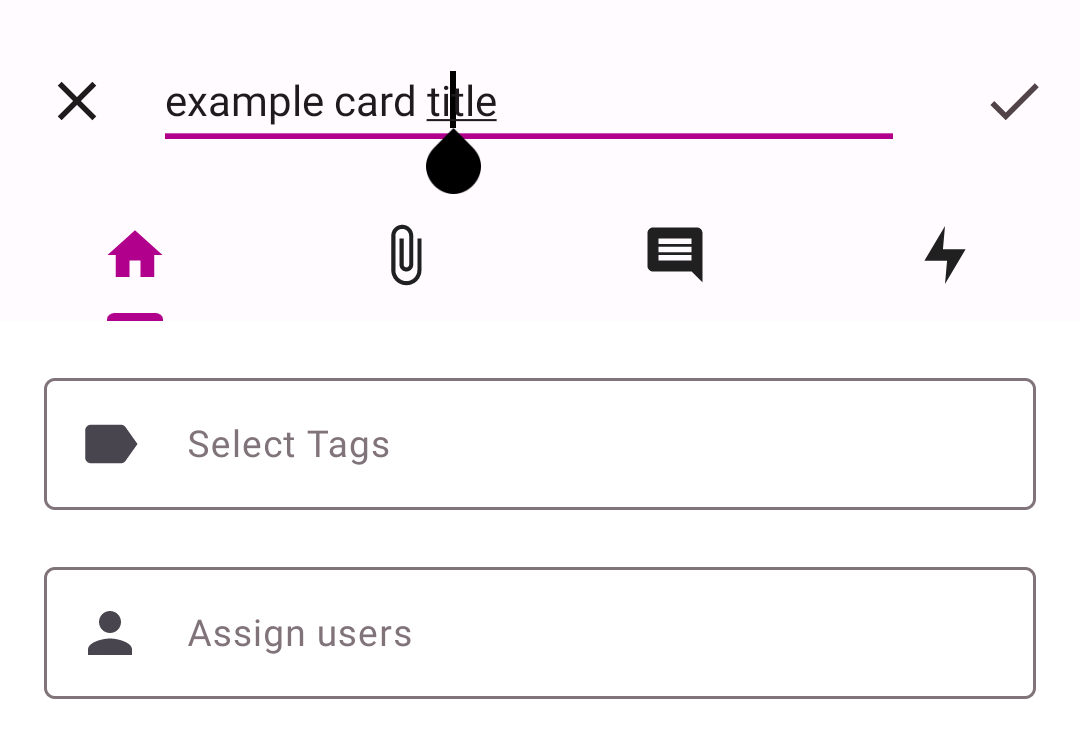
The cursor/I-Beam has the wrong color in some text fields, the ones I have noticed so far are the 'add card' dialogue and the 'edit description' textarea in the card view. Oddly enough, the 'edit card title' text input seems to use the right colors.
This color mismatch makes it rather hard to edit text as it is hard to see where the cursor is.
Steps to reproduce the behavior:
- Click on '+' button in the bottom right
- See that the cursor has the wrong color
Expected behavior
The cursor is clearly visible.
Screenshots
See the 'add card' dialogue in light and dark mode. I included the 'touch and hold' magnifying to make the cursor easier to see.
The black cursor is hard to see:
While the white cursor is not visible at all:
Cursor has correct color in the 'edit card title' dialogue:
Versions
- Nextcloud: 25.0.3
- Nextcloud Deck: 1.8.3
- Nextcloud Android: 3.24.2
- Nextcloud Android Deck: 1.22.1
Smartphone (please complete the following information):
- Device: Google Pixel 4a
- Android-Version: 13
- App-Store:
- Google Play Store
- Google Play Store (Beta channel)
- F-Droid
- Huawei AppGallery
Stacktrace
I can try to provide them later, if needed.
Thanks!

After long time the app was updated to v.1.23.4, but bug with coursor doesn't solved yet :(((

@nunq would you mind retesting this issue with the latest Deck Android version (1.24.1)? There has been quite some work on the theming party of the app, the cursor and I beams should have sufficient contrast in all places now. At least I couldn't find any remaining place that behaves as wrong as in your screenshots 😉