TimelineView

A customizable and easy-to-use Timeline View library for Android
Can be used as a standalone view or as a RecyclerView decorator
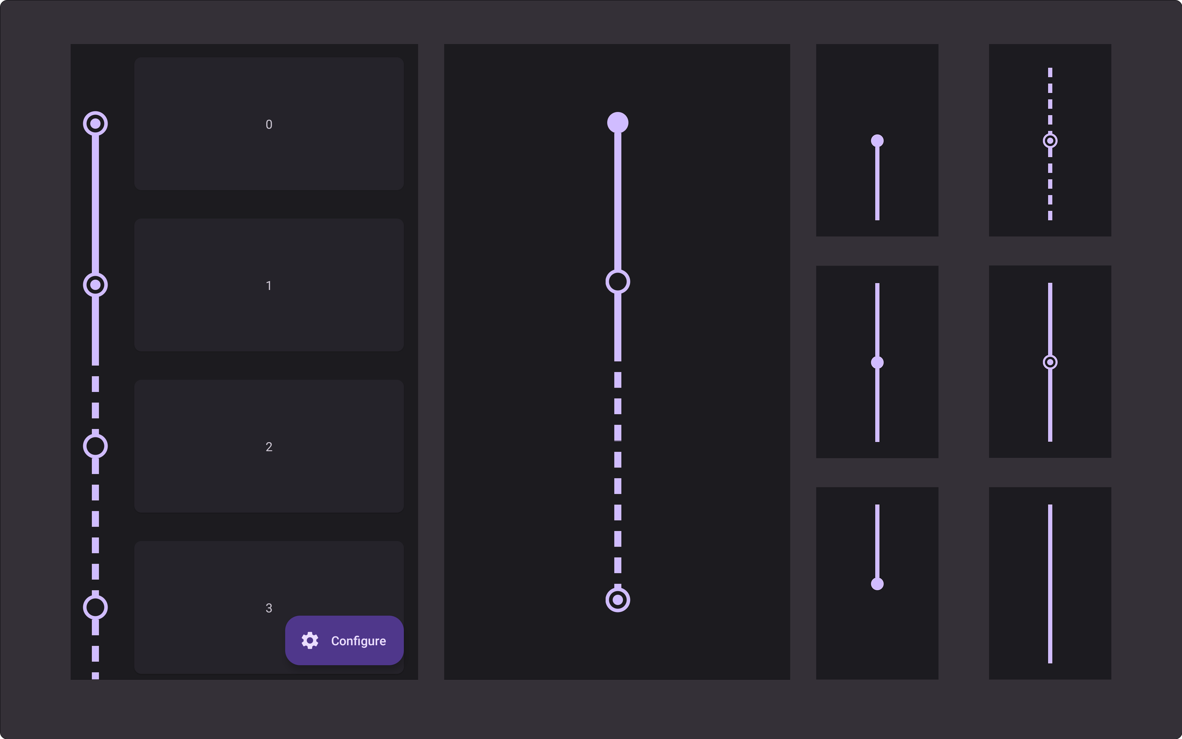
Previews
| Automatically adapts to the item height and supports expand animations | View type | Preview | View type | Preview | View type | Preview |
|---|---|---|---|---|---|---|
 |
first |  |
middle |  |
checked |  |
| last |  |
spacer |  |
dashed |  |
Setup
1. Add Jitpack to your root build.gradle
allprojects {
    repositories {
        maven { url "https://jitpack.io" }
    }
}
2. Add the dependency
dependencies {
    implementation 'com.github.lriccardo:TimelineView:1.0.5'
}
Usage
RecyclerView Decorator
recyclerView.addItemDecoration(
    TimelineDecorator(
        indicatorSize = 24f,
        lineWidth = 15f,
        padding = 48f,
        position = TimelineDecorator.Position.Left,
        indicatorColor = Color.RED,
        lineColor = Color.RED
    )
)-
Customization
Field Accepted values Default indicatorStyle IndicatorStyle (Filled | Empty | Checked) Filled indicatorSize Float 24f indicatorYPosition Percentage (0.0f - 1.0f) 0.5f checkedIndicatorSize Float TimelineView default value checkedIndicatorStrokeWidth Float 4dp lineStyle Normal (Normal | Dashed) TimelineView default value linePadding Float TimelineView default value lineDashLength Float TimelineView default value lineDashGap Float TimelineView default value lineWidth Float TimelineView default value padding Float 16dp position Position (Left | Right) Left indicatorColor @ColorInt TimelineView default value lineColor @ColorInt TimelineView default value -
Advanced customization
If your
RecyclerView.AdapterimplementsTimelineAdapteryou can customize how each item of your list is drawn. Implementing one or all of these methods, allows you to use thepositionargument to return a different customization for some of your items.interface TimelineAdapter { fun getTimelineViewType(position: Int): TimelineView.ViewType? fun getIndicatorStyle(position: Int): TimelineView.IndicatorStyle? fun getIndicatorColor(position: Int): Int? fun getLineColor(position: Int): Int? fun getLineStyle(position: Int): TimelineView.LineStyle? fun getLinePadding(position: Int): Float? }
Standalone view
<com.lriccardo.timelineview.TimelineView
    android:layout_width="wrap_content"
    android:layout_height="match_parent"
    app:timeline_item_type="first"
    app:indicator_size="12dp"
    app:line_width="8dp"
    app:indicator_color="@color/teal_700"
app:line_color="@color/teal_700" />-
Customization
Attribute Accepted values Default app:timeline_item_type first | middle | last | spacer first app:indicator_style filled | empty | checked filled app:indicator_size Dimension 12dp app:indicator_color Color Color.RED app:indicator_y_position Percentage (0.0 - 1.0) 0.5f app:checked_indicator_size Dimension 6dp app:checked_indicator_stroke_width Dimension 4dp app:line_style normal | dashed normal app:line_width Dimension 8dp app:line_color Color Color.RED app:line_dash_length Dimension 18 app:line_dash_gap Dimension 12