| Author: | Ralf Schlatterbeck <rsc@runtux.com> |
|---|
This is a program to plot antenna-related data resulting from an antenna
simulation. It can read the text output produced by nec2c and my
python mininec port pymininec. Most notably it can plot antenna
far-field pattern in both 2D (Azimuth and Elevation) and 3D (as a 3D
graphic that can be rotated and zoomed). It supports a local display
program (using matplotlib) and a HTML output version that displays
everything using javascript (using plotly). The program features a
--help option. If the program called with --help does not
display a -H or --export-html option, you most likely do not
have a recent version of plotly installed. In that case only the
matplotlib variant is available. For the plotly variant to work you
need both, a recent version of plotly as well as pandas installed.
The program started out as a companion-program to my pymininec project and is now an independent program.
The plot program can also display output files of nec2c, not only from pymininec.
The default is to plot all available
graphics, including an interactive 3d view. In addition with the
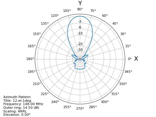
--azimuth or --elevation options you can get an Azimuth
diagram:
plot-antenna --azimuth test/12-el-1deg.pout
or an elevation diagram:
plot-antenna --elevation test/12-el-1deg.pout
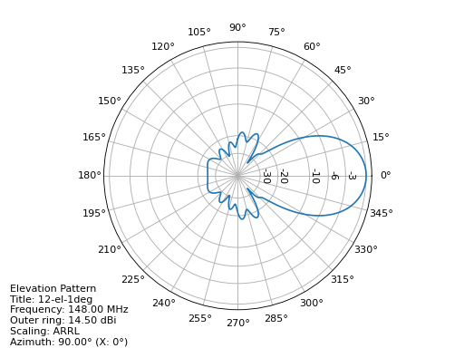
respectively. Note that I used an output file with 1-degree resolution
in elevation and azimuth angles not with 5 degrees as in the example
above. The pattern look smoother but a 3D-view will be very slow due to
the large number of points. The plot program also has a --help
option for further information. In particular the scaling of the antenna
plot can be selected using the --scaling-method option with an
additional keyword which can be one of linear, linear_db, and
linear_voltage in addition to the default of arrl scaling. You
may consult Cebik's [1] article for explanation of the different
diagrams. The linear_voltage option is not explained by Cebik, it is
in-between the linear and linear_db scaling options.
The latest version accepts several plot parameters, --elevation,
--azimuth, --plot3d, --plot-vswr, and --geo which are
plotted into one diagram. The default is to plot the first four graphs.
With the --output option pictures can directly be saved without
displaying the graphics on the screen. Note that unfortunately the
geometry display with the --geo option does not perform very well
because matplotlib has poor support for panning and scaling in 3D
plots.
The latest version has key-bindings for scrolling through the
frequencies of an antenna simulation. So if you have an output file with
a simulation of multiple frequencies (either with pymininec or
nec2c) you can display diagrams for the next frequency by typing
+, and to the previous frequency by typing -. For newer versions
of matplotlib you can display a scrollbar for the frequencies with
the --with-slider option.
Other keybindings switch the scaling for the antenna plots, a
switches to arrl scaling, l switches to linear scaling, d
switches to linear dB scaling, and v switches to linear voltage
scaling.
Finally the w key toggles display of the 3d diagram from/to
wireframe display. Note that the wireframe display may not be supported
on all versions of matplotlib and/or graphics cards.
All the plot supported for matplotlib are also supported with plotly.
These are --elevation, --azimuth, --plot3d, --plot-vswr,
and --geo. The plots can be either exported to a .html file using
the -H or --export-html option (with an additional filename to
export to) or injected into a running browser using the -S or
--show-in-browser option.
Unlike for matplotlib, each plot selected with an option is either
shown in a separate window in the browser or exported to a separate
file. If exporting to a file, additional output options can be selected
with the --html-export-option setting. The default is to export the
file with all javascript included (adds about 3MB to the file size).
With --html-export-option=directory the javascript is not included
and a plotly.min.js file is expected in the same directory as the
exported file. This file ships with the plotly distribution. When
exporting to a file, the plot name is appended to the file name given,
this allows export to several different plots in one program invocation.
The scaling variants selected with the --scaling-method option
cannot currently be changed at runtime with the plotly plots. As with
matplotlib, the default is arrl scaling.
All plots are interactive. For the far-field pattern plots (Azimuth, Elevation, 3D) frequencies can be selected in the legend to the right of the plot. With mouse-over you can see the current angle (Elevation or Azimuth with the 2D plots and both for the 3D plot) and the gain at that point. For the 2D variants, more than one frequency can be selected for plotting. This allows comparison of pattern between different frequencies. For the 3D plot, the frequencies in the legend act like radio-buttons, only one at a time can be selected.
With the --geo option you get a display of the antenna geometry.
Unfortunately plotly seems to have limitations on the zoom depths, so
for large antennas it is not possible to see the plot in deep detail. As
of this writing not all geometry details are displayed. In particular 2D
patches in NEC, transmission lines in NEC, and visualization of loaded
segments (e.g. with a capacity) are not shown.
| [1] | L. B. Cebik. Radiation plots: Polar or rectangular; log or linear. In Antenna Modeling Notes [2], chapter 48, pages 366–379. Available in Cebik's Antenna modelling notes episode 48 |
| [2] | L. B. Cebik. Antenna Modeling Notes, volume 2. antenneX Online Magazine, 2003. Available with antenna models from the Cebik collection. |
v1.8: Allow plotting of measurement data
- Deal with sparse matrix for plot values
- Interpolation of measured values in Phi (Azimuth) direction
- Add STL output of 3d pattern with optional library
- Allow setting the dB-unit (e.g. dBm for measurements)
- Allow plotting by polarization
- Version computation changed to allow install from git url
Note: Smith chart with matplotlib currently needs my patched pySmithPlot library. You can install this with:
python -m pip install pysmithplot@git+https://github.com/schlatterbeck/pySmithPlot.git
v1.7: Add Smith charts, optionally show impedance and band in VSWR plots
Many of the changes in this and several previous versions were suggested by Rob Banfield, DM1CM: Adding the bands and impedance to the VSWR plot are his idea as well as adding a Smith chart. Due to his attention to detail this release corrects a lot of rough edges of previous versions. Thanks Rob!
- The aspect ratio in 3D plotly plots is now correct. It used to be a little too wide in the X direction
- Add Smith chart display
- Options to add the impedance (either as real/imag or |Z|/phi (Z)) in the VSWR plot
- Option to show the ham radio bands in the VSWR plot
- Show loads and excitation(s) in geo plot, add ground to geo plot
- Margin of 3D plots in plotly are much wider now by default and can be configured with an option
- The style how the gain is displayed in the plotly 3D color bar can now be configured to save space (either relative or absolute gain in dB or dBi, the default is both)
- When there is only one frequency in the 3D plot, remove the frequency legend
- Add LICENSE file and pyproject.toml for newer install mechanisms in python
- Add tests for plotly output
- Use ppm images for the tests, the previously-used png images did contain the matplotlib version and thus were different for each version -- the ppm images do not have that problem, there are still many differences with different matplotlib versions
v1.6: More SWR plot changes
- Make SWR-plot vertical line colors configurable
- Rename elevation-angle and azimuth-angle options to angle-elevation and angle-azimuth so that we can again request an elevation/azimuth plot with shortened options like --ele or --azi
- Sort options lexicographically on --help
v1.5: Allow target SWR frequency in VSWR plot
- Add command-line option --target-swr-frequency
- Draw user-specifed target frequency in red, best (minimum) swr in grey
v1.4: Reset button and VSWR-Plot improvements
- Add grid and minimum-SWR vertical line to VSWR plot
- Remove display of frequency in mouse-over (in polar plots and 3D plot)
- Make polar reset button reset more parameters
v1.3: Add a reset button to plotly polar plots
- The polar plots, when zoomed in, could only be reset to the unzoomed view with a double-click. All other plots do have a reset button, add one for the polar plots, too.
v1.2: Allow specification of title (legend) font size in plotly version
- For some application (e.g. when using the plotly graphics inside a
html iframe) the title (or we may want to call it legend) of the
graphics may collide with the graphics itself. We can now specify the
font size with
--title-font-size. This option currently works only with plotly graphics.
v1.1: Specification of azimuth / elevation angle
- Now we can specify an azimuth angle for elevation plot and an elevation angle for azimuth plots.
- Bug-fix in computation of maximum gain azimuth direction: If the maximum gain in theta direction goes up or down, the azimuth angle would be computed incorrectly because all gain values at that theta angle are the same for all azimuth angles.
- Sort options: Since there are some options that only exist when some packages are installed we sort options instead of trying to add them in the correct order.
v1.0: Initial Release