A CSV file data analyzer using pure Python.
This is a CSV file data analyzer based on Python.
Features:
- Easy to use.
- Statistics(Sum, Mean, Std, Max and Min) of each data are calculated automatically.
- It can create multiple 2/3D graph.
- Launched on Windows 10

- Python 3.6.x or higher
- matplotlib
- mpl_toolkits
- numpy
- seaborn
- pandas
- tkinter
- Clone this repository.
- Install required libraries.
- Execute the following command and a GUI will be opened.
$ python src/CsvDataAnalyzer.py
-
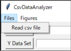
"Files" at left top of GUI -> "Read csv file"
-
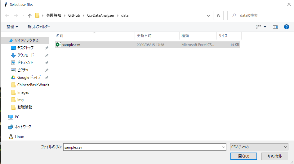
A file dialog will be oped.
-
Multiple CSV files can be selected too.
-
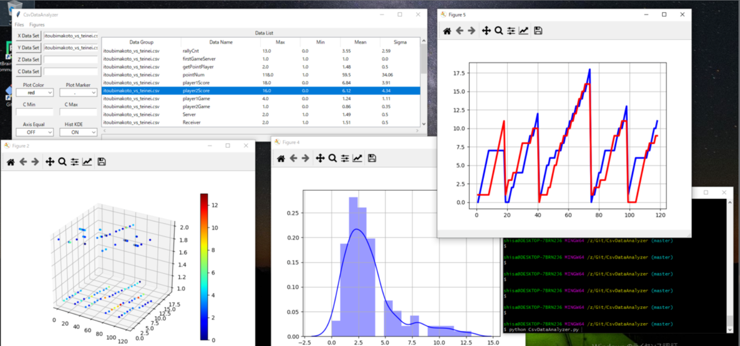
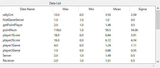
Reading will finish like this.
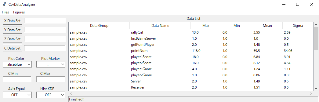


- Max, Min, Mean and Sigma(Std) will be calculated automatically.
- Those values are displayed on GUI.

-
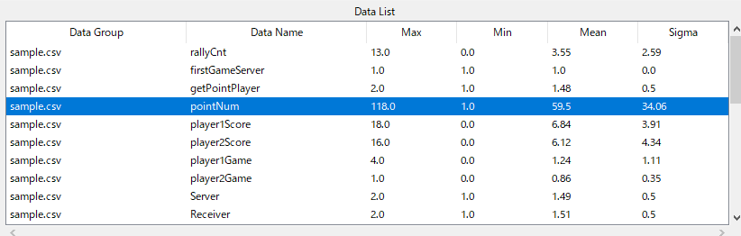
Select data you want to analyze on GUI.
-
Selected data is colored blue by left click.
-
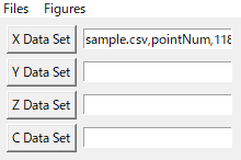
Set data to X axis by pushing "X Data Set".
-
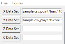
Set another data to Y axis by pushing "Y Data Set".
-
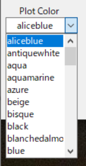
Select plot color from pull-down menu.


-
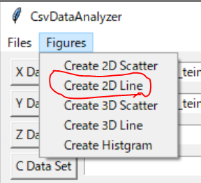
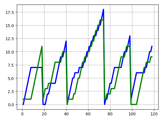
After setting data, select "Create 2D Line" from "Figures" menu.
-
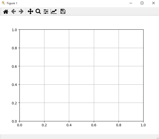
A empty figure will be opened.
-
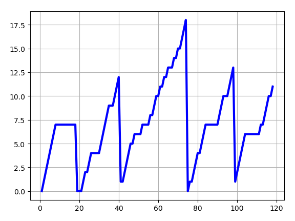
On the figure, click the right button. -> The 2D line graph will be shown.
-
Another data can be shown on the same figure.


-
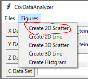
After setting data, select "Create 2D Scatter" from "Figures" menu.
-
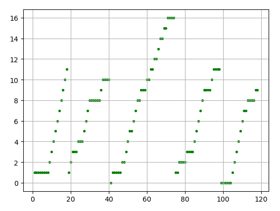
By following the above procedure, the 2D scatter graph will be shown.
-
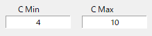
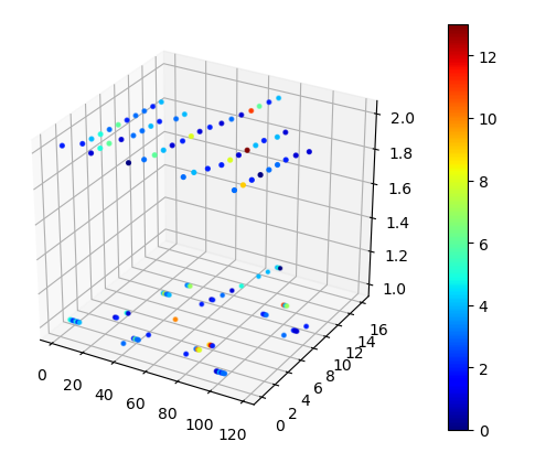
By setting a color data to "C Data Set", a heatmap can be created.
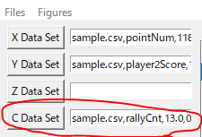


- You can set min/max velues of color bar.


-
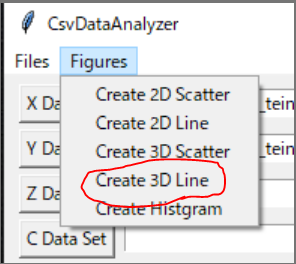
After setting data, select "Create 3D Line" from "Figures" menu.
-
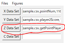
Set another data to "Z Data Set".
-
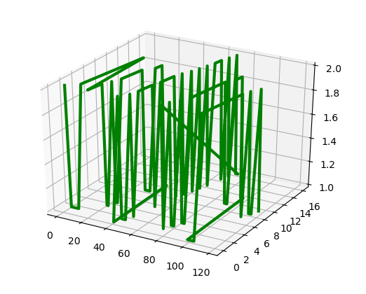
By following the above procedure, a 3D line graph will be shown.


-
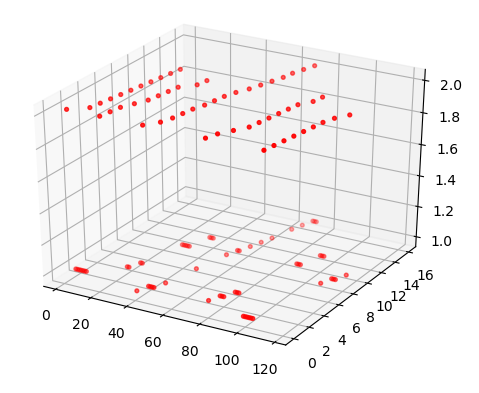
After setting data, select "Create 3D Scatter" from "Figures" menu.
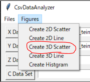
-
By following the above procedure, a 3D scatter graph will be shown.
-
3D heatmap can be created too.


-
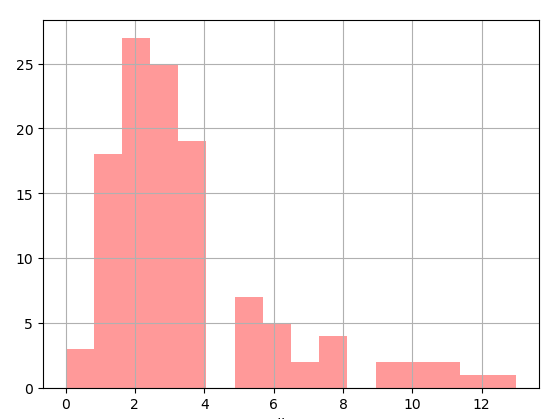
After setting data, select "Create 3D Histgram" from "Figures" menu.
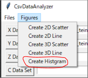
-
This histogram shows X data distribution.


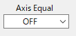
- You can switch ON/OFF from a pull-down menu "Axis Equal"".

-
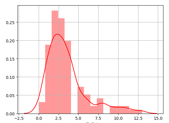
When a histogram graph is created, you can show a kernel density function together.
-
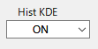
You can switch ON/OFF from a pull-down menu "Hist KDE".


MIT