Is there a way to put the caption at the bottom?
mgouget opened this issue · comments

Hello!
Thanks for this component which works great. Especially the full screen mode is a godsend!
Is there a way, when not using indexes, to put the caption at the bottom instead of the top?
I tried fiddling with the CSS without success.
I also tried using the "Caption outside vue-flux" mode, but in that case the caption does not appear when in full screen mode. Also, in that case, the following text jumps at each transition, as there is a
Regards!
Michel

Hello, and thanks for your words. I'm glad that you like it 😁
About the order is something I didn't think about, but as the items are flexed, you should be able to give them any order using the flex order property, like here
Please, check it and let me know if it doesn't work so I can find another way or create a feature.
Regards
Hello, did you try the solution I proposed?
Hello,
Thanks for the trick; in fact I am new in front-end development, so I don't master CSS well...
I found a solution by using the "Caption outside vue-flux", and conditionally disabling <flux-caption> inside using a document.onfullscreenchange handler and plagiarising your fullscreen detection routine :)
<vue-flux>
...
           <template v-slot:caption>
                <div v-if="fullScreen">
                    <flux-caption />
                </div>
            </template>
...
</vue-flux>
This works and allows me to style the caption when in normal mode; but a property allowing to position caption at top or bottom would be nice.
I got also feedback from a tester that the < and > buttons are too small, especially on a phone screen; maybe adding a property allowing next/previous when touching the left/right x% of the screen estate?
I have had a more serious problem when using vuetify with the drawer: the in-carousel caption is displayed above the drawer making it unusable... which explains why I don't use it in normal mode ;)
I was able also to add a tagline above the carousel by using the following:
<vue-flux>
...
<div class="in-carousel">
            <div style="text-align:center;">
                <p class="mg-h1 mg-gradient">
                    {{ tag.main }}
                </p>
            </div>
<div>
...
</vue-flux>
---
<style>
.in-carousel {
    position: absolute;
    width: 100%;
    top: 17vw;
    z-index: 5;
}
.mg-h1 {
    font-size: 6.5vw;
    font-weight: 300;
    font-family: Ubuntu;
    color: white;
}
.mg-gradient {
    display: inline;
    padding: 0px 0em;
    margin: 0;
    text-shadow: 0 0 0.5vw hsla(0, 0, 0%, 1);
}
</style>
Adding a callback function called at each transition would also be very nice for updating the tagline depending on the displayed slide...
Anyway, kudos for your superb component!
Michel
The CSS solution is way better, although the solution I gave you would have not work because the caption had the position absolute by mistake. I will give you the CSS code that will make it work:
.vue-flux .flux-caption {
   position: static;
   top: auto;
   bottom: auto;
   left: auto;
   right: auto;
   width: 100%;
   order: 5;
}
Just using the CSS above should fix all your problems, even the one with the drawer, otherwise let me know but I'm pretty sure, so you don't need all the stuff that you added.
About the buttons size, thanks a lot for the feedback, I will check them, but in the mean time you can just overwrite the CSS styles defining a minimum size:
.vue-flux .flux-button {
   min-width: 30px;
   min-height: 30px;
}
Thanks a lot for your kind words 😀 .
Regards!
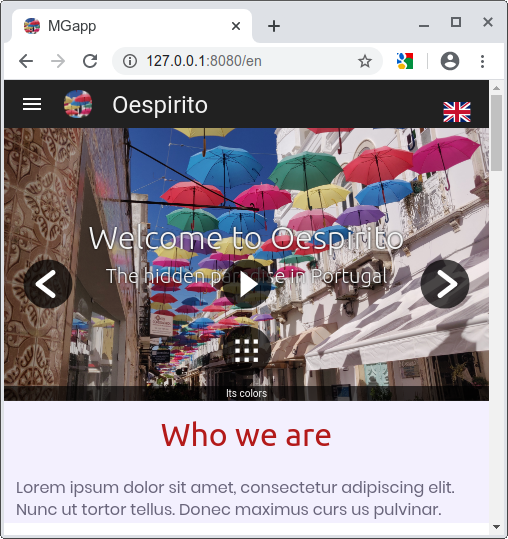
Hello Deulos, and thanks for your fast answer!
About the buttons,this is a very good band-aid solution, but it makes the buttons too big on a phone screen (see pic below)
I definitely think that the button display and the sensitive area should be decoupled (maybe by creating a div inside the sensitive area and displaying the button inside, so that we could style the padding/margin ???)
I tried your caption CSS which is nearly perfect for me, EXCEPT that the caption and the buttons are still displayed ABOVE the drawer. I tried fiddling with "order" and "z-index" for both the buttons and drawer, but without success. Here's the pic:

and that's a show stopper :(
Anyway these are details, the carousel is superb and I have acceptable solutions to go around glitches :)
Michel
Set the min sizes to adapt your needs, the code I gave you sets it to 30 but you car cange to 22 or so.
The idea of increasing the sensitive area is good but enter in conflict with the gestures...
About the drawer, I just checked the complements and they have a z-index of 45, but do not lower it or could cause some transitions to not display properly. Instead, increase the z-ondex wrapper over 45, and be sure that the css selector is enough specific checking the computed properties in developer tools. That should make it display properly.
Thanks again for your kind words, it is always a pleasure to help people like you 👍
Regards!
Hello, as I got no news, I will close the issue.
Let me know anyway if I can give you a hand in anything.
Regards!