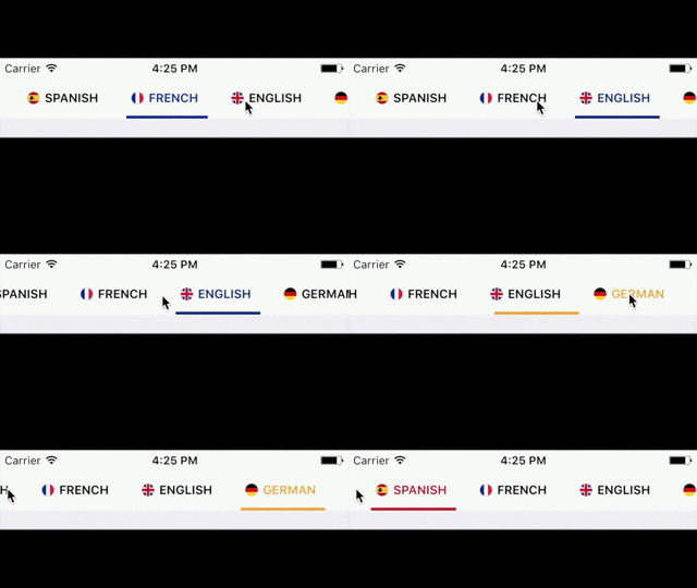
PagedContent - Easy to use library to display content with multiple sections
PagedContent is an iOS implementation of Android's ViewPager purely written in Swift. It allows to place content in "pages" in order to show one part of the content while hiding others. It uses a menu-based navigation to go through the different parts of the content.
Usage
The easiest way to use the component is to embed the PagedContentViewController in your view controller using a container view, or to initialize a PagedContentViewController in your parent view controller and adding it's view to your main view.
To setup each page of the content, you must create a PagedContentTab object with a title and a UIView object which will be the content of that page; and pass a list of these objects to the PagedContentViewControler. An example of this is as the following:
let backgroundColors = [UIColor.blue, UIColor.red, UIColor.yellow, UIColor.brown, UIColor.cyan, UIColor.green, UIColor.black]

        let tabs = ["view1", "view2", "view3", "view4"].enumerated().map { index, title -> PagedContentTab in

            let view = UIView()
            view.backgroundColor = backgroundColors[index]
            return PagedContentTab(title: title, view: view)
        }
pagedContentViewController?.update(tabs: tabs)
Tabs with image and title:
To setup the tab menu with title and images you just have to pass an additional UIImage object when initializing the PagedContentTab, as the following:
PagedContentTab(title: title,
image: UIImage(named: "icon"),
view: view)
Tabs only with image:
You can also setup the tab menu with only images, and for that you have to initialize the PagedContentTab with a UIImage, instead of a title.
PagedContentTab(image: UIImage(named: "icon"),
				view: view)
You can also set a custom size for the image by passing the imageSize parameter when initializing the PagedContentTab object, otherwise the size of the UIImage object will be used.
Styling
If you don't do any styling, the library will use the default theme for the menu which looks like the following:
You can change the styling of the menu using a PagedContentTabTheme object and calling the update(with theme: PagedContentTabTheme) function of the PagedContentViewController. You can set the following properties:
- Background Color
- Text color
- Selected Color (This applies to both text and the bottom line)
- Border color (Set to clear if you don't want any borders)
- Font
- Selected Font (Default is the normal font)
- Padding between tab buttons
- Full width or not (setting to full width makes the buttons take up as many space as they can based on the width of the menu and the number of buttons)
You can also set multiple selected colors if you want different colors for different tabs by passing a list of colors as the selectedColors parameter.
The height of the tab menu is by default 44 pts. You can change the height by changing the menuHeight property of the PagedContentViewController.
Requirements
- iOS 8.0+
- Xcode 8.0+
TODO
- Add additional styling options
- Add setup option with view controllers for each content page instead of views
- Add a contribution guide


